06 / 19
2023
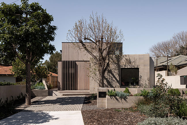
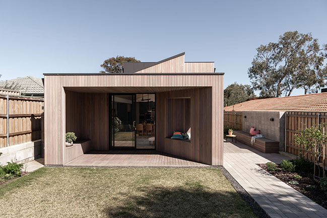
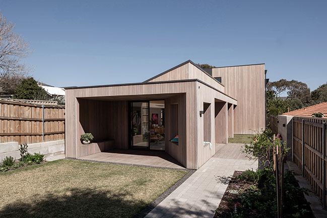
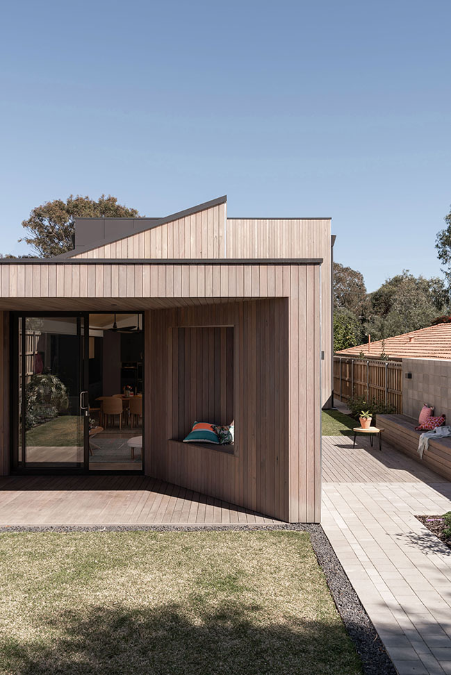
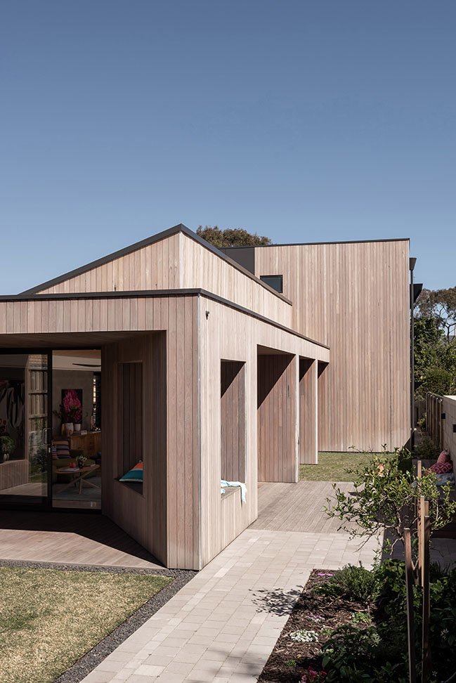
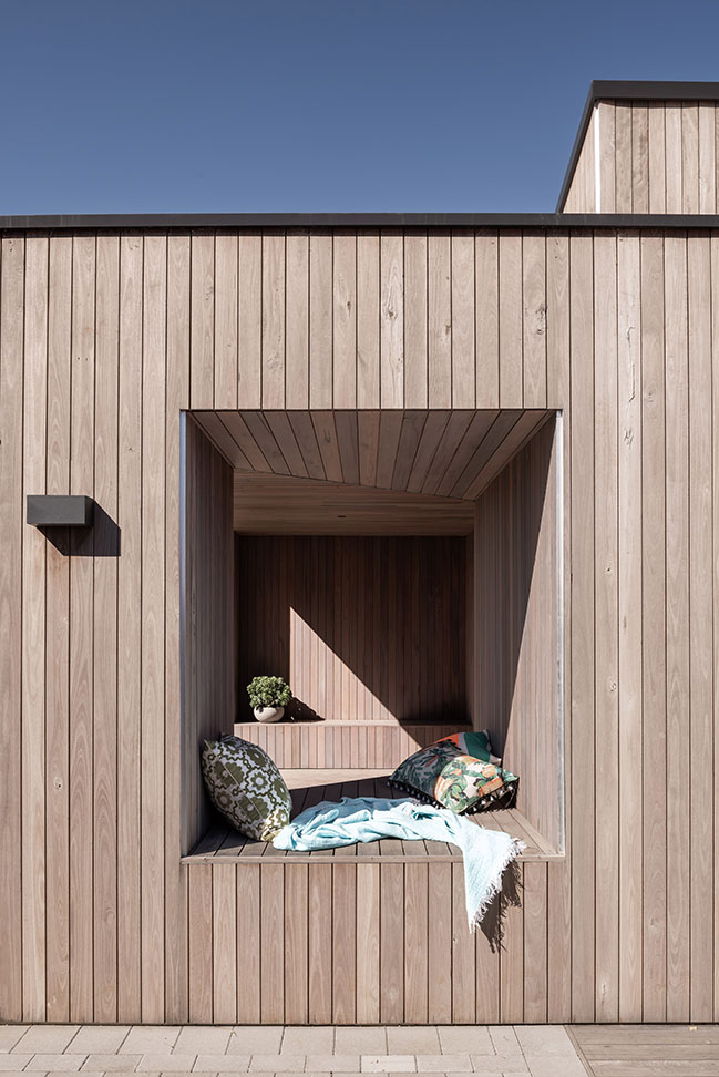
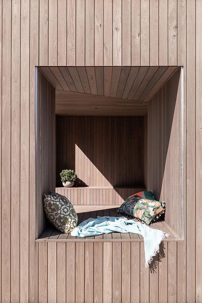
Our favourite nook of the home is the timber-clad reading nook wedged into the eastern deck wall. This spot receives morning sun, and afternoon shade; exactly what is required for reading or napping. It is these little details that give personality to a home...
> King George by Robeson Architects
> The Eagle House by Justin Humphrey Architects
From the architect: Sustainability, passive design, ageing-in-pace, multi-generational living…buzzwords in architecture and concepts which can often be applied in a tokenistic way. Not so for this project, with a client who was genuine and passionate about applying these design principles, that inspired us as architects to make sure they were implemented thoroughly at all levels and in all details. We are very proud of this house; it met the brief and budget and pushed us out of our comfort zone, in the best possible way.
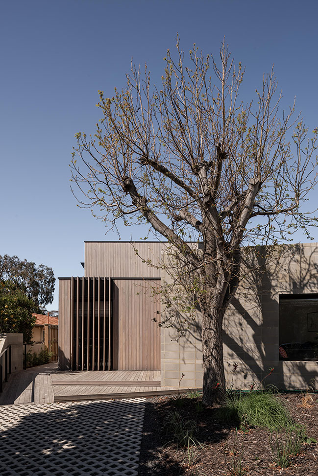
The Brief
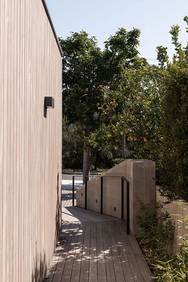
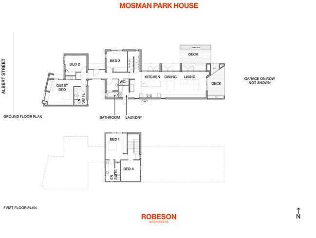
A home for a young family and grandmother (in the future). All areas of the home had to be wheelchair accessible, complying with the gold standard of the ‘Liveable Housing Design Guidelines’ which calls for wider hallways, doorways, and circulation space generally. This also meant the design needed to address the slope in the site, through ramps and graded paths to enable a person to transverse from front boundary to rear boundary without going up or down a step. (Note: this also makes for an easy move-in day for the furniture movers!) The program called for three bedrooms, two bathrooms, a home office, and a spacious living area. A key part of the brief was the inclusion of a ‘granny flat’, with its own ensuite and kitchenette, and a private entry. This space is to be used as a yoga studio until which stage the grandmother should move in. An off-street car bay is provided adjacent to this room, with an enclosed garage for two cars accessed from the right-of-way.
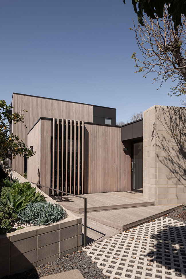
The Solutions
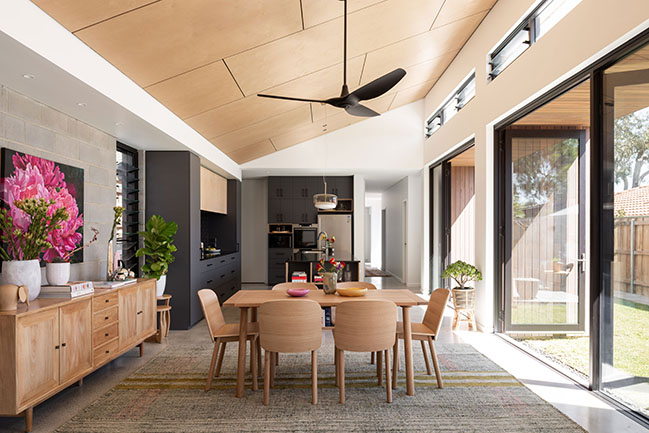
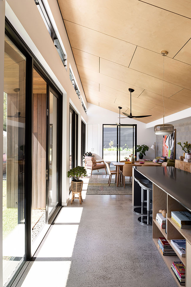
First up was resolving the need for level transitions from front to back of site. Floor levels were set, ramps created, then the floor plans grew from there. We decided not to align the bulk of the house toward the street, leaving a large backyard, but rather create smaller, distinct outdoor zones with their own distinct uses that are interspersed between the building footprint. The granny flat is located towards the street and is separated from the rest of the house with an entry courtyard. We chose to design around two established liquid amber trees, which effectively drove the angled wall to the granny flat, in order to avoid root disruption. The living ‘wing’ runs east-west and is pushed to the south opening onto a rectangular northern courtyard. To the east of this wing is a covered morning deck, which receives the eastern morning sun. This deck overlooks the largest garden, with veggies and fruit trees surrounding a grassed play area. The parent’s bedroom and retreat are the only rooms on the first-floor. The first-floor building bulk was setback a considerable distance from the street, maintaining an essentially single storey appearance of the home. Avoiding any building over the living areas allowed us to pitch the ceilings nice and high in those spaces and still meet council height requirements.
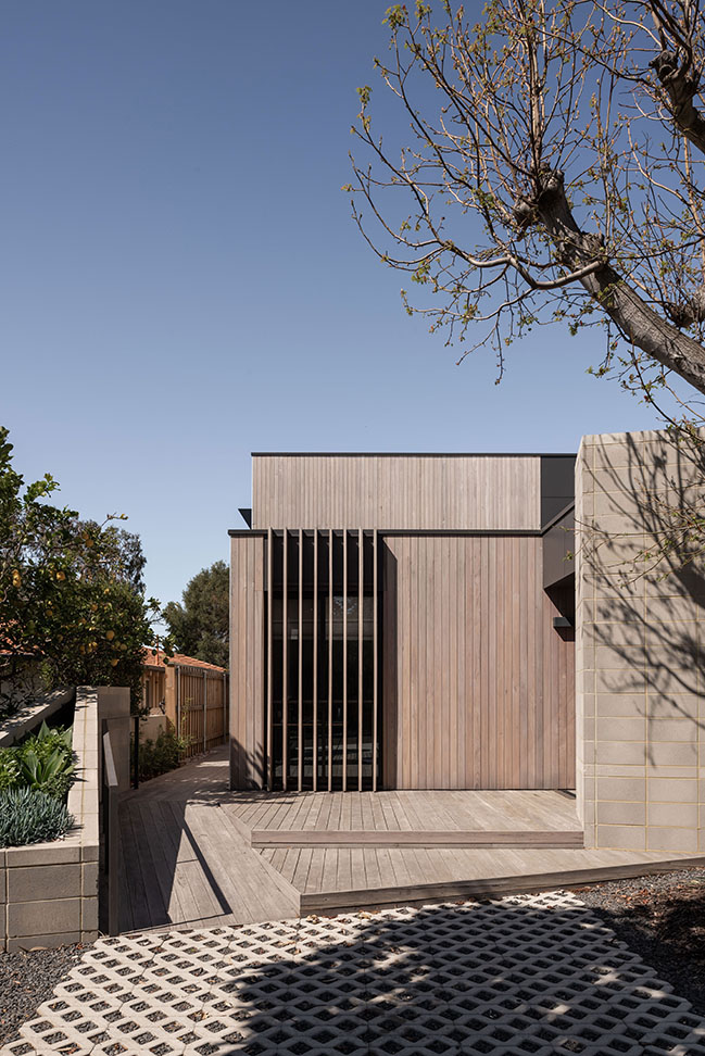
The Sustainability Features
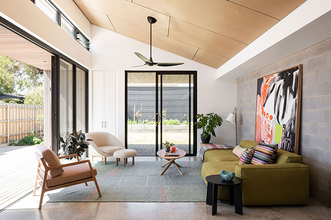
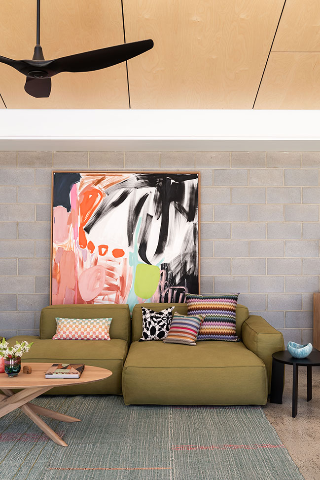
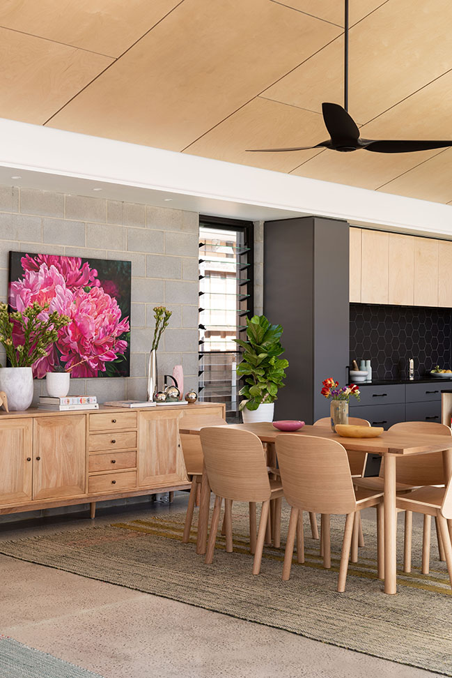
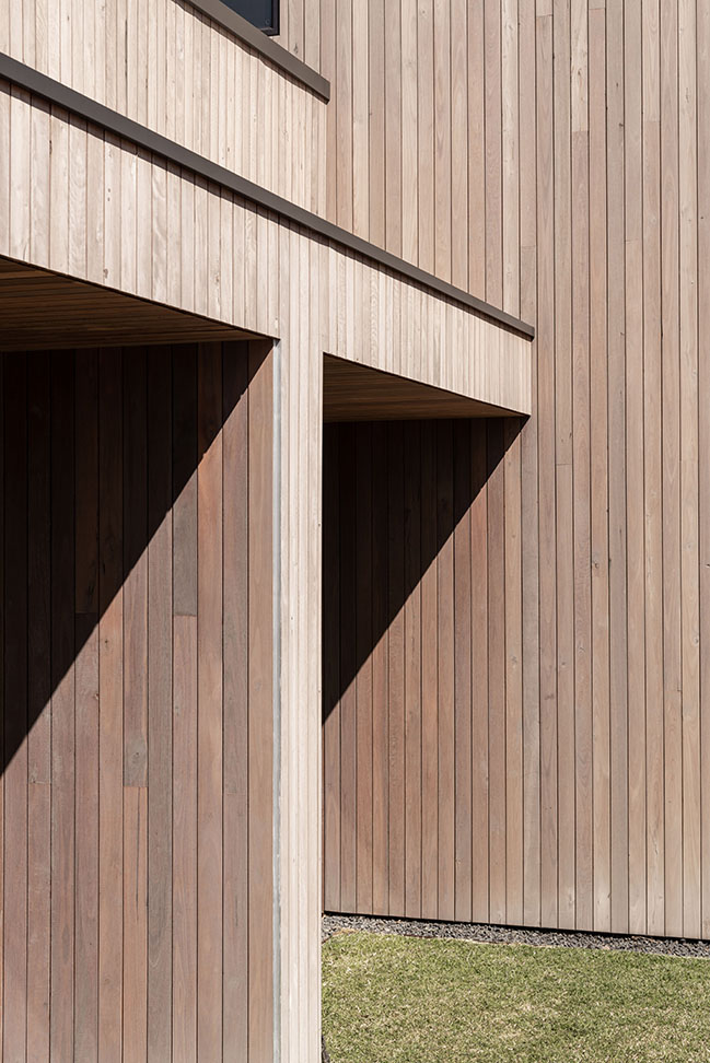
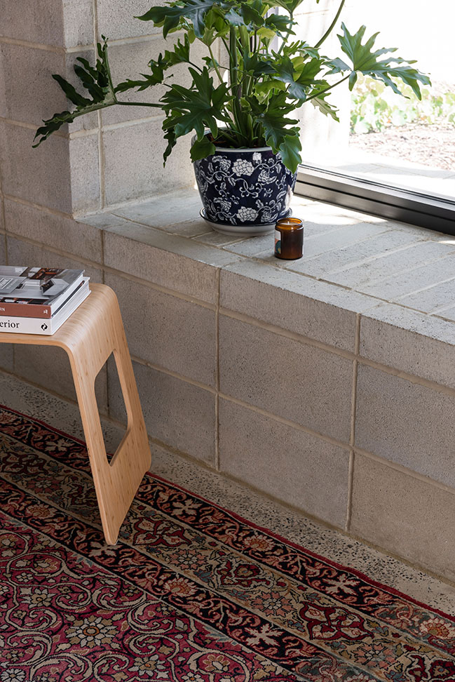
Sustainability runs through to the bones in this house, literally. Even the timber used in the wall studs and the cabinetry carcasses are ‘FSC certified’. It’s easy to forget these materials that are hidden from view, but when an owner is serious about sustainability and is prepared to invest in them it results in a greater sustainable outcome. The building is clad in recycled spotted gum, with the intention of it ‘silvering’ over time. A minimal amount of grey stain was added when sealing this timber, to promote a more even weathering (as some walls receive more sun than others). Large slimline water tanks are tucked along the south of the site, with a greywater system providing water to the garden and toilets. ‘Green’ concrete was used for the ground floor slab, which was then lightly polished to a ‘salt and pepper’ finish. Solar panels are fitted to the first-floor roof, with provision for future battery storage. There is no air-conditioning in the home, meaning louvres and windows are strategically placed to capture the cooling south-westerly breezes, together with ceiling fans to move the air around.
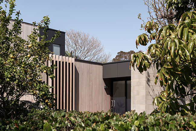
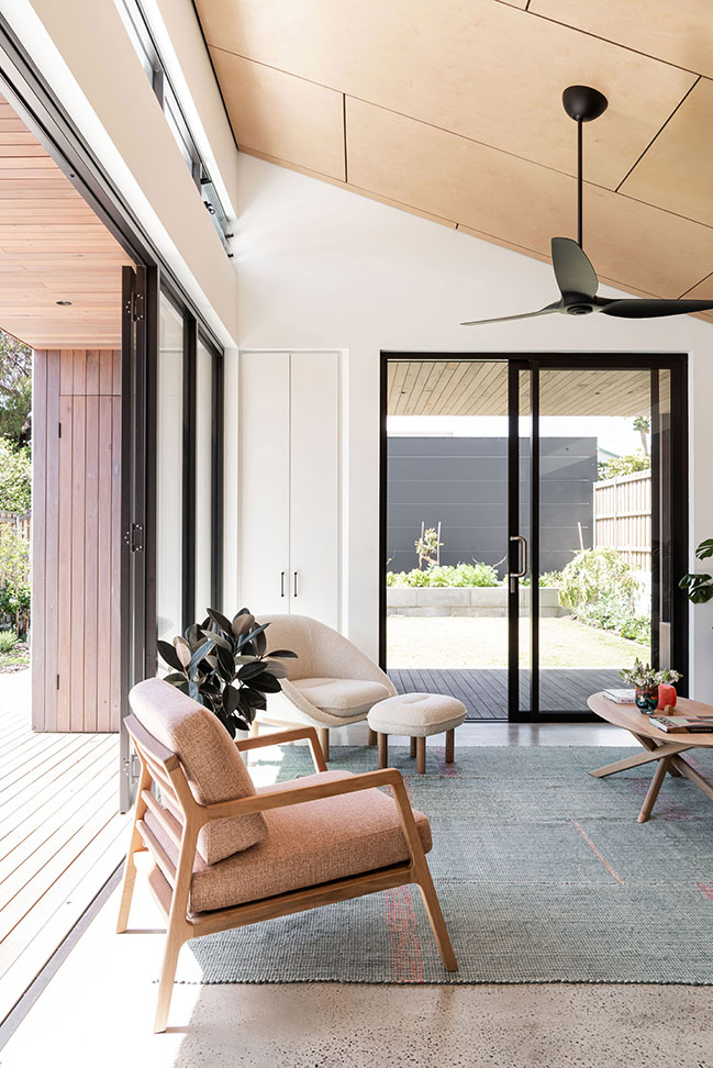
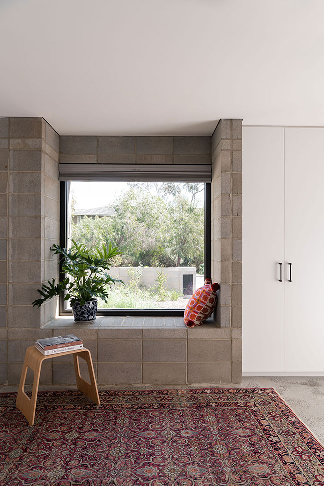
The ground floor walls are ‘reverse brick veneer’ construction, a wall type which is highly suited to Perth’s temperate climate. The inner wall leaf is made from grey utility bricks, with no applied finish, allowing it to contribute to the thermal mass of the home. Extensive glazing to the north of the living wing is shaded precisely to allow maximum winter sun penetration and zero summer penetration. The angled ceiling over this living wing assists further in bringing that desirable light deep into the floor plan.
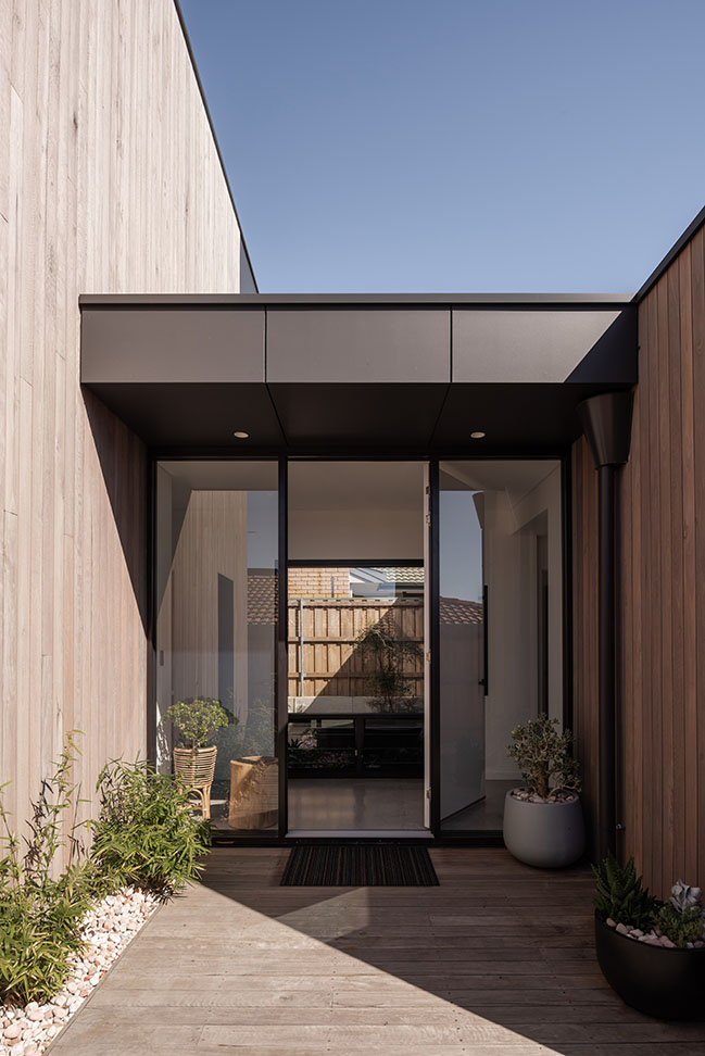
A pond was designed into the entry courtyard, for both aesthetics and to cool down the breezes entering the home in the afternoon. Low level louvres located adjacent to the pond allow this cool air to enter the home at a low level, with high level louvres located at the top of the ceiling in the living wing at the other end of the home, expelling the hot air from the home.
Architect: Robeson Architects
Location: Western Australia
Year: 2021
Project size: 269 sqm
Site size: 615 sqm
Photography: Dion Robeson
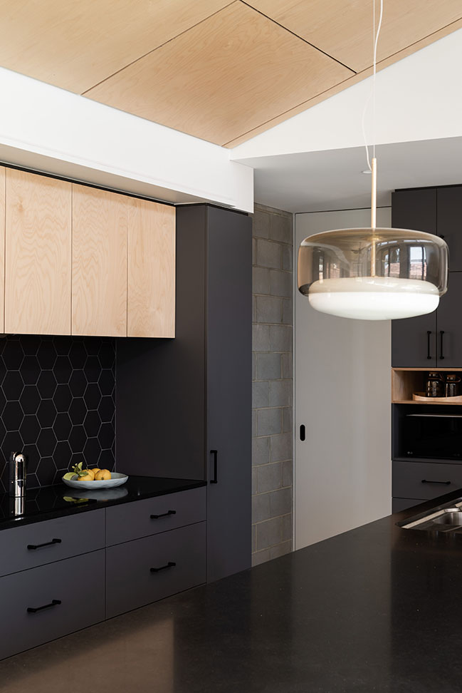
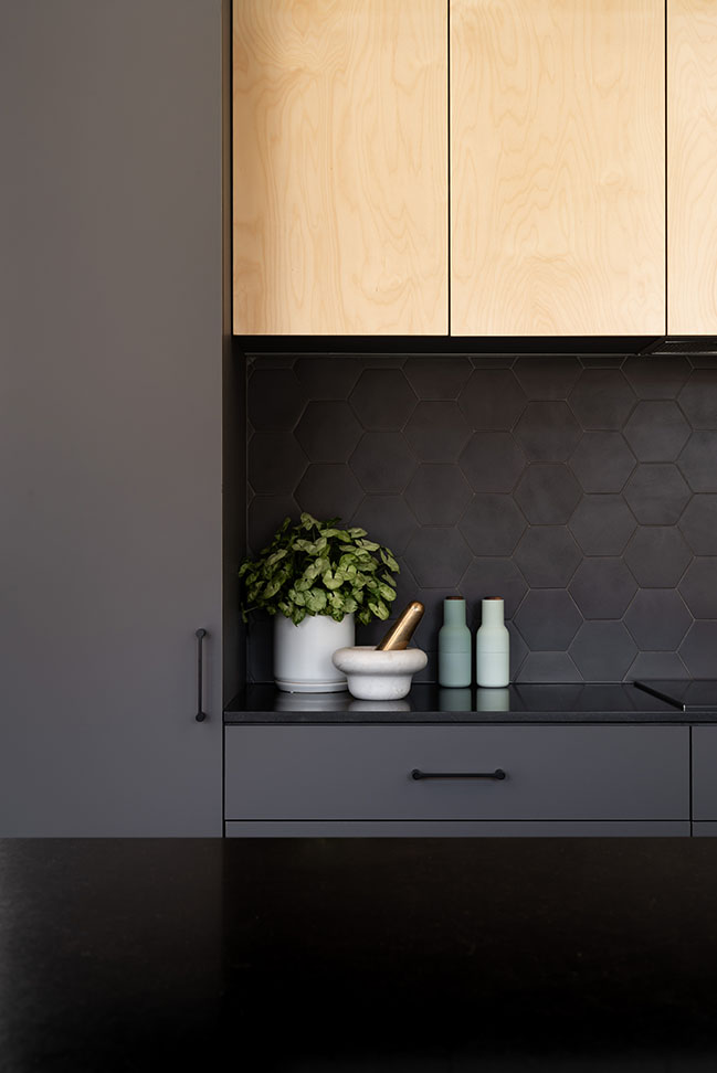
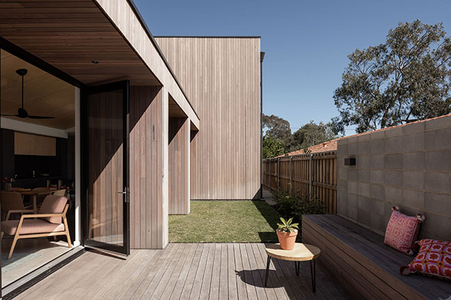
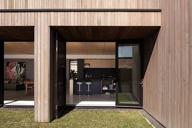
Mosman Park House by Robeson Architects
06 / 19 / 2023 Our favourite nook of the home is the timber-clad reading nook wedged into the eastern deck wall. This spot receives morning sun, and afternoon shade; exactly what is required for reading or napping. It is these little details that give personality to a home...
You might also like:
Recommended post: The Penthouse of the OPUS ONE, Hangzhou, China by T.K. Chu Design
