07 / 28
2022
A country retreat. That was the dream of the young couple with children, when back in 2019 they hired us to design their country house interiors...
> Artur Ramos Apartment by Diego Revollo Arquitetura
> Higienópolis Apartment by Diego Revollo Arquitetura
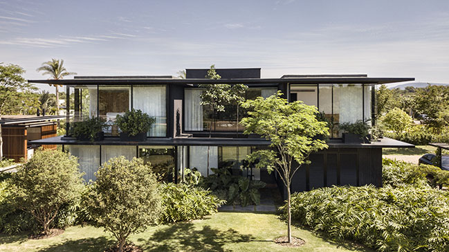
From the architect: Long-time clients of our firm, they expressed their desire for a cosy space, which could offer the same amenities they have in their home in the city, but providing other sensory and aesthetic experiences, with a more direct interaction with nature.
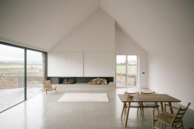
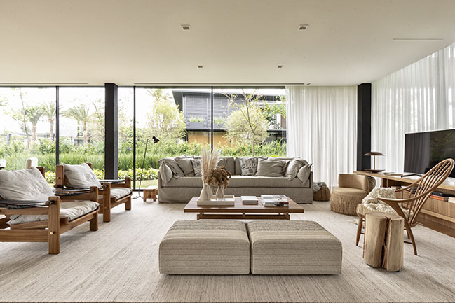
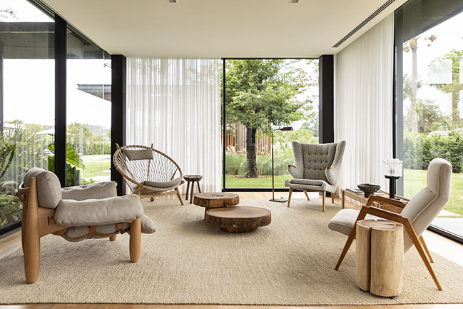
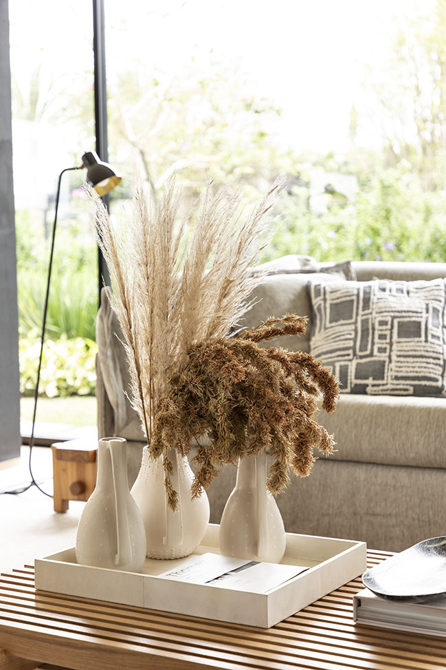
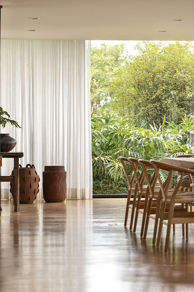
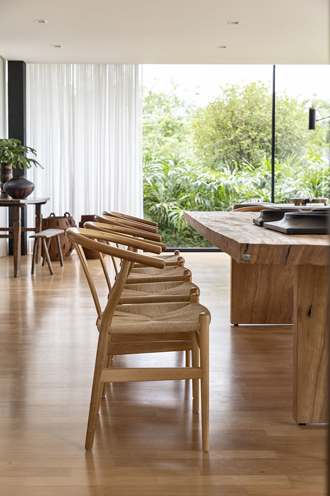
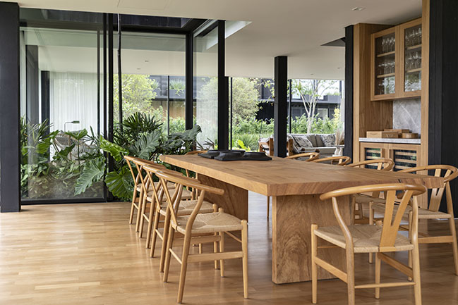
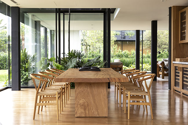
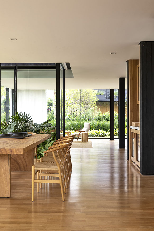
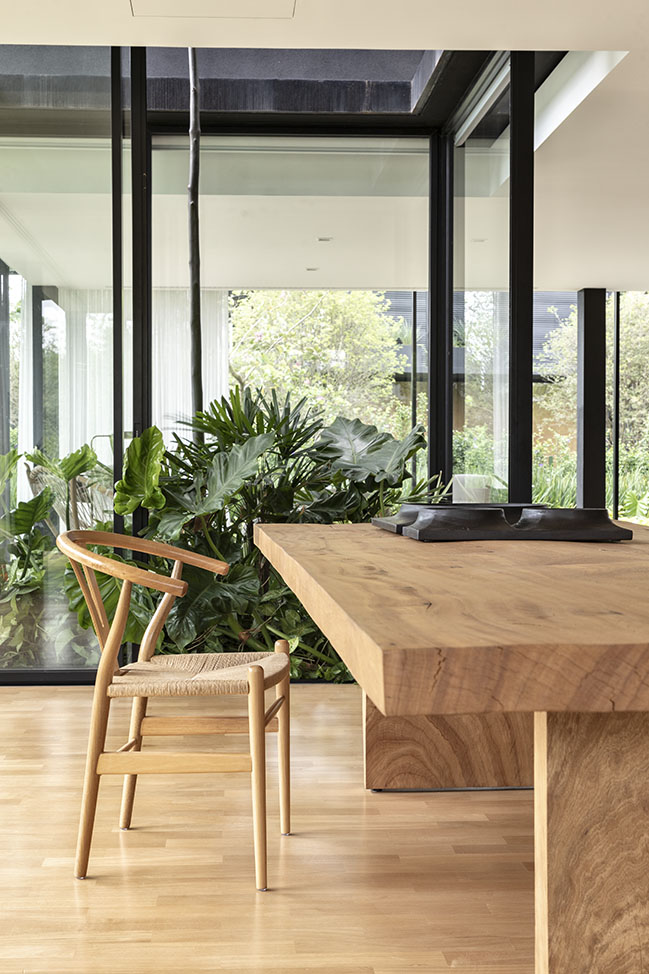
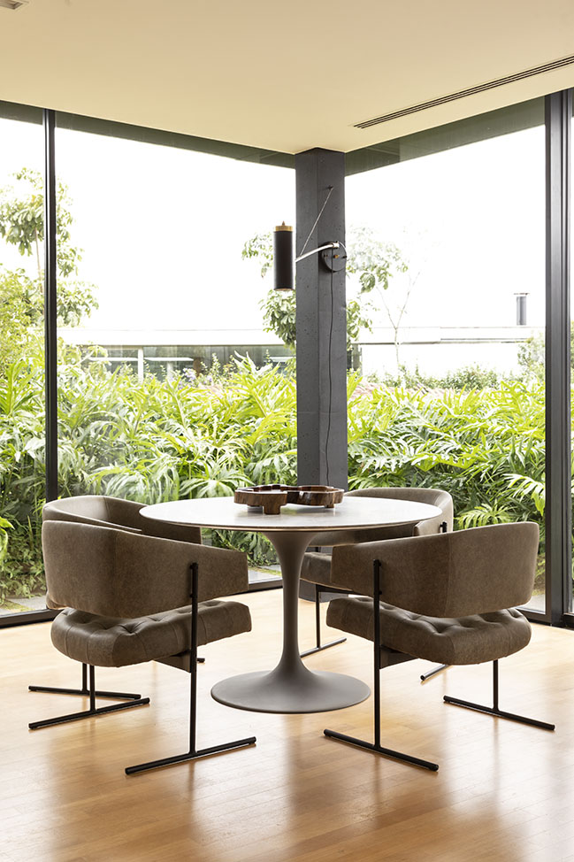
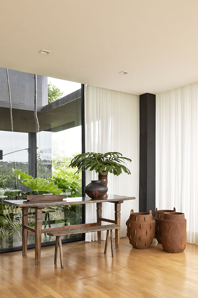
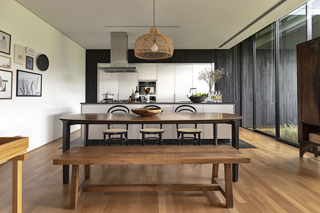
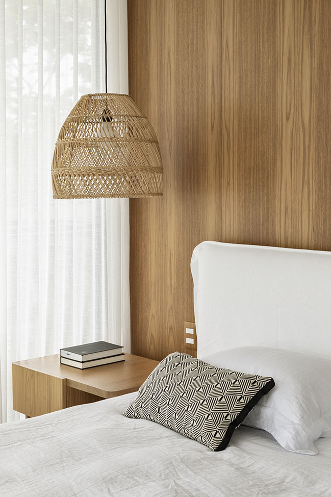
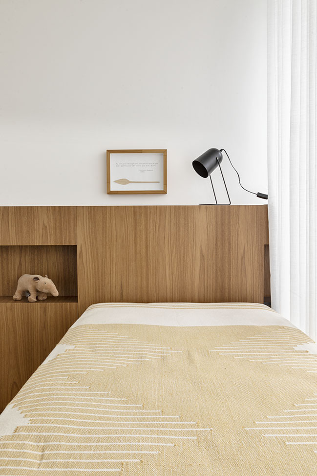
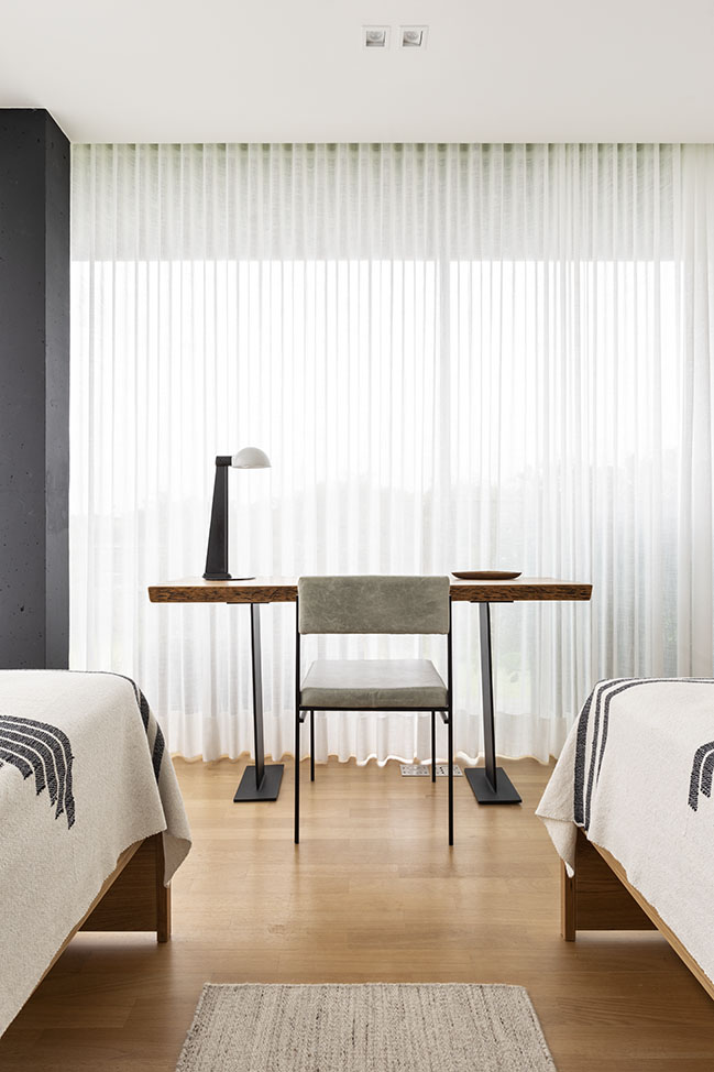
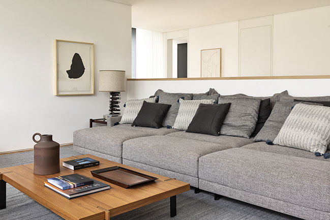
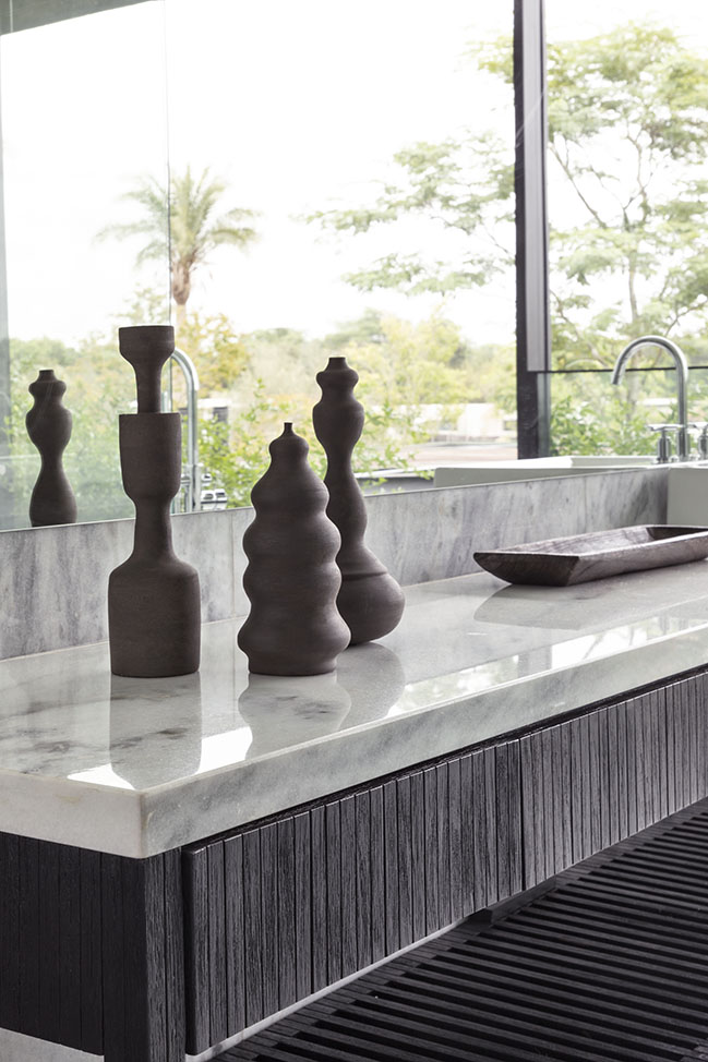
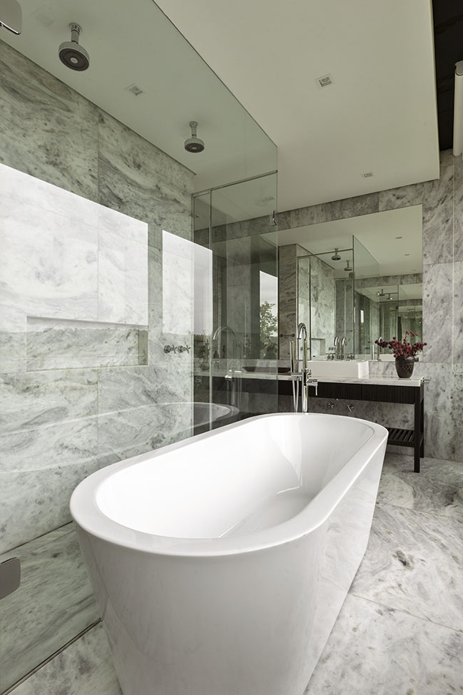
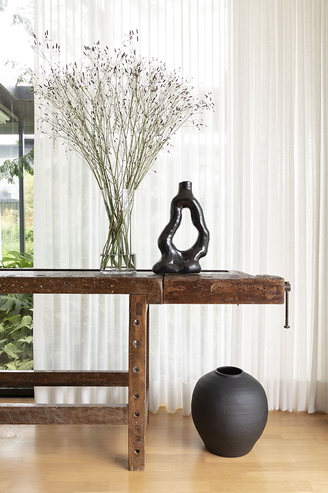
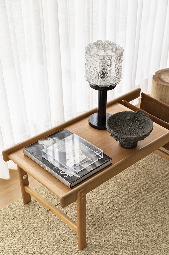
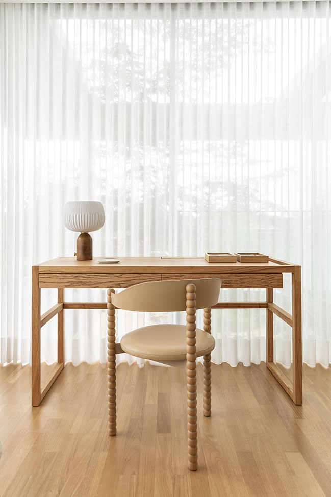
Due to the pandemic, this desire was strengthened and translated into the search for lightness and calmness in each one of the rooms. A neutral palette has then been adopted, dictating the décor of the entire residence. Avoiding any colourful element – in order not to compromise the peaceful aura that we intended to emphasize –, the design approach focused on exploring different forms, framings and plasticities, especially promoting the use of natural materials.
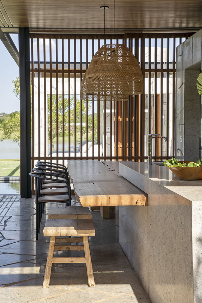
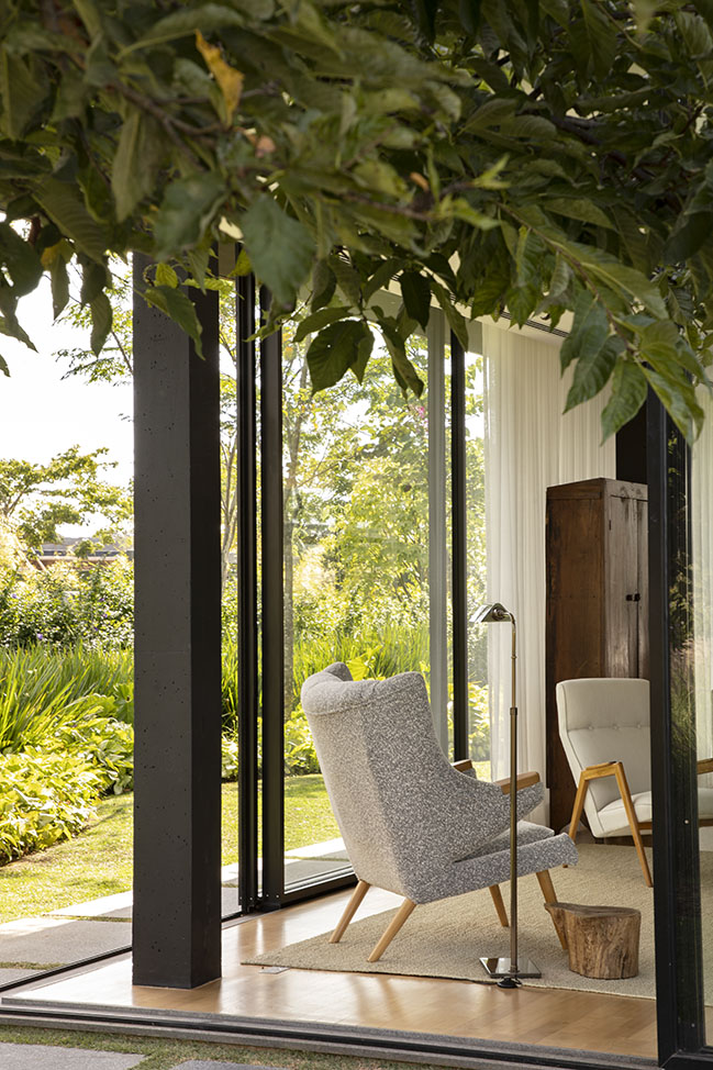
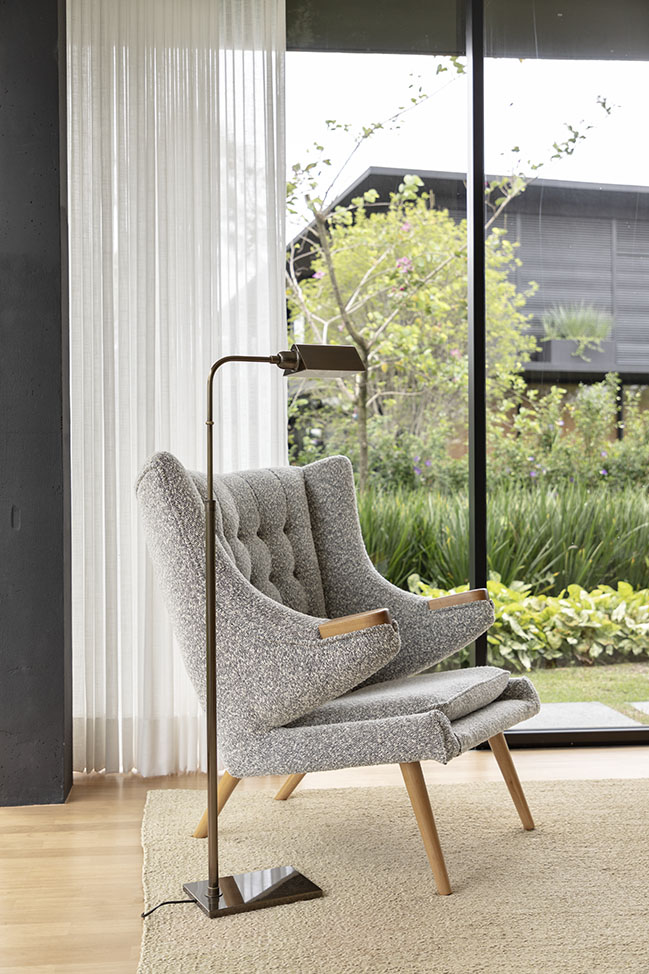
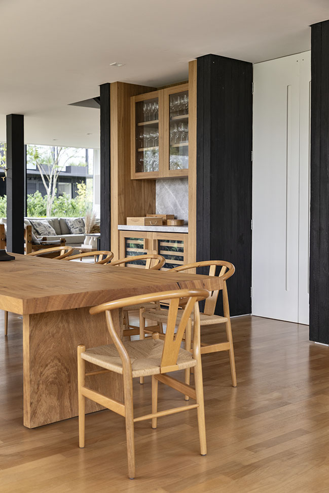
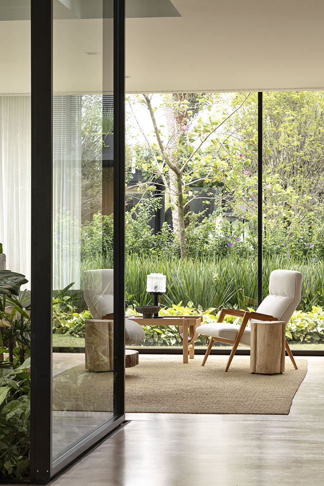
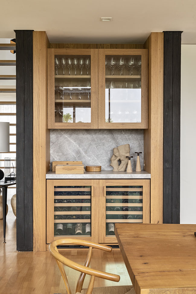
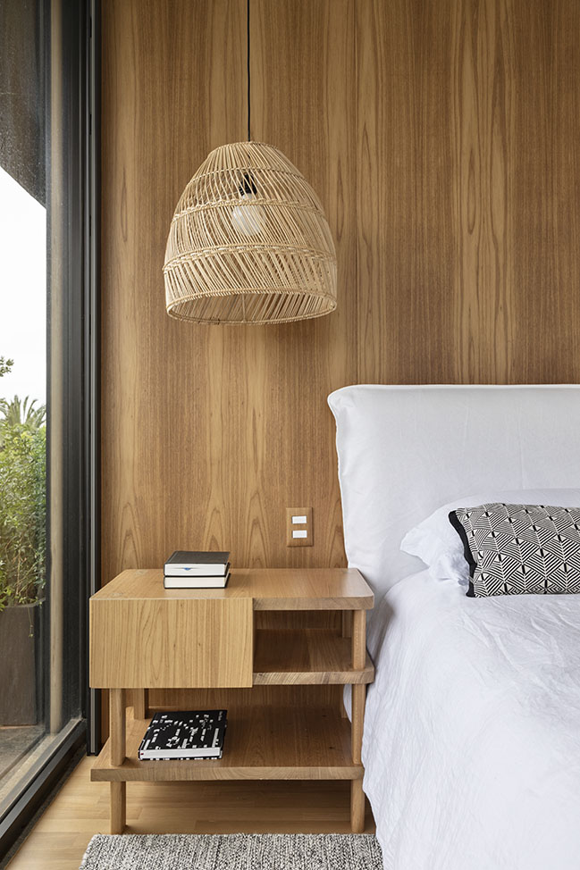
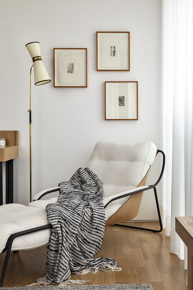
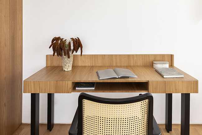
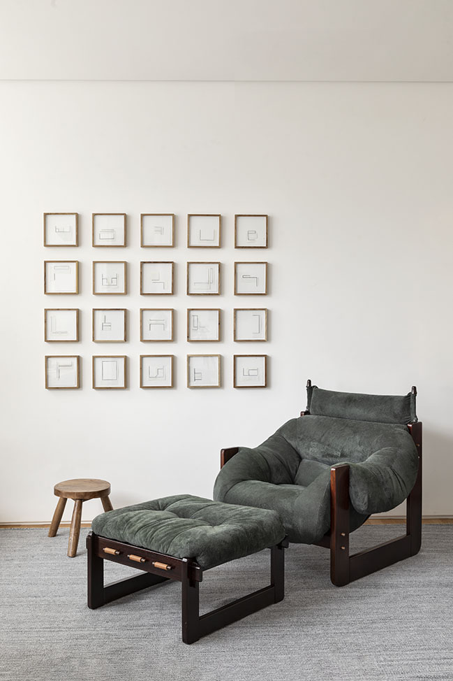
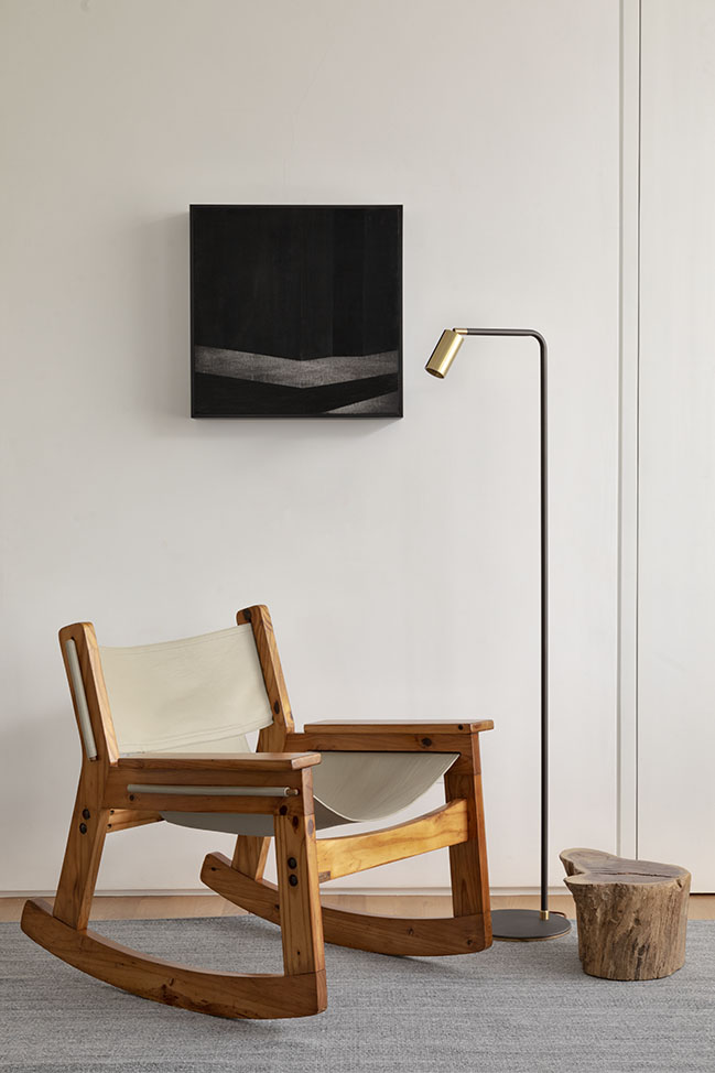
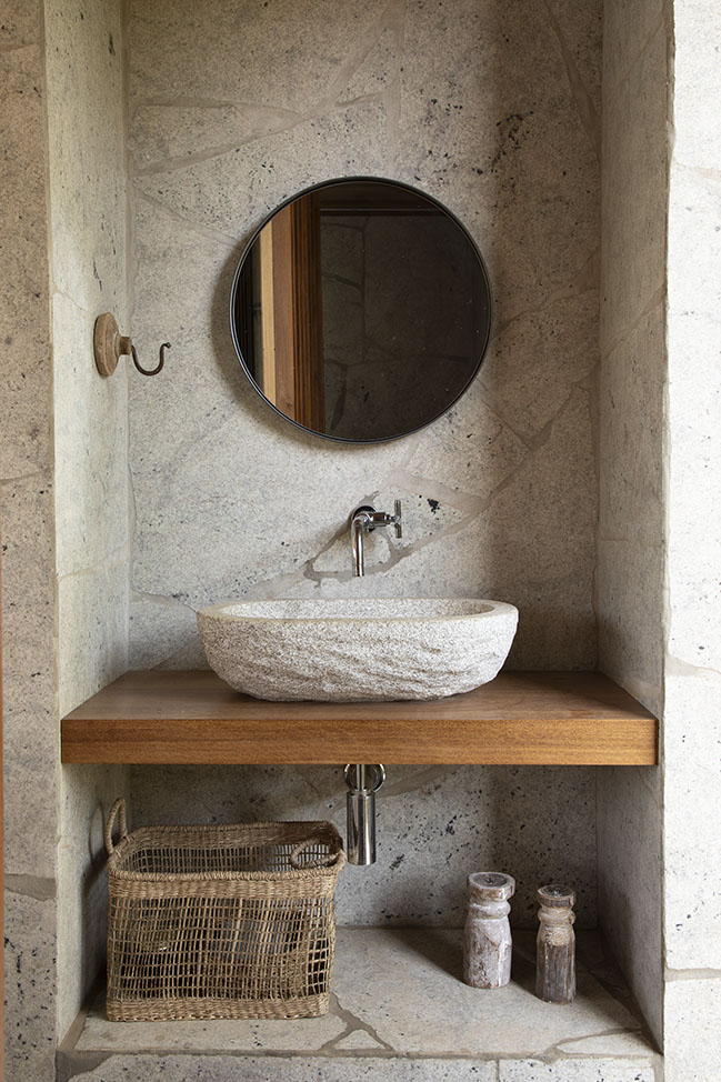
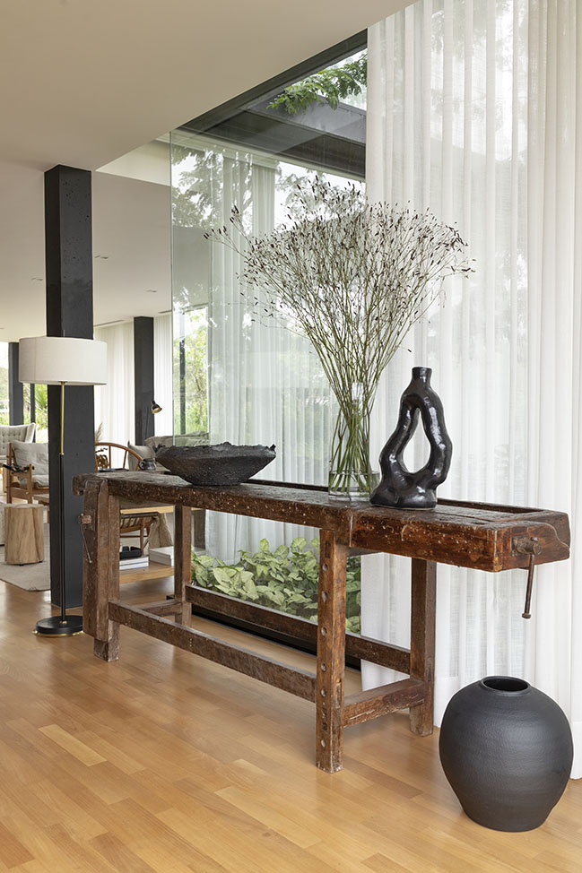
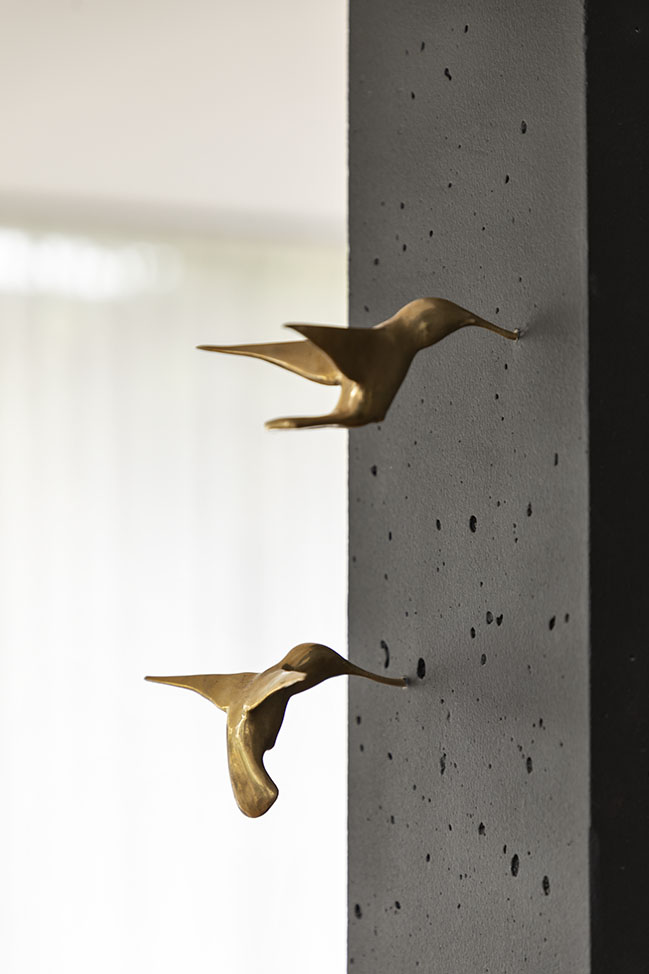
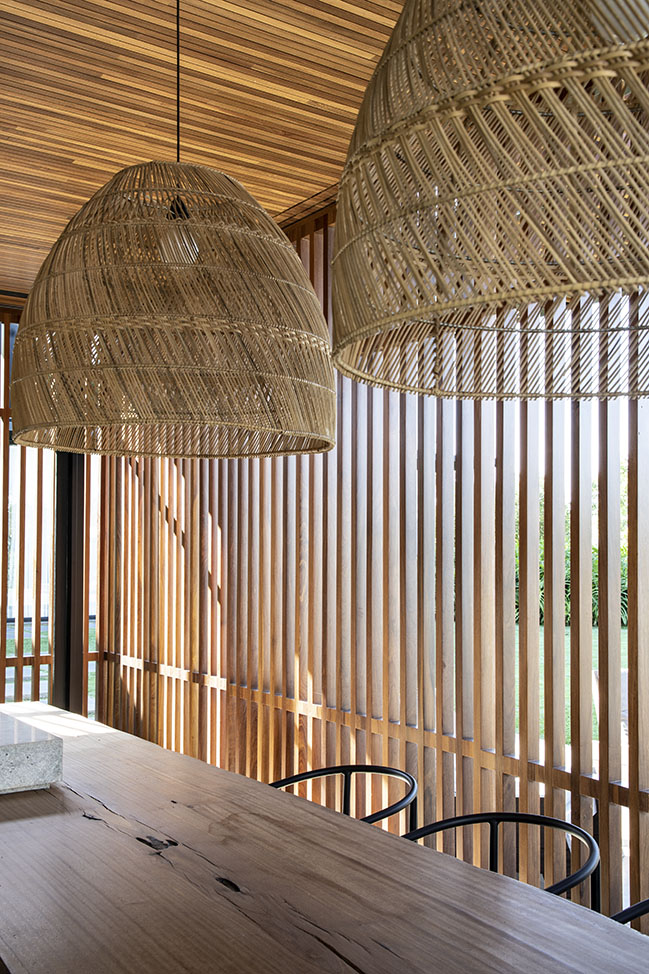
As in a complex compositional exercise, activities such as defining the internal layout, planning floor patterns, designing woodwork and curating furniture and works of art have been meticulously stitched together, in order to ensure that the neutral concept of the project would not result in monotony – and, on the contrary, that it would enable stimulating synaesthetic perceptions. The touch has been widely accentuated, through the variation of texture among all materials that have been employed, from the different finishes of wood and natural stone (either on their rustic or finely crafted conditions, depending on the use), to the variety of touch in straw, linen, leather, velvet fabrics and ceramic or clay elements.

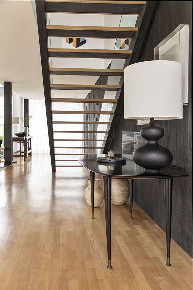
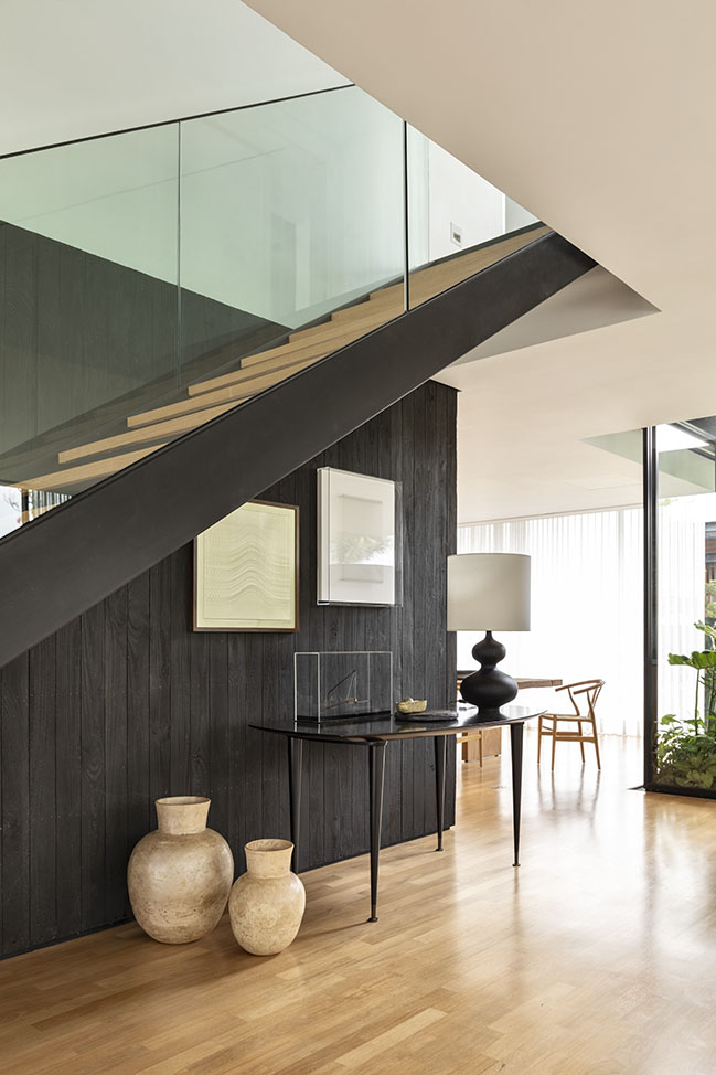
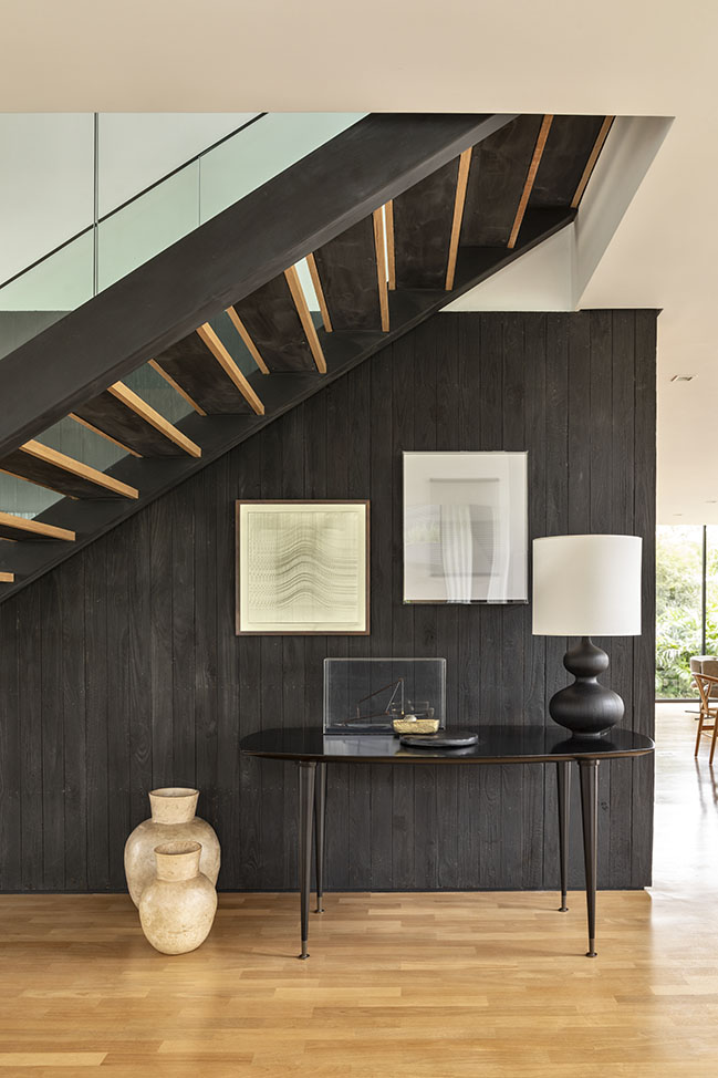
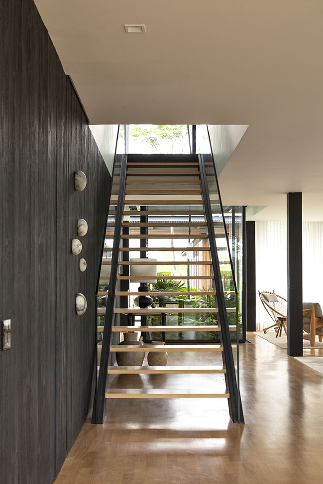
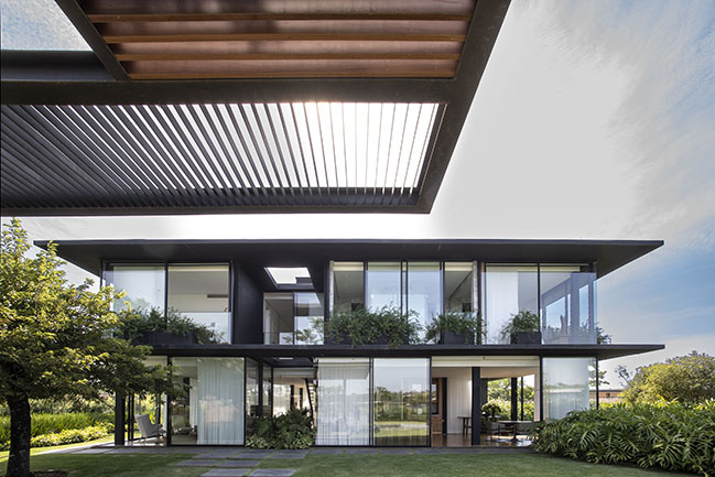
Nonetheless, visuality has not been neglected. The selection of design pieces has sought to compose an elegant and daring decoration, mobilizing different periods of the history of furniture and decorative arts, and experimenting volumetric variations - such as in the lounge area, where we arranged four armchairs with different design aspects to enrich the visual perception and create a room with personality. In addition, some architectural resources have been used to create interesting perspectives of the project, such as the design of an ebonized wood panel that simultaneously creates a casing for the service block, serves as a scenic background for the staircase, frames the cellar and also brings in the black colour, which is strongly present in the house façades.
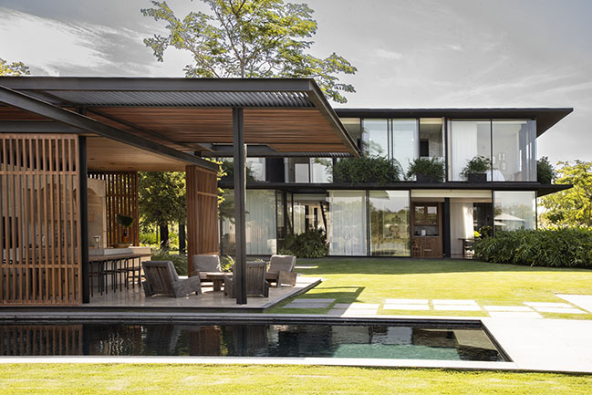
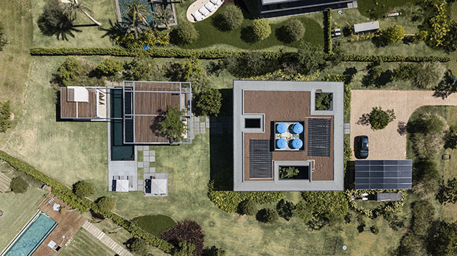
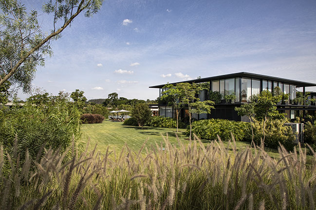
A large garden was also a requirement of the family, as the leisure space par excellence for their days spent in the countryside. In this sense, landscaping should be as natural as possible, with a vast grassy area, native species and the impression “that it had always been there”, according to the owner’s words. Clients also missed an outdoor living area, where one could experience the feeling of being outside, under the sun, the wind, the rain – since the house does not have any terrace or balcony. In order to satisfy such need, clients gave our firm the challenge of designing an annex for the house.
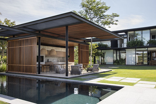
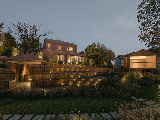
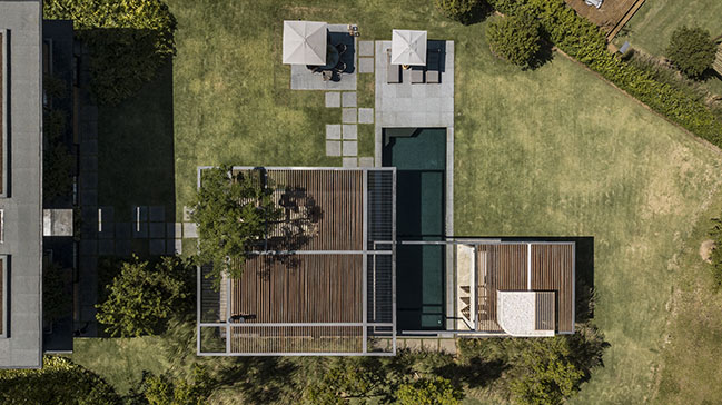
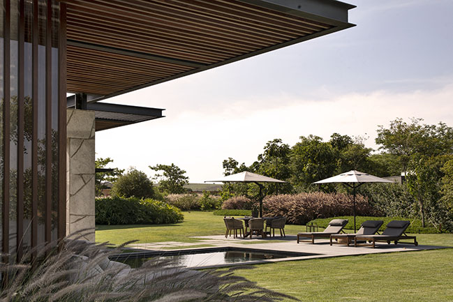
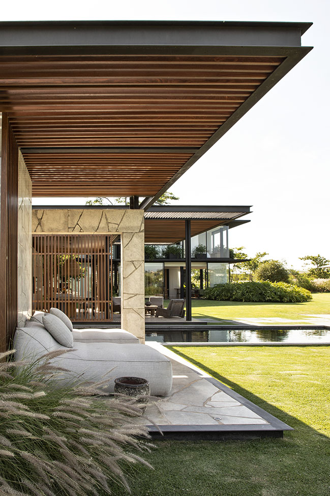
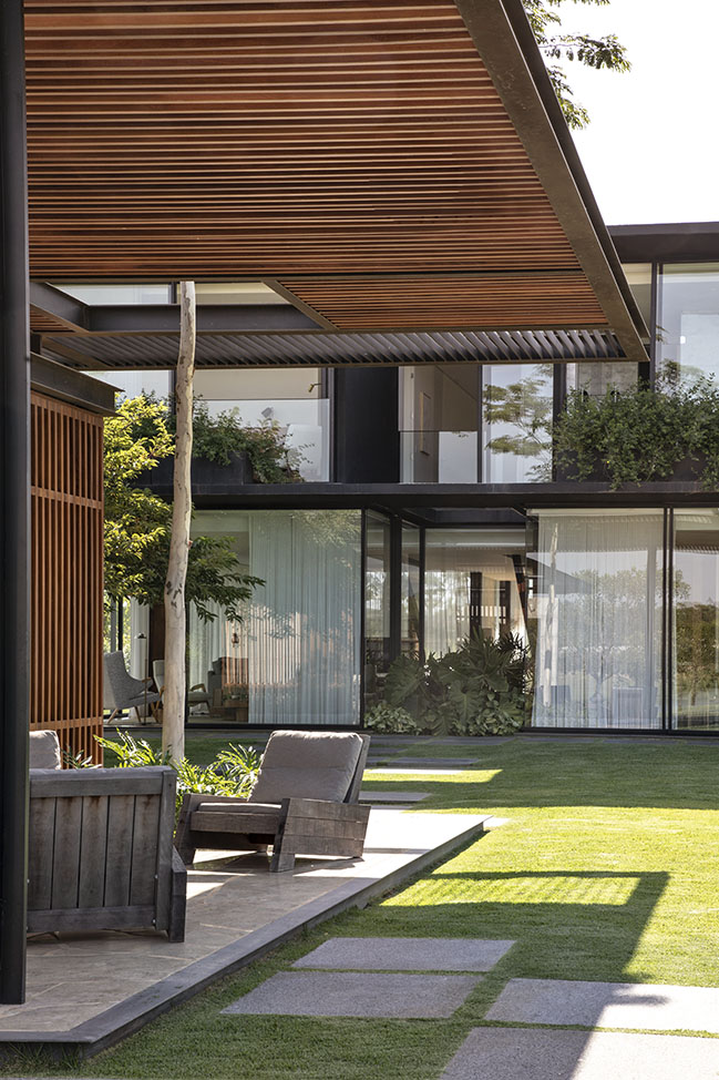
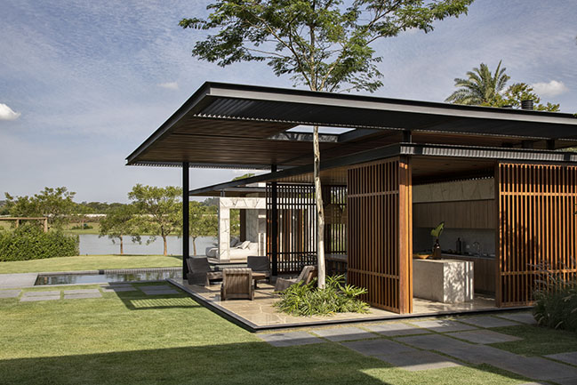
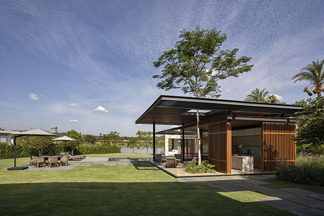
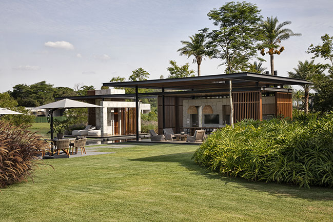
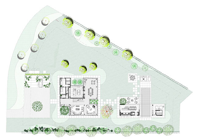
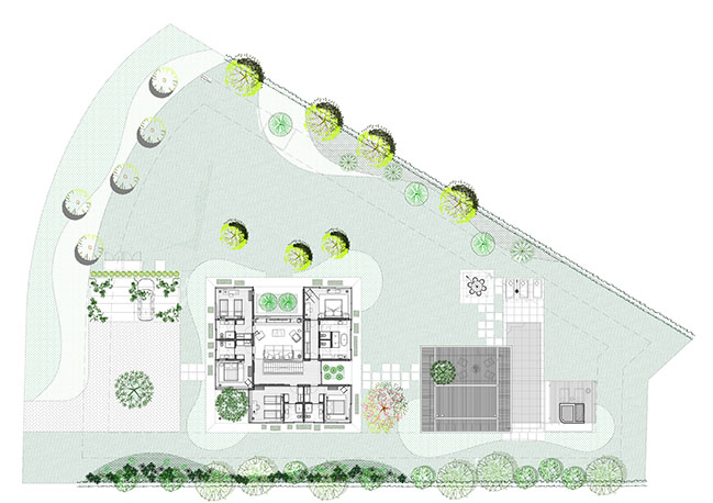
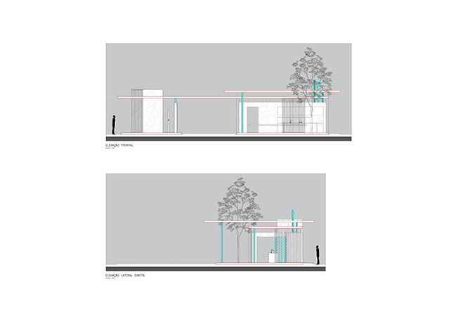
For that purpose, our initial concerns were, on the one hand, to ensure that the proposed volume would not obstruct the view of the lake located at the back of the lot, and on the other hand, that its form would not compete with the design of the main house, but neither represent a mere miniature of its structure. Therefore, a horizontal construction was designed, with light structure and eaves - references to the residence design. Its implantation on the lot was planned to follow the alignment of the main living room, guaranteeing formal and spatial cohesion with the residence.
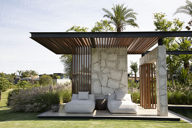
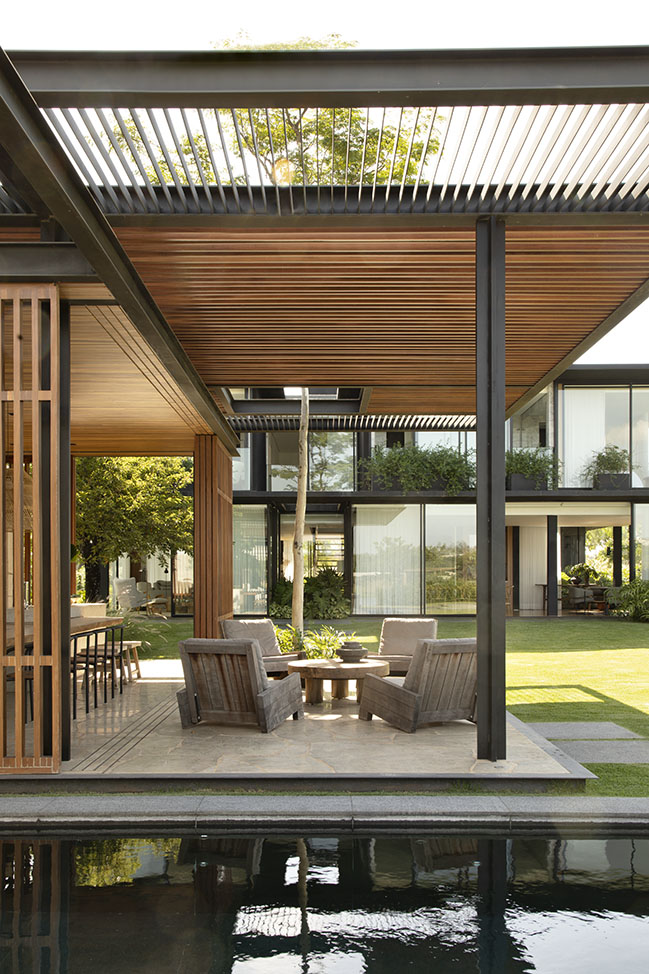
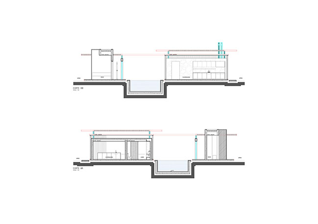
The structure we have designed consists of two built volumes, detached from one another and having the swimming pool between them, in order to separate the living and gourmet areas from the SPA. However, we have proposed a single roof interconnecting both constructions, which crosses the pool with lightness and reinforces the horizontality of the annex, but without creating any unwanted shades over of that leisure area.
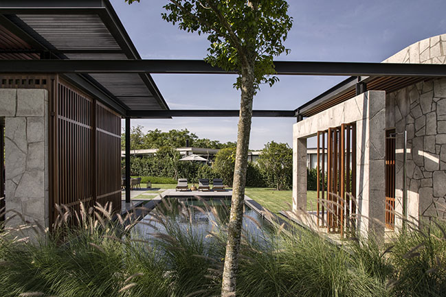
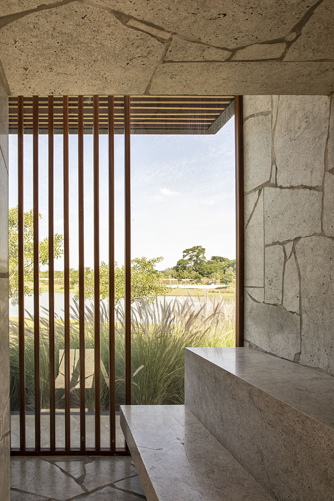
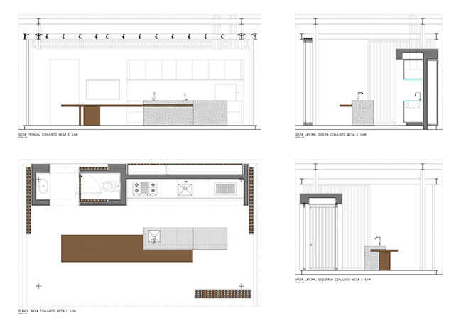
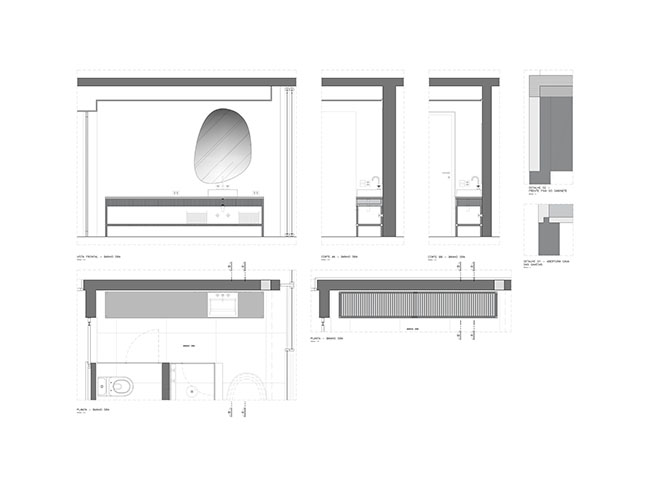
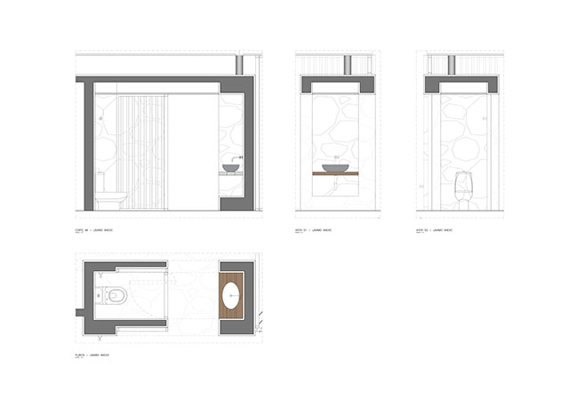
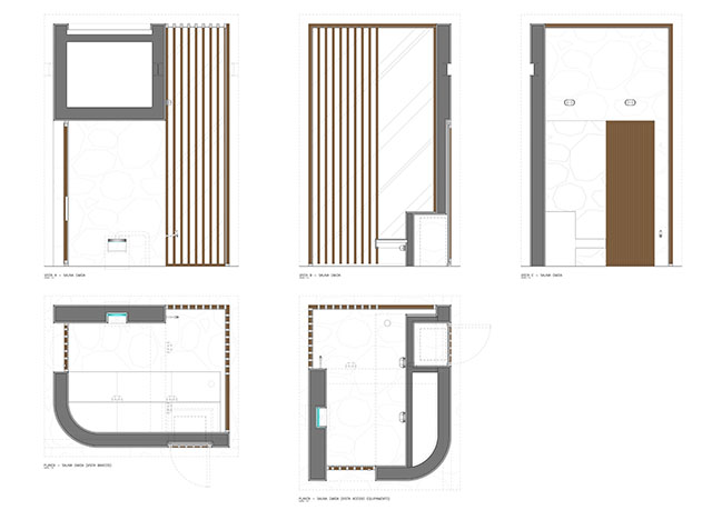
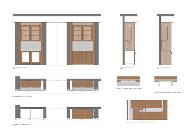
Exploring different materials and elements, the annex has only one solid wall axis, designed to allow the installation of the infrastructure required for the gourmet, to create an outside restroom and to give privacy to the sauna. All other façades of the annex are fully permeable, with extensive use of wooden louvers, which do not create a boundary between interior and exterior, on the contrary, function as a mere visual obstacle, ensuring full perception of the external weather.
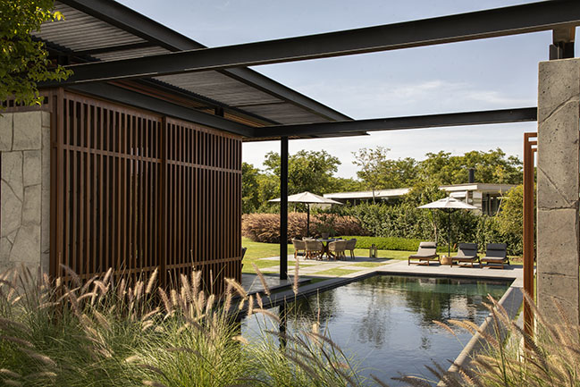
On these terms, in order to design the annex, we have reiterated the intention of the project as a whole: give birth to a bucolic idyll, though a breath of originality. Conceive a refuge of peace and well-being in the midst of the stormy times we have experienced throughout the pandemic, but also offer space for meeting beloved ones, in a brighter future – always seeking the excellence of a timeless project, which across the years can reach maturity without losing its vigorous aesthetic and functional proposal.
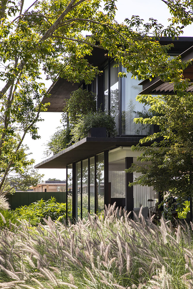
House Interior Design: Diego Revollo Arquitetura
Location: Fazenda Boa Vista, Brazil
Annex Floor area: 100 sqm
House Floor area: 576 sqm
House Architect: Triptyque Architecture
Annex Architecture & Interior: Diego Revollo Arquitetura
Landscape: Mauricio Prada
Construction: Epson Engenharia
Construction Management: JHSF
Photography: Ruy Teixeira






Sports House Interior by Diego Revollo Arquitetura
07 / 28 / 2022 A country retreat. That was the dream of the young couple with children, when back in 2019 they hired us to design their country house interiors...
You might also like:
Recommended post: Watermill House by Office of Architecture
