08 / 25
2021
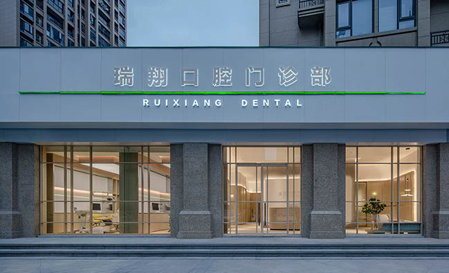
The words "dental clinic" tend to make people feel tense, nervous and anxious. The project aims to add a sense of comfort and relaxation to the clinic on the basis of ensuring professionalism and standardization of medical functions, to help patients who visit the clinic feel eased and calm...
> Dental Office by ASSONOMETRIA + Antonio Munarin
> Dental Clinic by Fran Silvestre Arquitectos
Professionalism and standardization beyond the superficial level
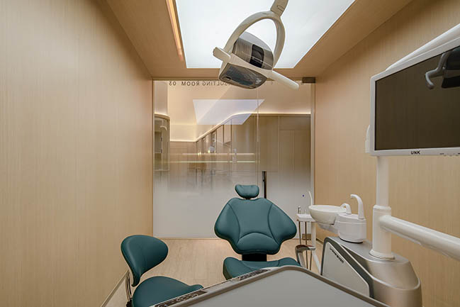
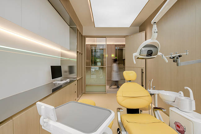
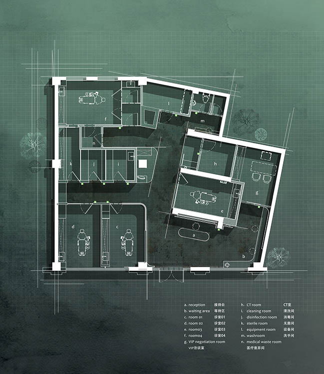
Spatial functions of dental clinic are different from other types of spaces. The design had to satisfy the functions for a professional and standardized clinic. There were specific requirements for the floor area of consulting rooms and the CT room. Besides, small operating rooms were required to meet the medical standard that circulations of dentists, patients and discarded medical supplies shall not cross each other. Only after the overall layout met relevant medical standards, the design team started to consider aesthetics.
Incorporation of architectural languages
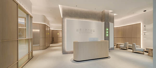
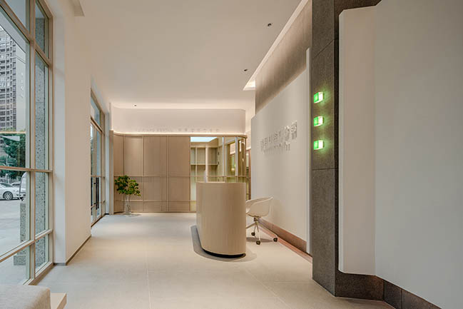
At the start of the project, the designers investigated the site and found that many existing columns and walls were unchangeable. The first key issue of the design was how to make full use of the existing architectural structure and integrate it with space to make the whole space more smooth, reasonable and comfortable. The spacing of the four load-bearing walls were utilized to form functional spaces like CT room and bathroom which don't strictly require daylight. The design team eliminated the discordance between the slanting walls and the overall layout, and created corresponding beveled forms to enhance the sense of design along the circulation. The reception desk complements the existing beveled spatial structure, forming a meeting point for the entire space.
The "green bridge" between professionalism and comfort
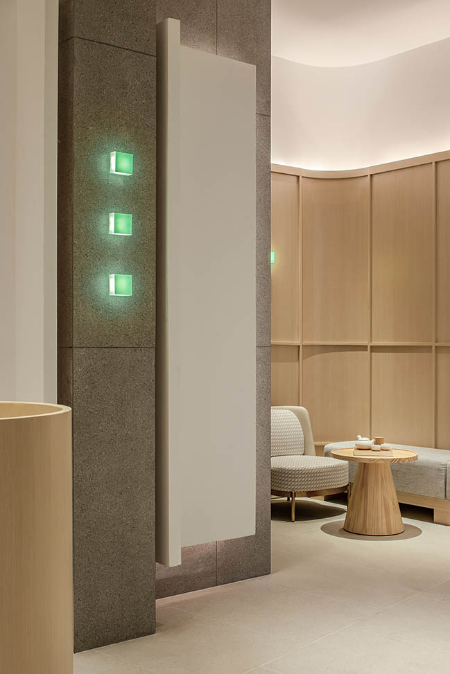
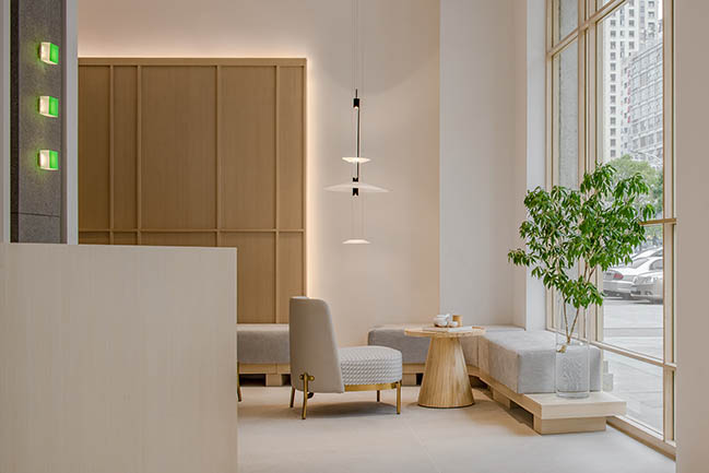
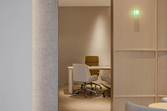
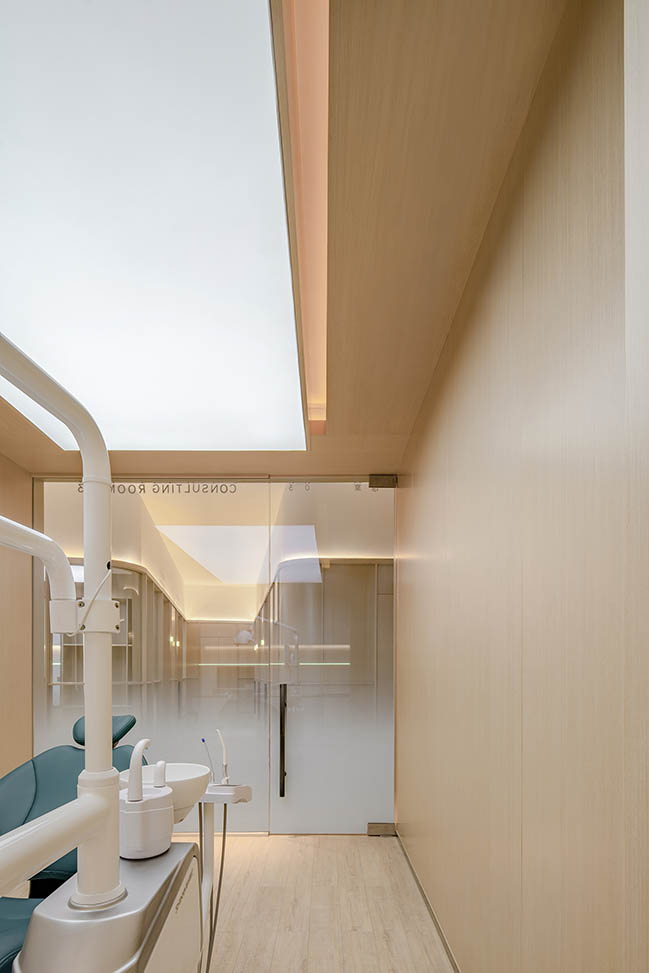
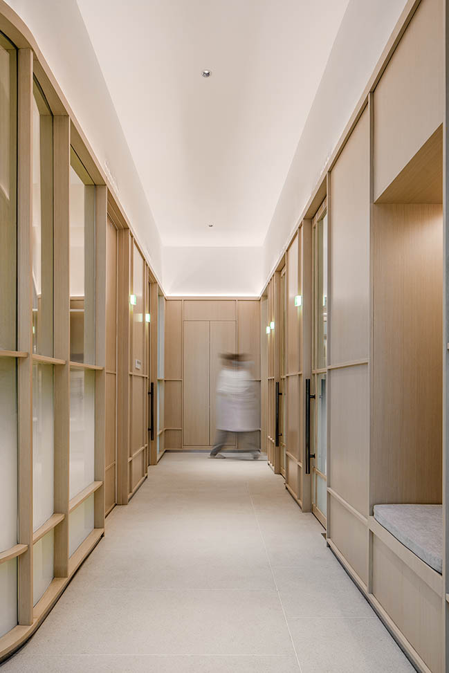
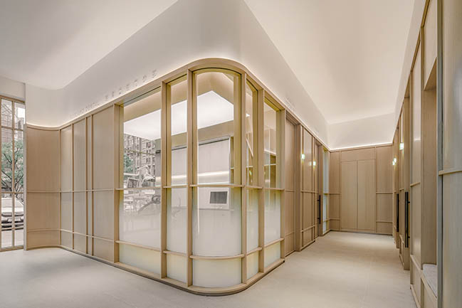
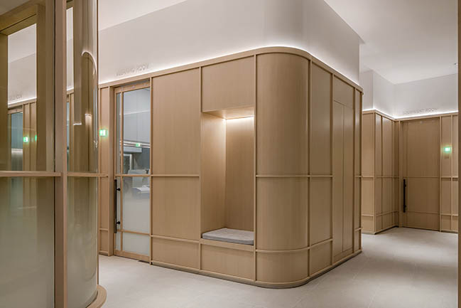
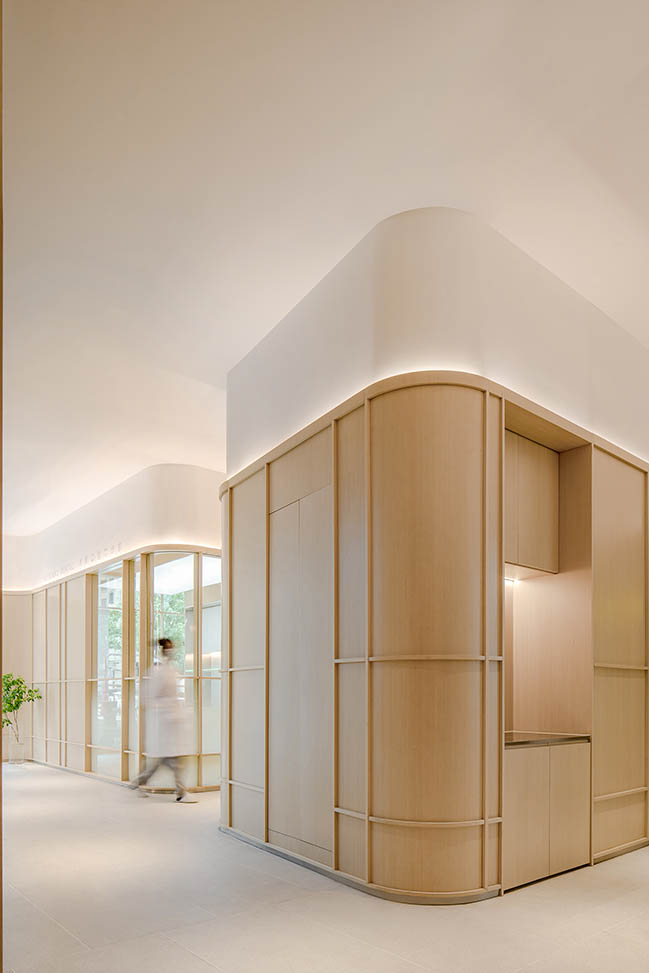
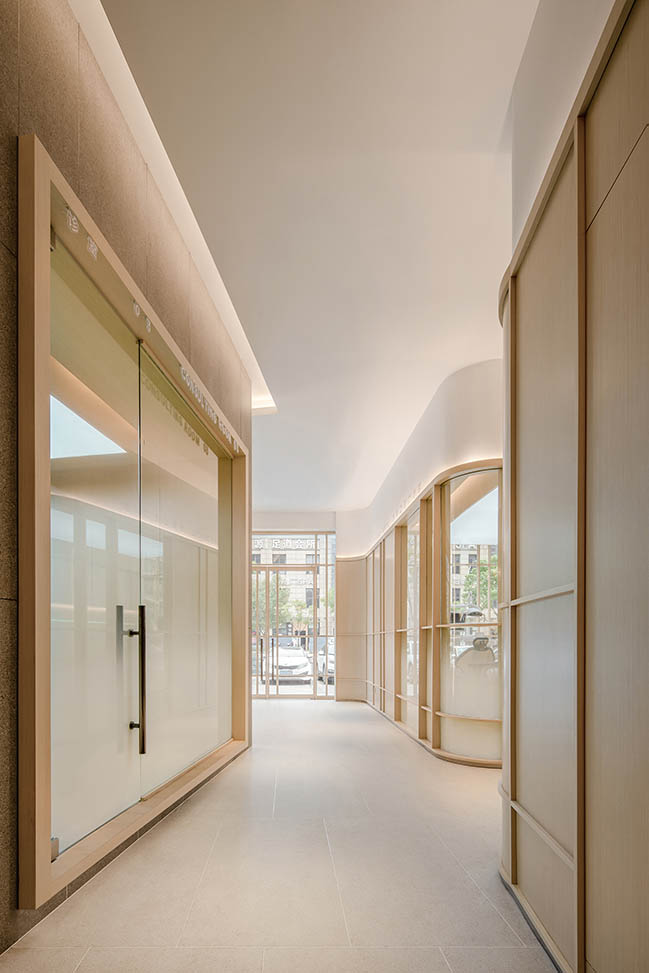
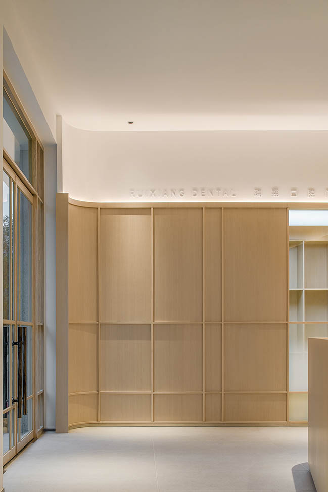
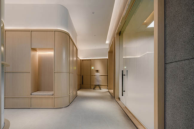
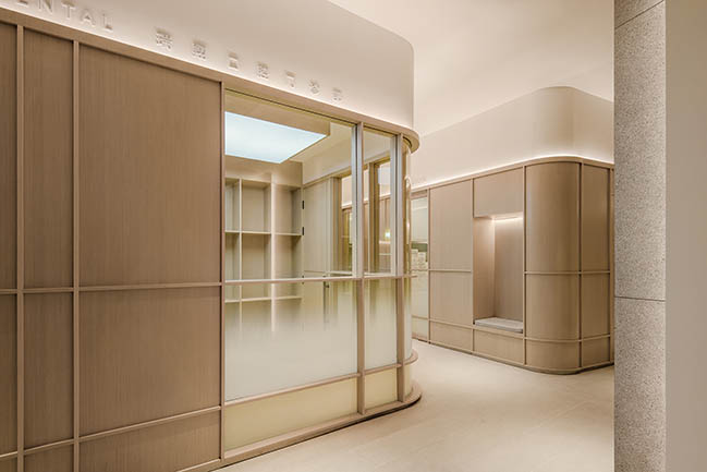
In view of visitors' nervousness and anxiety in the dental clinic, it is crucial to select relaxing, comfortable materials and colors. Considering the age span of patients, the design team adopted a large area of wood veneers, the natural texture and tone of which add lightness and comfort to the mechanical and hygienic space.
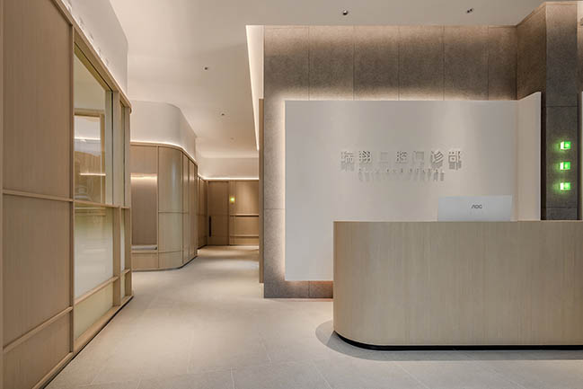
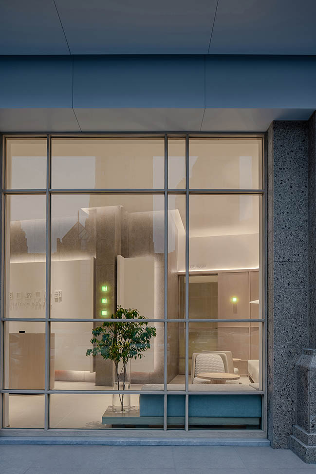
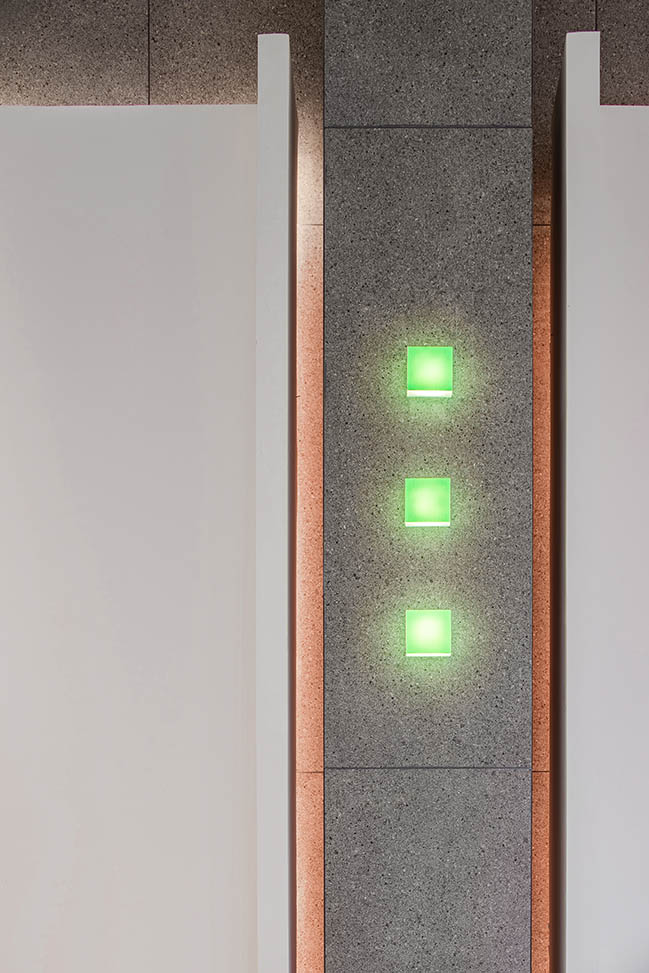
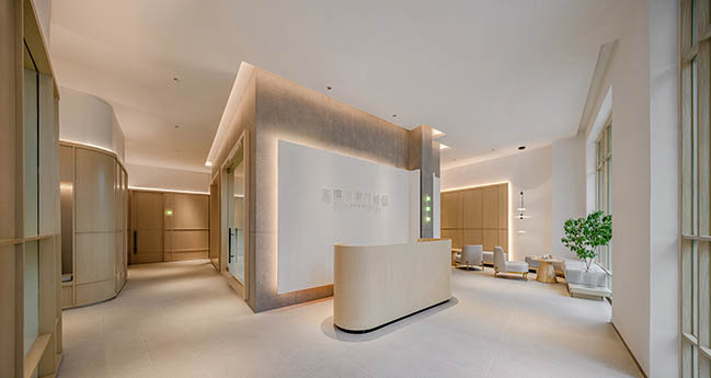
The reception area inside the entrance becomes a visual focus of the space. The backdrop of the reception desk consists of two layers, including a screen wall composed of gray tiles featuring terrazzo textures and a smaller white relief-panel wall. The white logo wall softens the rigidness of the gray tile wall, and adds a casual touch to the space.
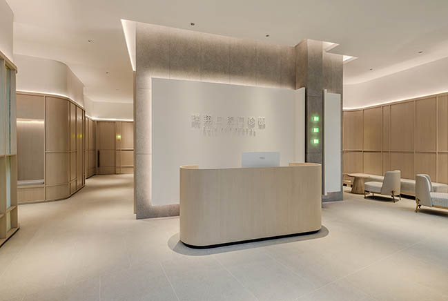
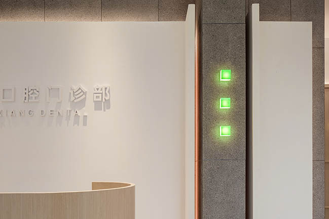
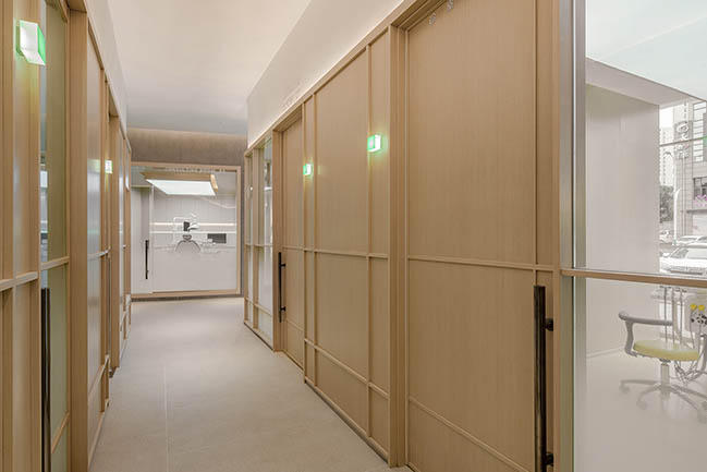
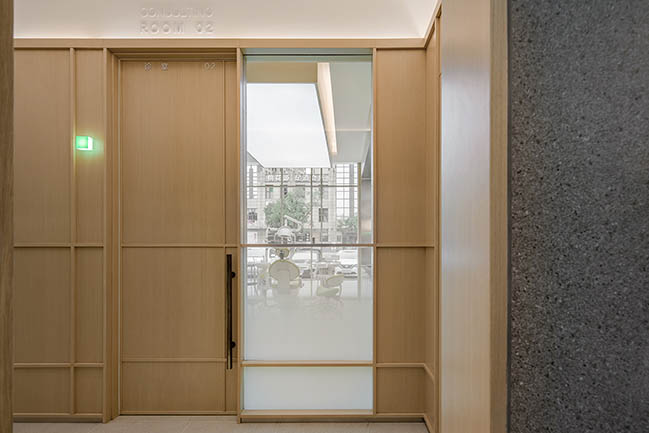
The three small green cubes on the wall build a "green bridge" between professionalism and comfort. Green serving as an accent hue is integrated into the whole space in an elaborate way. As the small green cube at the door of every consulting room lights up, it indicates that a dentist is seeing a patient. The green cubes on wood-veneer walls are not only functional, but create impressive visual experiences.
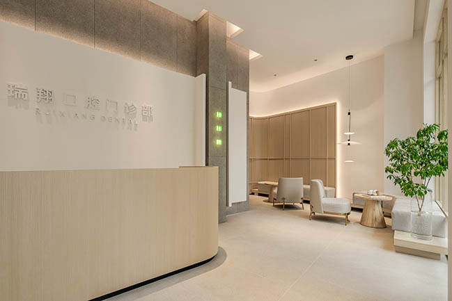
A clean "green light" can be seen on the wall of each consulting room, which is actually a transparent glass panel. With bespoke thickness, green components and illumination by light strips, the glass plate gives a sensation of green light, shows a sense of technology and makes the space more lively, natural and relaxing.
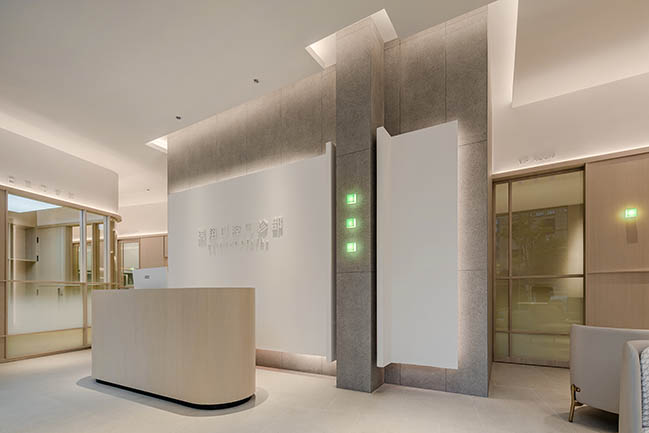
Because of the high storey height, the walls adopted segmented design. The white latex paint on the ceiling extends to the upper part of walls, hence lowering the spatial height visually. And the circled floodlight along the white wall part makes the top area of the space more bright and aesthetic. The cost of such segmented walls is much lower than that of full-height wall panels. The embossed name of the clinic is added to the upper white wall segmentation, forming a sense of order and making the wall more vivid.
Each detail of white walls is based on people-oriented considerations, which exactly shows the starting point of the design.
Design Firm: JACKY.W DESIGN (JWD)
Location: Wenzhou City, Zhejiang, China
Year: 2021
Area: 194 sqm
Chief Designer: Jacky Wang
Photography: WYAP
YOU MAY ALSO LIKE: Acevedo Dental Office by YLAB Arquitectos

YOU MAY ALSO LIKE: Paris Dental Studio by JCPCDR Architecture
Ruixiang Dental Clinic by JACKY.W DESIGN
08 / 25 / 2021 The project aims to add a sense of comfort and relaxation to the clinic on the basis of ensuring professionalism and standardization of medical functions, to help patients who visit the clinic feel eased and calm...
You might also like:
Recommended post: Showroom and Offices DFG-Pavestone by OLA Estudio

