01 / 05
2019
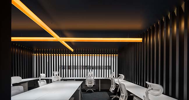
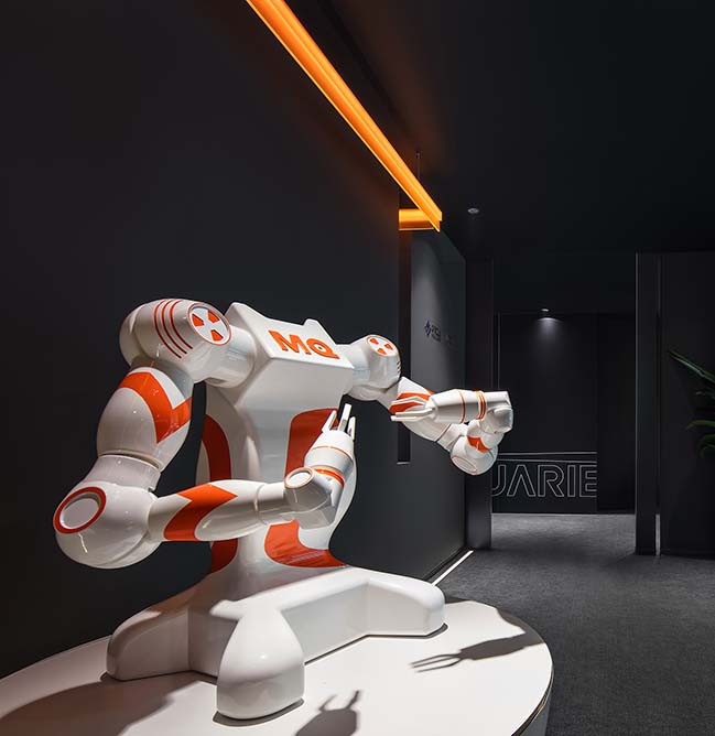
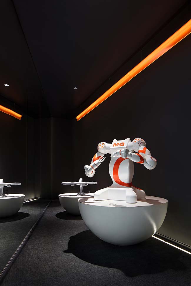
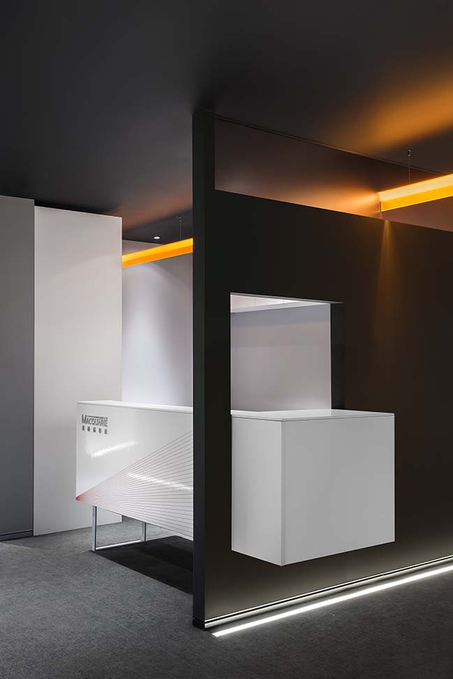
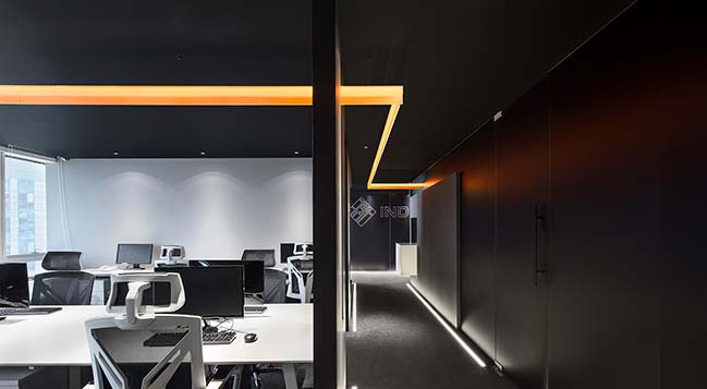
MACQUARIE - a firm dedicated to research and development of robotic arms reached out to CUN DESIGN to reimagine its R&D Centre where an orange light runs through.
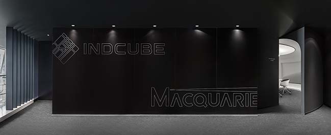
Architect: CUN DESIGN
Location: Room 31007 - Room 31010, Building C, GALAXY SOHO, Beijing, China
Year: 2018
Area: 420 sq.m.
Designers: Cui Shu, Wang Jizhou
Design Team: Ma Chuan, Kong Weiqing, Zhao Ya
Photography: Wang Ting
From the architect: Since 2016, CUN DESIGN has been trying to explore corporate workspace design in a wide range of areas, and so far has completed plenty of offices for companies involved in different fields, including games, new media, culture communication, internet, film and visual technology, real estate development, high-tech R&D, as well as cultural and creative industry, etc.
Based on practices in this regard, we put forward the concept of "Corporate Operation Space" and have been conducting further researches on it. As AI and intelligent machines constantly advancing and changing our life, we have been seeking for cooperation with companies engaged in this field. Fortunately, MACQUARIE, a firm dedicated to research and development of robotic arms reached out to us to reimagine its R&D Centre. For us, it was a fantastic opportunity, though accompanied by challenges.
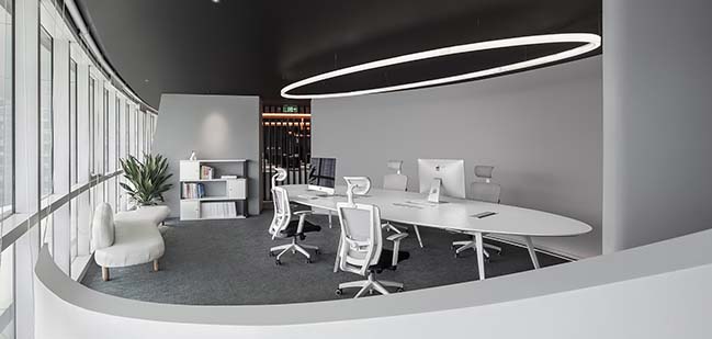
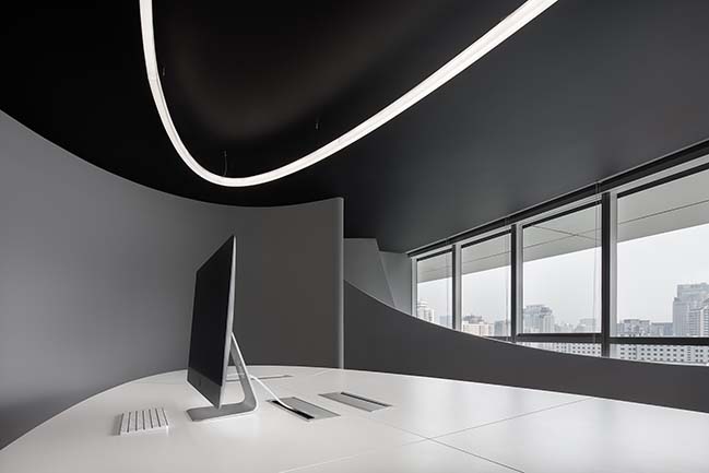
Challenges - At the beginning, we visited the original R&D Centre, a 400-square-meter workspace consisting of three independent spatial units. It is situated in GALAXY SOHO, a landmark designed by Zaha Hadid Architects. The overall architecture features special and striking shapes, which resulted in irregular plan of interior spaces, hence bringing difficulties to our work.
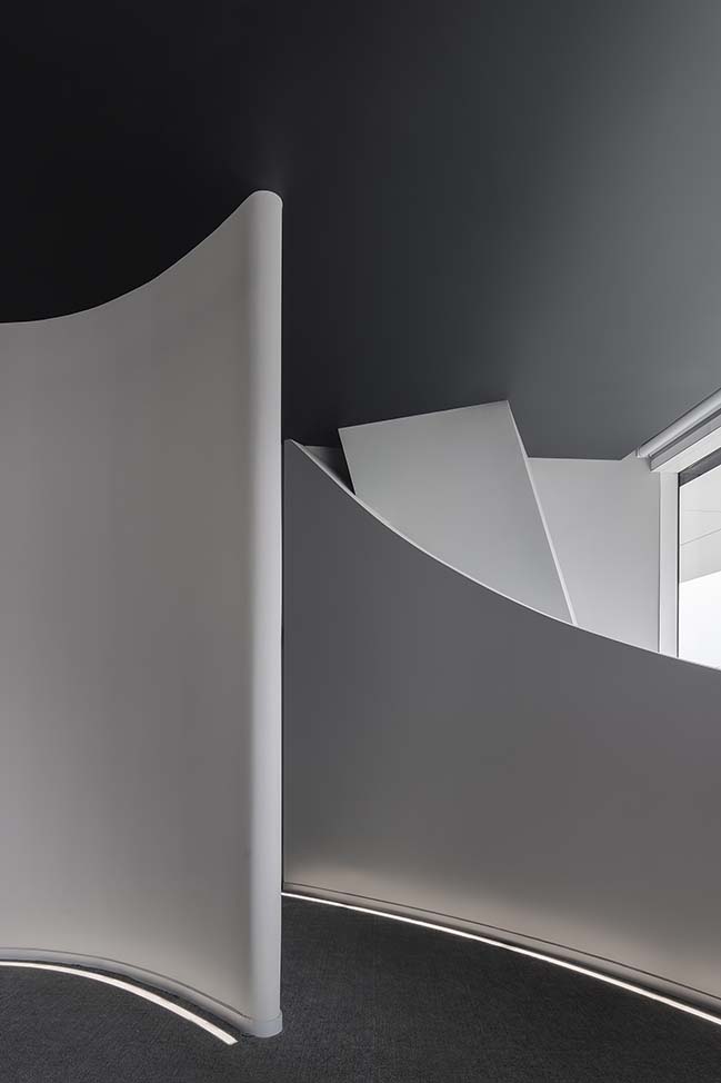
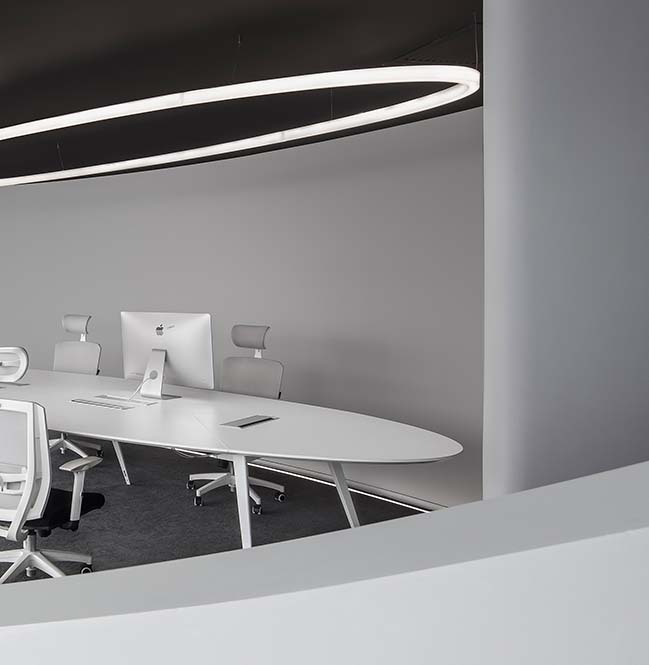
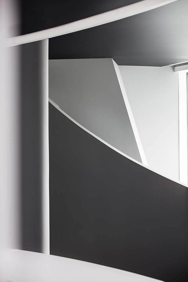
First of all, the plan has a curved shape, so it was hard to find a straight wall or divide the overall space into several square ones. Besides, the fan-shaped plan also made it difficult to arrange straight circulations to partition the space. It was a great challenge which we had to solve.
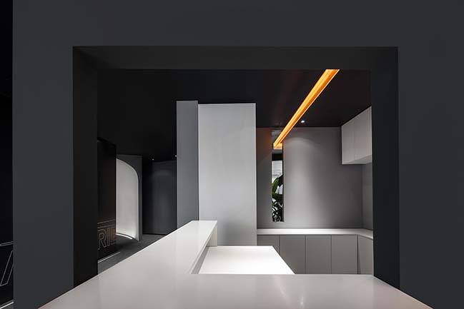
What's more, the ceiling air conditioning and beams caused a relatively low ceiling height, only 2.1 meters in some parts of the space. So dealing with the clutter of the ceiling in the relatively small space was also an arduous task.
After identifying these challenges, we worked to figure out solutions. However, things didn't go very smoothly. We overturned nearly twenty design schemes and still couldn't find an ideal one, because we thought they were a little bit complicated.
Inspiration - I like riding, and pay great attention to motorcycles. As we were stuck with the design solutions, an electric motorcycle concept unveiled by BMW in 2016 enlightened me. The motorcycle has the following three characteristics:
- Using no traditional machines, which changed the way of assembling and restructuring;
- Utilizing the most prevailing materials to redefine the product;
- Combing technology with interconnection, which brought some changes to the functions.
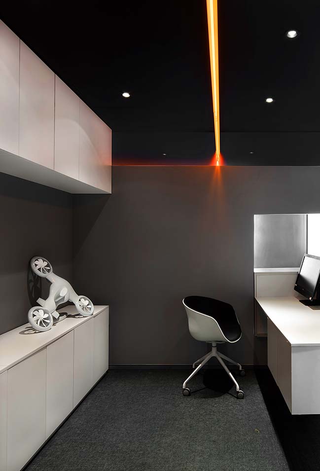
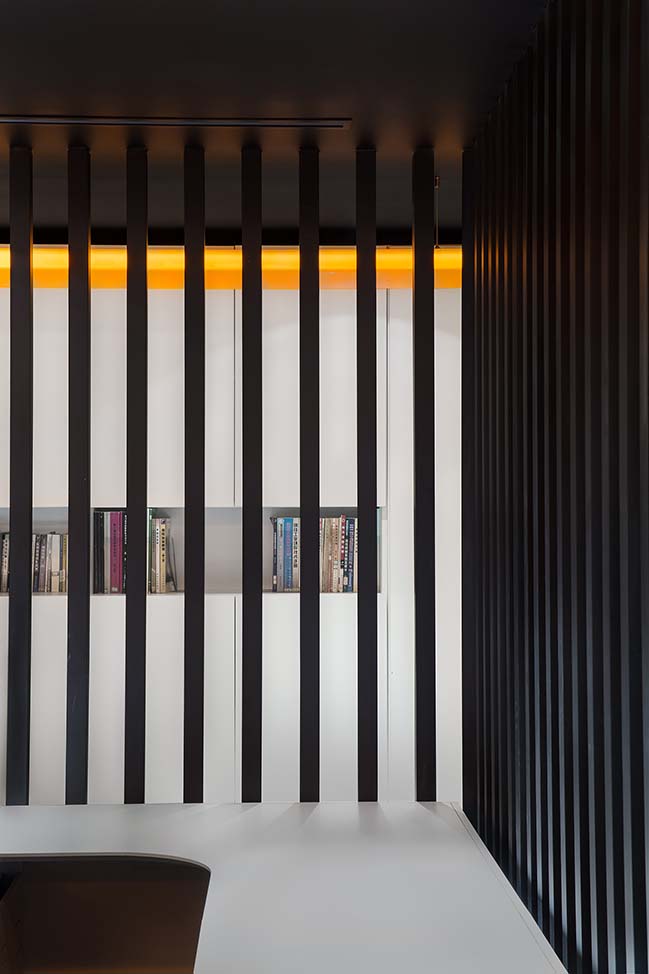
I really love the orange element of it, like a light, stretching through the whole body of the motorcycle, and breaking the conventional structure of motorbikes. A beam of light can pass through the space and solve all the problems. So I drew inspiration from it, hoping to create an impressive workspace.
Realization
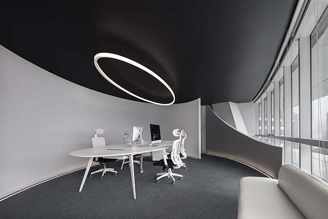
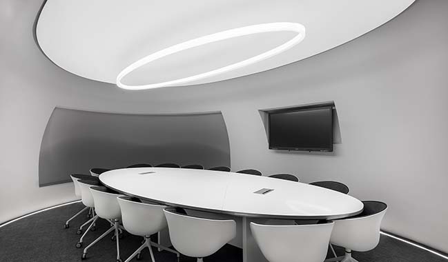
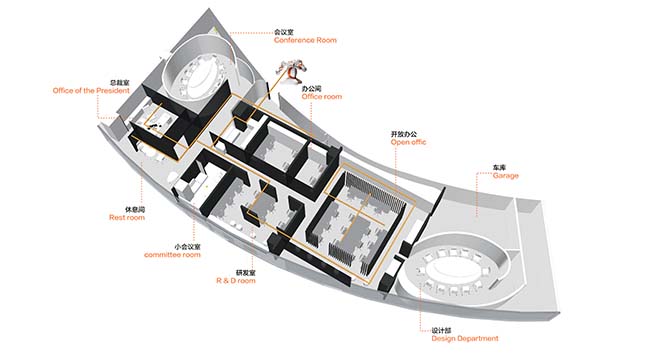
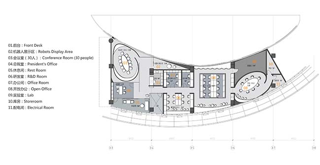
1. Learning from BMW's design idea, we firstly rearranged the layout of the space. We made use of the unique features of the curved spaces and endowed them with the functions for conference and discussion.
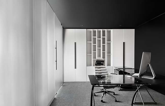
And at the areas with more regular shapes, we split out several offices.
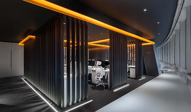
At the middle of the overall space, we designed an open square working area, with the office furniture arranged in a modular way, which ensured a comfortable working space for the staff. Around this square working area, we restructured four necessary circular passageways. Each was given other different functions. It was from this core square area that the spatial layout of the office was completed.
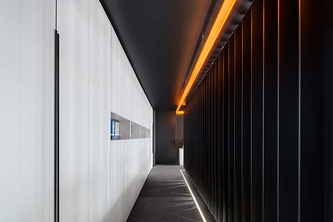
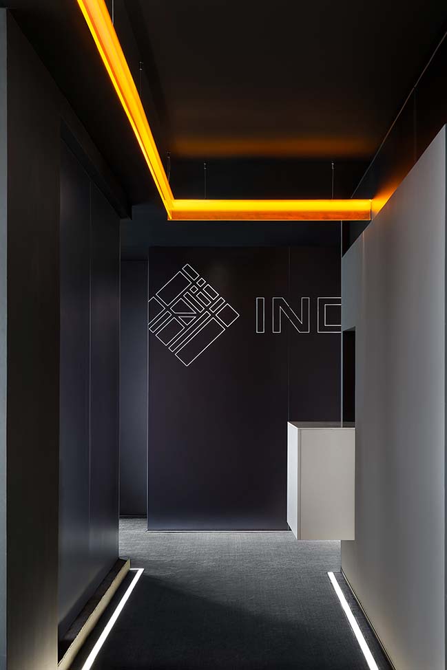
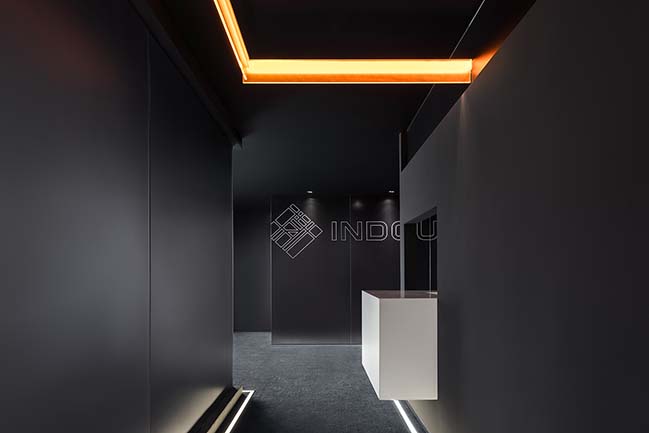
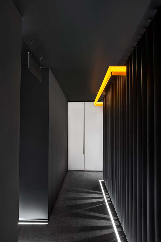
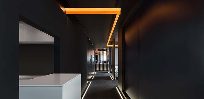
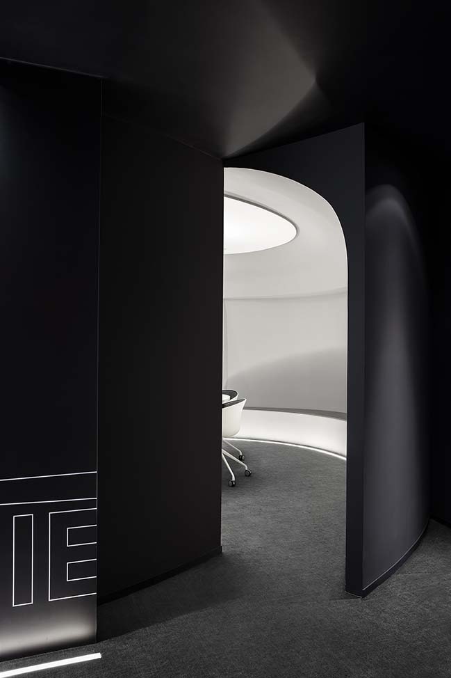
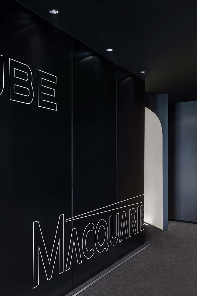
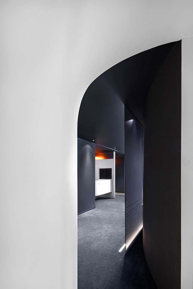
2. For the narrow spaces left, we turned them into the foyer and corridors. And most importantly, we redesigned the circulation of entering the office. The space is enclosed and narrow at the entrance. But as going further in, it becomes more open, filled with surprises. We spent lots of time thinking about the plan, with a view to letting the daylight completely fall on each staff’s working position.
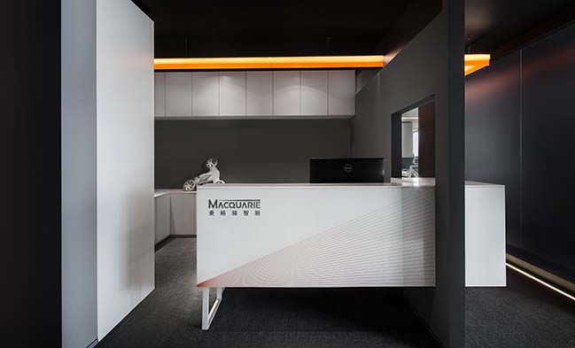
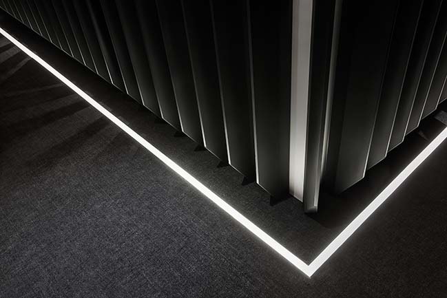
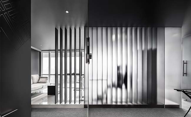
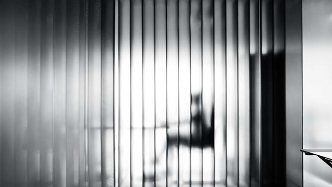
3. Besides, we also honored the source of the design inspiration - BMW’s electric motorcycle concept. The entire space features textures similar to that of mechanical design works, with translucent glass, gray metals, stainless steel and plastics, very modern.
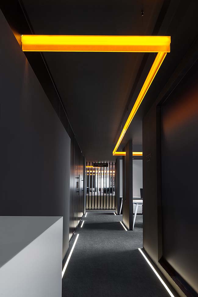
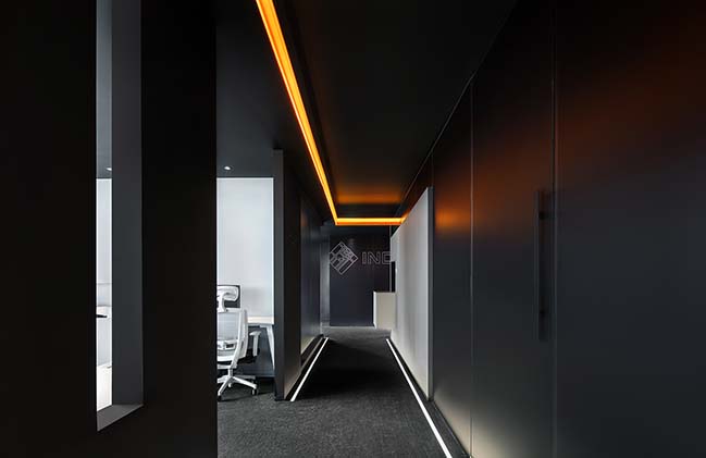
4. At last, I integrated the orange light that I love the most into the space. Its position was not identified through careful calculation. It starts from the entrance, leads to all areas and runs through the whole space freely, creating a free atmosphere in the office.
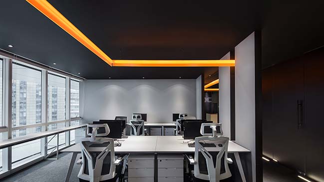
We are gratified to draw inspirations from an excellent work from other design fields, and see it as a new approach for our interior design practices in the future.
The founder of MACQUARIE was very impressed by the orange light passing through the office, so the company utilized orange elements in their latest product. For us, it's the best reward.
> YOU MAY ALSO LIKE: CUN Design presents their new office in Beijing
MACQUARIE R&D Centre by CUN DESIGN
01 / 05 / 2019 MACQUARIE - a firm dedicated to research and development of robotic arms reached out to CUN DESIGN to reimagine its R&D Centre where an orange light runs through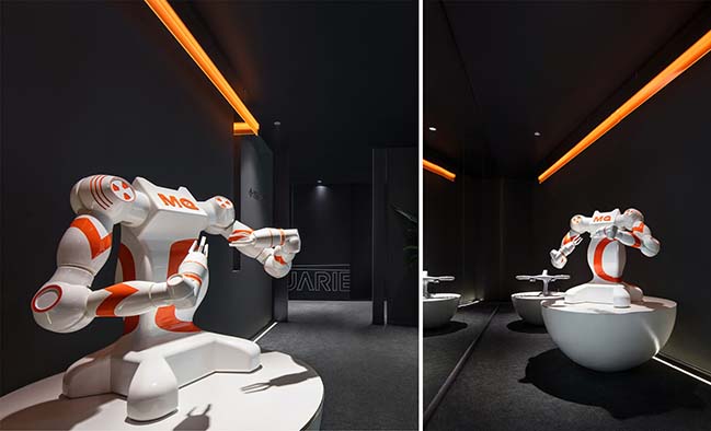
You might also like:
Recommended post: Arena Children's Centre by CohenLeigh Architects
