02 / 04
2020
The Balcony project is located on the corner of two streets, one a thoroughfare to the train station and the other a main route to the local primary school...
Architect: Bastian Architecture
Location: Sydney, Australia
Year: 2019
Project size: 149 sq.m.
Site size: 170 sq.m.
Structural Engineering: Cantilever Consulting Engineers
Builder: Highfield Building Developments
Photography: Katherine Lu
From the architect: Decades ago, it was commonplace to use front porches and balconies as interstitial spaces, spaces which connected with and were at the intersection of public and private space. Balconies and verandas were used as places to contemplate and watch the world go by, or chat to the neighbours as they returned from work or shopping. These spaces afforded a means of interacting with neighbours and the neighbourhood in general, a practice which has all but disappeared in today’s society. Newtown terrace is a response to this paradigm and looks to reinstate the balcony as a point of engagement, to reinstate the conversation between the residents and the neighbourhood.
Newtown, historically a working class suburb where everyone is welcome and anything goes, has always had strong community engagement. Currently the suburb is a mix of young families, professionals and students all living side by side in small houses stacked along narrow laneways. The close proximity of neighbours, a tendency to walk rather than drive and many countless local facilities mean the community spirit prevails.
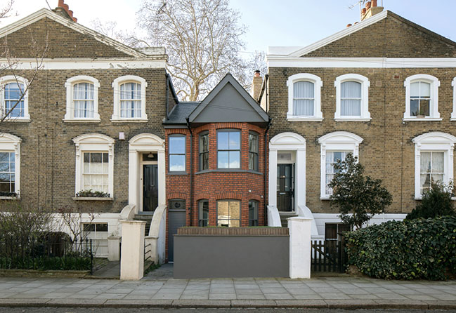
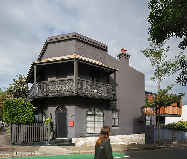
The Balcony project is located on the corner of two streets, one a thoroughfare to the train station and the other a main route to the local primary school. Due to its location the house is perfectly positioned to speak to and engage with the street. When the opportunity came to add a single room to this corner terrace the location informed the framework for the renovation. The challenge of the design was in respecting the existing building and conservation area while adding a modern extension to the highly visible second street frontage.
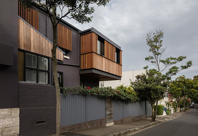
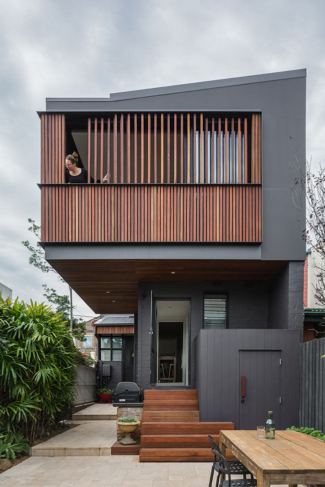
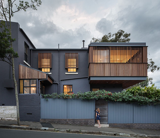
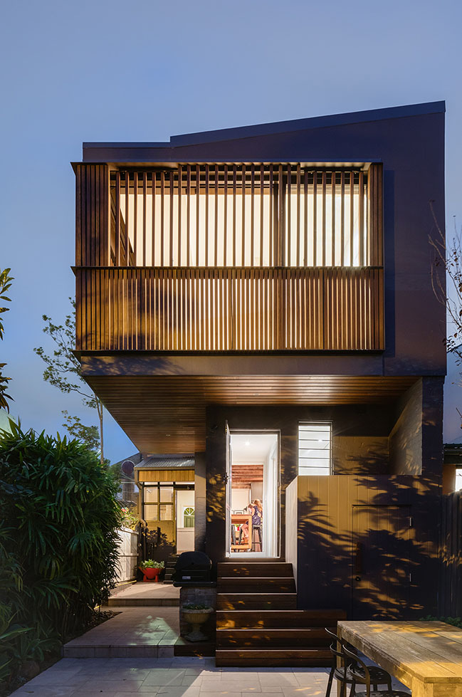
Given the house is in a heritage conservation area, the dance with Council towards approval was long and protracted. Conceptualised as a large balcony, the new extension hovers above the street and is cloaked in timber screens which open and close to encourage or dissuade conversation with the street. The process was a lesson in how to collaborate with council while persevering and holding onto a design idea which didn’t fit neatly into Council’s ideas of what was appropriate for the conservation area.
The form of the extension is a result of these conversations, the design manages to fulfil council’s almost contradictory requirements; that new volume blend into the existing building while the extension be clearly defined. This confusion of design direction was embraced and used to inform many of the design decisions throughout the process. There is a constant blurring of what is old and new, new plumbing is fixed to the exterior of the terrace while timber and steel screens provide privacy and sun protection to the existing windows of the renovated bathroom and study.
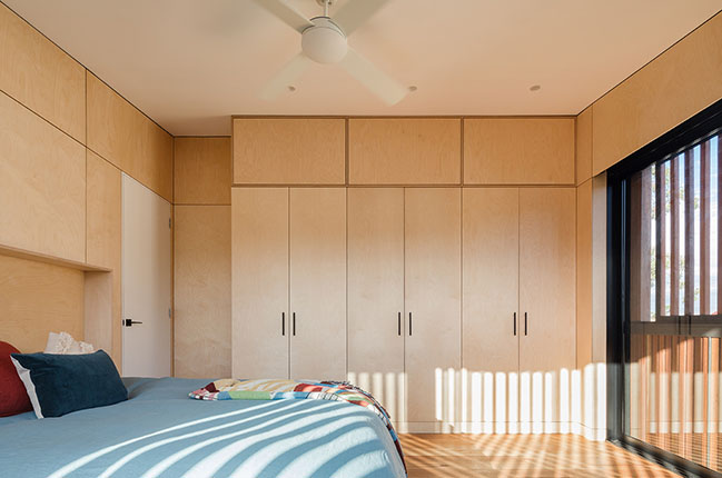
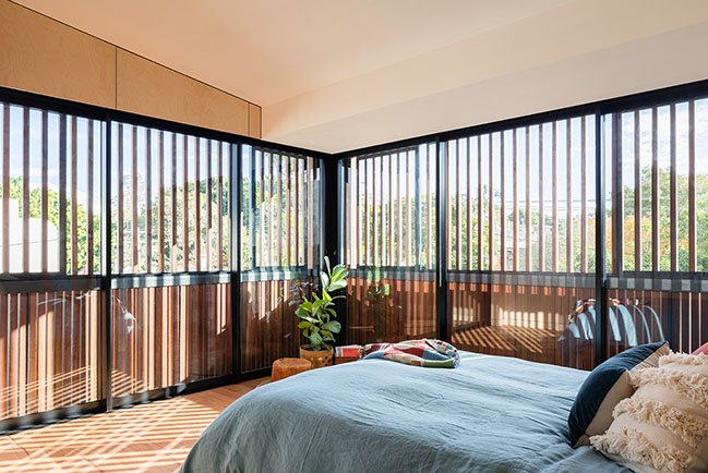
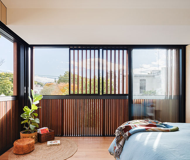
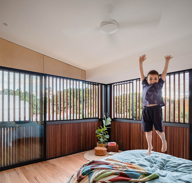
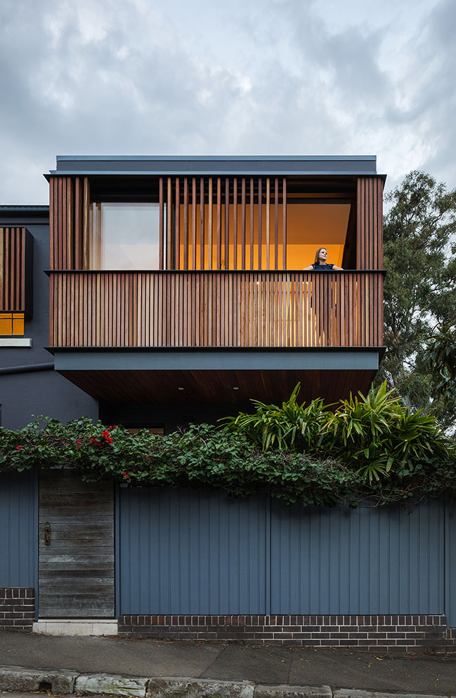
The cantilevered form suspends itself over the street, reintroducing private living to the public realm. The visibility of the extension and engagement with the street revisits the era when people sat on balconies or porches and chatted to neighbours as they passed by on their way home from work. Internally the occupants have the ability to control their interaction by moving the spotted gum timber screens open or shut. Behind the timber screens are large glass sliding doors, which when fully open leave only the timber balustrade between bedroom and street, an act which transforms the room into one large bedroom balcony.
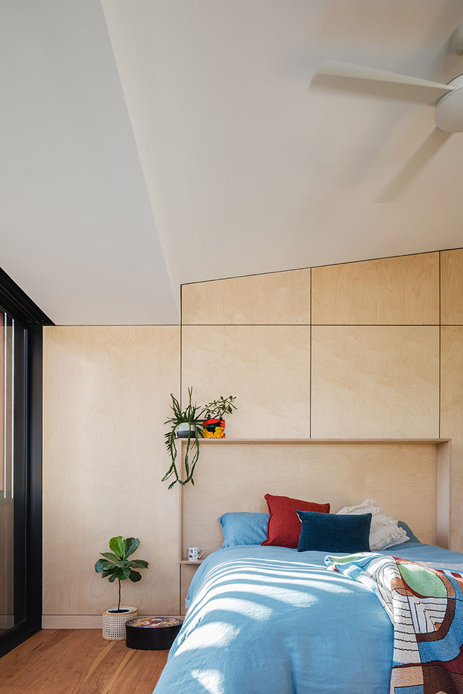
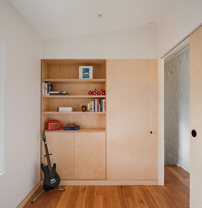
When selecting the materials for the internal spaces the decision was made to choose materials frequently used both internally and externally to enhance the balcony character of the room. Plywood panels line all the walls in the main bedroom, including the cupboards, and blackbutt timber flooring runs throughout the renovation.
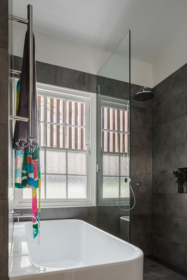
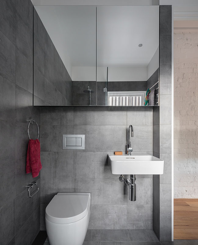
As you move into the existing rooms there is an intentional blending of old and new materials. The original patched and painted brick wall is retained along the length of the building and new plywood skiting boards wrap around the base of the walls in the new study. While there is generosity in the new bedroom, the existing spaces are compact and work hard to provide the amenity required. In these rooms the material palette is paired right back, restraint has been used and only two materials are utilised in each room. The study integrates ply with plasterboard and in the bathroom the same large format tile is used on the floors and walls which are offset against the white plaster board above the tile line.
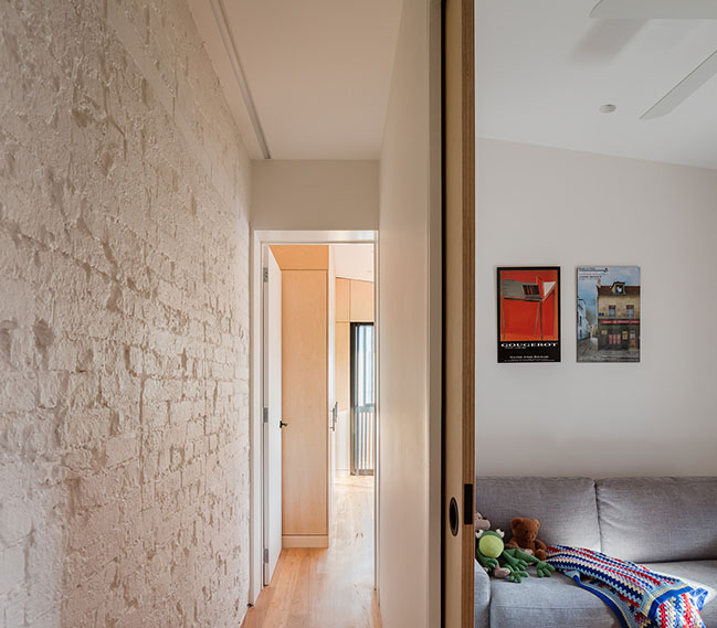
As is often the case in old terraces storage is limited, so where possible new joinery has been integrated into all of the rooms. The joinery and wall cladding in the study meets a large plywood sliding door which connects the study with the hall, blurring the edge of this compact room. The external timber screens are a consistent element in each room with views obstructed or revealed through the Spotted Gum battens. The timber screens are placed over the existing windows of the study and bathroom to connect these rooms with the new bedroom and much larger sliding timber facade.
The completed renovation provides key additional spaces: a fourth bedroom, flexible study space and a renovated family bathroom, and a by-product of the cantilevered form is the shelter it provides for the new timber steps which connect the elevated living spaces of the ground floor to the rear courtyard.
However, the real achievement of the new form is the reinstating of the conversation between the neighbourhood and the occupants of the house.
YOU MAY ALSO LIKE:
> Bay House in Sydney by Porebski Architects
> Clifftop House in Sydney by Utz-Sanby Architects
YOU MAY ALSO LIKE: Bridge Building in Sydney by Luigi Rosselli Architects
The Balcony by Bastian Architecture
02 / 04 / 2020 The Balcony project is located on the corner of two streets, one a thoroughfare to the train station and the other a main route to the local primary school...
You might also like:
Recommended post: 45 Degrees by J.C. Architecture
