05 / 06
2024
AD ARCHITECTURE reimagines Overland's headquarters showroom as a boundless "runway" for the new Earthism Series...
> Future Artspace H by AD ARCHITECTURE
> Red Box by AD ARCHITECTURE
From the architect: Architecture is a relationship, bringing a pure spiritual experience and creating an abstract, tranquil, pure and geometric space. The interior space is awash with natural daylight and artificial lighting, allowing people to feel the spatial power and resonate with its spirit.
01 Project background
In October 2023, the porcelain and stone tile brand Overland entrusted AD ARCHITECTURE to conceive an experiential showroom for its new Earthism Series, as a part of the brand's headquarters upgrade initiative. This commission also marks a continuation of the collaboration between the two sides in 2021 when AD ARCHITECTURE initially crafted a showroom for Overland.
Situated within Overland's headquarters in Foshan, this project serves as a brand experience center, aiming to enhance the brand's image as a multifunctional space that combines reception, display, and experiential functions.
02 Brand analysis
Overland innovatively translates people's subtle subjective feelings about ceramic tile products into technical parameters, and merges a subdued color aesthetic with modern manufacturing technology. Based on natural, modern and composite elements, the brand's products are designed and developed across multiple dimensions such as color, texture, grain, luster, and touch. Overland is born to cater to high-end aesthetics, emphasizing the integration of natural and fashionable elements. Its product range includes high-end sintered stone, ceramic tile, quartz stone and others, targeting elite groups with unique tastes and advocating for a modern, fashionable, simple, and pure style.
In 2024, Overland launched its eighth-generation symbol product series in solid colors, themed "Earthism." Guided by the philosophy of "attaining the broad and great while addressing the delicate and minute," the new series aims to innovate the language of ceramic tile materiality, advocating for a lifestyle without limitations. The development of the new product series utilizes "texture-grain symbiosis technology" to address the aesthetic challenge of naturally seamlessly traditional ceramic tile textures and grains, thereby restoring the natural tone of material design.
03 Product features exploration
The showroom design was based on a thorough reflection on the essence of new product series and a deep dive into its presentation and display.
Overland illustrates that "Earthism" can be interpreted as "earth style, naturalism". Earth is a realm without a ceiling, where life naturally assumes a relaxed posture. Even within the urban landscape, humans remain connected to nature. Remarkable architecture seamlessly extends from nature, serving as both habitat and a conduit for human-nature interaction. The choice of ceramic tile as a building material further amplifies these natural sentiments.
Therefore, the project's design needed to grasp the design philosophy of the new product series, leveraging architectural space and light as mediums to create a backdrop that highlights the new products. The overall design needed to show respect for and harmonious coexistence with nature.
04 Innovative logic
How to present a future showroom? how to employ an innovative logic to break away from the homogeneous design of conventional showrooms? These were the key questions driving AD ARCHITECTURE when designing Overland's headquarters showroom for the first time in 2021. The resulting showroom not only effectively showcases product experiences but only conveys brand identity with a positive impact.
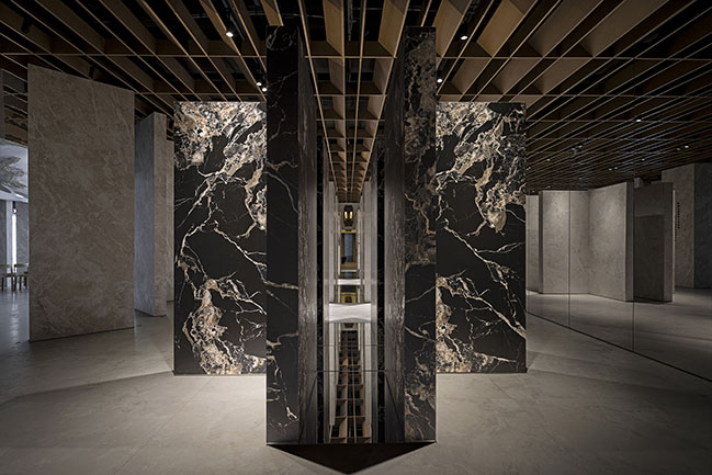
In contrast to the initial showroom, which resembled an art gallery, this time AD ARCHITECTURE opted for a showroom space reminiscent of a fashion runway. This project introduces a fresh approach to spatial presentation, engaging with porcelain tile products in a unique way while reflecting a profound contemplation on the presentation of ceramic tile showrooms in China.
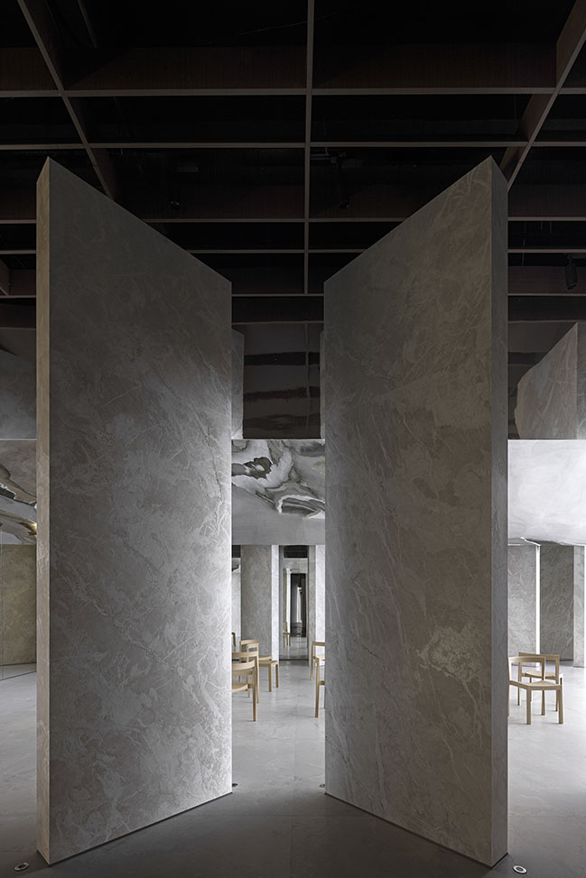
Moving away from the homogeneous displays and products-centric designs typical of conventional showrooms, this space emphasizes the interaction between products, space, nature, people and time. It represents a bold yet confident exploration of showroom design within China's ceramic tile sector. From a business standpoint, this project marks a positive step forward in the industry.
05 Free arrays
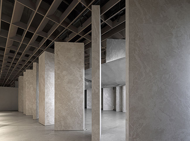
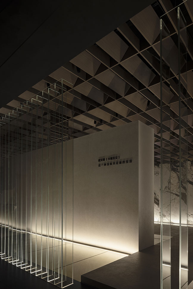
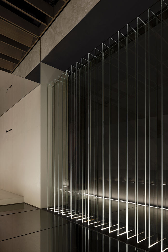
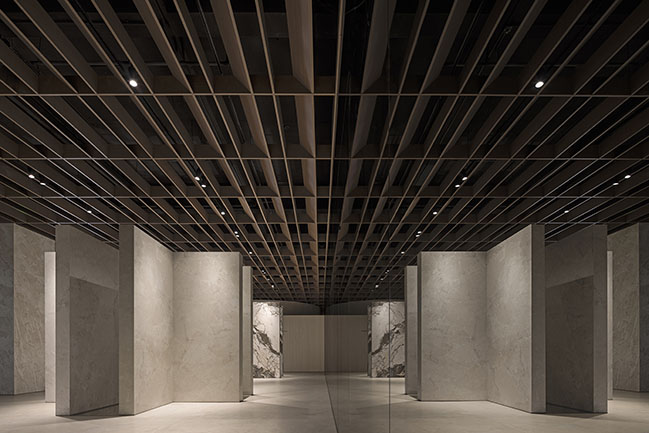
The sense of spatial sequence brought by the arrays of structures permeates the overall design. The insertion of gaps adds a sense of freedom without compromising the directionality of the space. Instead, the space becomes intriguing and mysterious, fostering low-density interaction between individuals. The boundaries are not opposing, but blurred yet integrated.
06 Rigorousness
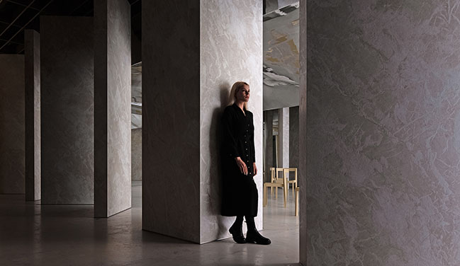
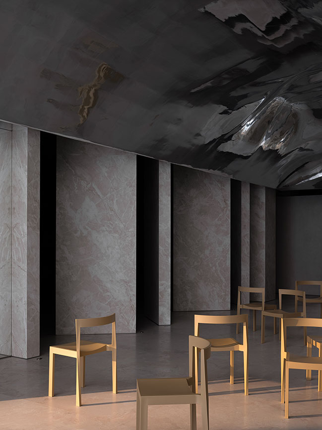
Overland's new Earthism Series presents a fresh interpretation of the natural textures of marbles. In the wake of the market's recent fascination with solid colors and high-end gray tones, Overland has introduced a new trend through the new product series. This marks a resurgence of marble textures in the industry, emphasizing progress and classic legacy rather than mere replication. However, the diverse natural patterns of marble presented challenges in achieving harmony in the showroom design, underscoring the importance of rigorous product categorization in display. Therefore, during the design process, AD ARCHITECTURE classified the colors and patterns of the products, utilizing a semi-enclosed way to display each product with a distinct identity, thereby better showcasing their personality and quality.
07 Spatial narratives
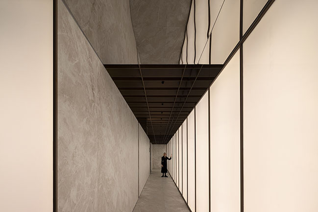
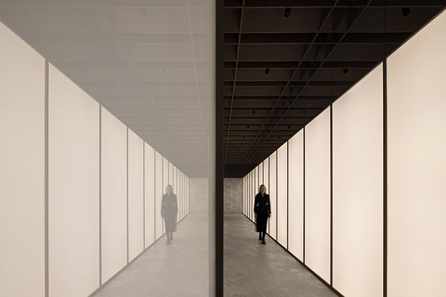
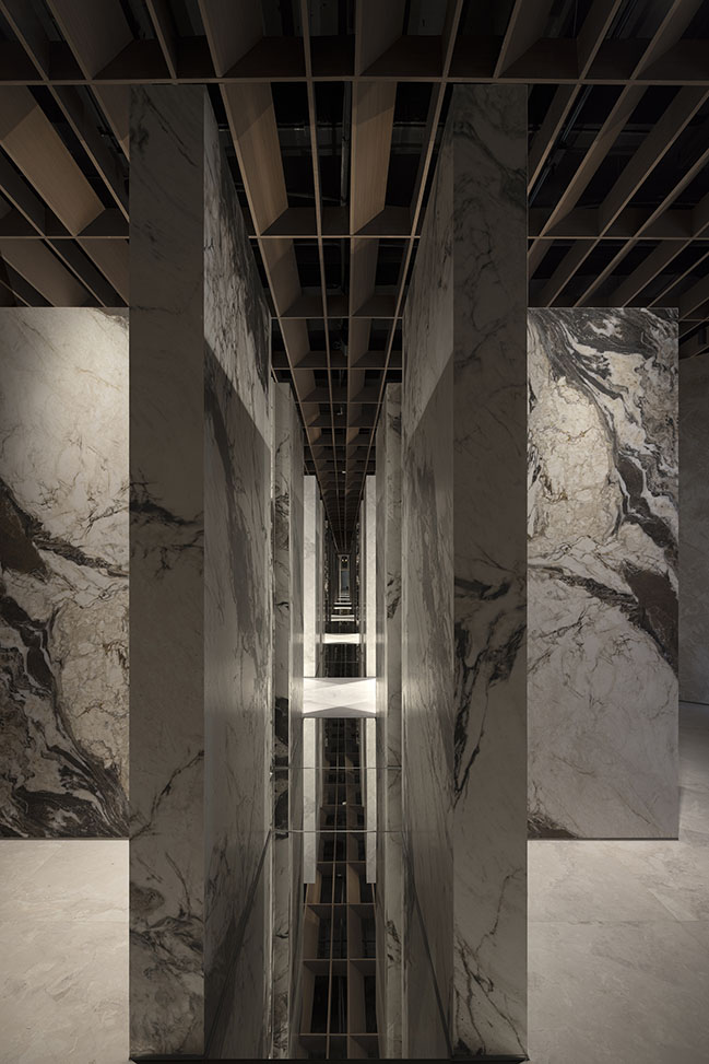
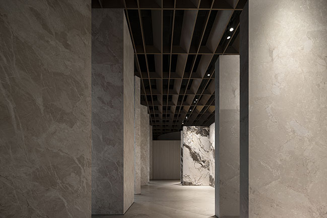
The overall design concept of the space is to create a "runway" for products, facilitating interaction between people and objects and showcasing the relationship between people, space, and products. The overall space highlights the sintered stone products, complemented by a wooden ceiling structure to enhance the space's natural and gentle ambiance.
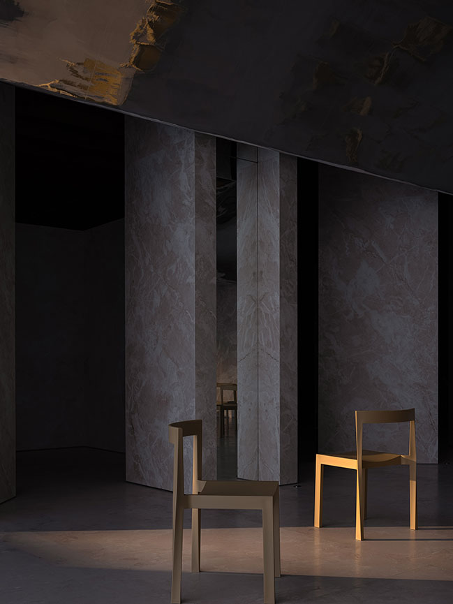
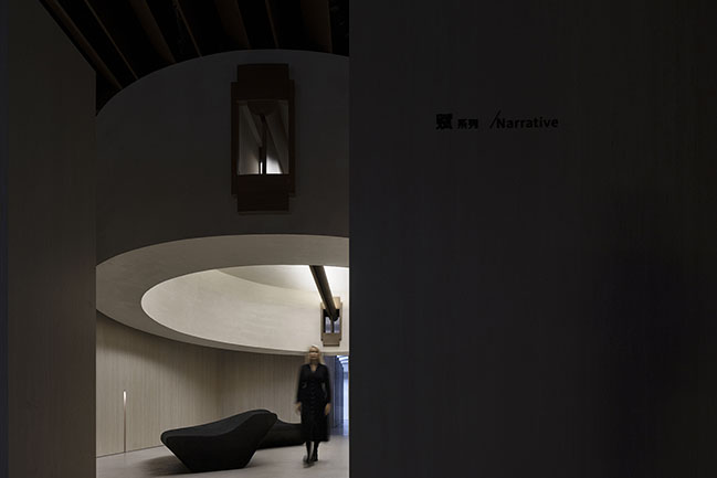
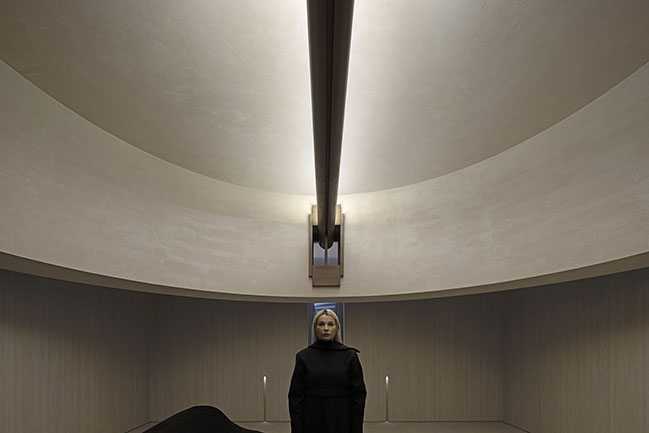
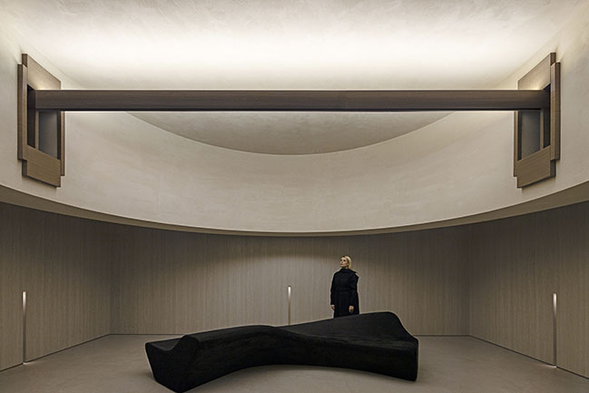
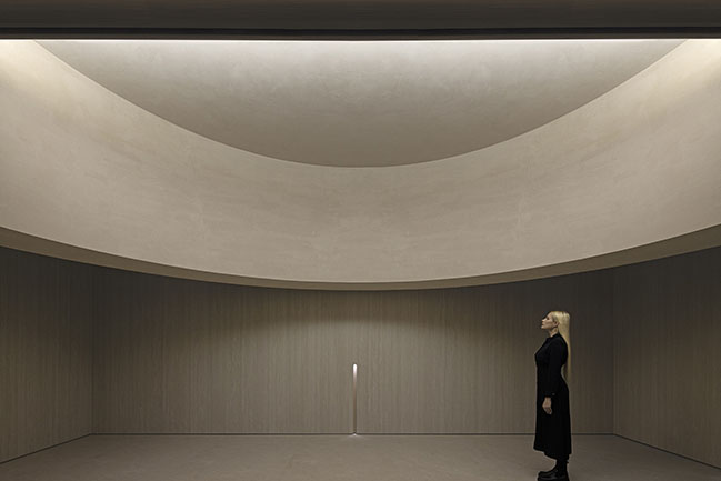
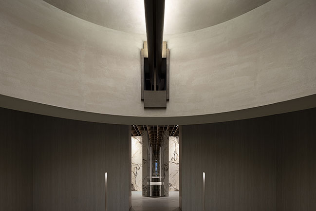
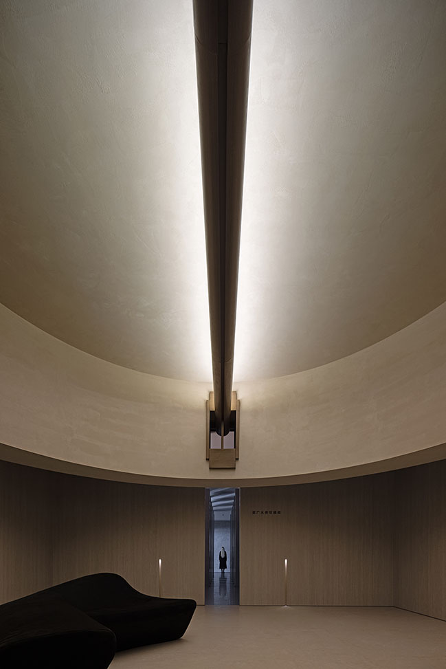
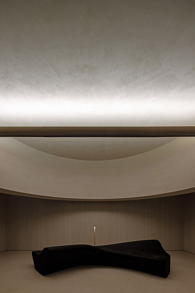
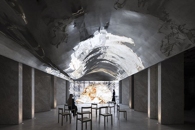
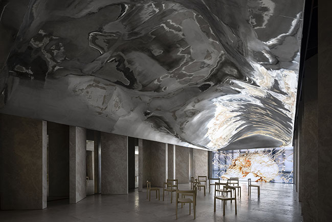
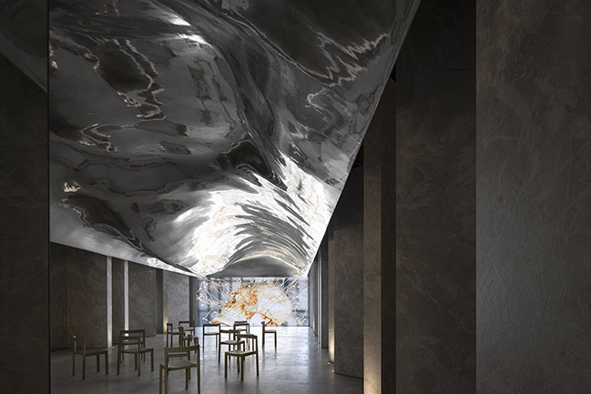
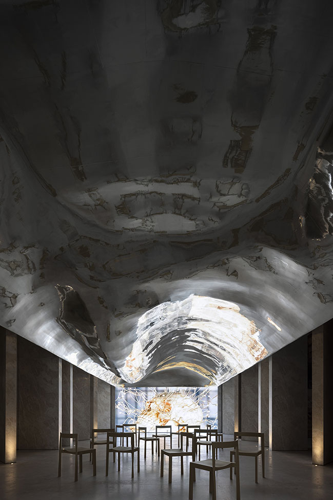
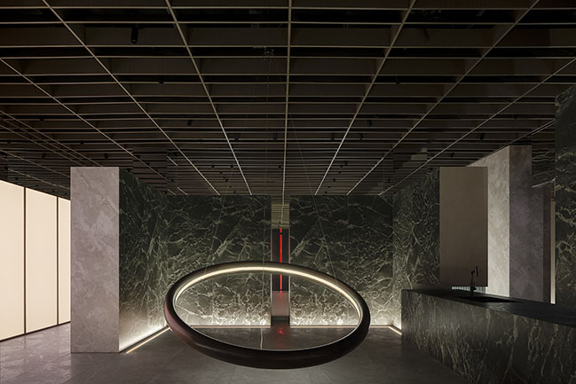
The visitors at Overland headquarters mainly consist of dealers and designers. Within this environment, AD ARCHITECTURE have incorporated a diversified space — a salon area intended for future use. Designed with symmetry to evoke grandeur and respect, the salon space features a large scale, flowing shapes on the ceiling to soften the overall ambiance and create a visually captivating experience that reinforces the brand's identity.
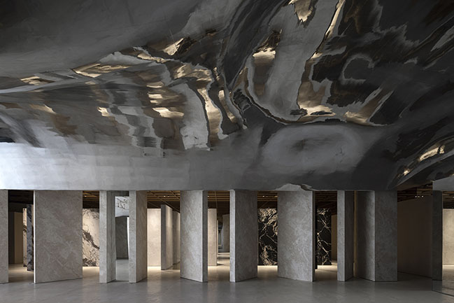
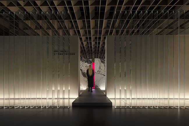
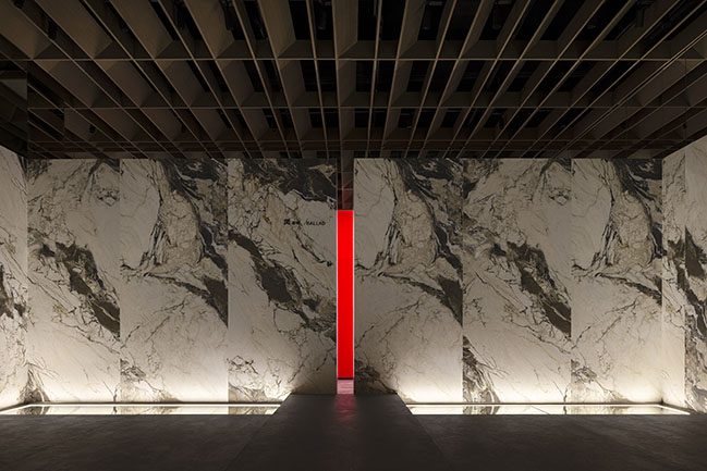
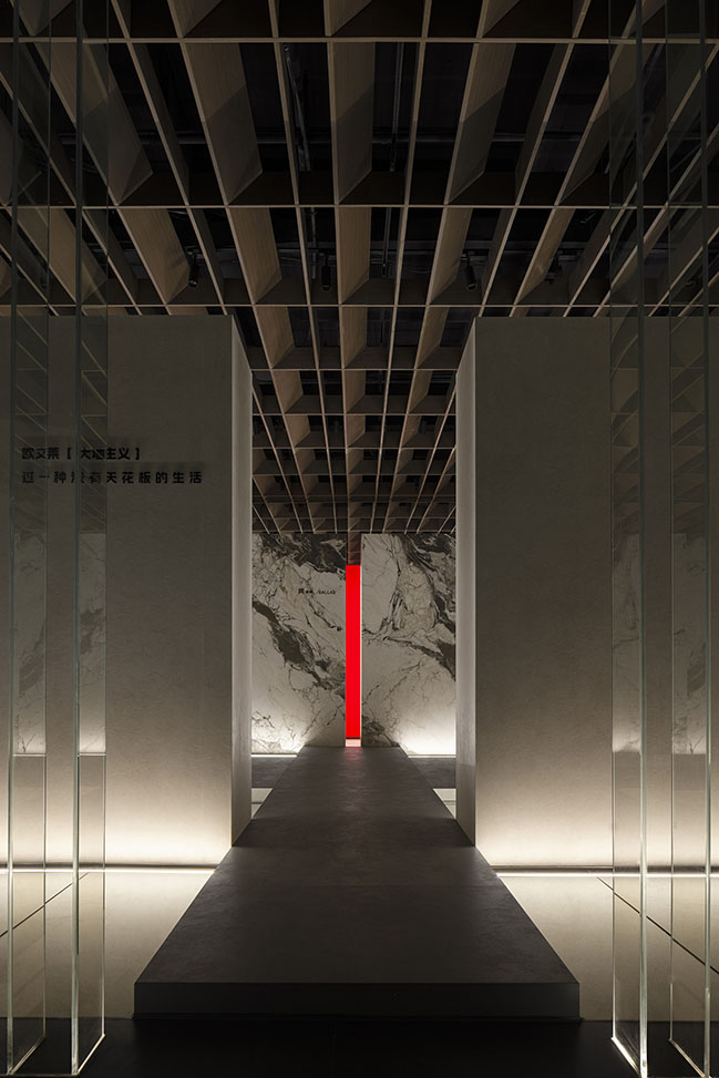
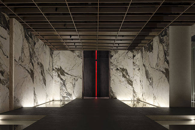
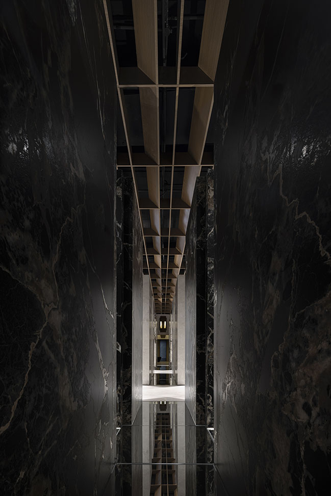
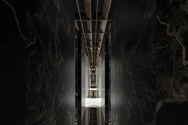
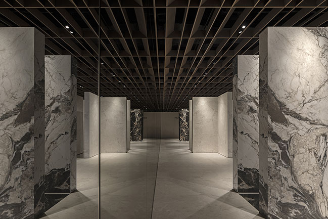
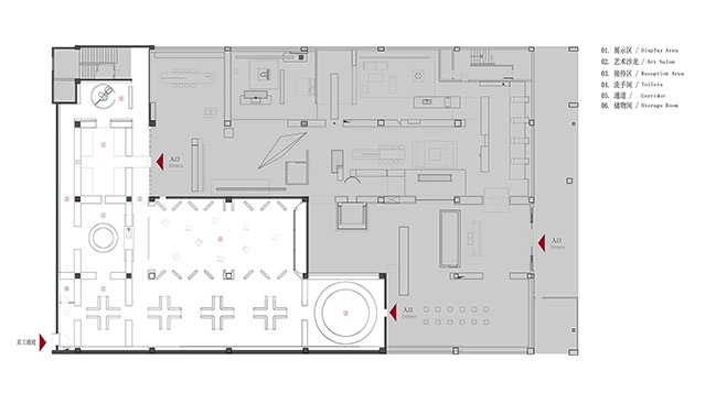
In the original, unaltered areas of the building, the design team brought in glass arrays as partitions, with four L-shaped thick walls enclosing the first product display area. The reception and lounge area is connected to the adjacent brand space at the entrance. The reflective surface on the floor evokes the imagery of water, effectively softening the space while generating a sense of fluidity. The enclosed space displays the Ballad Collection of the brand's new Earthism Series, with the neat product displays effectively emphasizing the natural and unrestrained characteristics of the Collection. The cross-shaped floor design imparts a profound sense of balance to the space, while the large openings guides visitors toward the corridor.
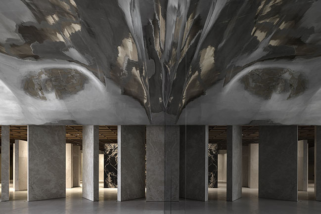
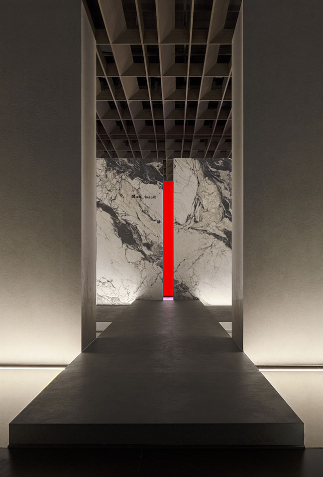
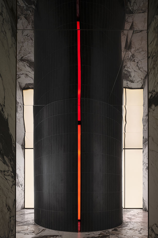
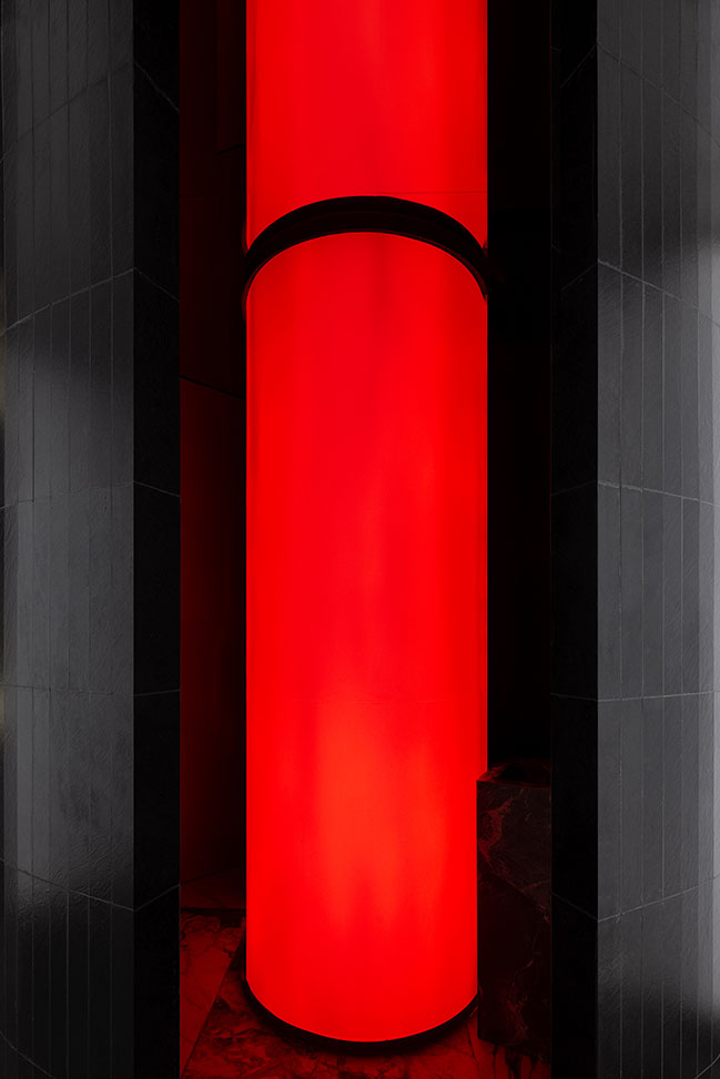
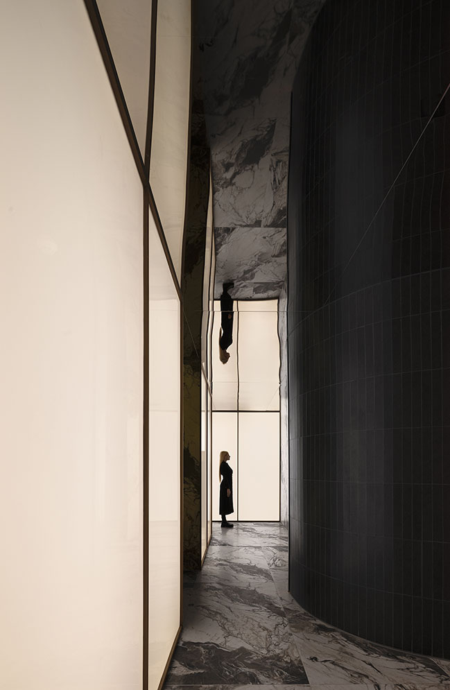
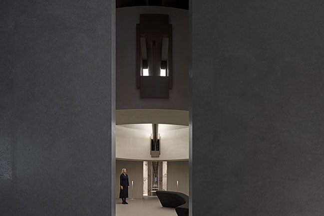
The black cylinder at the visual center emits red light through its gap, creating a striking contrast with the luminous background wall. The black sintered stone panels characterized by large grains contrast sharply with the solid colors, while the mirrored ceiling extends the scale of the space and intensifies this contrast, resulting in a dynamic and immersive experience that captivates visitors.
The passage is designed with a minimalist approach, blending solid-color grain-featured sintered stone slabs with an extended light wall to create a harmonious atmosphere and a serene transition space.
The enclosed space clad with products featuring green marble patterns serves both as a product display area and a water bar for the salon space, emphasizing both visual experience and functional integration. Additionally, the space features a futuristic feeling, which is another key consideration in its design.
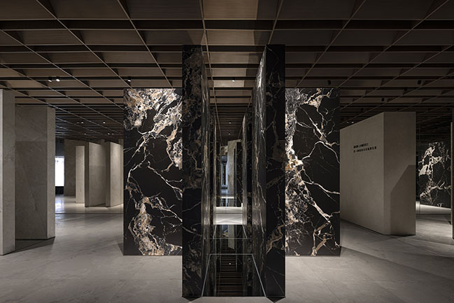
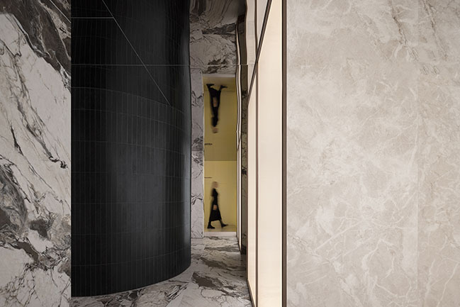
In contrast to traditional porcelain and stone tile showrooms where samples are typically affixed to walls, AD ARCHITECTURE opted for a new approach. Several cross-shaped structures, each of which is formed by four L-shaped units, showcases the products at the focal point of the space. The repetition of this structure creates a strong sense of sequence in the space. Furthermore, the use of mirrors on the walls and floor further blurs the spatial boundaries, inviting visitors into an illusionary yet tangible environment.
An enclosed square space is leveraged to connect the original and renovated areas, facilitating a smoother transition within the space. The distinctive architectural languages and lighting bring serenity to the space, culminating in a scene conducive to communication. Additionally, a solitary curved sofa is subtly placed to create an interactive setting.
Design Firm: AD ARCHITECTURE
Client: Overland
Location: Foshan, Guangdong, China
Year: 2024
Area: 850 sqm
Chief Designer: Xie Peihe
Photos: Ouyang Yun
Video editing: AD ARCHITECTURE
Overland's Headquarters Showroom for the New Earthism Series by AD ARCHITECTURE
05 / 06 / 2024 AD ARCHITECTURE reimagines Overland's headquarters showroom as a boundless "runway" for the new Earthism Series
You might also like:
Recommended post: City of Plants | An Interactive Installation by Ma Yansong / MAD
