10 / 18
2018
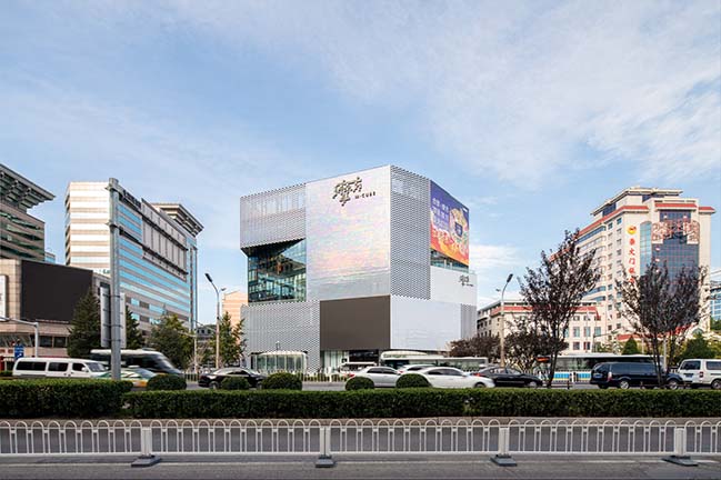
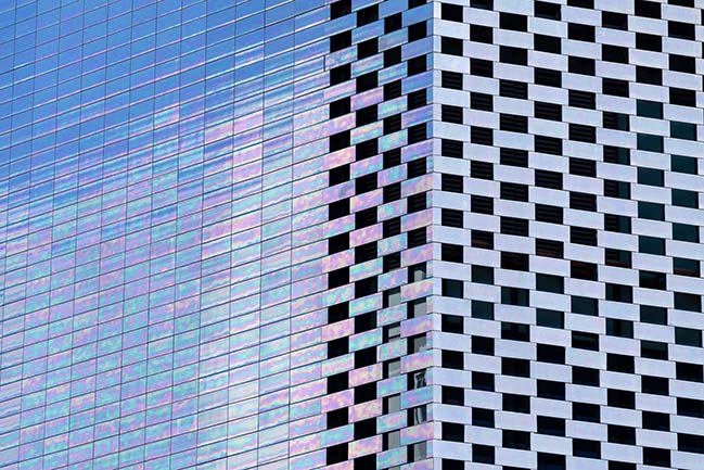
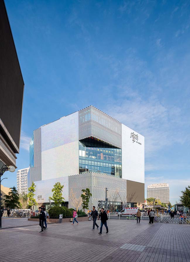
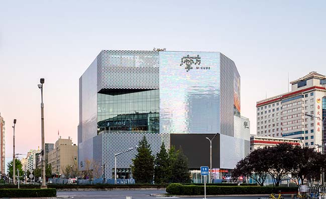
The Beijing KWG·M·CUBE, a 40,000-square-metre shopping centre designed by MVRDV, has completed construction in Beijing. Asked by the client to make the building a visual statement, MVRDV created a multifaceted volume that responds to its surroundings with a pearlescent ceramic façade, which shimmers in a spectrum of colours under changing light conditions.
Architect: MVRDV
Location: Beijing, China
Year: 2018
Principal-in-charge: Jacob van Rijs,
Partners: Wenchian Shi and Fokke Moerel
Design Team: Jose Ignacio Velasco Martin, Aser Giménez, Marta Pozo, Cai Zheli, Wing Yun, Helen Tai, Arjen Ketting, Antonio Luca Coco, Leo Stuckardt, Jonathan Schuster, Bowen Zhu, Rune Veile, and Maciej Jakub Zawadzki.
Co-architect: Beijing Xinjiyuan Construction Company Engineering Design LTD.
Landscape architect: Urbis Landscape
Facade consultant: Meinhardt Facade Technology, Beijing, CN
Tile manufacturers: Hunter Douglas Architectural Terracotta
Lighting: LPA, Tokyo, JP
Interior architect: AGC Design, HK
Contractor: Gartner (Permasteelisa Group), Shanghai, CN
Photography: Seth Powers
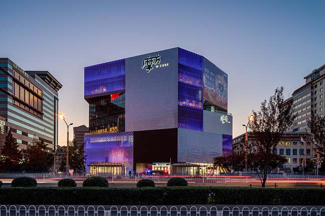
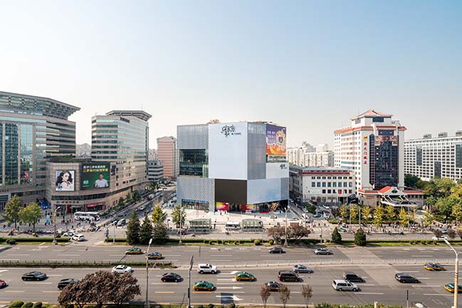
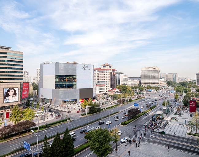
From the architect: Located just within Beijing’s innermost ring road, the KWG·M·CUBE is prominently located next to the Beijing Railway Station and near to both the Temple of Heaven to the Southwest, and Tiananmen and the Forbidden City to the Northwest. Given this prime location and the consequent value of the land, the client wanted a building that would stand out from its mostly beige and grey neighbours, while also packing a large amount of space into a relatively small footprint. Contradicting this request were the desires of the city government, whose preference was for a building that would fit in with its muted surroundings on the busy street.
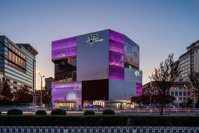
MVRDV was commissioned to design the building’s exterior and responded to these competing hopes with a 7-storey volume that rises to the maximum allowed height of 36 metres—an unusually tall building for this kind of mall. The shape of the building was generated by cutting the volume at various angles to orient the façades to face key locations, such as the railway station and an intersection on the other side of the street, generating a shape that is both contextual and recognizable in its visual presence. It also allowed MVRDV to include open-air terraces on each level, which are symbolically oriented towards landmarks such as the Forbidden City and Temple of Heaven—some visible from the building, others more distant—to root the building in its location.
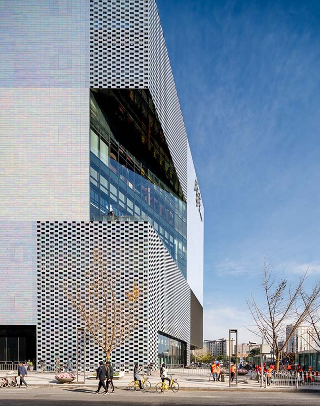
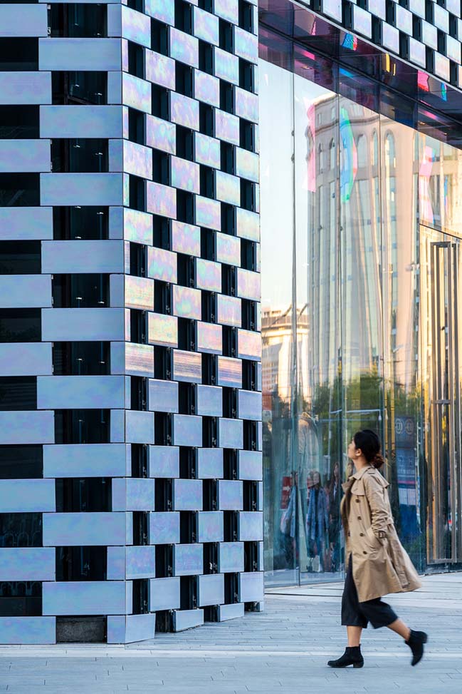
The building is wrapped in a pearlescent ceramic façade that at different times appears either grey or colourful, creating a subtle façade that does not need large LED screens to stand out and catch the attention of the passers-by. Hand-glazed in China, these tiles were made by applying three layers of glaze to the ceramic, and firing at a different temperature each time.
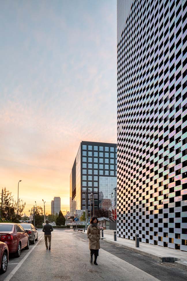
“We designed the KWG·M·CUBE so that the building continuously displays new patterns and colours. Depending on the weather and light conditions and where you stand, the façade might look subtly grey, or it might shine with all the colours of the rainbow,” says Jacob van Rijs, principal and co-founder of MVRDV. “In this part of Beijing, there are restrictions on architecture and many nearby buildings are completed in shades of grey and beige. Our solution allowed us to do exactly what the client and the city wanted: to create an attractive visual statement in which exuberance and modesty go hand in hand.”
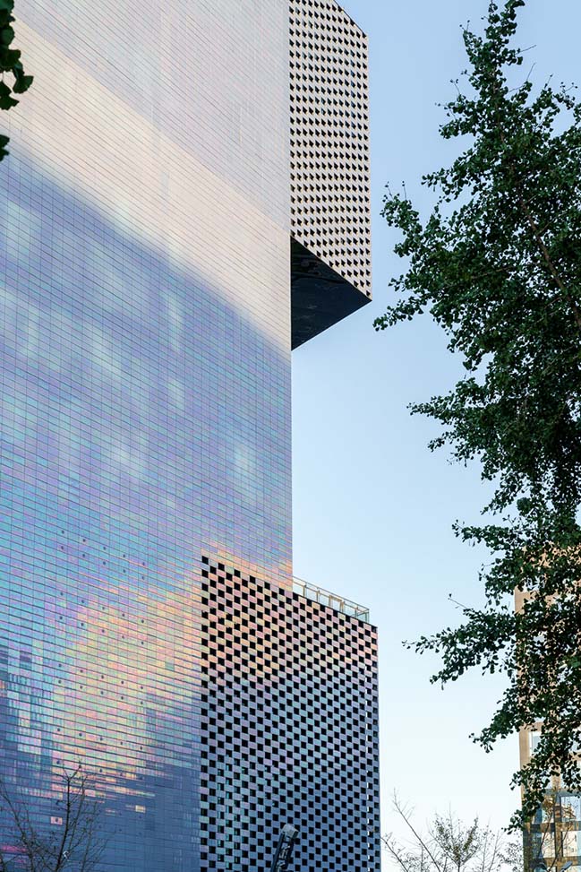
The surface treatment of the façade also breaks up the mass of the building while responding to the light and view requirements of the interior program. While some areas of the surface were required to have blind facades to accommodate the stores behind, other stores are able to use diffuse light to their advantage, and here the ceramic tiles are used in a checkerboard pattern. In other places such as lobbies and cafes, fully glazed facades provide a visual connection between the inside of the shopping centre and the mall.
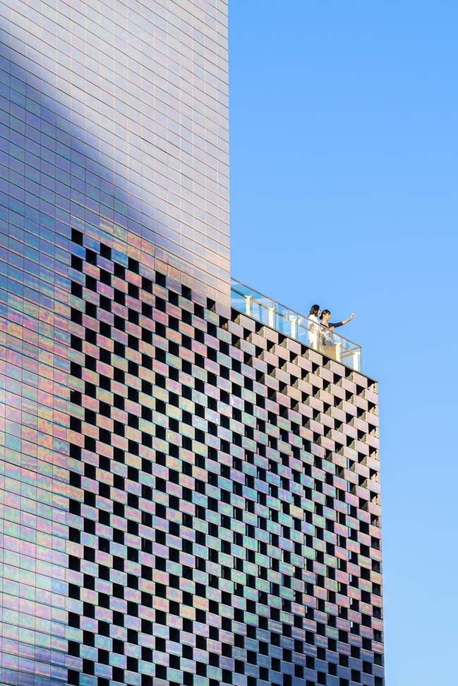
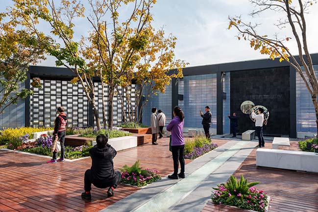
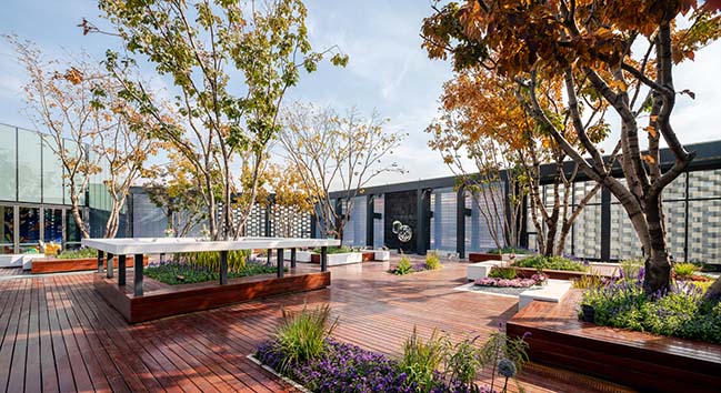
To accommodate the building’s 7-storey height, MVRDV proposed to split the KWG·M·CUBE shopping centre into two layers: on the lower 3 floors is the daytime shopping centre, which mostly hosts retail stores, while the upper levels feature more restaurants, bars, and cafés, and will truly come alive at night. In order to allow the upper floors to function while the lower floors are closed, an express elevator from the ground level takes visitors up to a second lobby on the fourth floor. To complete this layering effect, a landscaped roof terrace allows visitors to relax outside when the weather is pleasant.
MVRDV won the competition to design the KWG·M·CUBE for client KWG Group Holdings in February 2012 and have worked on the project alongside façade consultants Meinhardt Façade Technology, contractor Gartner Permasteelisa Group, tile manufacturers NBK and HDTC, and co-architect Xinjiyuan.
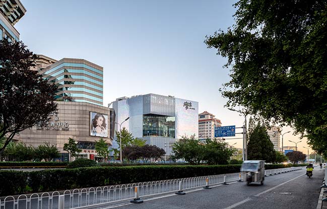
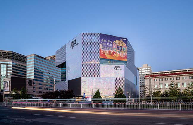
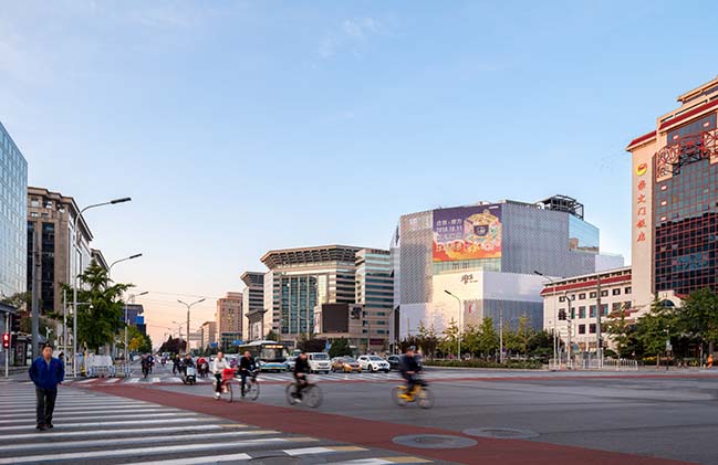
M-Cube Shopping Centre in Beijing by MVRDV
10 / 18 / 2018 M-Cube designed by MVRDV combines pearlescent exuberance with contextual modesty in Beijing
You might also like:
Recommended post: Alma Residence by Microclimat
