03 / 30
2019
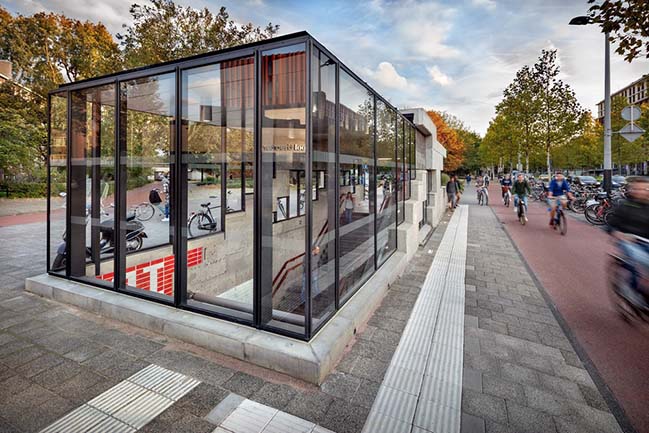
Architectural studio GROUP A has recently completed renovating the Oostlijn (East bound Line) of the Amsterdam Metro. The project includes 5 underground and 11 above ground stations.
Architect: GROUP A
Client: Metro en Tram Amsterdam
Location: Amsterdam, Netherlands
Year: 2018
Photography: Digidaan
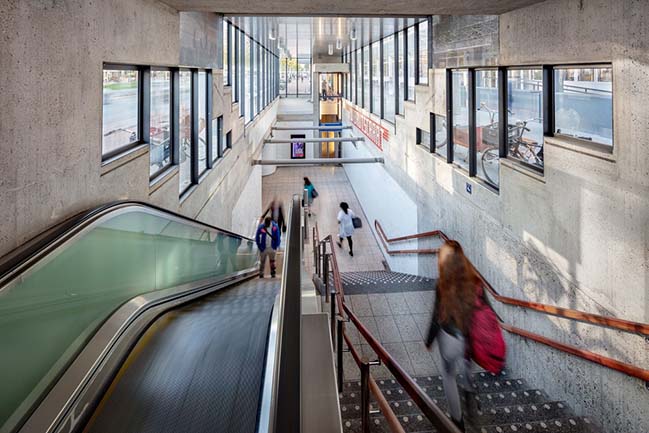
From the architect: The Oostlijn runs from the Central Station to Amsterdam Zuidoost, partially underground and partially elevated above ground. It was built in the seventies in a signature brutalist style.
Over the years, the clarity of the original architecture had become muddled. The line’s identity faded because of subsequent modifications. Passengers complained of a lack of safety, comfort and overall smudginess. The metro operator was in desperate need of a clear strategy regarding wayfinding, advertisement, ticket vending and commercial signage. Escape routes were too narrow and a proper smoke exhaust was lacking. In short, the stations were no longer equipped to face the future.
GROUP A developed a design vision, based on enhancing social security, comfort and identity. Their aim was to create a modern metro system which functions adequately, is comprehensibly organised, and pleasant to use. The architects proposed to achieve this without denying the brutalist DNA of the metro line or even demolish it. But instead build upon it.
All 16 stations are different, so GROUP A first evolved the design vision into a Generic Design. This consisted of a set of general site unspecific design interventions, of which the most important are:
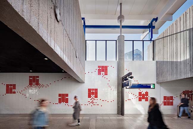
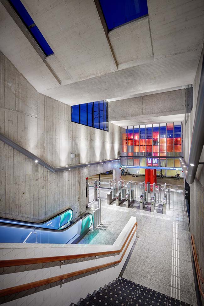
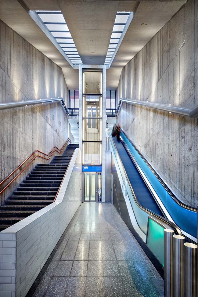
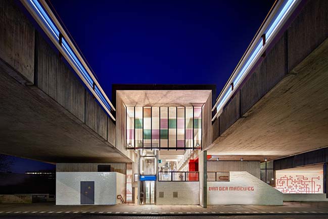
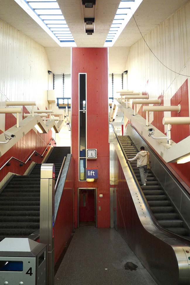
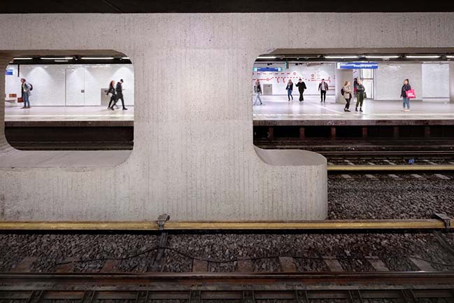
Transparency - GROUP A added transparency to the stations by creating large voids near the entrances. This creates overview between different levels and enlarges the passengers’ feeling of safety. It also brings daylight deeper into the station halls which allows for natural orientation.
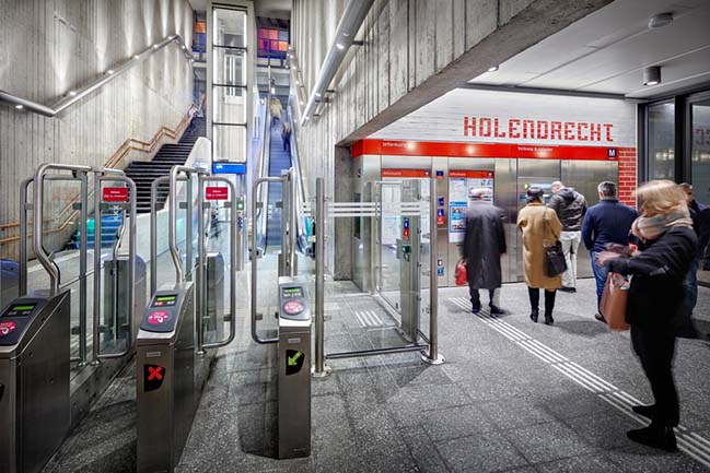
Clusters - All wayfinding, advertisement and ticket vending elements are clustered on central locations, well lit and instantly visible. The clusters are based on a modular design - easy to maintain and accommodate future changes.
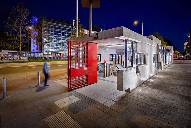
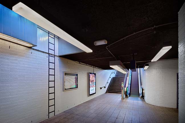
Clean Floor - The clusters are integrated into the walls, to keep the floors clean at all cost
Indirect Lighting - Wall and ceiling directed spots emphasize the spatial qualities of the original stations. For the above ground stations, with very high concrete ceilings, the architects designed a lightline with light spots, cameras and speakers integrated.
Colour - Starting from a monochromatic basis, the colour was used strategically. Apart from the wayfinding, colour is used solely to emphasize points in space that require the passengers’ attention: entrances, ticket vending, information and vertical connections.
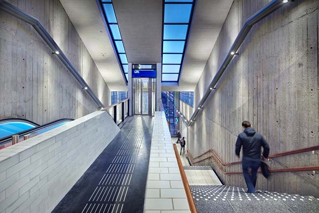
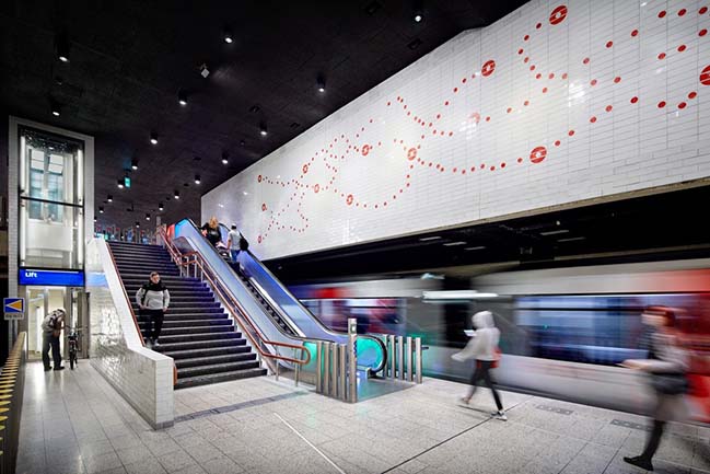
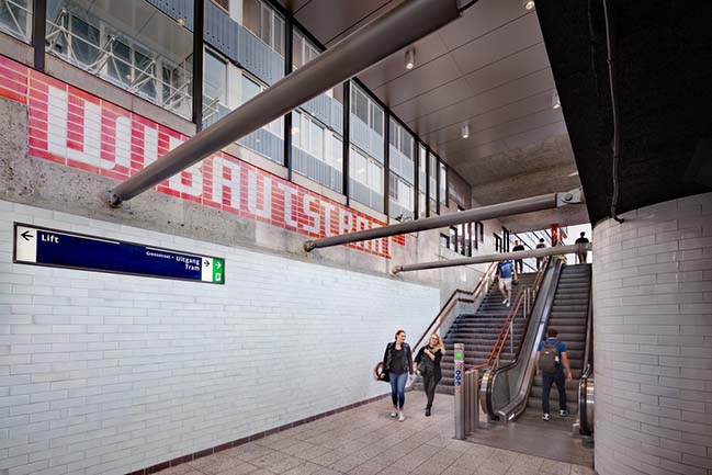
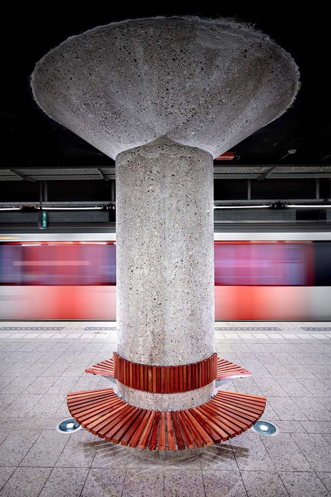
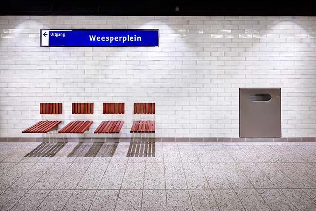
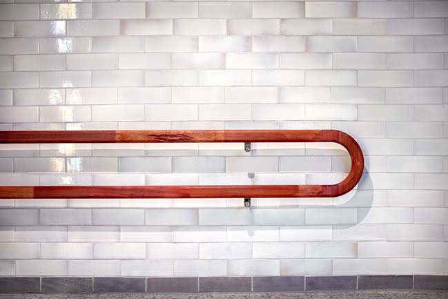
New materials - In contrast to the original concrete surfaces, GROUP A added new materials like glass, hardwood and glazed tiles. Rich materials that are easy to clean and appeal to a sense of comfort.
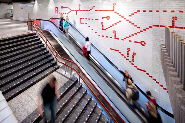
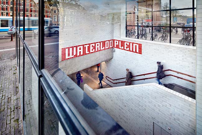
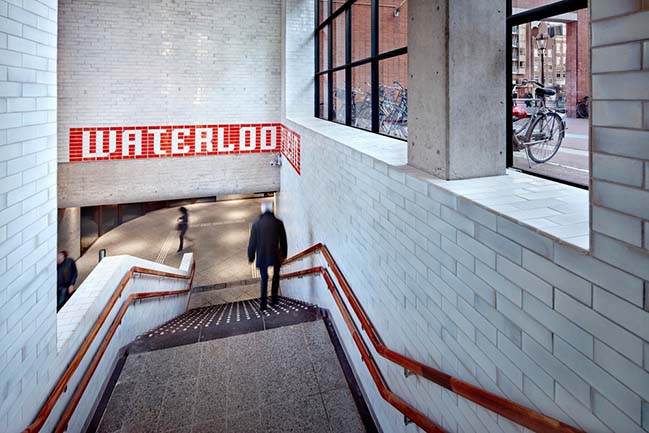
Identity - Patterns and stations names were designed in the modular system of the wall tiles to create an Oostlijn specific “alphabet”. This graphical layer binds and strengthens the Oostlijn’s overall identity.
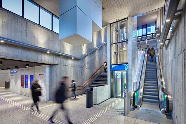
The project was carried out with limited budget and without interrupting daily commuter traffic. After almost ten years of hard work, the Oostlijn has now once more become a functional, comprehensible, and pleasant addition to public space in Amsterdam. A good basis for the next 30 years.
YOU MAY ALSO LIKE: Zorgvlied Crematorion by GROUP A
YOU MAY ALSO LIKE: New Metro Line in Amsterdam by Benthem Crouwel Architects
BEFORE RENOVATION:
Metro Oostlijn by GROUP A
03 / 30 / 2019 Architectural studio GROUP A has recently completed renovating the Oostlijn (East bound Line) of the Amsterdam Metro
You might also like:
Recommended post: 5S Apartment in Sydney by Nicholas Gurney
