10 / 06
2021
Situated in the Florentine neighborhood, HOME BASE project is the perfect home-base for the new urban lifestyle...
> J3 Apt: A apartment for a couple in Tel Aviv by Studio ETN
> 264: Luxury apartment in Tel Aviv by Anderman Architects
From the architect: In the past year, people worldwide have radically changed their perception of what a residence should be. For many, a vacation at a luxurious hotel seems like a distant dream, work is often done from home, and social interactions, whether with family, friends, or for romance– now take place in the same space where we wake up and go to sleep.
Our relationship with our surroundings is changing, requiring mental flexibility and creative thinking.
In response to this new global reality, Tel Aviv-based design house KOT, led by Architect and Interior Designer Kfir Galatia Azulay, has recently completed an apartment intended for a young bachelor. Situated in the Florentine neighborhood, Azulay’s HOME BASE project is the perfect home-base for the new urban lifestyle.
Galatia-Azulay aspired to create a dual living experience –on the one hand, personal, intimate, protective, and ambient, on the other hand, luxurious, cosmopolitan, pampering, and state of the art. A hotel-like apartment that walks the thin line between public and private, illuminated and shaded, transparent and concealed.

In line with this vision, the architect drew inspiration from Indian-Canadian poet Rupi Kaur, who wrote: “I am not a hotel room. I am home.” Similarly, Galatia-Azulay sees the urban living experience as a constant vacation from home, a concept that is instilled in his many current projects.
The apartment is located in a modernist residential building in the iconic Florentine neighborhood, which in recent years has become a hub for intellectuals, artists, filmmakers, and members of the LGBT community.
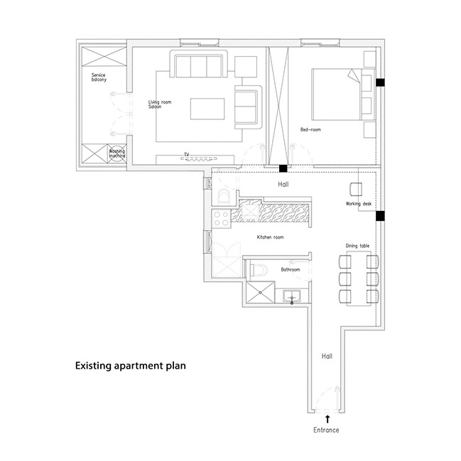
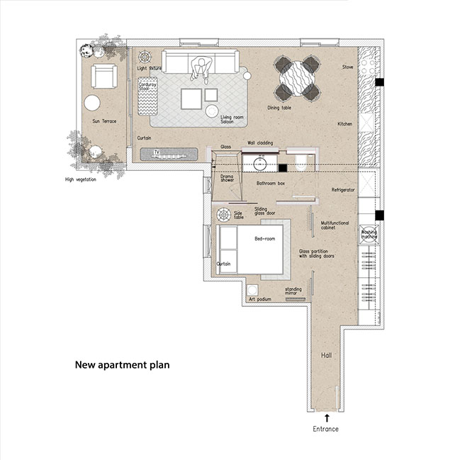
The original space was comprised of a foyer devoid of natural light, two enclosed rooms, an enclosed kitchen, a shower with no ventilation, and a balcony that served as a storage room. In other words, the structure was out of touch with its external surroundings.
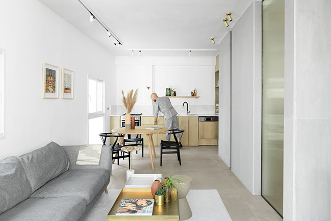
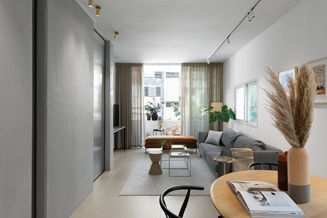
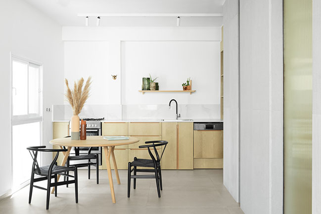
The renovated apartment includes a modern open kitchen, a spacious living room with a dinette, a private bedroom, a designated bathroom, and a covered sun terrace. All the existing infrastructure was replaced and upgraded during the renovation.
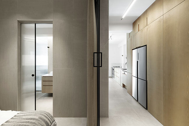
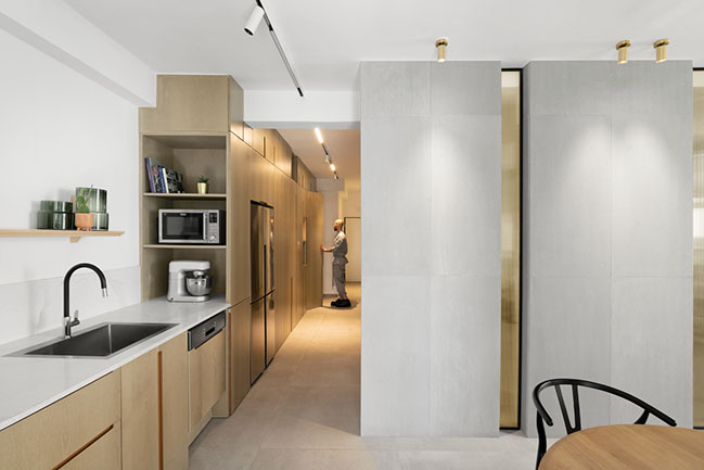
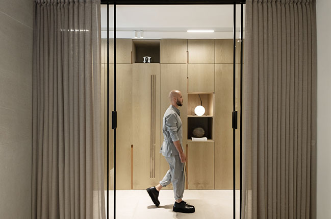
Entrance into the apartment is via a small foyer, and then continues parallel to a nine and a half meter long solid-wood carpentry unit, company designed and custom-made.
Azulay: “The apartment is located in a modernist, minimalist, and simple building. We, therefore, wanted to create a clear use and movement experience, combined with modern and meticulous interior design, emphasizing movement, look, and light, tailored to the building’s character. We took care to ensure the use of precise materials and finishes.”
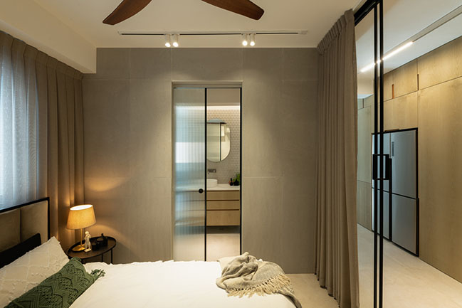
The flow of movement is clear in this apartment, and its functionality is expressed in the large wall unit. The essence of the central carpentry unit changes and flows intuitively, in accordance with the room in front of which it is located, a closet parallel to the bedroom, service, and laundry parallel to the bathroom, and a kitchen in front of the living space.
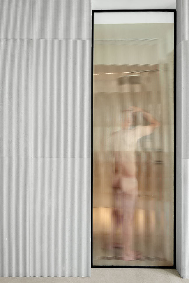
The bedroom is framed with glass walls and sliding doors, with a wide opening to the closet, transferring light to the hallway, and creating an illusion of a larger, more spacious room. For privacy, one can draw the linen curtain, turning the glass wall into an opaque one.
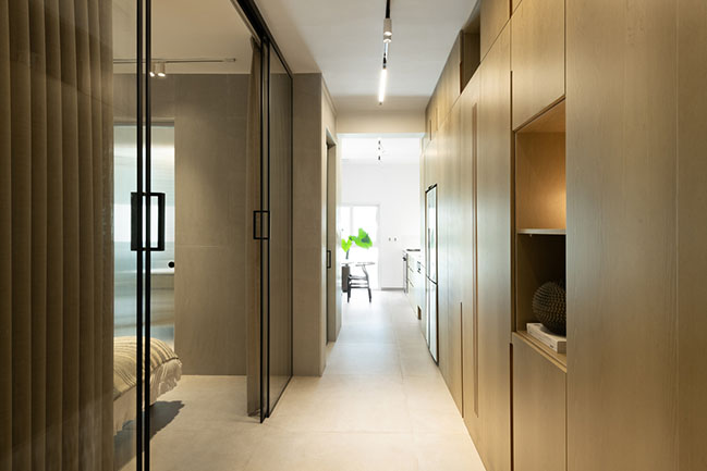
The apartment’s most prominent feature, however, is the new bathroom at its center. The prominent foyer led the architect to create a show-stopping central element ‘out of nothing’, and convey a new, refreshing version of this home. He chose to place the washing unit in an extraordinary location – at the heart of the apartment, allowing the view to and from it to create varying effects throughout the day.
The new washing unit is not a room, but a ‘box’ placed at the center of the apartment, creating a relationship of concealment and exposure with the rest of the apartment. The box is covered with high-quality marble slabs, and corrugated glass partitions and doors, which allow accurate and measured exposure of its contents.
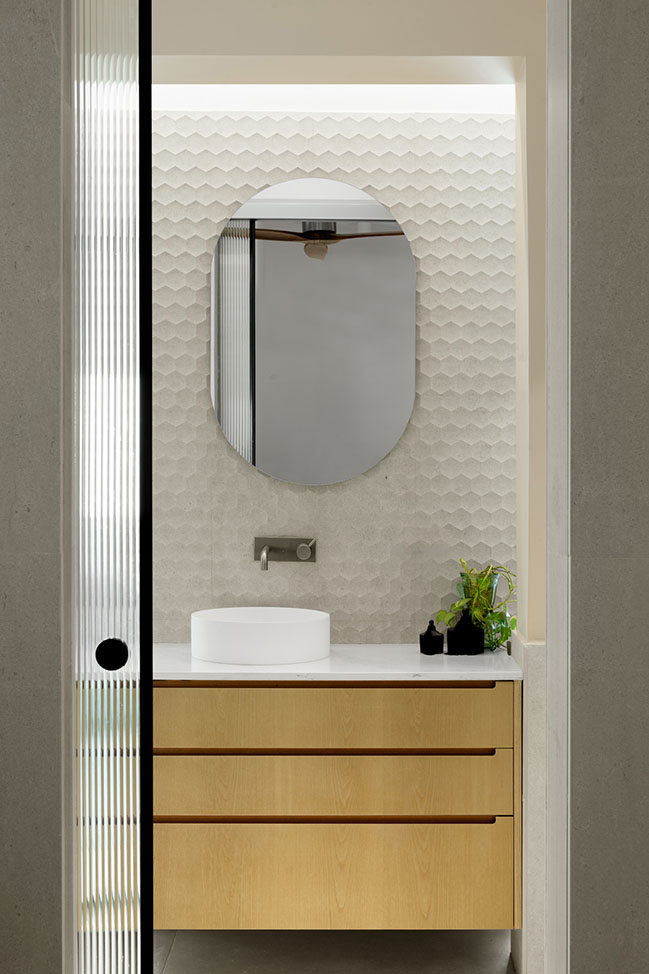
The interior of the unit is covered with elongated marble slabs in shades of sand and stone. The box can be accessed through the bedroom and living room so that it serves the apartment’s owner and his guests throughout the day.
The entire apartment is paved with sand-colored stone tiles that warm the interior, combined with ash wood furniture and carpentry in a warm gray hue. The light and comfortable furniture in the living space lends a European atmosphere to the apartment, with the use of light sandy shades alongside corduroy upholstery, brass tables, and a black wood dresser.
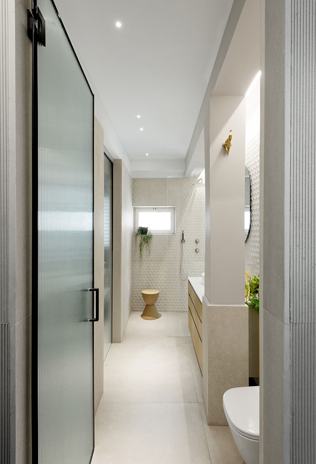
The contrast between the neighborhood’s rough character and the apartment’s new interior creates an illusion of escape into a luxurious suite, but in fact, this is an escape into one’s self, since the project is well anchored to its time and space.
“When the client enters the renovated apartment, the first thing he saw was the view from the floor to ceiling kitchen window," says Azulay, "and what was my goal – to stay in touch with our changing world, albeit in a new kind of a relationship."
Architect: K.O.T Architects
Location: Tel Aviv-Yafo , Israel
Year: 2020
Project size: 55 sqm
Photography: Gidon Levin
YOU MAY ALSO LIKE: The Box-Tel Aviv Loft by toledano+architects
HOME BASE Tel Aviv by K.O.T Architects
10 / 06 / 2021 Situated in the Florentine neighborhood, HOME BASE project is the perfect home-base for the new urban lifestyle...
You might also like:
Recommended post: Pergola House: A wooden villa by rundzwei Architekten BDA in Berlin


![Modern apartment design by PLASTE[R]LINA](http://88designbox.com/upload/_thumbs/Images/2015/11/19/modern-apartment-furniture-08.jpg)


