08 / 29
2022
This building is located in a typical urban complex-type housing district with a mixture of houses and apartment complexes. It seemed necessary to protect the privacy of residents from various dense residential forms and environments around them, and to secure sunlight for a bright and pleasant space...
> Five-Story House In Seoul By Stpmj
> Seongsan-Dong Mix-Use By A Round Architects
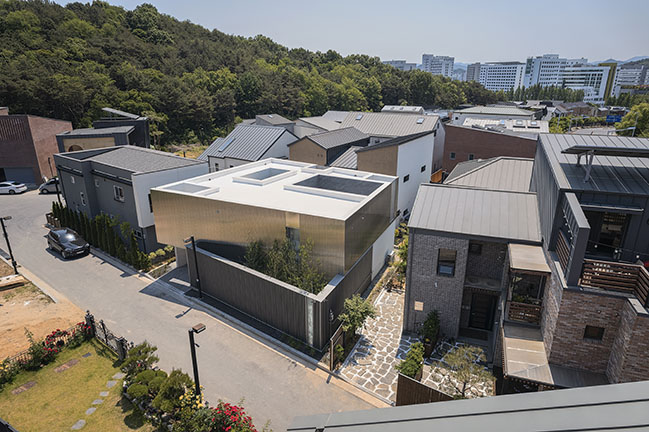
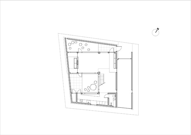
From the achitect: Unlike the site of a housing district formed in a general square shape, the shape and lines of this site, which are diamond-shaped, are important clues to the composition of space to be developed in the future.
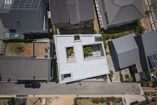
Placement: In order to accommodate each space required by the owner within a limited site, this building chose to conform to the shape of the site, not the right-angled layout where dead space occurs on the irregular site.
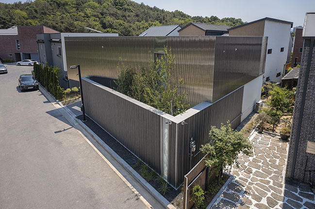
It was intended to diversify the space that appeared by recognizing the unique lines of the site and actively entering the space, and wanted this building to be revealed in a natural shape rather than a forced shape on the site.
First of all, the residential space was expanded to the entire site, and empty spaces were created one by one in relation to the interior space to meet the construction rate stipulated in the region and the necessary area required by the owner.
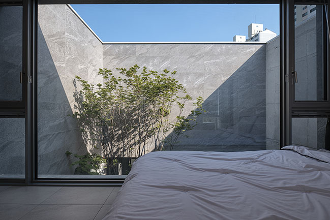
The empty spaces created in this way are filled with light and nature one by one, and serve as a middle ground that provides a bright and pleasant space along with protecting the privacy of residents.
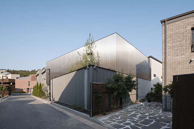
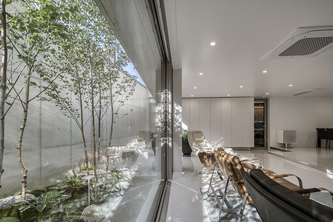
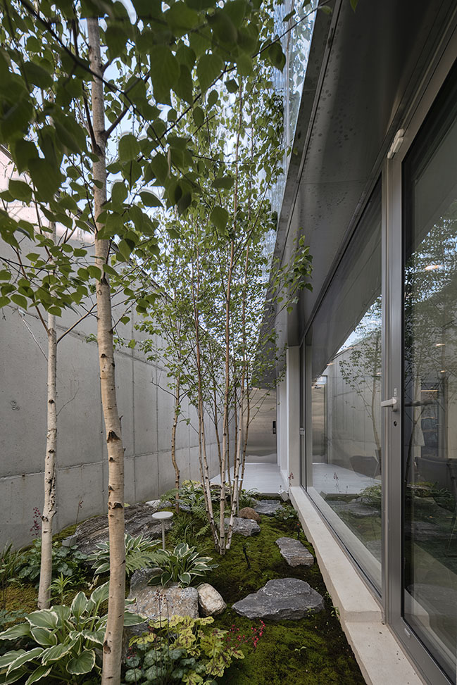
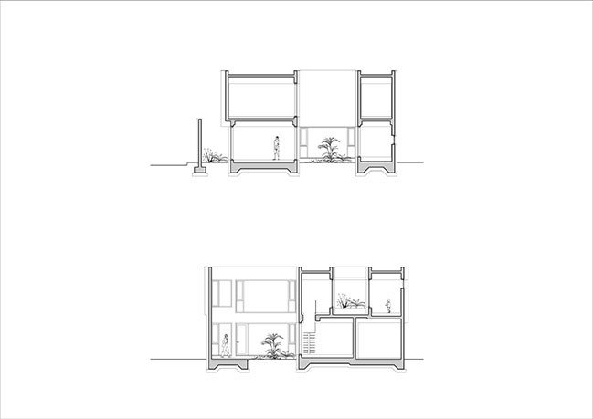
Composition: When you open the stainless steel door outside, you will welcome a narrow and long space filled with various stones and birch trees.
The small birch forest in front of your eyes, which makes you forget the city center for a while, also serves as a buffer area for residential spaces and external roads.
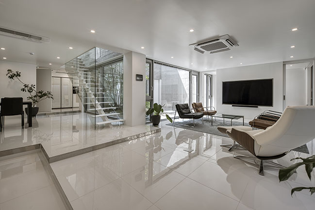
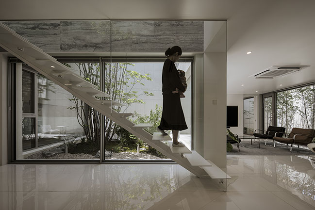
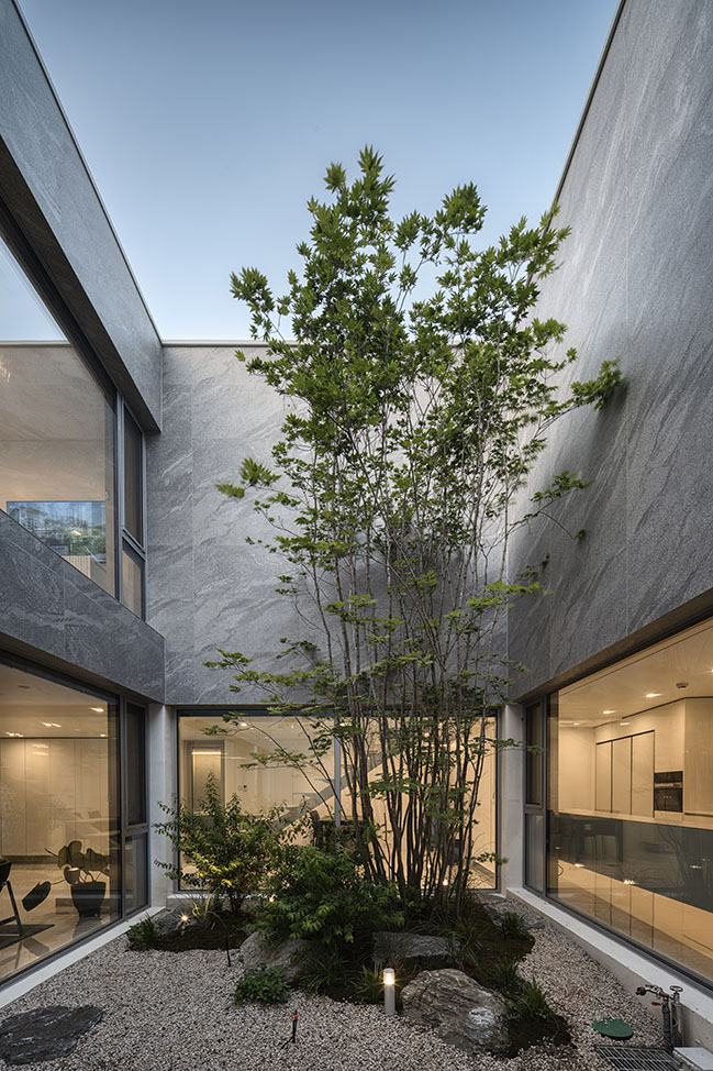
When you open the second door leading to the inside and enter, you will see a living room, dining room, and kitchen arranged around the middle center where large mountain foliage is planted.
Located between the mountain maple and the forest of small birch trees, the living room and the kitchen and dining space where you can always feel nature become a shelter for residents to refresh themselves away from the daily life of the city.
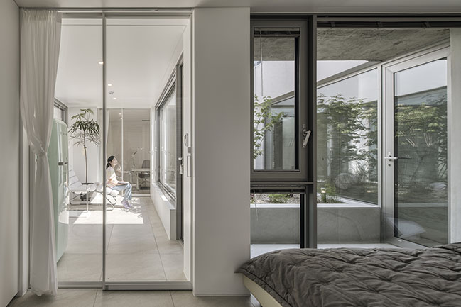
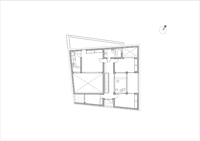
A small flower bed on the second floor, which is decorated in a different scale from the first floor, is placed between the child room and the child room to recognize each other's existence and coordinate the distance between each other.
Surrounded by a nursery and flowerbeds, the multipurpose room also serves as a living room and another small shelter for children who are tired of studying, or for couples who sometimes have a glass of wine.
Interior: Between the intersection and the disorganized boundary of the interior, the interior space expands to the outside, and the exterior space expands to the inside, and the light, sky, wood, and stone of the intersection naturally become interior.
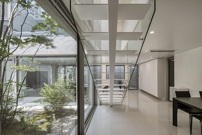
The floors and walls of the first floor, which are intentionally excluded from the decoration, are the background of light and nature from the middle, and the second floor, where the bedroom is arranged, has the floor finished with beige-toned tiles to give a calm and warm feeling.
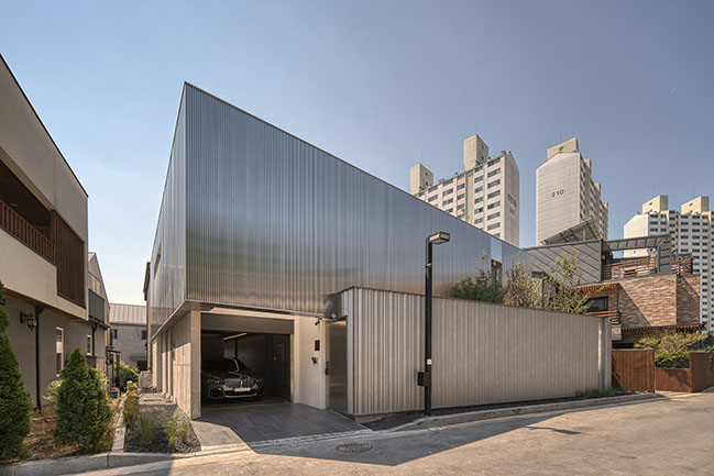
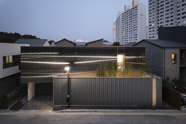
Facade: Unlike the ground floor mass placed in conformity with the site, it is set back and slightly twisted. The mass on the floor reduces the weight of the street environment felt by pedestrians.
The birch tree, which shows its face between the twisted mass on the first and second floors, defines the boundary between the two mass, and raises questions about the space.
In order to make the shape of the twisted mass stand out and change the street environment that can be monotonous, metal materials were chosen as exterior materials.
The mass on the first floor was weighted by applying toned down luxe (color steel plate) as the base of the building, and the second floor was bright and stainless louver was applied to reduce the weight.
The mass on the second floor surrounded by stainless louver provides a sense of rhythm to the surrounding environment by changing its appearance with light over time due to the unique physical properties of stainless steel.
The combination of the two metals, which have different physical properties and density of expression, seems to be similar to the two slightly deviated mass, but has a different subtle harmony.
Architect: Archirie
Location: Dunsan 1(il)-dong, Daejeon, Korea
Year: 2022
Project size: 235 sqm
Site size: 267 sqm
Photography: Cheon youngtaek
Metal Facade by Archirie
08 / 29 / 2022 This building is located in a typical urban complex-type housing district with a mixture of houses and apartment complexes...
You might also like:
Recommended post: Infante Building renovation by Meireles Arquitectos
