10 / 14
2018
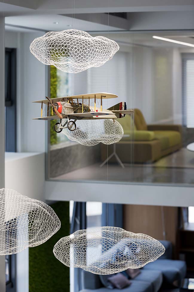
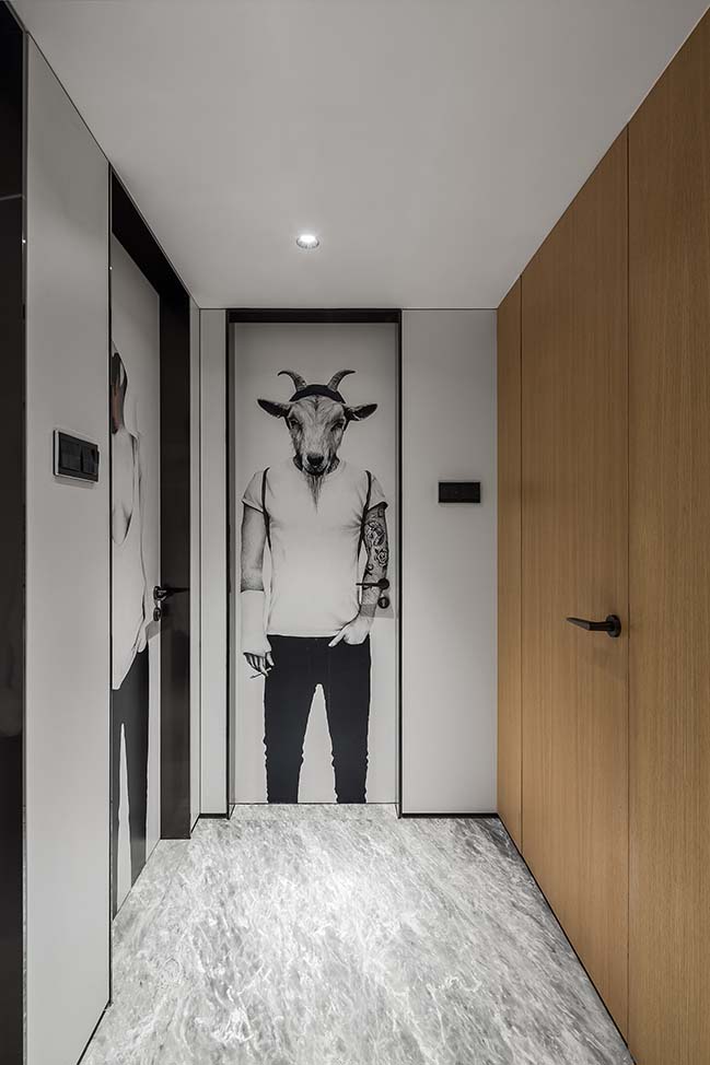
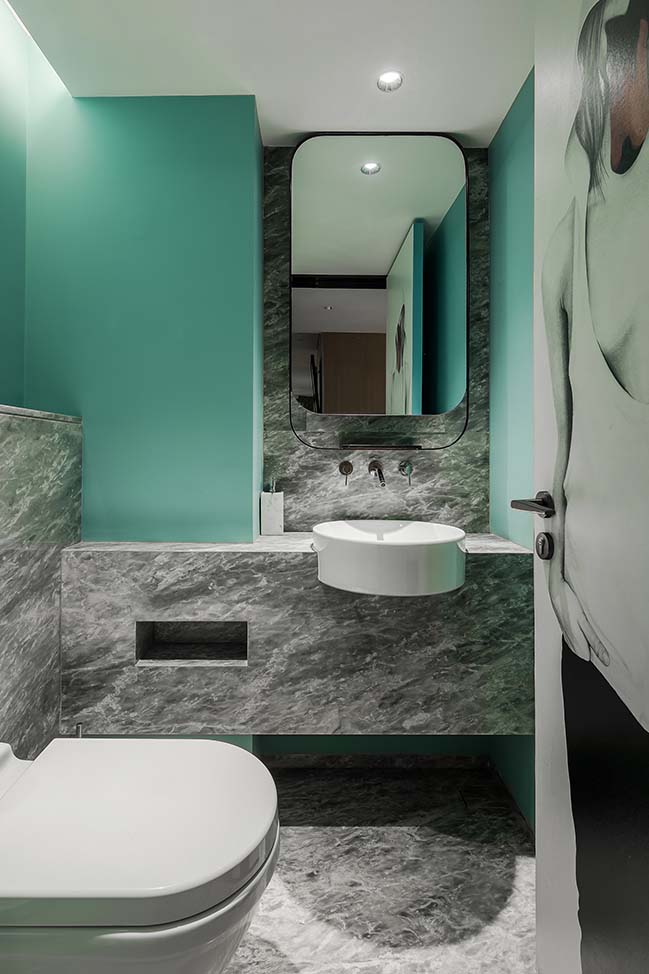
The CROYO headquarter office is situated at the "green city" of China, Nanning, with a total area of 543 square meters. Bearing in mind that the original intention of design is to serve people, the designers created this open-plan office where users can enjoy working and at the same time ensures efficiency of work and communication.
Design company: Shenzhen Super Normal Design Co., Ltd.
Client: CROYO
Location: Nanning City, Guangxi Province, China
Year: 2018
Project area: 500 m2
Chief designers: Yang Jianxun, Wu Minwen
Design team: Zhang Lei, Li Jianing, Wang Chuangzhe, Song Xiangqian
Decoration design: Super Normal Design + CROYO
Lighting instruction: Pan Yu
Construction: Guangxi CROYO Decoration Co., Ltd.
Photography: Fan Wenyao
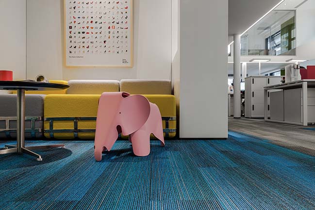
Project's description: As talking about inspirations for the design, the designers shared the experience at the 2014 Milan Furniture Fair. " During the Fair, we were deeply impressed by Arper for the modern and simple design as well as rich color of its products, which can be used in various spaces of different functions. Likewise, as we saw Vitra products, we couldn't help paying tribute to generations of Vitra people for their pursuit of architecture, art and products. In Vitra's factory in German, they even built a museum to hold the collection of 100 chairs. People appreciate beauty all seem to be keen on collecting classic works and seizing every wonderful moment which all can be interpreted by design."
"At the fair, I encountered a young man who showed great enthusiasm for design, though not receiving systematic education in this regard. However, I also saw confusion in his eyes, which reminded me of my school days. My intention for design is very simple: creating natural spaces which can warm and comfort the users."
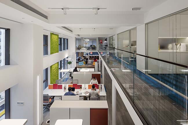
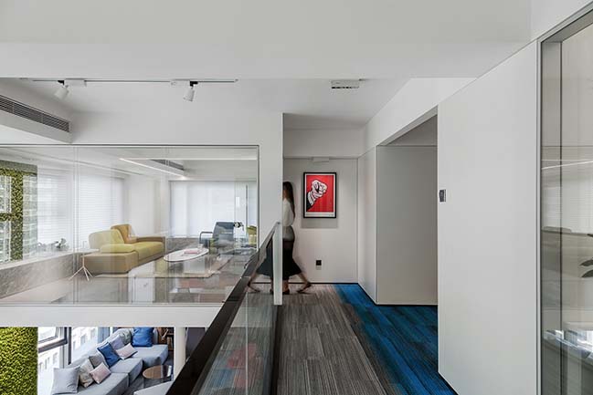
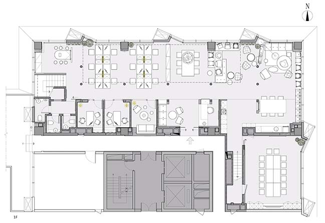
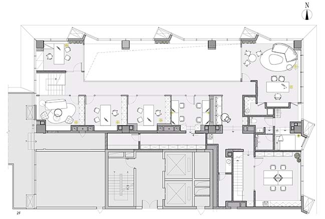
The original space of the project merely occupied an floor area of 280 m2, with a story height of 5.09 meters. Therefore, the designers took setting up a floor slab as the first step, so as to expand the usable area. Considering that the thickness of the floor slab would affect user's experience, the designers invited friends from Arup Group to be the structure consultants, with a view to creating a thin yet solid floor slab. They tried the best to integrate some structures with the walls, arrange the structure pillars in reasonably and deliberate on the position of each lighting fixture. Eventually, a 150mm-thick floor slab was designed and installed, separating part of the original space into two floors, with each designed in an appropriate height. Through the restructuring of the space via the floor slab, the usable area was expanded to 543 m2.
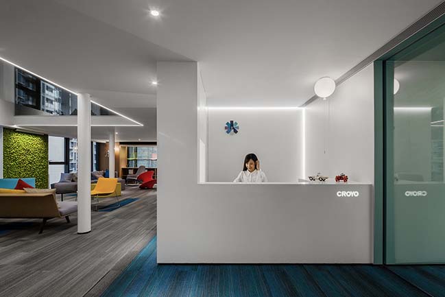
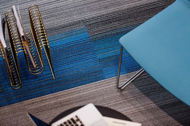
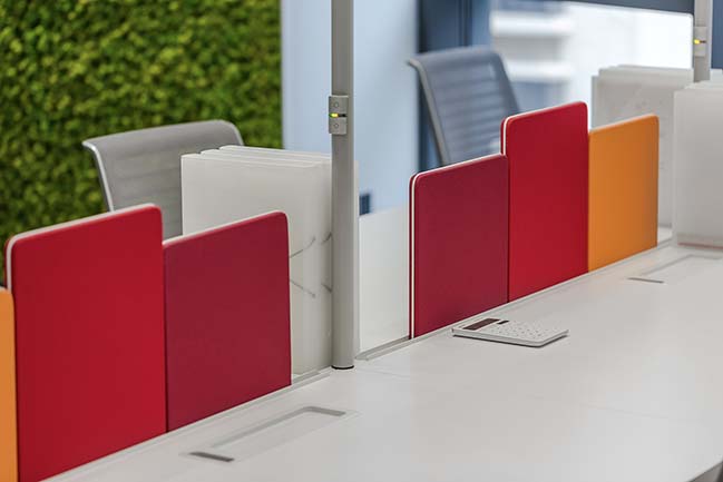
The front counter area is bright and refreshing, embodying the beauty of minimalism. With a view to keeping balance, the designers added some exquisite decorations in the area, thereby creating a lively and relaxing atmosphere. The spatial aesthetics is also demonstrated in the utilization of colors. The blue-gradient carpet keeps people calm, the red office partition makes people passionate, while the green preserved plants add a natural feeling into the space.
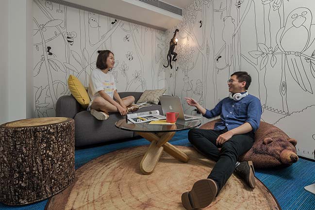
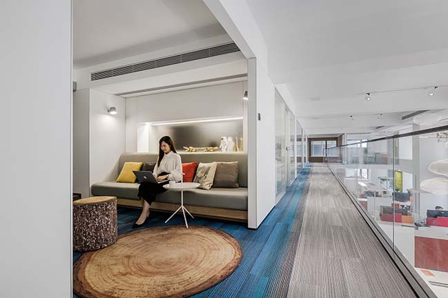
With the theme of "forest", the design of the brainstorm area is unique and distinctive. In order to bring the forest into the space and recall childlike innocence, designers put a stump-shaped chair, a rug with pattern of tree rings, a sofa resembling sleeping bear and a wall lamp in the shape of monkey in the area. Such bold and ingenuous combination of these elements is conductive to encouraging the staff to "think out of the box" and spark inspiration and creativity during team discussions. As for lighting design, designers chose to utilize floor lamps instead of point light sources, which generate soft and undazzling light, making people feel comfortable and cozy.
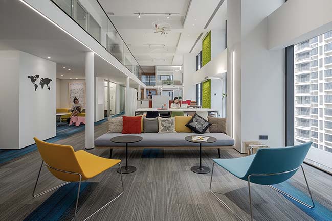
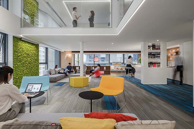
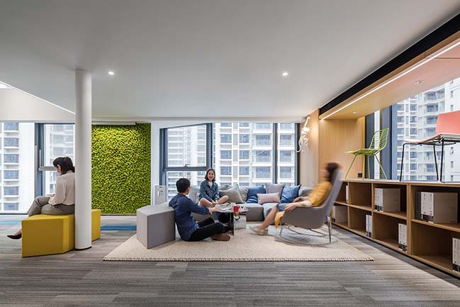
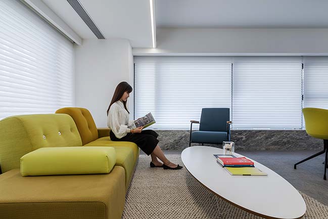
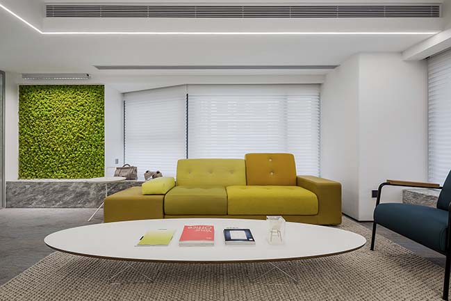
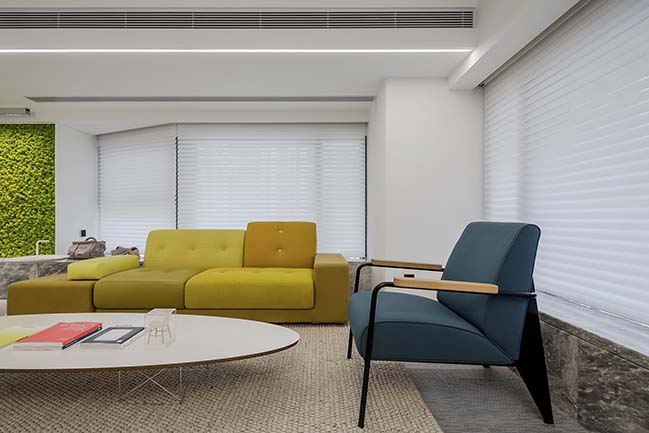
The designers attached great importance to designing a leisure area in the office. Lounge chairs and the distinctive modular sofa, combined with the bar counter, enable the staff to take a short break from work and have more contacts. In such relaxing environment, different teams can communicate freely and even generate collision of ideas in deep level. The leisure area features bold utilization of prevailing and vibrant colors, which creates a relaxing and cheerful atmosphere and embodies CROYO's concept of "reject to be boring".
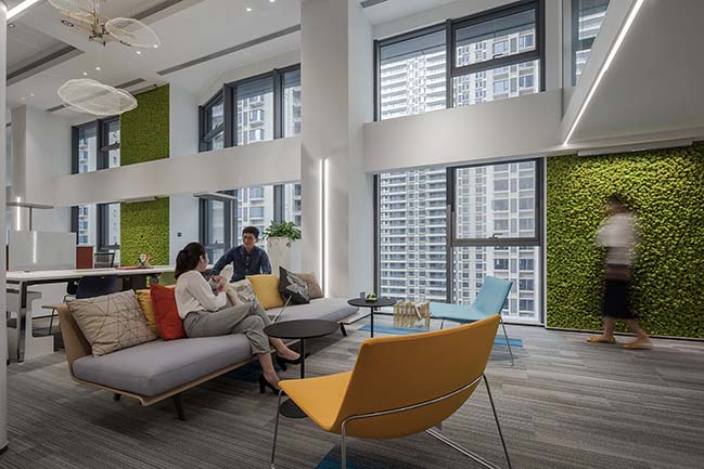
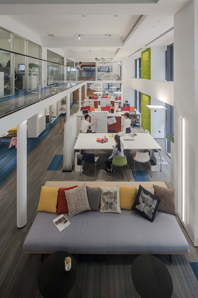
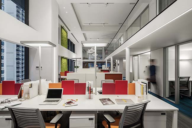
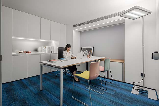
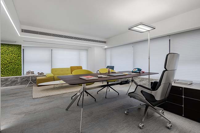
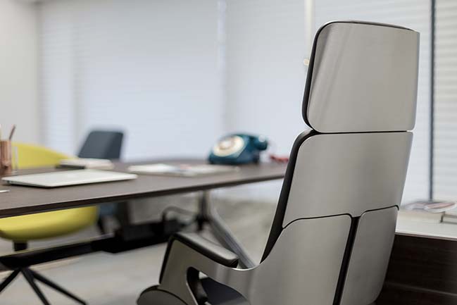
With a view to creating an open-plan office area, the design team set both independent work spaces and shared work spaces, so that the staff can choose the way of working in accordance with their preferences. Such design helps to facilitate face-to-face communication and professional knowledge exchanges among the staff, improve their capability of adapting to changing environment and strengthen their impetus for work, hence enhancing work efficiency. As for seating, the designers chose Steelcase ergonomic office chairs which make the employees feel comfortable and energetic. For lighting design in each independent offices, the interior and lighting designers made a new attempt. As opposed to installing lighting fixtures on the ceiling, they determined to use Waldmann free-standing luminaires. Such solution not only gives the ceiling a simple and clean look but also ensures the light to be soft and pleasant. The average color temperature of light is 4000k, creating a bright and pleasant working environment. However, in the shared working area, which was not partitioned by the floor slab, the designers adopted a different lighting solution. Considering that it was a full-height space, desk lamps were utilized so as to guarantee sufficient light. Besides, on the ceiling of this area, wide-angle track projectors were installed. In order to protect the staff at each seat from dazzling light, the designers made some multilayer cellular reticulations to cover these projectors.
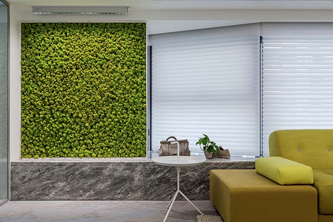
Furthermore, TVF wall washers were also used in the shared working area, making the preserved moss with exquisite texture on the wall more striking and refreshing.
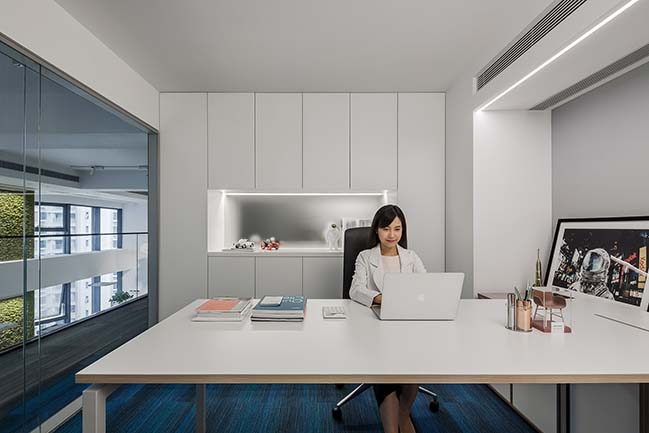
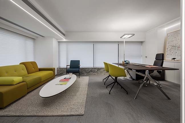
In the CEO's office, the designers put a fish-scale-patterned carpet on the floor, with its streamlines interplaying with light strips, presenting a soft and relaxing tone. Besides, the green plant wall, combined with the sunlight that penetrates the Hunter Douglas louver, inject vigor and vitality into the space.
The CEO of CROYO, Allan, shared his memory of childhood, through which the designers drew inspirations for designing the game room. " I remember a sultry afternoon where I played SUBOR games with my younger brother in front of the TV. The Cicadas' chirp, the swish of leaves and the sound of pressing keys of the game controller that afternoon were deeply imprinted in my memory."
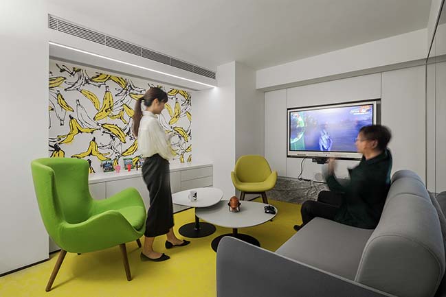
Vibrant yellow color set the tone of the game room. It was furnished with large and small leaf-shaped chairs, a clover-shaped table, Zen-style sofa, cute wallpaper with banana patterns, as well as smart projection screen. The game space enables the staff to entertain and relax themselves after work.
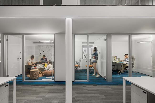
In consideration of practical use, the three independent manager offices were designed in minimalist style, with all decorations and structures arranged in a coordinated and integrated manner. The designers skillfully made full use of elements in the space to serve storage functions. The hidden storage boxes keep the desk surface clean. And the little-fox-shaped chair, Candy chair and large leaf-shaped chair in every manager office together present diverse and striking visual experience.
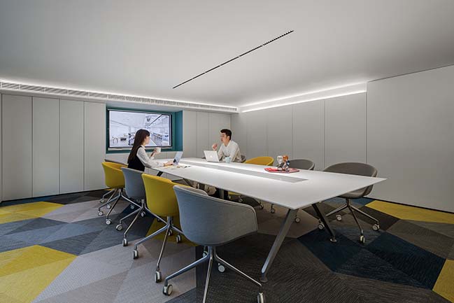
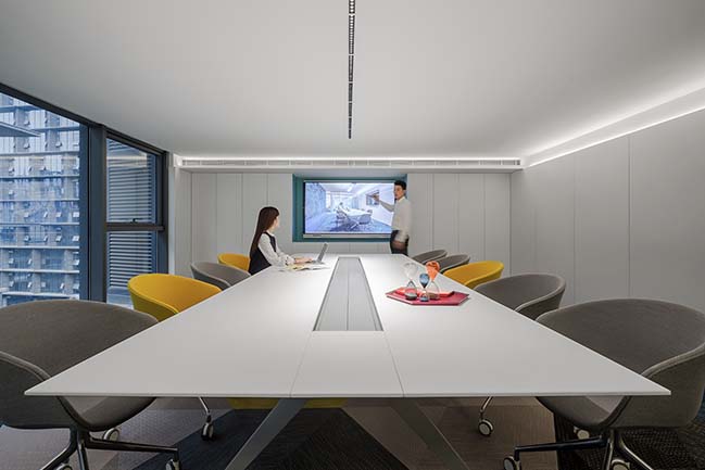
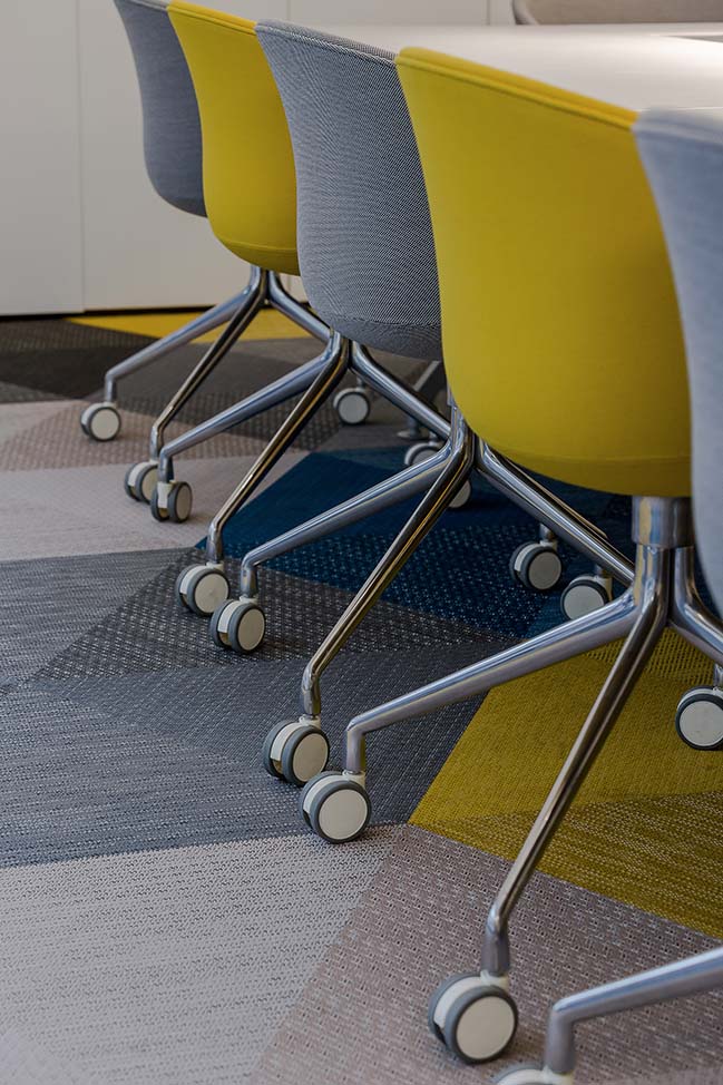
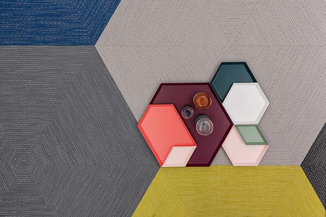
For the conference room, the designers fully utilized neutral tones, with a view to optimizing visual experience. Besides, to improve the efficiency of meetings, a Four Point Eight board-room table was placed in it. There is a rectangular groove in the center of the table so that all power suppliers and data cables can be installed in it, thus avoiding mess in the space. All the lights are focused on the table. Moreover, a smart flat-panel TV was installed on the wall, which offers a new and convenient way for the staff to make presentations and enables them to write on the screen, indicating a future conference mode. The Bolon carpet and HAY furniture with vibrant colors keep tediousness off during meetings. With upward illuminants lightening the ceiling, it makes the space relaxing, though with limited height.
The designers are convinced that a good mood improves work efficiency and a space making people feel comfortable is the best people-oriented design.
"The space is not primarily a container of objects but the abode for human consciousness. What we should study is simply the image of the space that is filled with happiness, rather than enumerate picturesque features of houses and analyze for which reasons they are comfortable."
> You may also like: MARS Case Concept Prototype by OPEN Architecture
> You may also like: Carlowitz & Co. in Shanghai by RoarcRenew

> You may also like: Sino Ocean - Oriental World View Sales Center by Waterfrom Design
CROYO Headquarter Office by Shenzhen Super Normal Design Co., Ltd.
10 / 14 / 2018 The CROYO headquarter office is situated at the green city of China, Nanning, with a total area of 543 square meters. Bearing in mind that the original intention of design...
You might also like:
Recommended post: Delvaux Flagship store in New York by Vudafieri-Saverino Partners
