01 / 25
2019
Do you want to come to Madrid? Try to book yourself a tourist apartment for the weekend using the booking app of choice ... That one in Malasaña with little terrace and the bar looks great, but that other one in Chamberí is also very cool and although smaller, its sofa-bed "will do” cause it´s just so stunning... For those who want to feel in Miami Beach without crossing the Atlantic, you have this one, in La Latina, filled with neon lights, "flamingoes" and all the pastels of art deco; for those of you who like to feel like English Lords, there is this other one, very close, entirely covered in chesterfield couches and antique bookcases….
Architect: Egue y Seta
Project name: MAD City Rentals
Location: Madrid, Spain
Year: 2018
Area: 34m2 + 53m2 + 40m2
Photography: Vicugo Foto
From the architect: The competition within the real estate market in Madrid, whether for sale, short-stay or rental apartments, is getting tougher day by day and the requirements on the aesthetic and functional quality of such real estate products are consequently increasing, becoming ever more specific and fall, of course, over us architects and decorators. And we´re loving it! Real State promoters have been forced to abandon the safe bet that minimalism made all too easy and are being pushed to "embrace" the risk involved in trying new styles to directly allude to a target composed of grown up "x-generation" members and hyper-segmented millennials, extremely "socially-networked", raging "review-holics" and most likely "over-hashtagged".
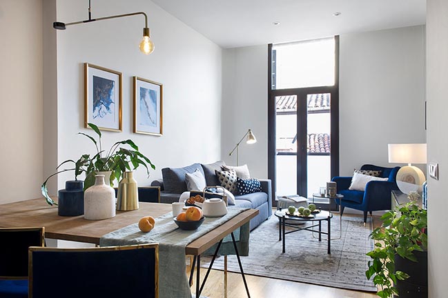
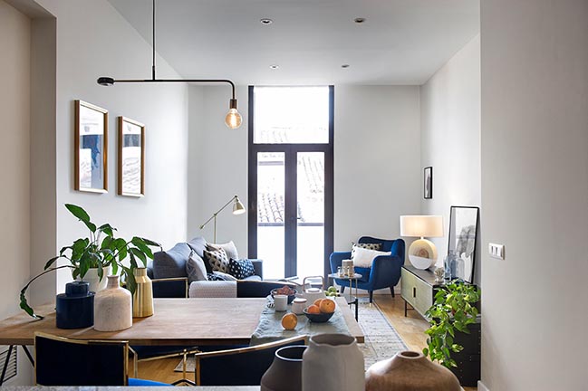
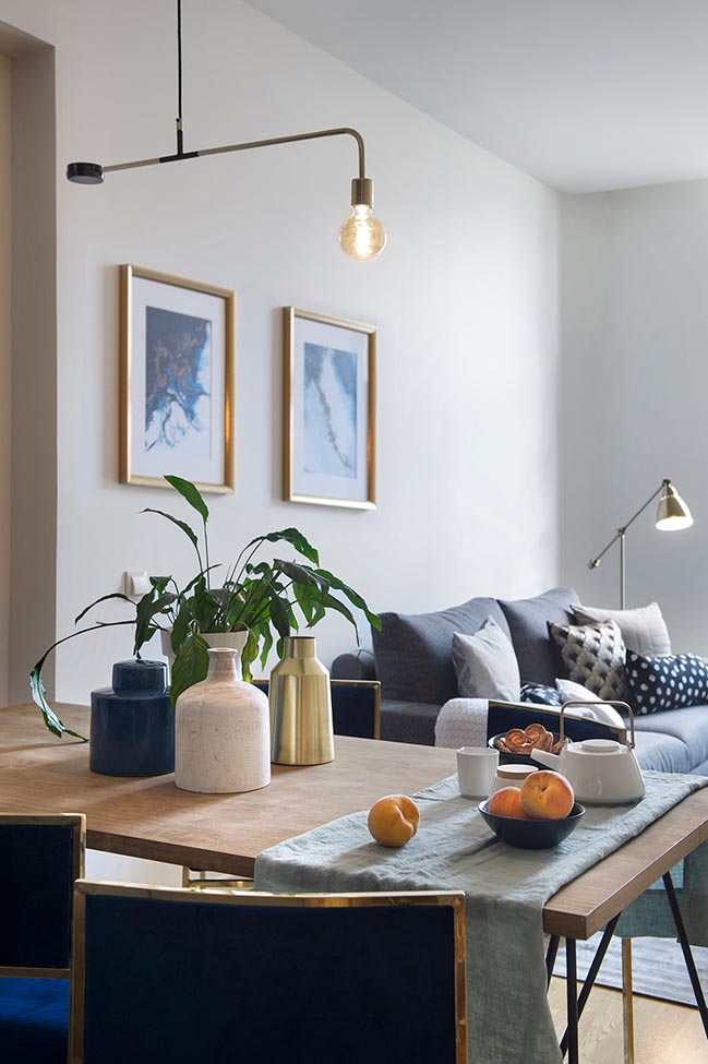
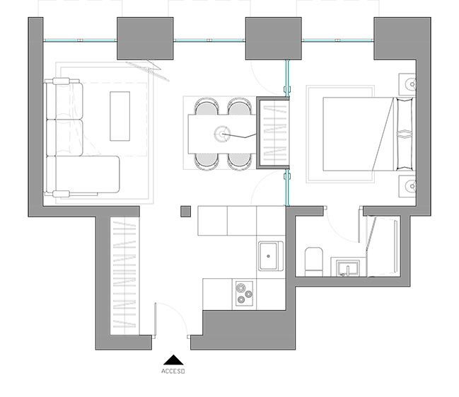
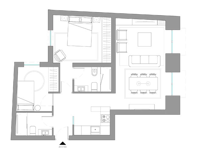
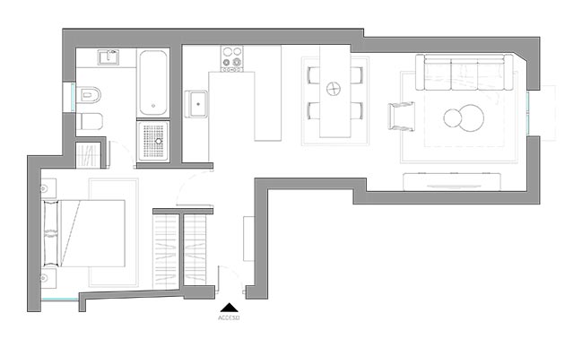
This is how three apartments of almost identical layout and located in the same building ended up looking like entirely different "worlds". Which one do you like the most?
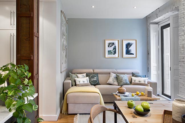
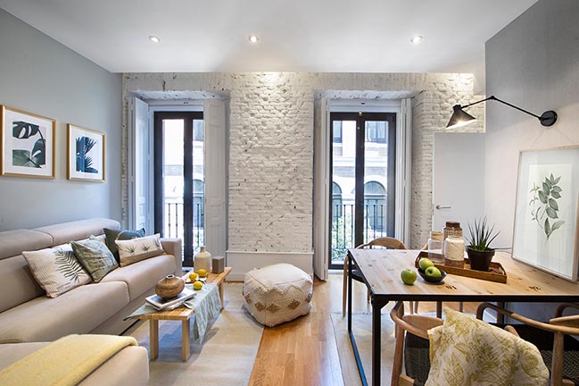
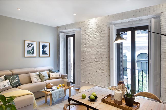
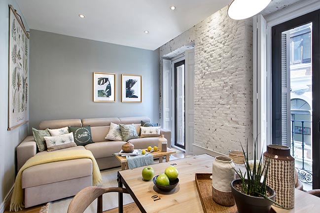
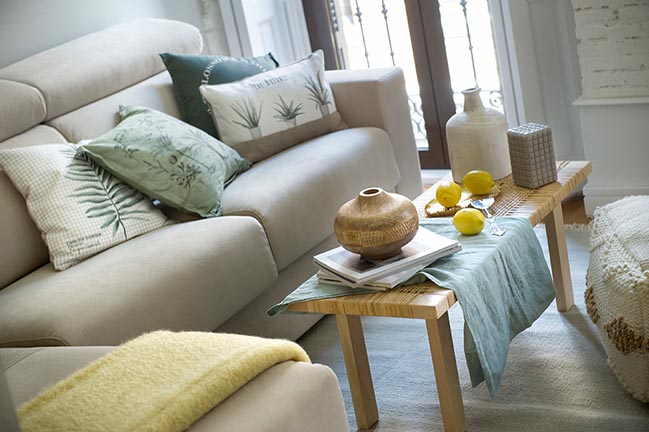
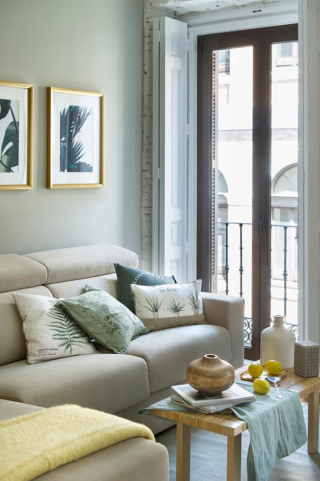
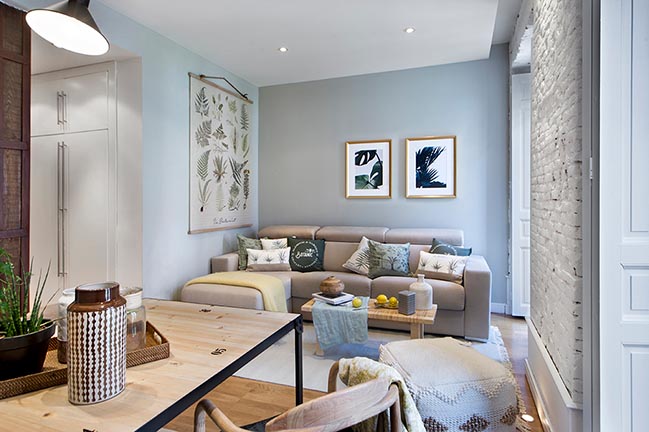
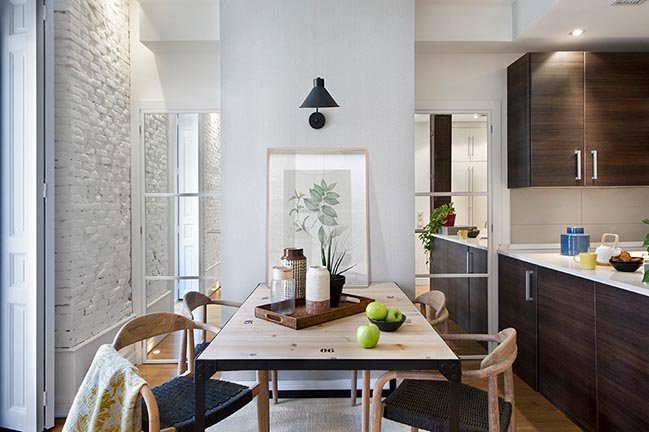
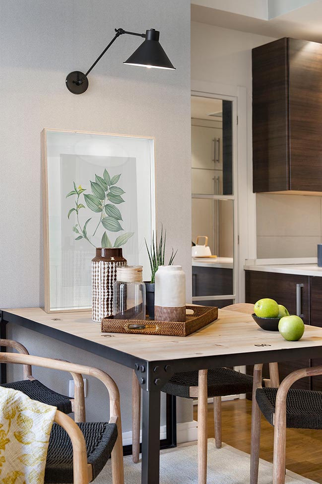
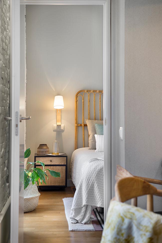
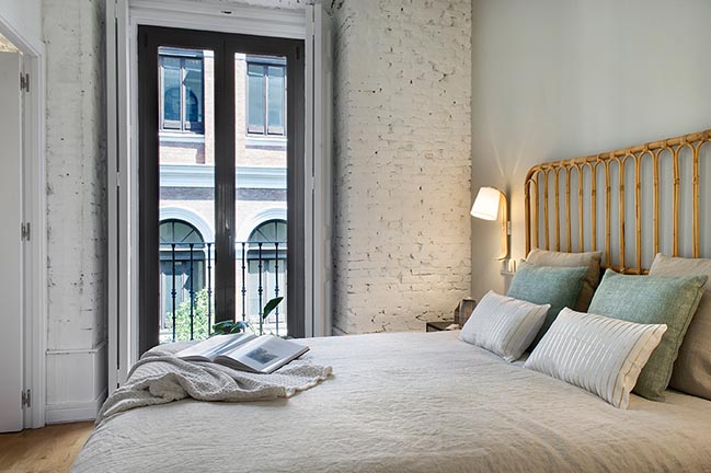
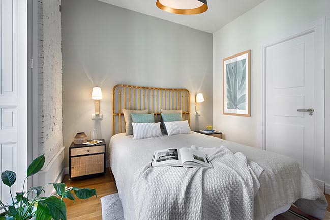
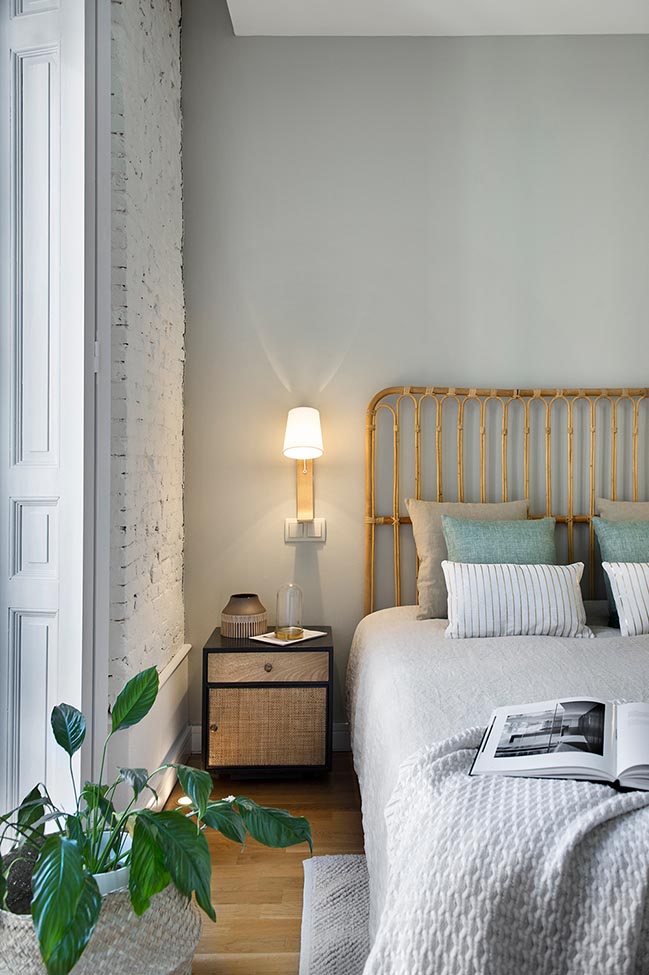
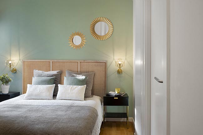
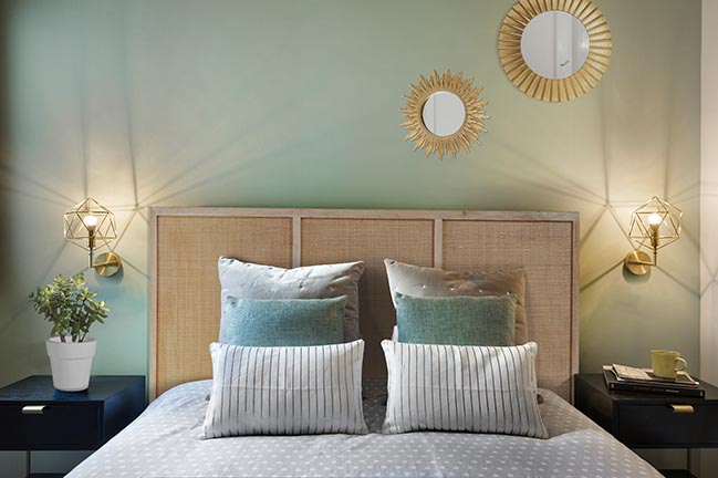
The One with the Botanical Chic - A festival of natural, earthy and vegetal colors and textures that go from the sandy neutrals to the cooler greens, including some orange and golden hues to take your eyes to that specific corner or that particular piece. Here the "green" is not only conveyed through the botanical lithographs, the textile patterns of the decorative cushions, or the mint tone of the wall; the vegetal fibers chosen for the seating of the dining room, the coffee table and the pouf´s raw lining are "green" in spirit too; also, the bamboo headboard of the bed in the bedroom matching the wicker door fronts of the nightstands; and all linen textiles ranging from linen to silk and cotton want to inscribe themselves into this natural trend. ¿Would you say this is rustic? Perhaps, the molded skirting boards in white, in conjunction with the mirrored doors and the architectural and decorative lighting help contain that “cottage” “look & feel” while providing instead a hint of sophistication to a scheme that otherwise might have seemed too Provencal. If this "little apartment" has not left you "green" with envy, try taking look at the next one.
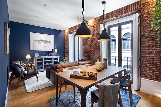
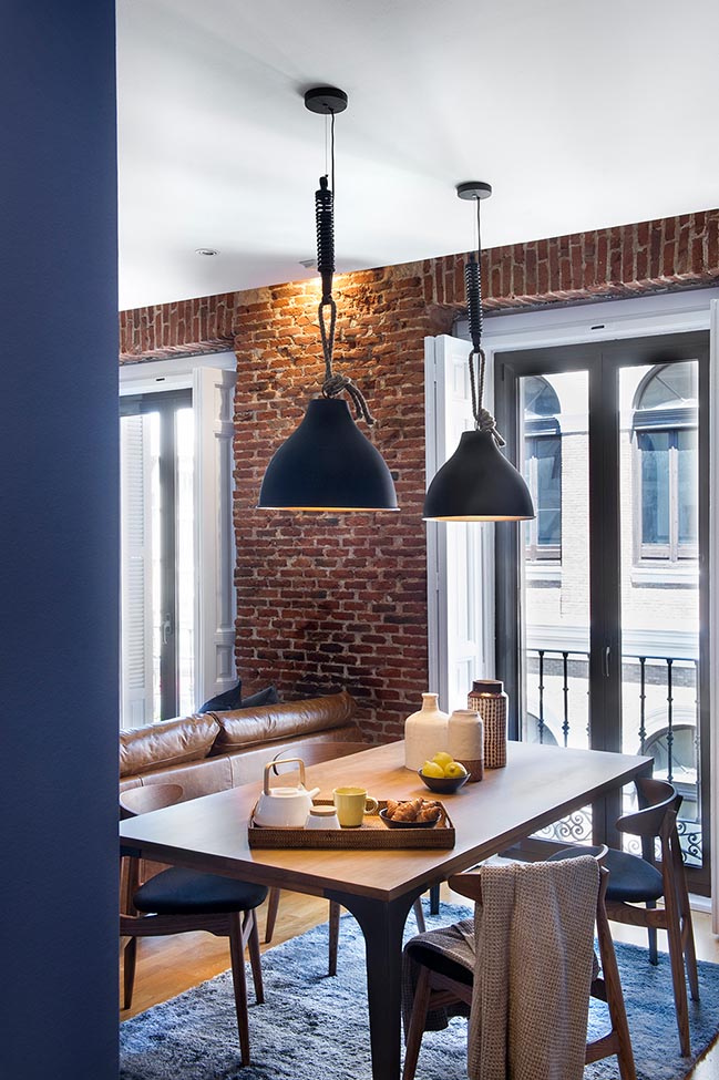
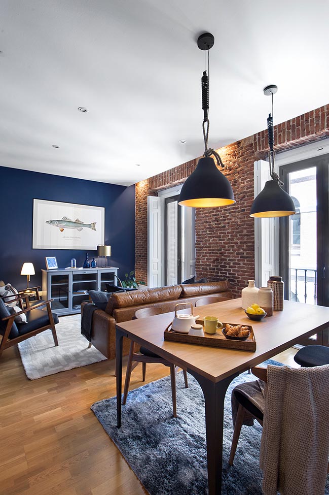
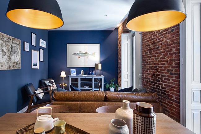
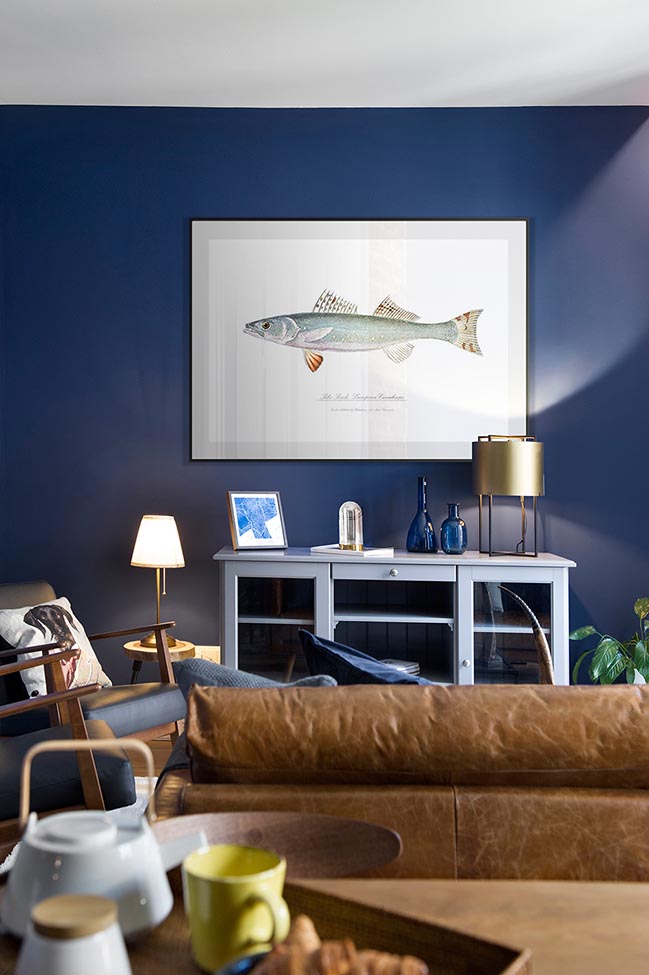
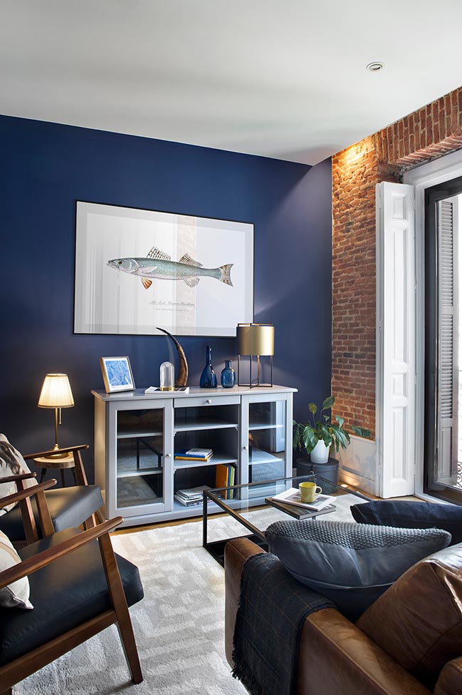
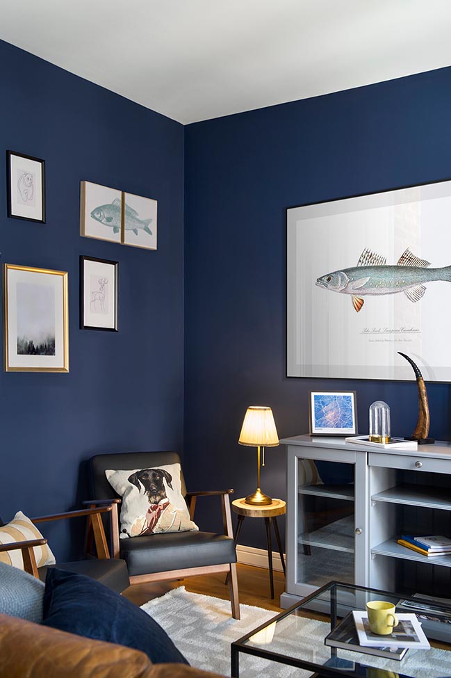
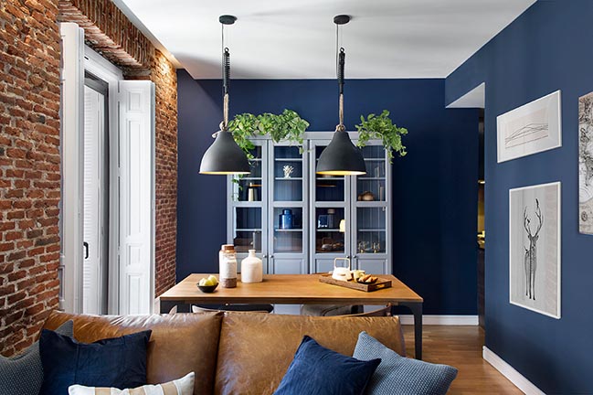
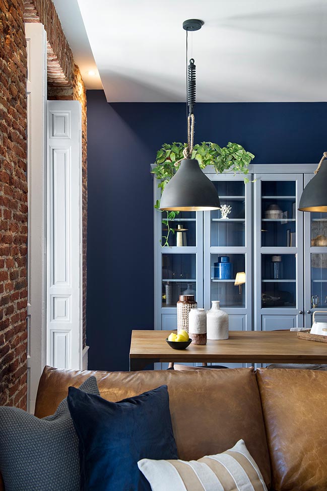
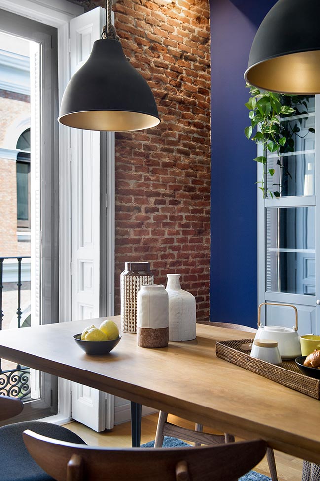
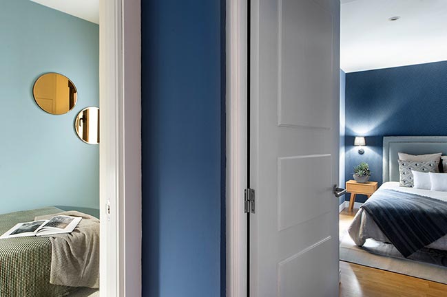
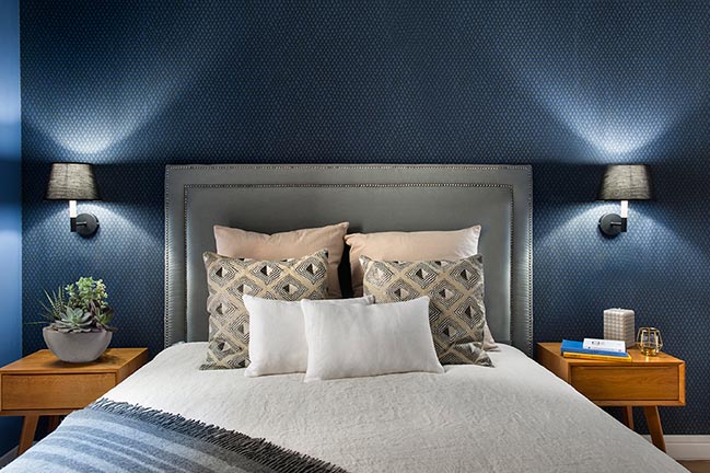
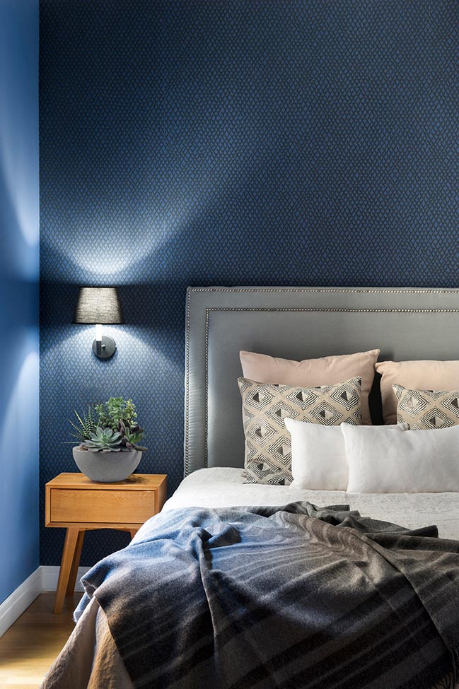
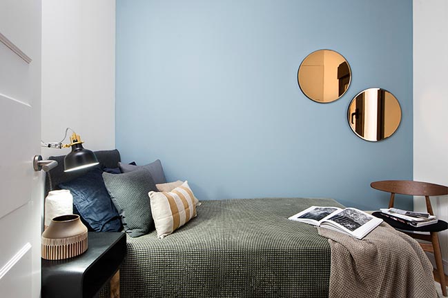
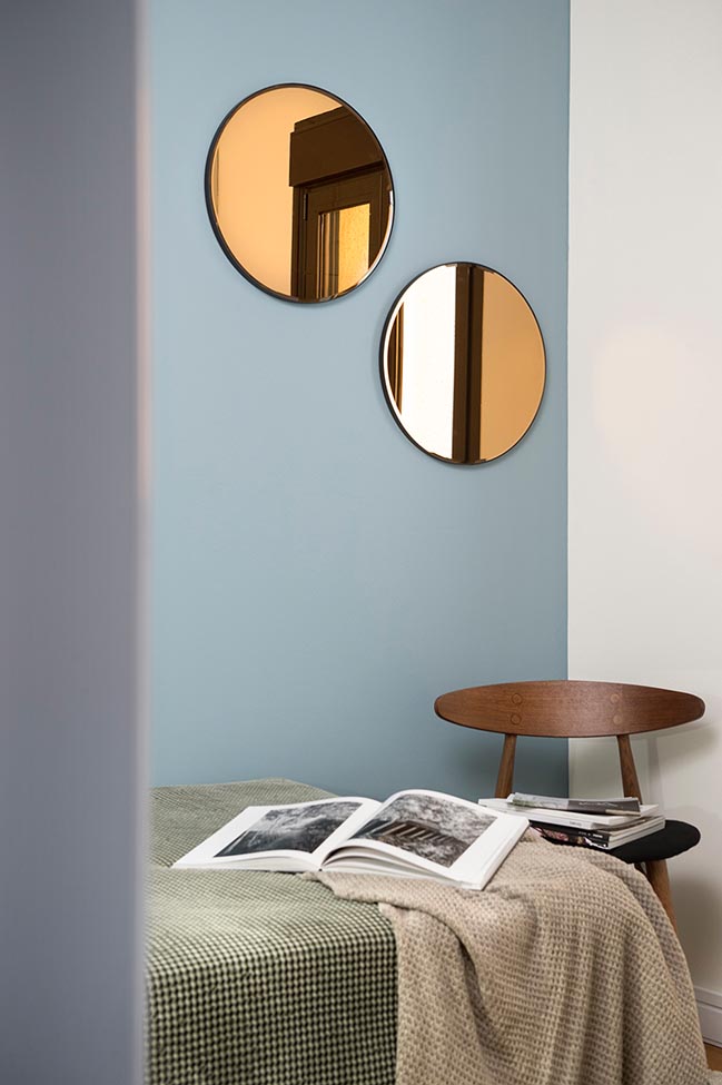
The One with Brit-Blue - Was that style called Oxford or Cambridge? Neither we know this nor is it, truly, so crucial, but who said that one could not combine all those aged leathers, those velvets, those woods and those Chesterfield sofas with enveloping protagonist walls painted in deep (and electric?) blue? Who said that distressed brick walls only worked within the most rabid industrial style ambiances? Are maps, fish and dogs too masculine motifs? Or is it possible to "feminize" a little the whole set by including greenery, mirrors, lighting and decorative details in gold, here and there? Was versioning that deep blue to a lighter aquamarine tone in the second room, or representing it in all its depth, but through a patterned wallpaper on the headboard wall a risky decorative pirouette or do you consider it instead a (stylistic) betrayal? No need to decide now! Before, why don´t you just join us to visit the third of the apartments.
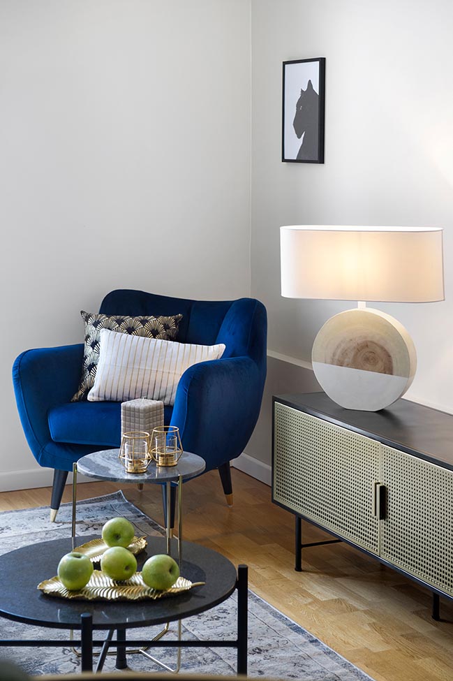
The One with Organic Lux - Can decorative luxury be approached from a more organic and less "green" perspective? It can! The wood and marble grain can be combined with golden and stony structures. The uniform softness of the velvet may indeed work with organic-inspired graphic patterns in the form of shells or petals. You can superimpose images of a “raging until abstraction” sea to that of a tame black panther. You can dye leaves gold and turn them into plates; bottles to blue so that their color "floods" the surrounding walls; and to frame our own reflection in gold to see yourself “shine”, every day. You can assemble all the above on top of Persian carpet over which it would be a pleasure to walk barefoot while covering the bed with gray dots, gold stripes and green gabardines over which it would be hard not to dream.
What about you? in which of these three apartments would you prefer to live?

> YOU MAY ALSO LIKE: Un-Lofting Almogavers by Egue y Seta
[ VIEW MORE EGUE Y SETA'S PROJECTS ]
> YOU MAY ALSO LIKE: Ana Apartment in Madrid by Francesc Rifé Studio
>> VIEW MORE SMALL HOUSE DESIGNS <<
Egue y Seta designs three rental apartments in Madrid
01 / 25 / 2019 Do you want to come to Madrid? Try to book yourself a tourist apartment for the weekend using the booking app of choice ...
You might also like:
Recommended post: Kongresshalle Nuremberg by gmp Architekten



![Modern apartment design by PLASTE[R]LINA](http://88designbox.com/upload/_thumbs/Images/2015/11/19/modern-apartment-furniture-08.jpg)


