11 / 23
2021
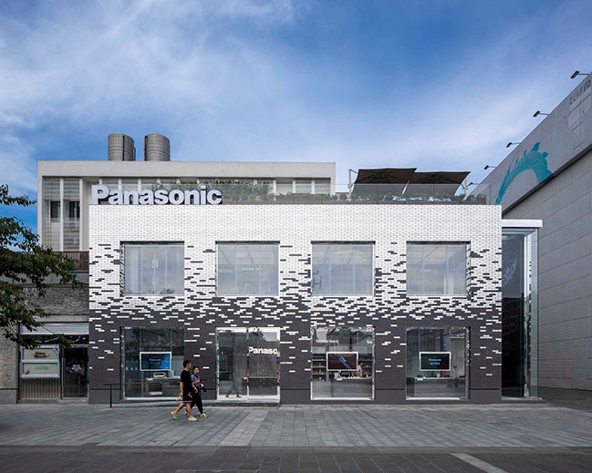
Say Architects has designed a new concept store for Panasonic, a global leader electronics brand, on Hangzhou Lakeside Pedestrian Street...
> Infinitus Plaza by Zaha Hadid Architects inaugurated in Guangzhou, China
> Sino-Italian Cultural Exchange City Reception Hall - The Chinese Cultural Hall by aoe
From the architect: Panasonic entered the Chinese market in 1987, has been committed to the Chinese market to convey the concept of people-oriented. Say also hopes to take this opportunity to reinterpret the localized expression of international brands in China and create a new landmark building for the Lakeside Pedestrian Street.

Visible products
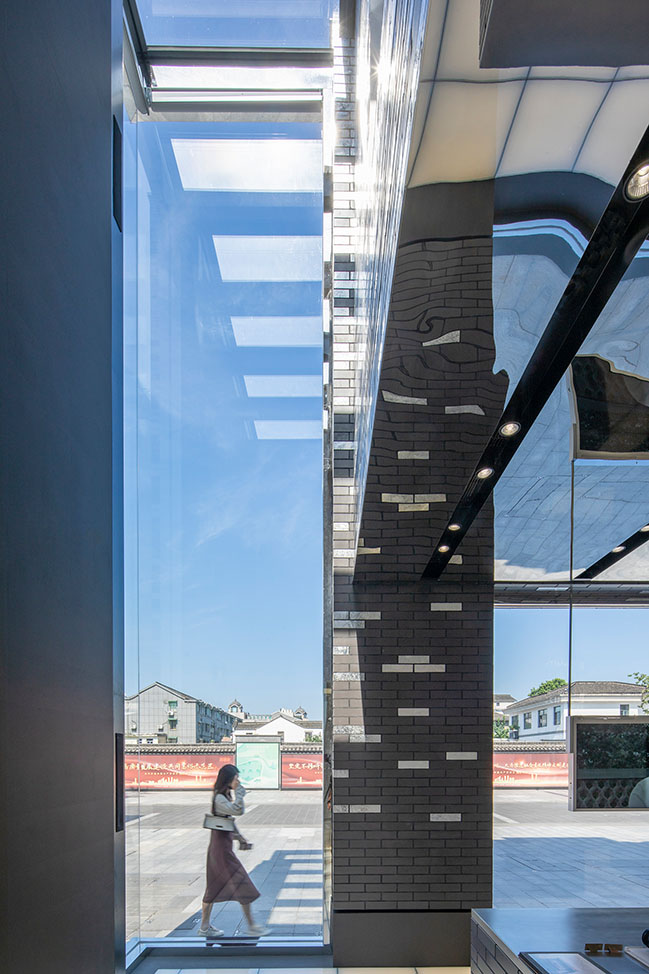
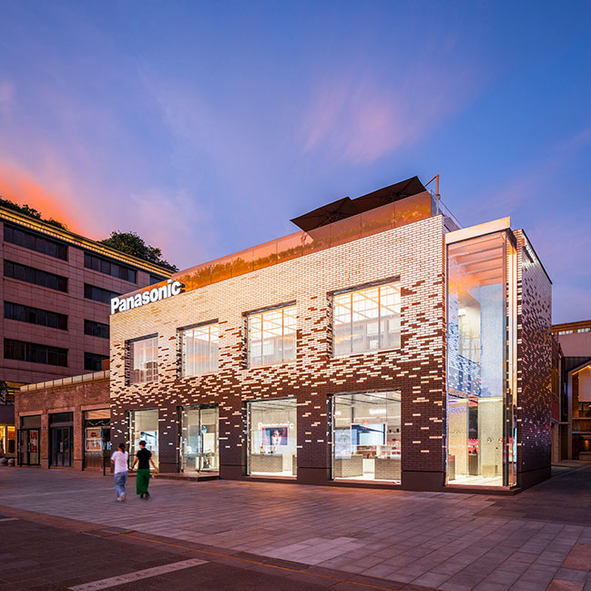
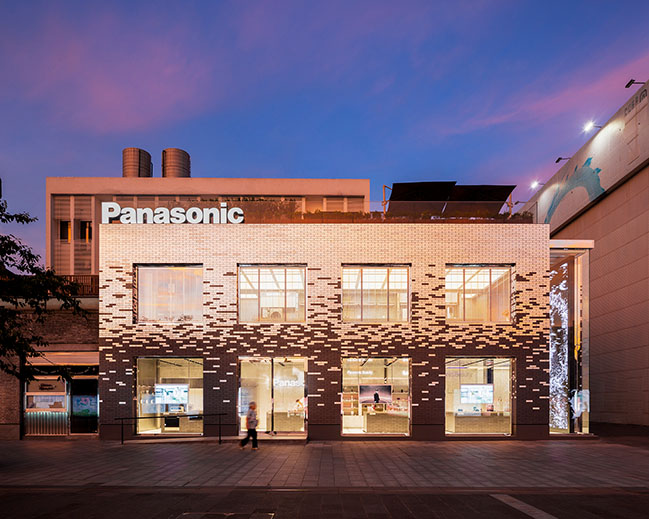
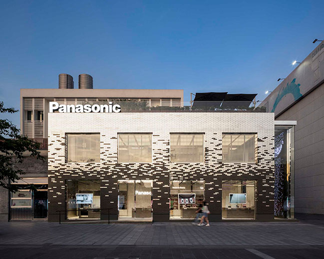
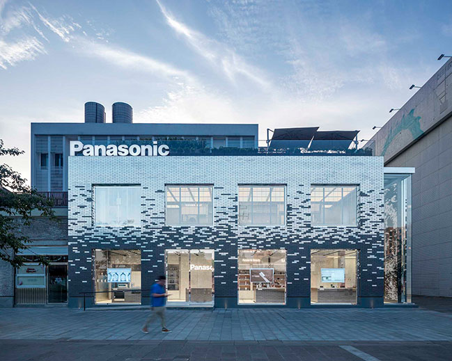
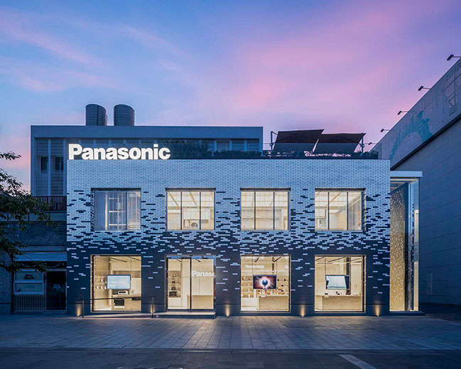
The commercial space of traditional electrical appliances is relatively closed and the facade is usually covered with a large area of advertising and enclosure. And it makes the commercial advertising as the starting point of consumption decisions. However, Say readjusted the facade of the building and opened eight external display windows. These open windows replace the traditional large advertisements and make it easier for visitors to visually touch the brand. The prioritization of the experience feeling brings more vitality to the street and community.
Locality
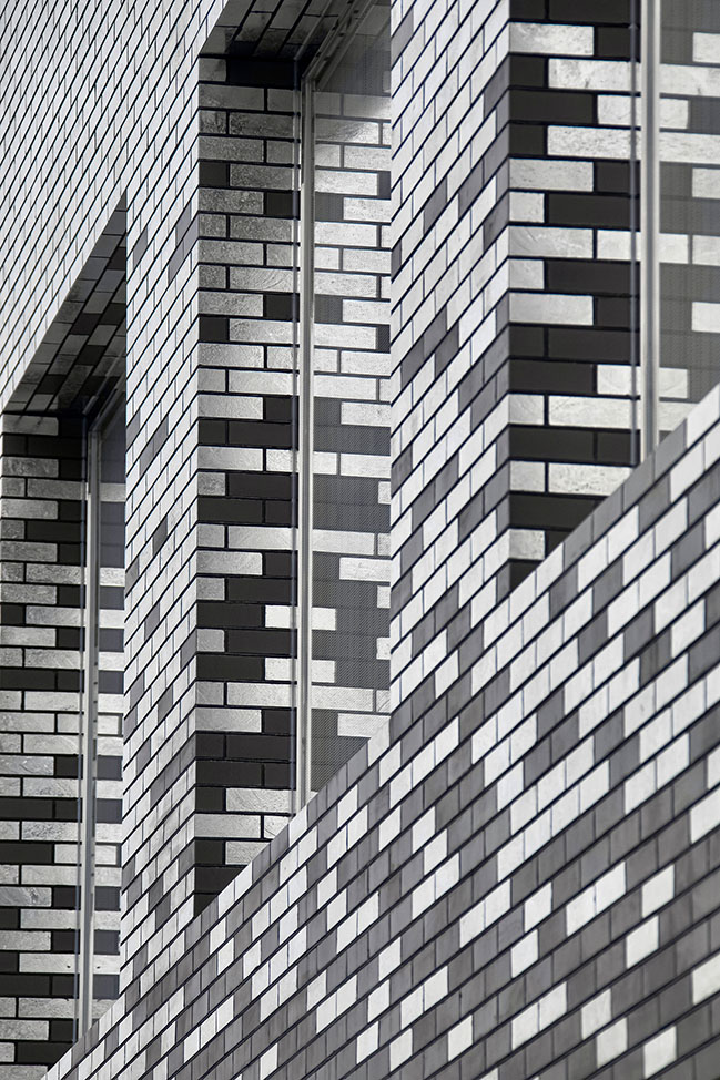
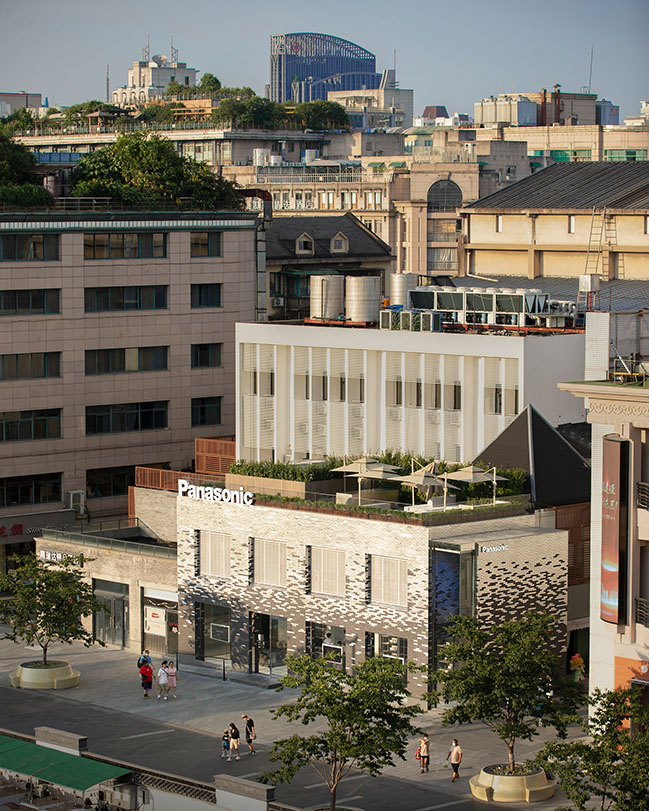
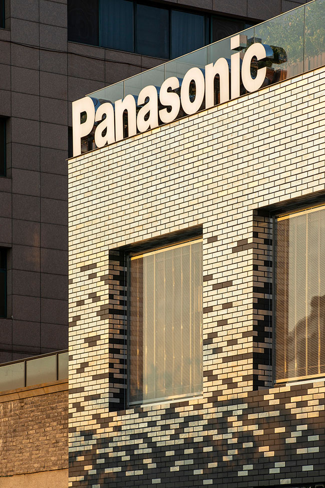
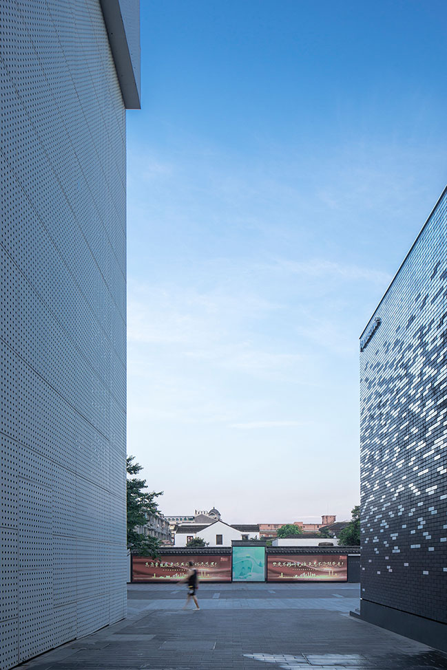
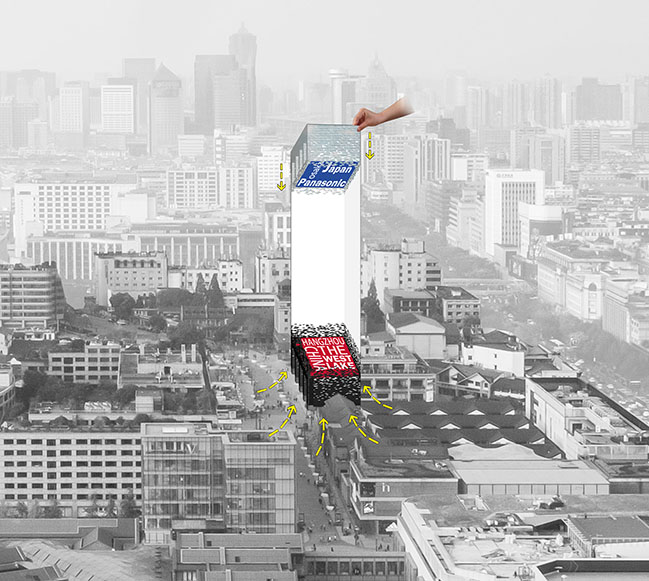
Say regards the whole building as two parts: the lower part is gray bricks rooted in the local area and the upper part is silver plated based on the international area. And there is a natural and smooth transition at the junction. Traditional culture and technological innovation are ingeniously integrated in the facade just like the intimate handshake between Panasonic and Chinese culture.
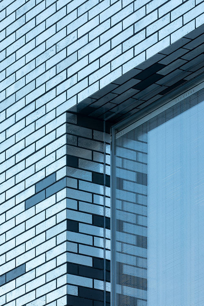
Reduce light pollution
During the process of manual silver plating, a large number of bubbles will be produced in the handmade brick. When producing in the fire, the bubbles break and form a unique natural texture. Therefore, the diffused reflection of lights are carried out, greatly reducing light pollution.
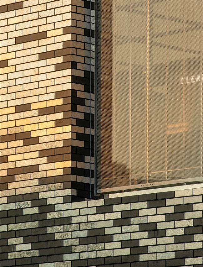
Convey natural emotions
With the rejuvenation of the country's consumer market, Say hopes to create a more vibrant building facade as a brand image. Hand-plated silver bricks replaced half of the gray bricks. From the early morning to the dusk, the building is like a vibrant mirror, happy to show natural colors to young consumers. Seasons, weather and temperatures are integrated into the building facade. The building is very much like a frank and sincere child, passing on the joys and sorrows of nature to every citizen who passes by.
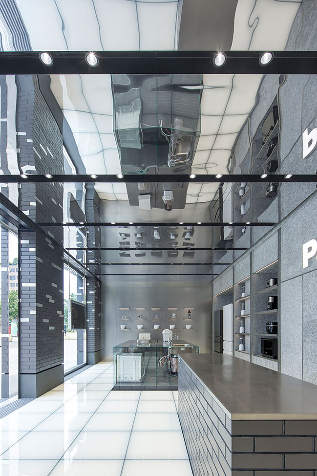
Practical aesthetics
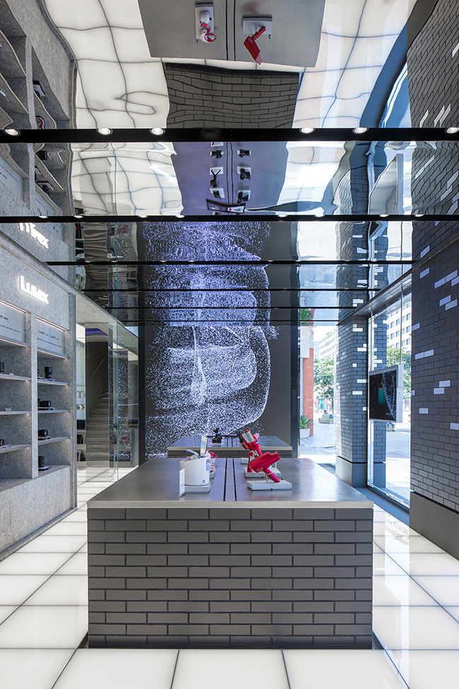
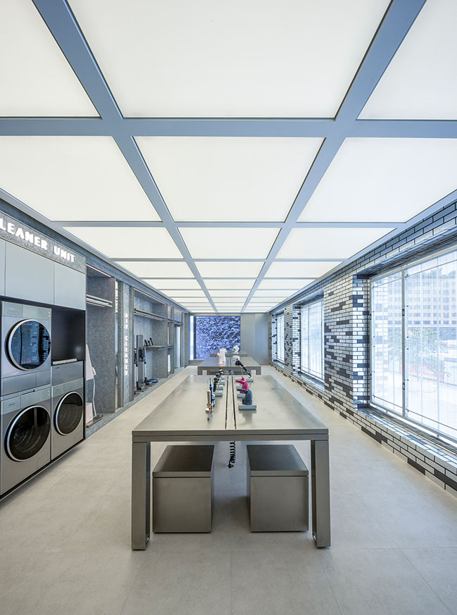
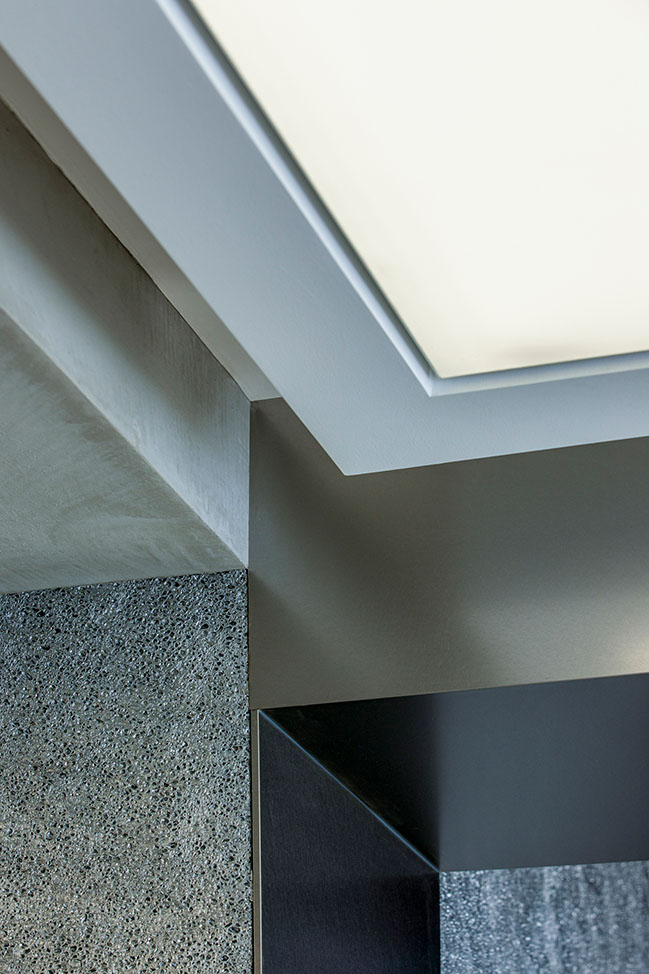
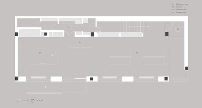
The indoor space is divided into two floors, which is divided into two symmetrical spaces with the floor axis. Different from the traditional display mode of enterprises, the route and the space are divided into one floor of space through four rooted land floating island brick platforms, which also symbolizes the coping strategy of Oriental culture in international culture. The ceiling is composed of thirteen 4.2-meter stainless steel mirror panels to help consumers understand the space exhibits in multiple dimensions. In order to solve the problem of air conditioning maintenance, each plate driven by two customized motors can be lifted separately. They are like Panasonic products, whose visual also pursues the ultimate aesthetics in ensuring good practicality.
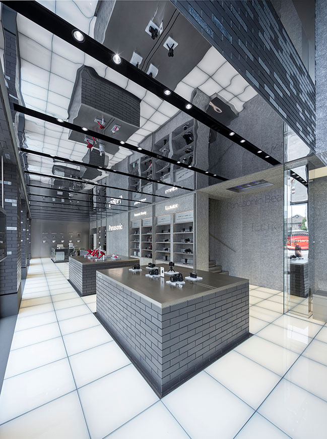
Fascination
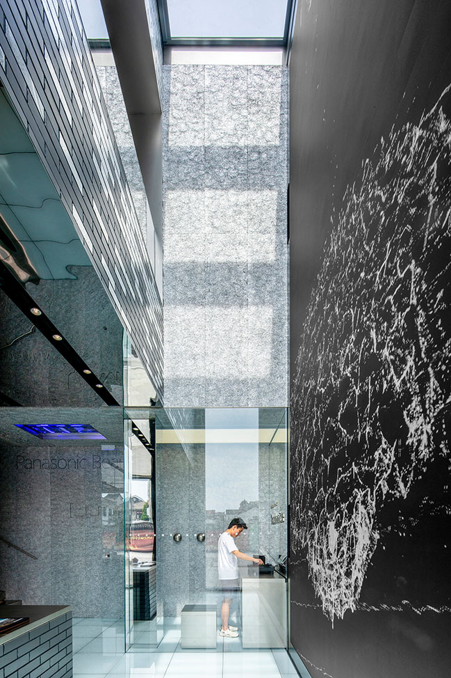
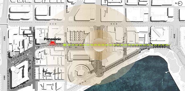
The main road with the largest traffic of Lakeside Pedestrian Street is located in the south of the site, where two pieces of nearly 8 meters of low-e glass form a transparent southwest corner, the internal high space cooperates with LED curtain wall, circularly play a short film created by new media artists Chi ZHANG for the bright house, the implicit artistic creation is brought to every consumer through the most direct way, which is also Say's exploration and practice of new retail space.
Journey of time and space
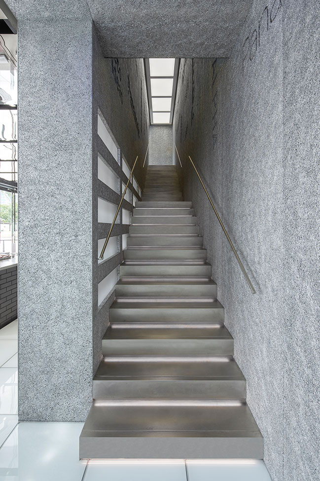
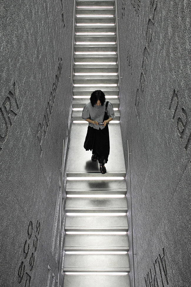
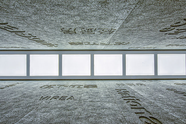
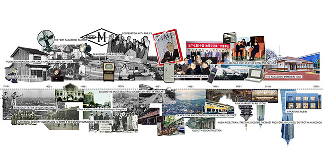
To ensure the maximum display scale along the street, the double running staircases originally are located on one side were converted into straight running stairs and placed behind the display wall. The visual window of Panasonic air conditioning serves as a guide to the entrance to the stairs. The whole staircase is covered by the casting foam aluminum. The century-year development history of Panasonic is recorded in an etching manner through the whole way upstairs, bringing a journey of time and space.

Mirror space
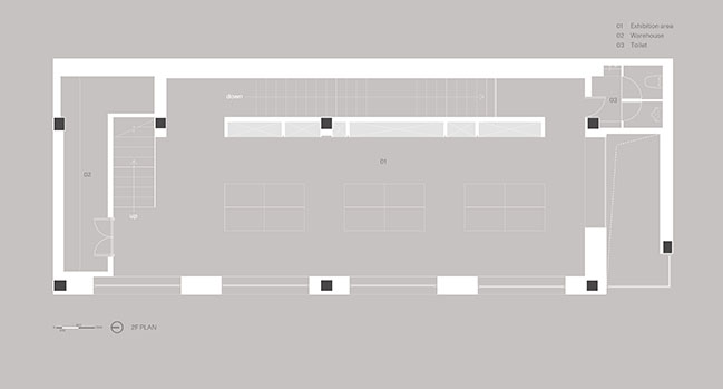
The mirror symmetry space of the exhibition hall on the second floor and the ceiling echoes the glowing ground on the ground floor, and the walls extend from the facade to the interior maintaining the continuation and unity of the style. At the end of the space is the indoor terrace on the second floor and LED's video art consistently conveys the brand spirit, while the array of CNC TVs on the other side becomes the guide to the penthouse garden.
Secret garden
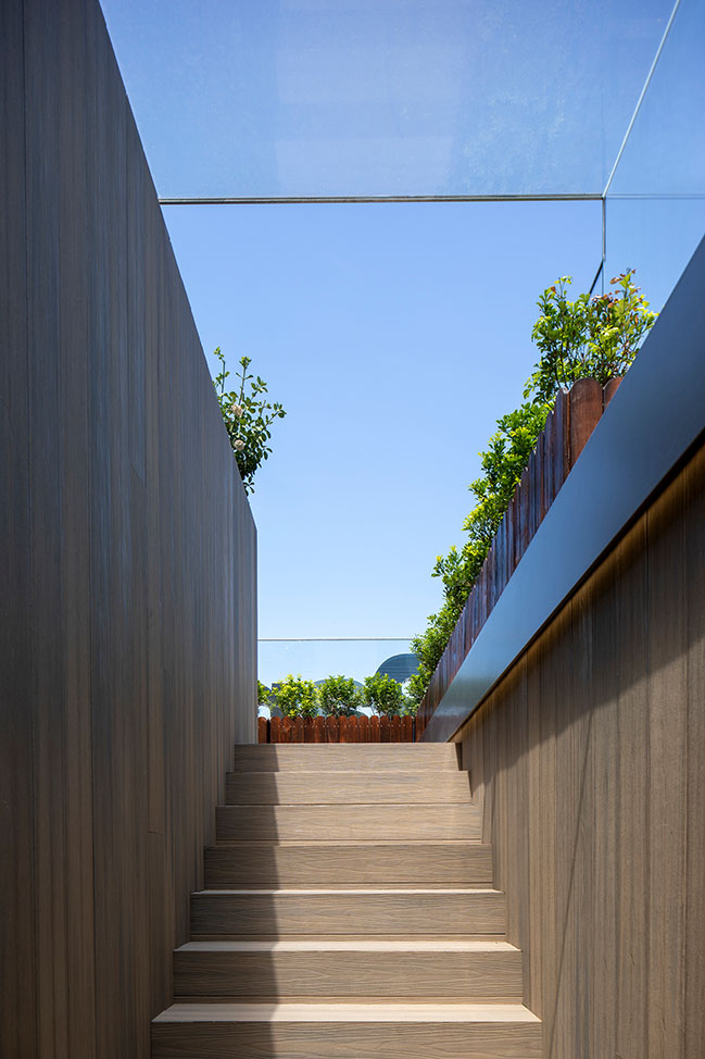
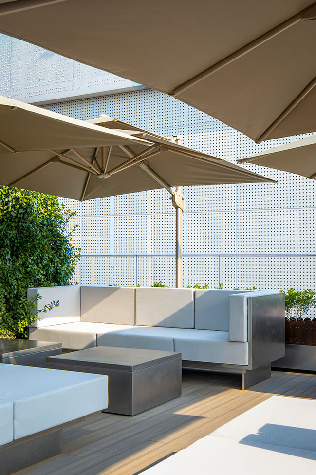
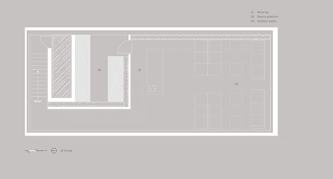
The mix of warm color floors and stainless steel elements makes the abandoned roof form into a private and young garden terrace, bringing flexible possibilities to the traditional commercial space.
Panasonic Bright House integrates nature, citizens, culture and corporate brands, appropriately brings humanities and technology into people's lives, and also shows the world the localization expression of international brands in China.
Design Firm: Say architects
Client: Panasonic
Location: Hangzhou, China
Year: 2021
Area: 350 sqm
Partner-in-charge: Yan Zhang, Jianan Shan
Project Team: Danli Song, Siyun He (Model Making)
Construction Consultant: Lihui Feng
Construction: DaJiang Builder
Photography: RAW VISION
YOU MAY ALSO LIKE: Changzhou Culture Plaza by gmp Architekten

YOU MAY ALSO LIKE: DoThink · Wings Hangzhou Sales Center by GFD



Panasonic Flagship Store by Say architects
11 / 23 / 2021 Say Architects has designed a new concept store for Panasonic, a global leader electronics brand, on Hangzhou Lakeside Pedestrian Street...
You might also like:
Recommended post: UNStudio designs a new mixed-use development in Nanjing
