09 / 09
2024

> Sham Shui Po Penthouse by Hintegro
> Mayfair Garden by LITTLEMORE INTERIOR DESIGN
Project's description: A newly married young couple has approached Hintegro, requesting a dream home design. The clients have a fondness for mid-century and wooden furniture, so we have crafted the aesthetic around these elements. Additionally, the couple desires to evoke an 80s/90s ambiance, which aligns with the background of Hintegro's lead designer, Keith.

The clients also seek a versatile home - one that caters to their current needs as a couple, yet remains adaptable to accommodate potential changes, like a puppy or newborn. To achieve this, the design incorporates a balance of vibrant and muted colors, as well as flexible furniture.

Be versatile
This young couple has plans to grow their family size in the next few years. To prepare for these changes, we have used loose furniture in multiple spaces. For example, the wheeled L-shaped cabinet in the living room can be moved around when the clients want to bring in larger furniture for a newborn or pets. Additionally, the loose storage bed in the guest room allows the clients to restructure the space based on the newborn's needs.
Beyond the furniture, the clients also specially requested the use of tiles throughout the home. Tiles were selected because they are stain-resistant and water-resistant, making them easy to clean as the family grows.

Fondness for mid-century and wooden furniture
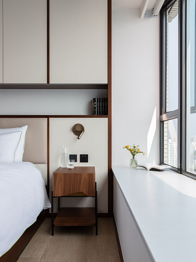
The client has a particular fondness for walnut-colored furniture, which has ultimately led to the incorporation of pieces from a few Scandinavian brands, such as the "Cocktail Table" from Finn Juhl and the Carl Hansen & Son CH33T dining chairs. These furnishings blend seamlessly with the built-in furniture, where Keith has utilized hardwood trims and plastic-laminated cabinets throughout the home. This not only resonates with the mid-century look the client desires but also adds a personal touch, reflecting the client's background in the 90s and Keith's in the 80s, as this type of cabinetry was heavily used during those periods.
Another standout piece in this home is the cabinet on wheels that spans from the foyer into the living room. In addition to the hardwood trims and plastic-laminated cabinets, the set of drawers in blue gradients evokes Finn Juhl's iconic sideboards with a similar hue scale.
Keith has also introduced Japanese materials and furniture into the home, such as pieces from Nissin, one of the largest furniture brands in the Hida region of Japan. Additionally, the master bedroom's wainscoting features a traditional Japanese Naguri scalloped pattern, adding an Eastern touch to the space.

Work Life Balance
As the client works from home on certain days during the week, she prefers to log in from the dining table instead of setting up a desk in a multipurpose walk-in wardrobe. This is not only because the dining area enjoys a direct sea view, but also because it provides ample space for her to spread out her work materials.
Additionally, the coffee machine and a sink are located just behind her "work station." This setup allows the client to have everything easily accessible while she is working or hosting friends. Family and friends can simply grab a cup of water without having to go into the kitchen.
The refreshment station also extends back into the kitchen preparation area, situated around a fixed textured-glass corner. This design choice lends continuity to the space and visually enlarges the area.
The guest room also serves a dual purpose as the client's personal man cave. When not in use by guests, this space becomes a dedicated retreat where the client can indulge his passions. As a music enthusiast, the client has set up a small drumming area in the corner of the room, where he enjoys playing in his free time.

The Balance in Colors
The two clients have different tastes when it comes to colors, with one preferring more vibrant shades and the other gravitating towards more subtle tones. Striking a good balance between these preferences is also one of Keith's priorities.
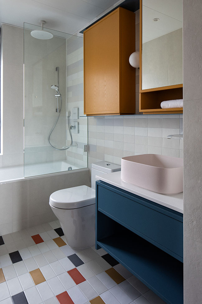
In general, the design scheme utilizes a majority of cool shades across the various spaces. However, to create distinct visual highlights, select warm tones have been incorporated, such as the yellow ceiling in the corridor and the use of multiple colors in the guest bathroom. This approach allows the space to maintain an overall cohesive aesthetic while still catering to the differing color sensibilities of the two clients.

From Clients to Working Partners
This project stemmed from a referral by the client's sister, who had met Keith at a business event. She felt Keith would be a good fit for her sister and brother-in-law, as they all share an appreciation for Japanese and Scandinavian design and craftsmanship, much like Keith himself.
Through the collaborative process with this young couple, Keith and the clients discovered that they also aligned on core values and visions when it comes to their work. This synergy ultimately led to one of the clients joining Keith's marketing team.
This project serves as a great example of how a design engagement can unexpectedly lead to broader collaborations and new opportunities.

Interior Design: Hintegro
Location: Hong Kong Island, Hong Kong
Year: 2024
Project size: 1296 ft2
Site size: 1724 ft2
Photography: HDP Photography


Mid-Century Apartment Design with 80s/90s Vibe for a Young Couple by Hintegro
09 / 09 / 2024 A newly married young couple has approached Hintegro, requesting a dream home design. The clients have a fondness for mid-century and wooden furniture, so we have crafted the aesthetic around these elements...
You might also like:
Recommended post: Astonishing house in Colorado by Patrícia Martinez Architecture


![Modern apartment design by PLASTE[R]LINA](http://88designbox.com/upload/_thumbs/Images/2015/11/19/modern-apartment-furniture-08.jpg)


