11 / 09
2020
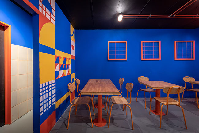
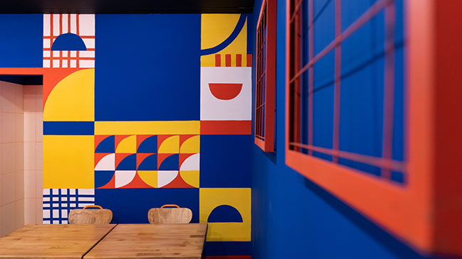
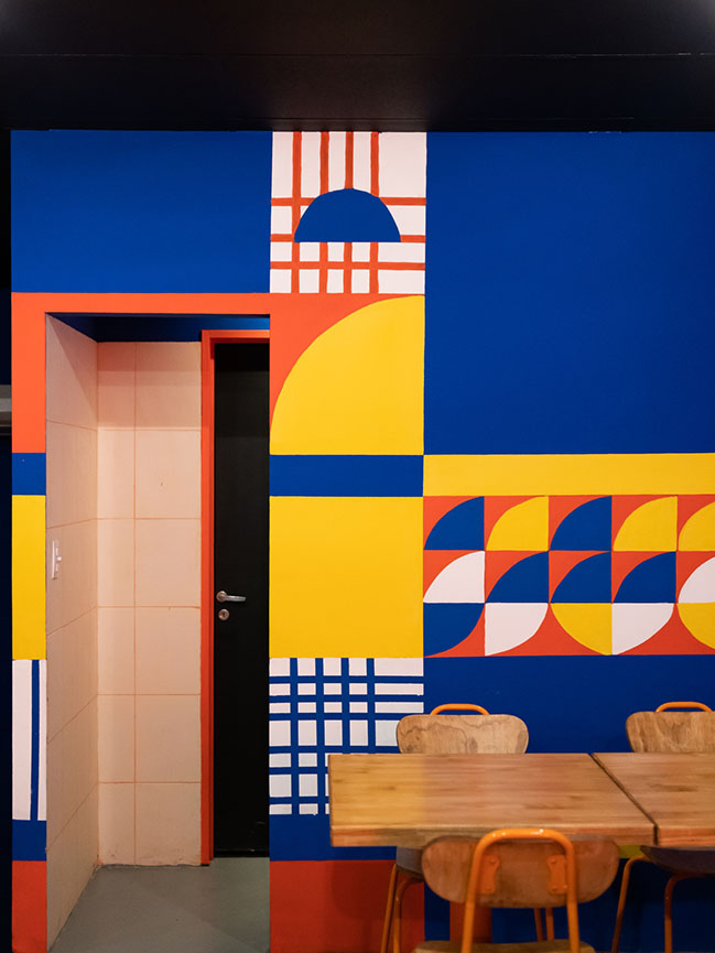
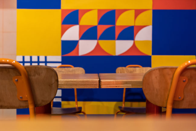
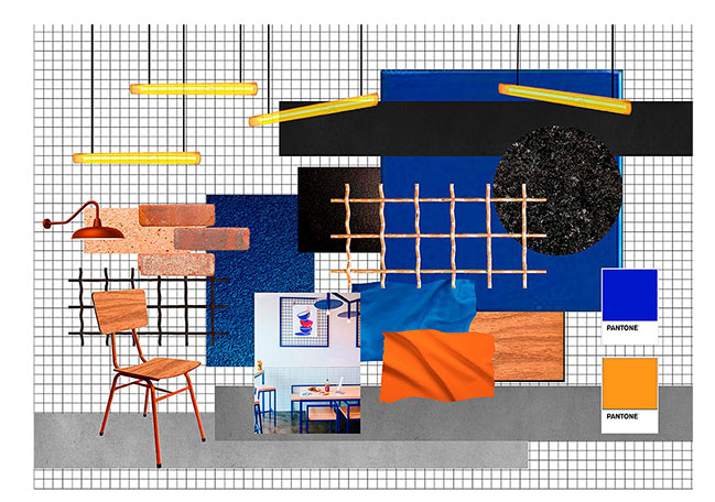
Hoppines’s concept and identity was based on in the eighties, with its vibrant colors and eccentric geometries, the pornfood, and the rebelliousness of that time period...
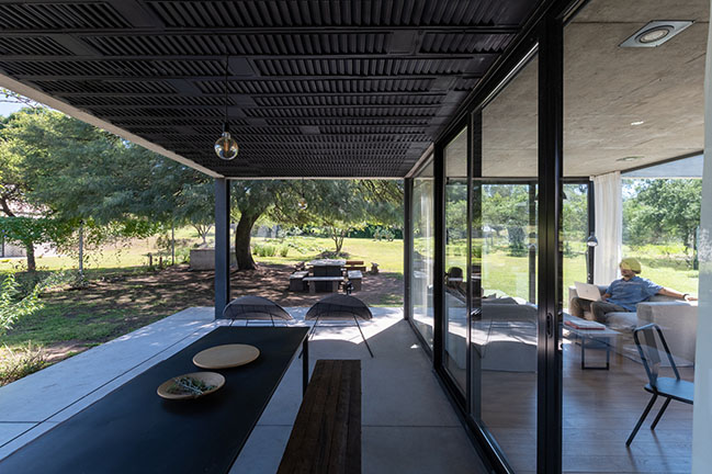
Architect: Estudio Montevideo
Client: Juan Finocchiaro
Location: Córdoba, Argentina
Year: 2020
Area: 120 sqm
Architect in Charge: Ramiro Veiga, Marco Ferrari, Gabriela Jagodnik
Team: Julieta Astorica, Juan Baralo
Photography: Gonzalo Viramonte
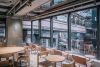
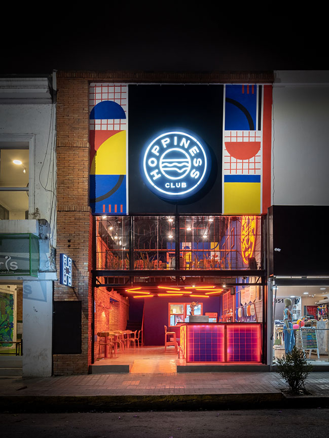
Project's description: We were asked to carry out the restyling of a commercial premise that started as a brewery, and the public started choosing it because of its burgers. That resulted in the need of giving the place a functional and aesthetic turn. That public became so regular clients of the place that it started to operate as a friends’ club.
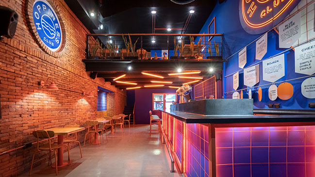
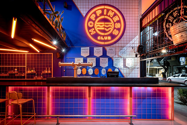
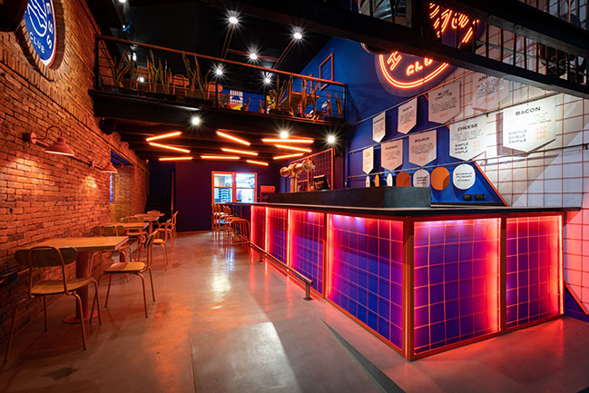
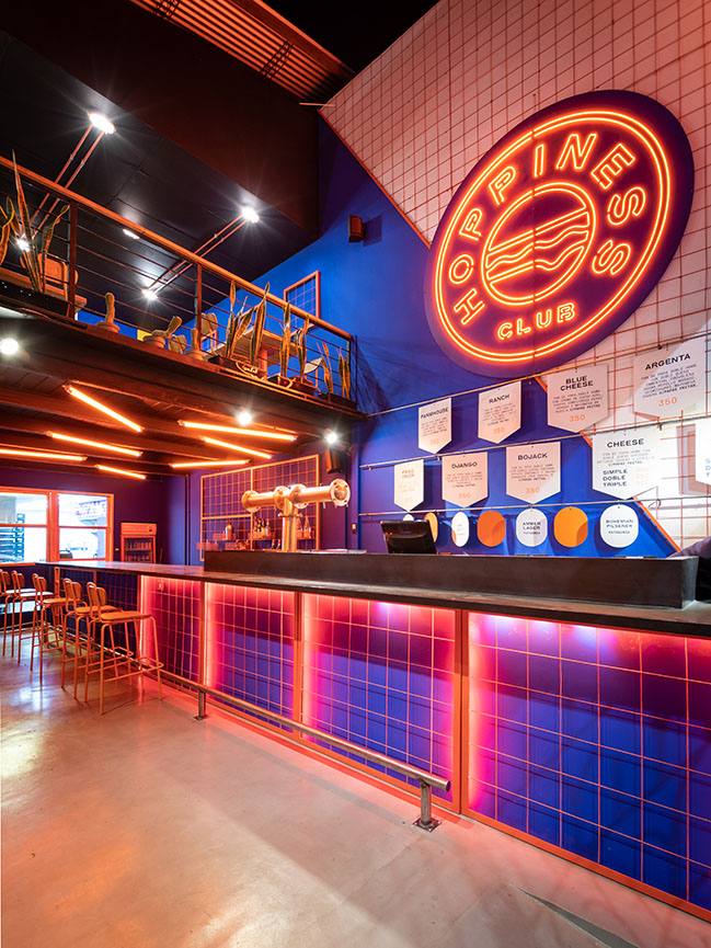
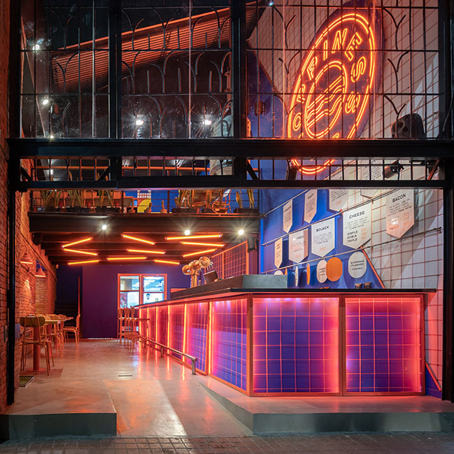
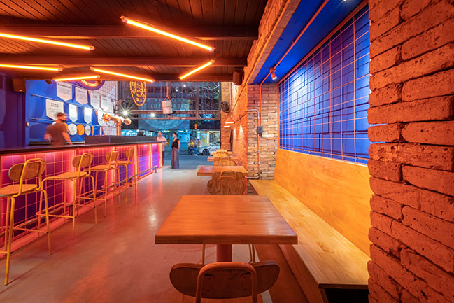
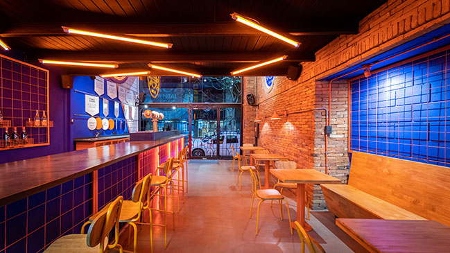
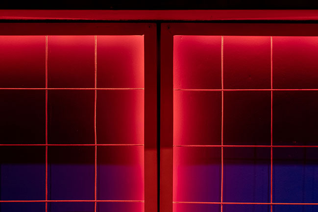
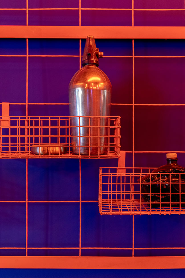
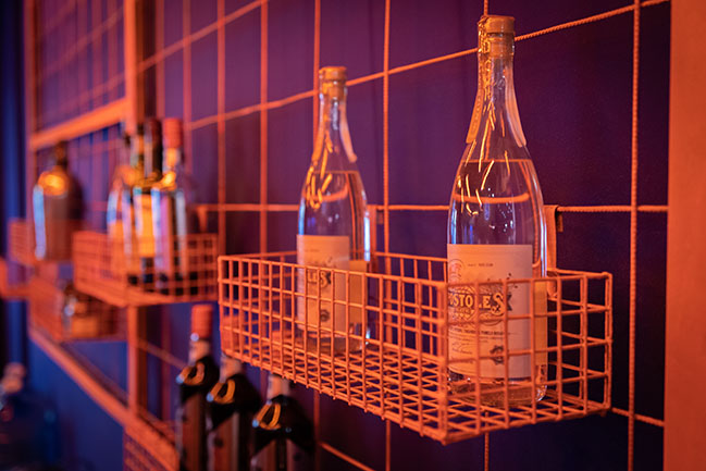
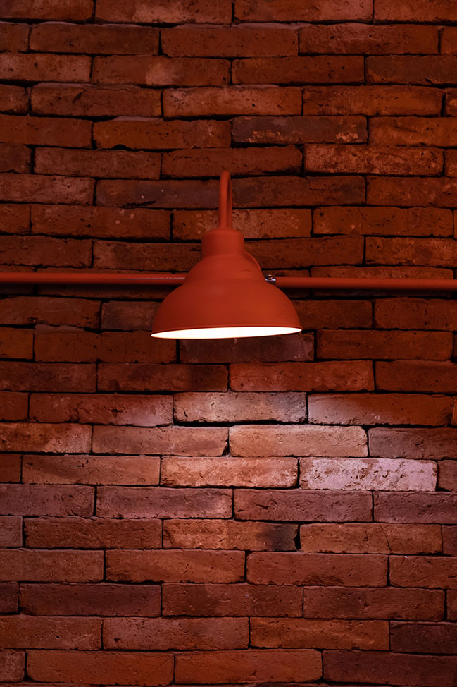
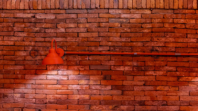
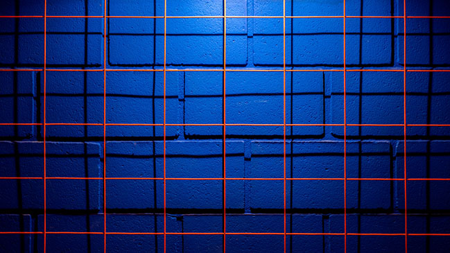
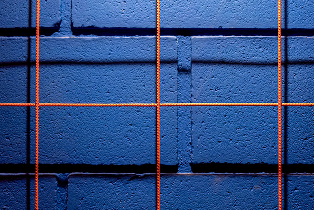
In order to make the idea of a club stronger, we chose the colors that would represent it from now on. Blue and orange. The latter is applied to materials such as pipes and meshes. In turn, the former is applied in plains such as walls and big areas.
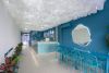
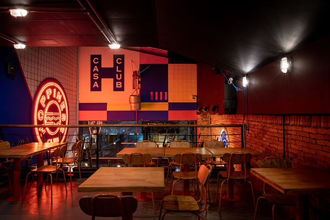
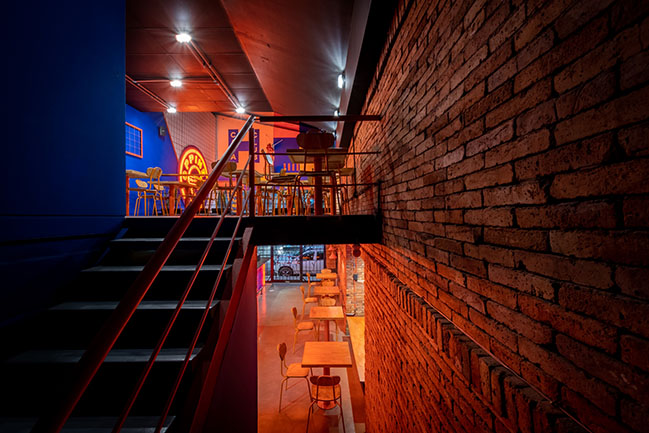
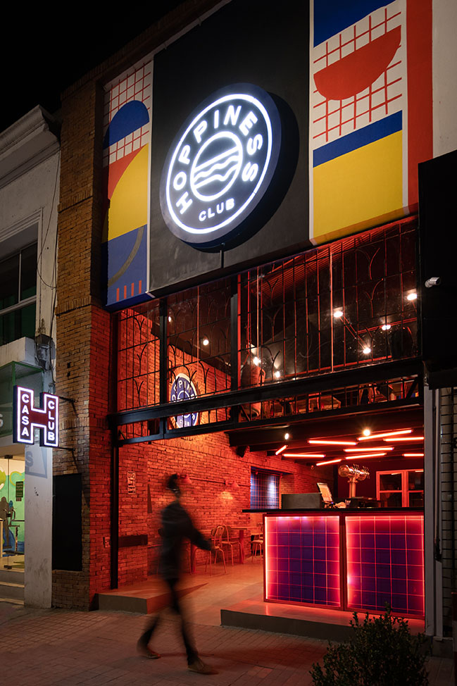
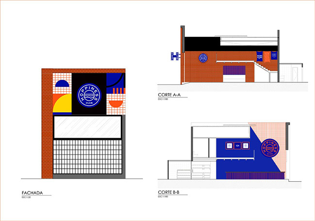
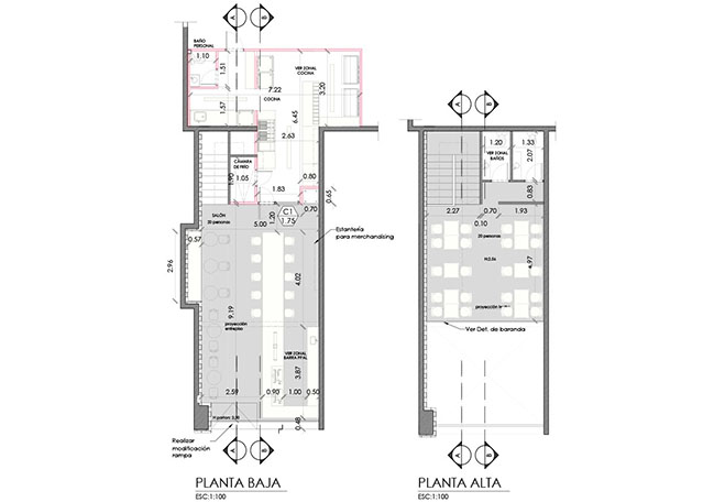
The premises remains partially open with a liftgate and a sliding roof that creates an entrance patio. At the back, there is a roofed area and an upper floor that has a balcony facing the backyard.
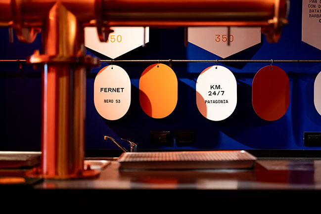
With an area of just 80 m2, we seek to highlight the importance of providing good service, and we invite the client to gather around a big counter, which goes from the sidewalk to the kitchen located at the back of the premises. The fact that the counter reaches the line of the sidewalk results from the idea that the premises works with a central and well-developed take away service.
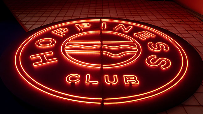
The wall behind the counter is split into two by a diagonal line that divides a structural framework of orange and blue mesh. Just in the middle of the place, a neon-light sign gets all the attention from all sides.
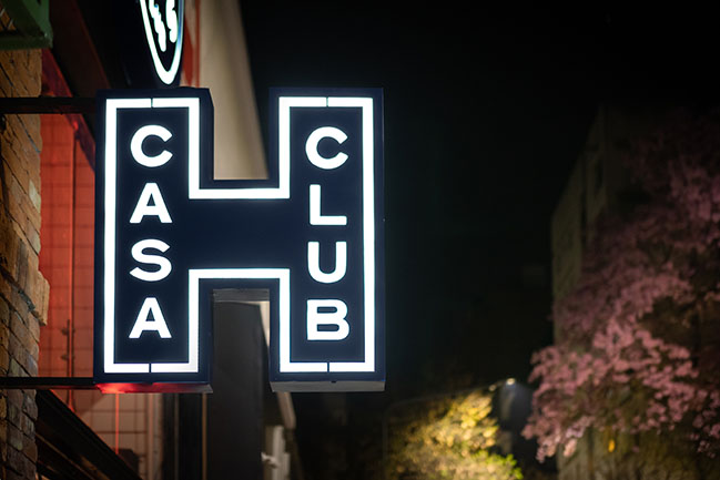
On the facade, patio and upper floor, there are murals specially designed with the new branding developed for the premises, with geometric shapes, representing the different products for sale.
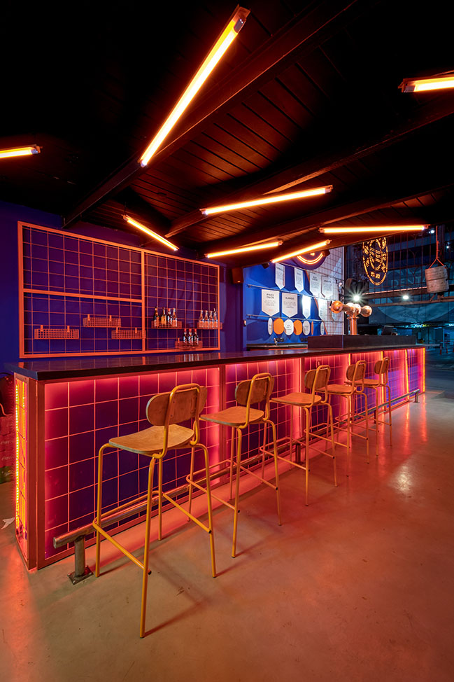
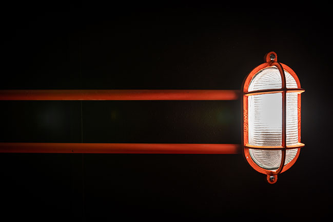
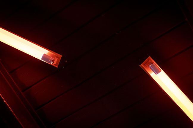
The orange lighting designed with fluorescent tubes, neon lights and led strips completes the atmosphere of the friends’ club that we wanted to achieve.
The words that echoed at all times in the development of the project were “open”, “invite”, “surprise” and “accompany” the client in a new experience at a place already known, but renewed.
YOU MAY ALSO LIKE: Tokin Sushi Bar by Estudio Montevideo
YOU MAY ALSO LIKE: Sifonda 2 by Estudio Montevideo
YOU MAY ALSO LIKE: Quade: A bookstore in Córdoba by Estudio Montevideo


Hoppiness by Estudio Montevideo
11 / 09 / 2020 Hoppines's concept and identity was based on in the eighties, with its vibrant colors and eccentric geometries, the pornfood, and the rebelliousness of that time period...
You might also like:
-
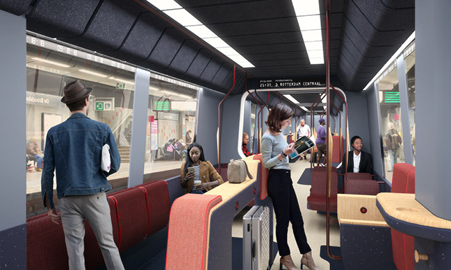
10/28/2020
Mecanoo designs new RET Metro interior
Recommended post: House SI by GRUPO Studio