03 / 26
2020
HUIYA CERAMICS entrusted Foshan Topway Design to conceive its headquarters and exhibition hall via transforming an old building...
Design firm: Foshan Topway Design
Client: HUIYA CERAMICS
Location: Bldg.16, Taobo Avenue, Nanzhuang Town Chancheng District, Foshan, China
Year: 2019
Area: 4,000 sqm
Chief designers: Wang Zhike & Li Xiaoshui
Design team: Foshan Topway Design
Photography: Ouyang Yun
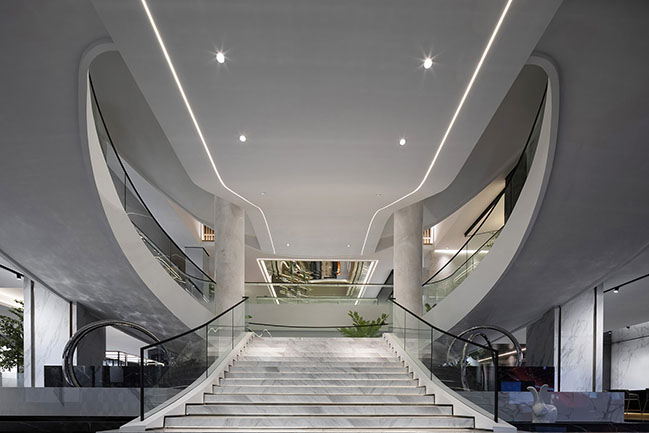
Project's description: Based in Foshan within the Pearl River Delta known as a manufacturing hub, HUIYA CERAMICS is a leading building material supplier which has witnessed the development of China’s ceramic tile industry. In face of drastic changes of the market and industry transformation, what should traditional manufacturing brands do? Under such circumstance, HUIYA CERAMICS entrusted Foshan Topway Design to conceive its headquarters and exhibition hall via transforming an old building.
The old building constructed 20 years ago is a historical heritage that carries past memories. However, it posed some challenges to the design because of the inappropriate and outdated architectural structures.
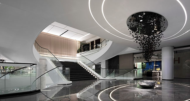
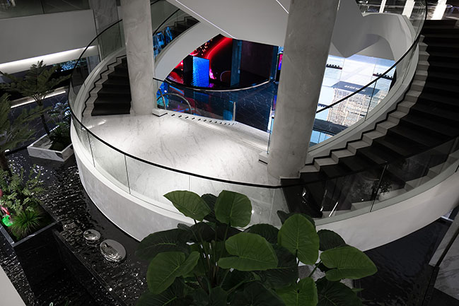
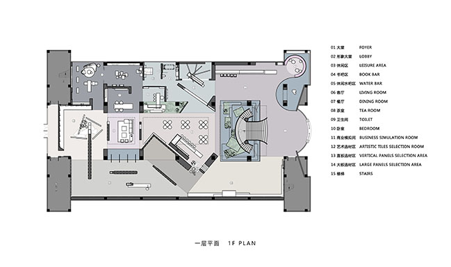
For instance, there is a massive staircase fronting the foyer, which divides the space into two sections and forms a huge hollow space in the middle. The goal was to link up the separated spaces, create fluidity and inject new vigor into the old building, through transforming parts of the space while remaining the main architectural structures unchanged.
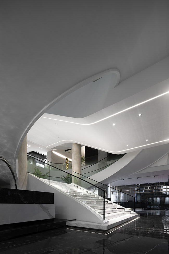
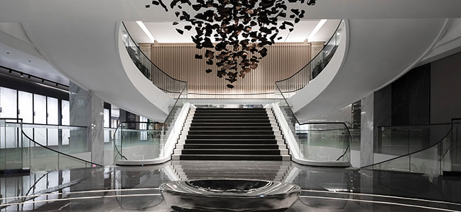
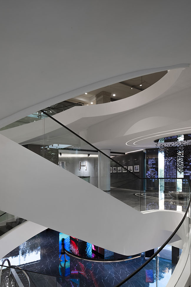
The designers tried to integrate the concept of free space with industrial civilization, and incorporate modern aesthetics into the traditional space. They intensified the curved shape of the staircase based on its original structure, which produces fluidity and guides the sight line. The white finishes make the originally cumbersome staircase appear lightweight and lively. The white ceiling is like an extending fabric curtain, and the two light strips highlight its flexible and graceful form, just like two clues telling stories of the past. During the renovation, the designers deliberately retained two beige columns on the two sides of stairs, which symbolize pillars of the brand and also pay tribute to the past.
At the bottom areas of the staircase, several different “boxes” are stacked naturally, with a stainless steel ring inserted in. Water flows between “boxes”, endowing the space with a free, tranquil yet dynamic ambience.
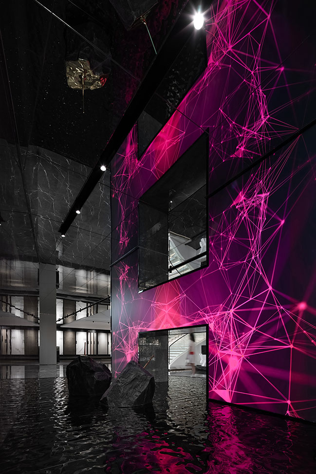
Two structural columns help to form an H-shaped structure, which echoes with the first letter of the brand name HUIYA. Apart from being a cultural symbol of the brand, it also presents a sense of structure, and represents quality of industrial manufacturing. In addition, the futuristic animation shown on it brings free visual variations to the space, accentuates the project theme via elements of auroras, clouds and universe, and enables interaction between visitors and the brand.
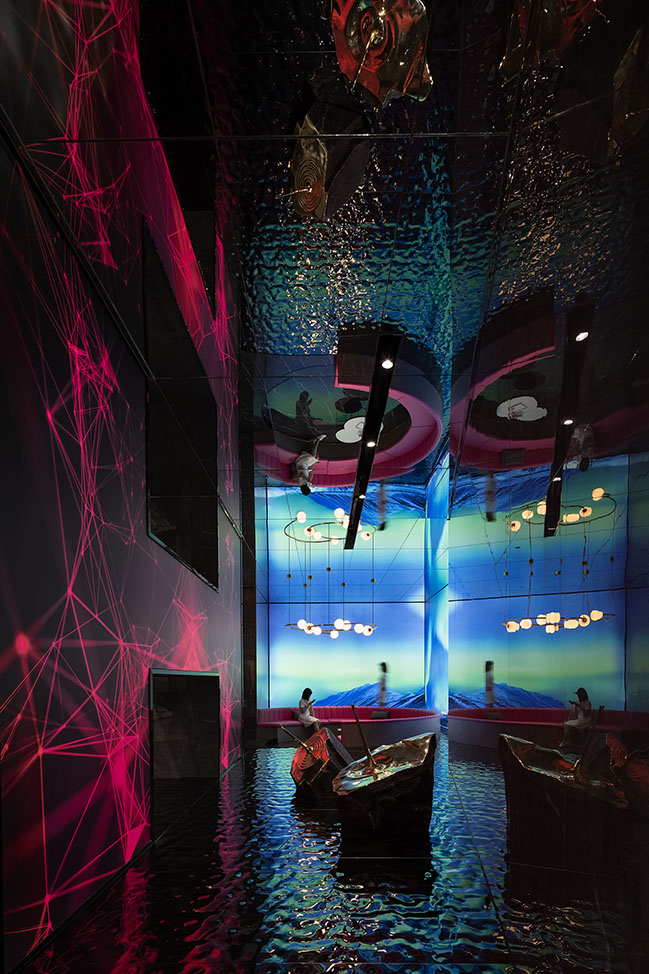
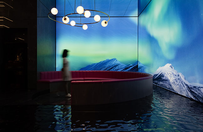
In the leisure area inside the entrance, multimedia technology is applied to create virtual scenes, which produce perfect visual effects and allow visitors to be immersed in novel futuristic experiences. Along with the rhythm of soft music, various dynamic images are presented on walls, creating immersive scenes and stimulating people to explore. Virtual auroras are reflected on water surface, very charming.

The brand image area has a long reception desk, which guides the circulation route and also extends spatial boundaries. Real and virtual scenes are well combined to endlessly extend the space and blur boundaries. The circulation route is unfolded freely based on the plan, which enables visitors to freely stroll in the space and have varying visual experience at every step.
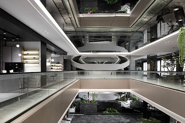
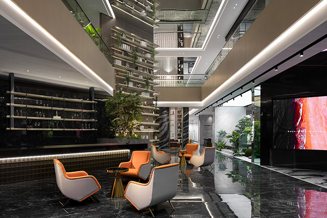
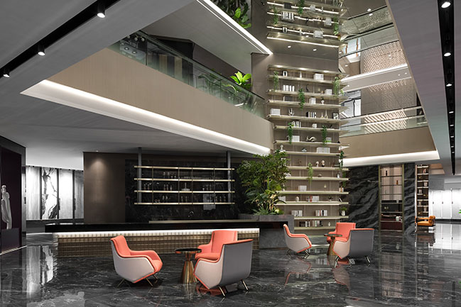
Modern people aspire to escape from the hustle and bustle of urban life, and get close to nature. Taking advantage of the exhibition hall's storey height, the design team carved out an atrium, where nature is brought in. Featuring green plants, interplay of light and shadows as well as ample daylight, this well-designed hollow space injects vitality into the lobby bar, and creates a “vertical oasis”. Outdoor landscape is introduced into it, which facilitates free connection of spaces while promoting continuous interaction between human and nature.
The coffee bar area is characterized by a full-height bookcase, which partitions the space and penetrates the ceiling of the second floor, hence generating drastic visual effects. This area not only serves the brand’s clients, but also functions as a sharing experiential space. In face of nature, the design should be humble and restrained. Clear hues and materials of different textures are perfectly combined to coordinate and blend with nature, so as to let the space return to simplicity.
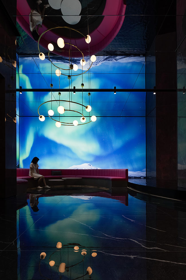
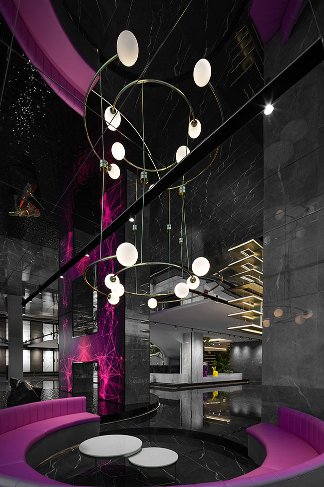
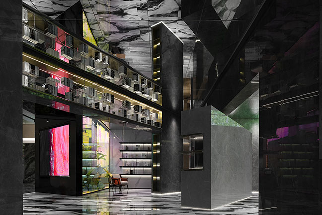
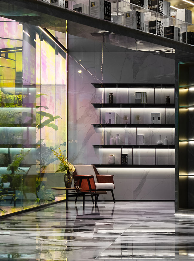
Lights and colors are integrated to create an enchanting “dreamland”. The diverse and changing hues open up a mysterious journey. Through cutting out the superfluous, the designers re-organized the spatial relationship, which is awash with freedom. Then, appropriate hues and lights are brought in, which generates fun interplay of light and shadows, produces color-changing effects, enriches visitors’ sensory experiences and guides them to explore the space.

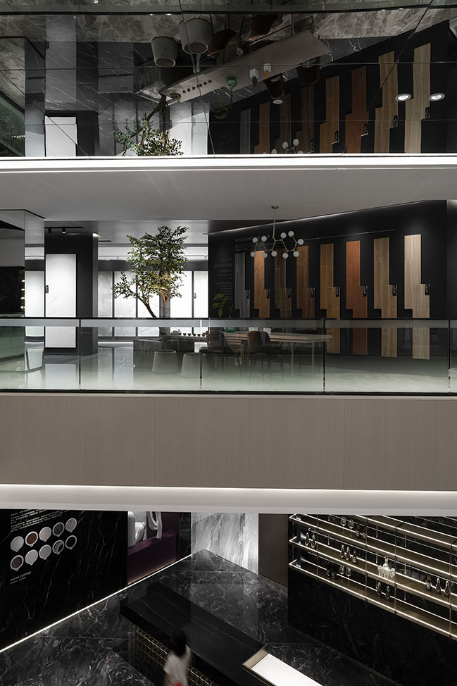
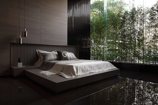
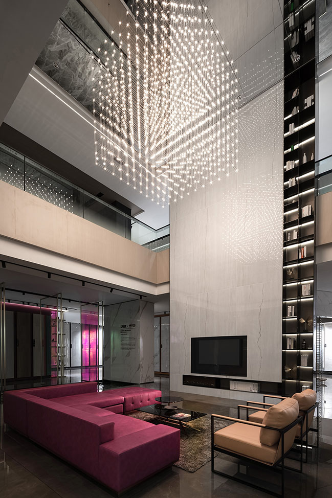
Based on the spatial scale, the living room utilizes large marbles featuring continuous grain to form the backdrop. The mirror ceiling generates reflections, and helps to visually extend the space. Besides, the red sofa adds a lively atmosphere to the space, and the matrix-like lighting fixture emits charming lights, rendering this area intimate. The bedroom shows perfect match of matte wood-grain tiles and soft fabrics and features a large French window that bring in outdoor landscape, together producing a tranquil and elegant spatial ambience.
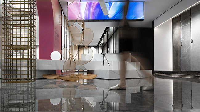
The grid structure and architectural blocks are interwoven, showing a sense of structure and the contrast of solidness and void. The freely-stacked blocks, the art installation formed by metal grid, the stylish light box, and exquisite adornments, all enrich the layering of the space.
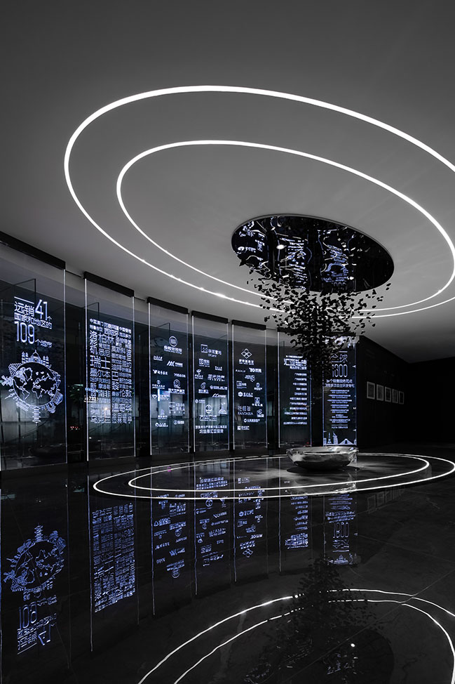
Oval lights on the ceiling and the floor echo with each other, and the inverted pyramid art installation is composed of charcoal pieces, which look like floating fragments. All of those elements help to inject a cultural atmosphere into the space. The brand story is carved on glass. The inlaid light makes the carved characters seem to float in the air, and effectively highlights a futuristic feeling.
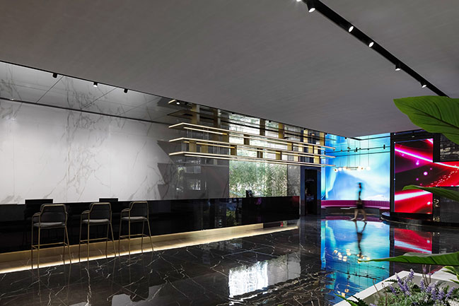
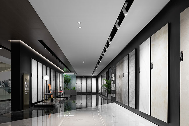
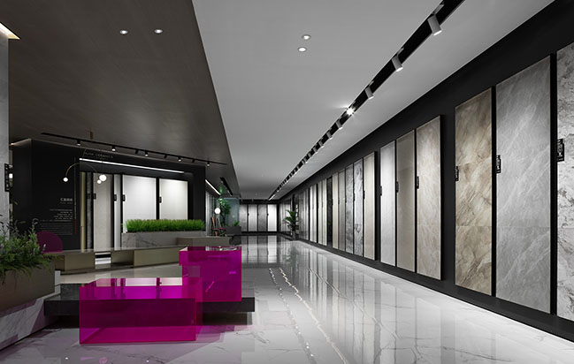
The overall three-storey space is open and awash with fluidity. There are no apparent spatial boundaries interlacing with each other, which is replaced by carefully-designed hidden intersecting relationships. The reflective ceiling infinitely extends the entire space, and maximizes it visually.
YOU MAY ALSO LIKE: New OPPO Headquaters in Shenzhen by Zaha Hadid Architects
YOU MAY ALSO LIKE: Shenzhen Bay Headquaters City by Henning Larsen
YOU MAY ALSO LIKE: Louvre Sofitel Hotel in Foshan by CCD-Cheng Chung Design (HK)

HUIYA CERAMICS Headquarters & Exhibition by Foshan Topway Design
03 / 26 / 2020 HUIYA CERAMICS entrusted Foshan Topway Design to conceive its headquarters and exhibition hall via transforming an old building...
You might also like:
Recommended post: Ciutat Vella apartment in Barcelona by YLAB Arquitectos
