11 / 20
2018
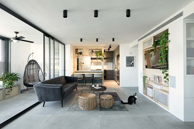
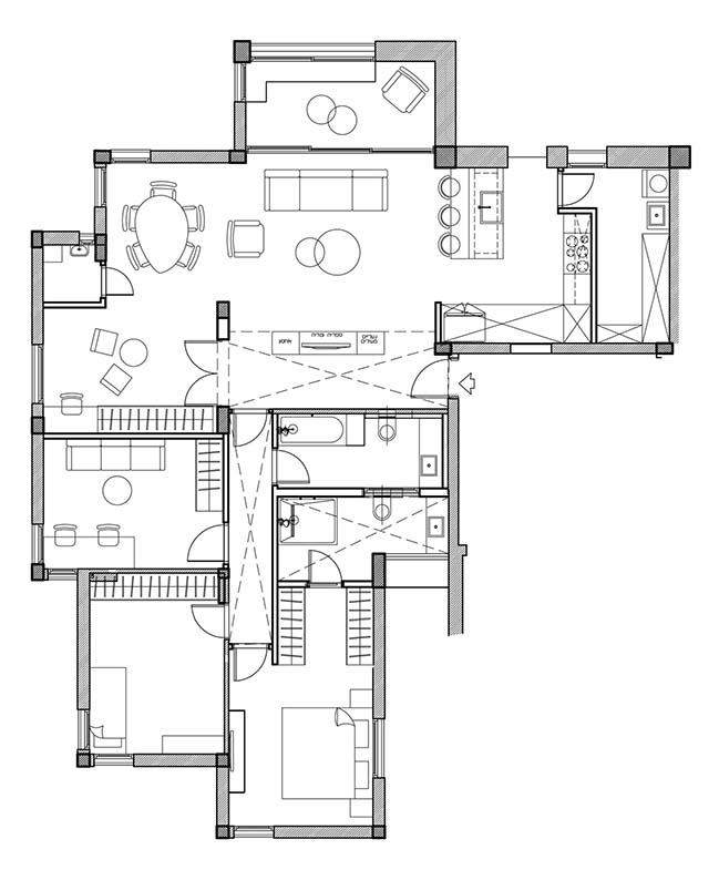
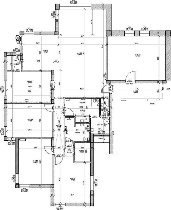
A young couple moved from central tel aviv to a bigger and quieter apartment in north Tel Aviv and invited Studio Perri to plan and design their new home. The apartment is 135 m2 in size and includes a living room, kitchen, dining area, balcony, 4 rooms, 2 bathrooms, storage room and a small room foe the cats.
Architect: Studio Perri
Location: Tel Aviv, Israel
Year: 2018
Area: 135 m2
Photography: Gidon Levin
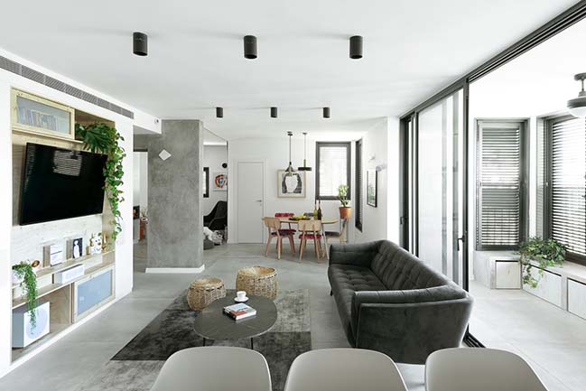
From the architect: Before the renovation The apartment was divided into two units - a large apartment and a separate small unit. The building is old from the 70's and the apartment had never been renovated before. The tenants dreamt of a spacious and full of light apartment that would provide an accurate response to their needs. The guidelines were to create a modern and minimalist design that balances beauty and functionality.

Almost all the walls of the interior were destroyed in the renovation except for the pillars of support and two walls in the son's room. We set up the kitchen and the storage room where the separate unit was, thus turning the kitchen into part of the bright and open living space. The kids play room was designed where the old kitchen was and all its walls were destroyed except for a supporting column.
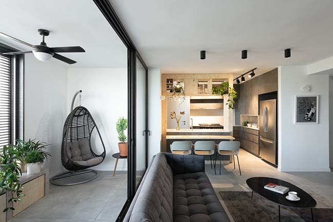
In order to create an internal balcony we took advantage of the bulge in the exterior contours of the building and designed a balcony that is isolated from the house by internal large windows. The original narrow corridor was enlarged, and the master room was redesigned with two parallel wardrobes leeding to the adjacent bathroom.
All the Bathrooms were redesigned in the area of the old bathrooms but in a completely different way. We have replaced the flooring, wall coverings, sanitary equipment, electrical systems, plumbing and air conditioning, interior and entrance doors, windows, lighting, furniture, and the carpentry items throughout the apartment. We connected to the dreams and desires of the customers From the beginning, and created a shared vision that guided us in designing the apartment.
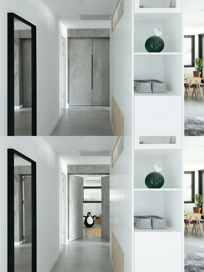
The front door leads to the hallway created from multi-functional furniture that we designed. The furniture separates the entrance hall from the living space, allows intimate entry into the private rooms area, and provides a useful solution for storing shoes, sunglasses, keys and other furniture. The back of the furniture serves as a closet for coats and bags.
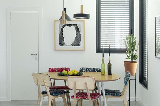
It was important for us to create a coherent and tight design style, so we defined a palette of colors and materials that is repeated in the carpentry items, finishing materials, lighting and furniture: maple wood, gray, white and black wood veneers with color touches of blue, gold and red.
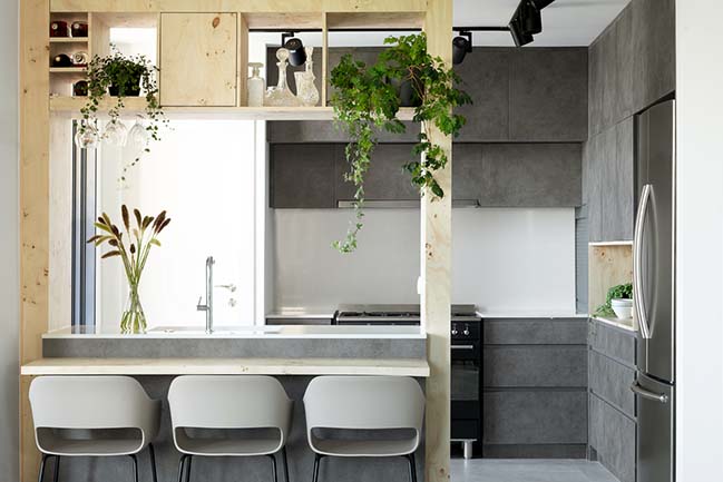
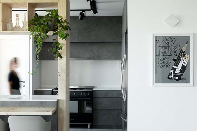
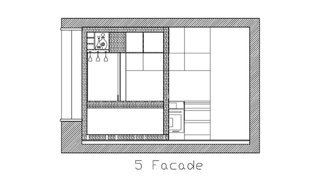
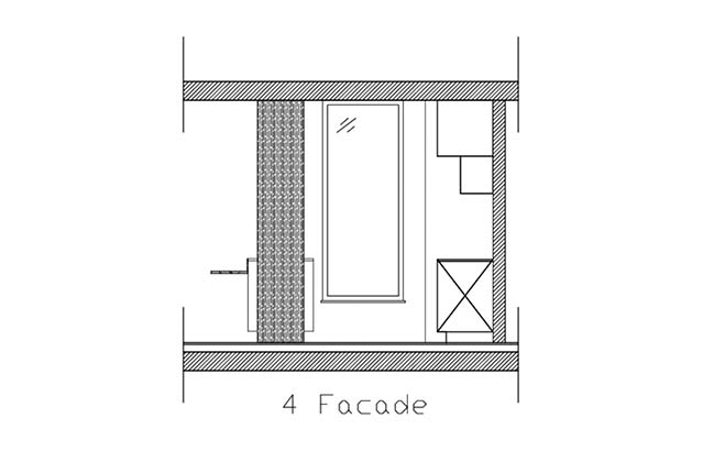
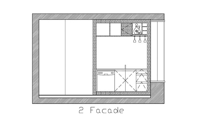
The kitchen was designed to allow eye contact with the entire living room and the play room, with a counter surrounded by a wooden frame: the frame creates a setting of the kitchen without closing it, and also serves for high storage of alcohol, hanging glasses of wine and decoration.
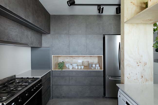
The materials we chose for the kitchen were in accordance with the tenants' demand to design a functional and durable kitchen: Formica in dark concrete texture, and wood root veneer map, the contrast creates an interesting and dramatic combination and both durable and strong materials.
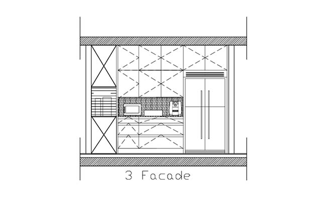
Behind the kitchen is the storage room - a room with floor-to-ceiling cabinets, which serves both as a laundry room and as a multi-purpose storage space. The living room is in the center of the public space and is furnished in modern lines and durable and practical materials - a gray sofa, a black marble table with metal legs, and a carpet that defines the living room.
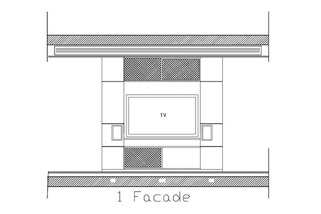
The multi-directional piece of furniture (used for storage) is used by the living room as a library that combines the television, and all the audio systems. From the living room you can go out to the closed balcony which is separated by large windows in black aluminum frame.
The balcony is luxurious with a hanging rocking chair, and beneath the large windows is a concrete bench with niches in which storage boxes on wheels are covered by the same veneer as the map tree, where we used the kitchen and the other details of the carpentry in space.
On the far side of the living space far from the kitchen lies a small cubicle designed for cats: it was one of the tenants' demands, to design a small but ventilated cubicle with the sandbox and food of the house cats. The play room is located near the dining area.
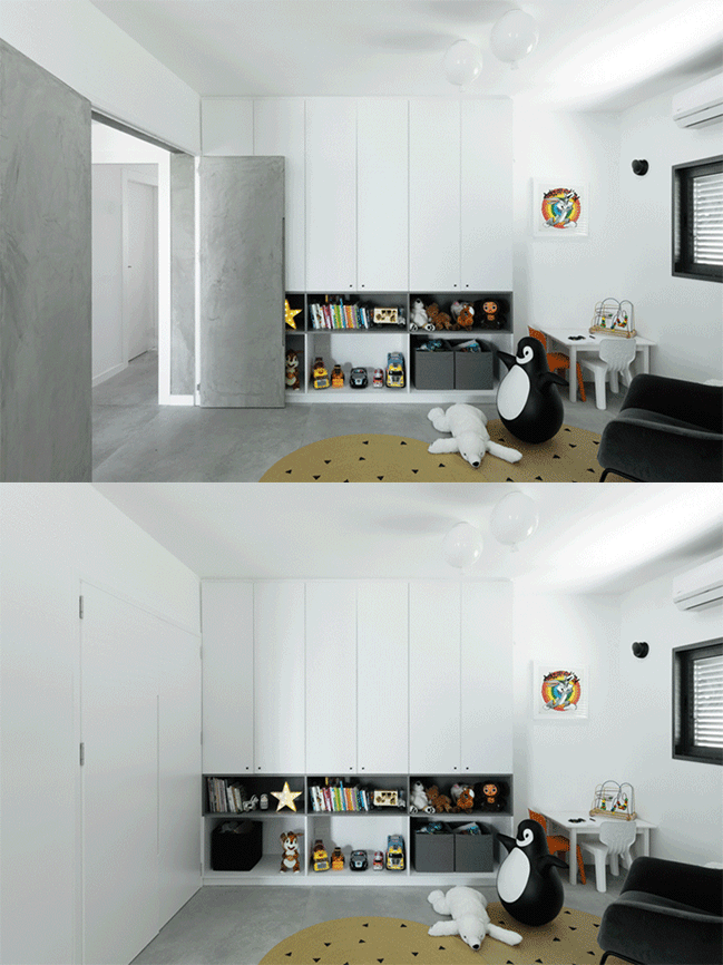
It is designed in a way that enables continuous eye contact from the kitchen and the living room with the children playing in it, and when necessary the doors and curtains can be closed to hide the mess and get privacy: from the entrance to the games room is an especially wide opening with two doors, and there is no separating wall As a partition. This room can actually be a continuation of the living space, or alternatively be a room in itself.
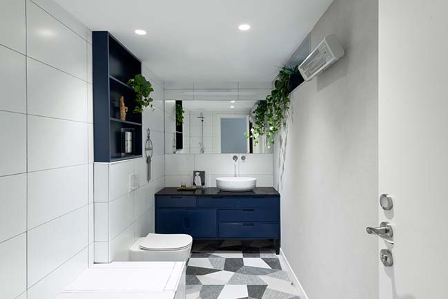
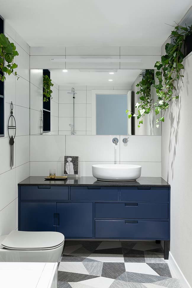
Between the living space and the corridor leading to the rooms there is a door added to the tenants' request to create acoustic separation between the various areas. The study is at the beginning of the corridor, with a large computer table and a sofa and is used mainly as a man cave to the owner of the apartment. In front of the study is the general bathroom, which is paved with tiles with geometric textures in shades of blue, gray and black.
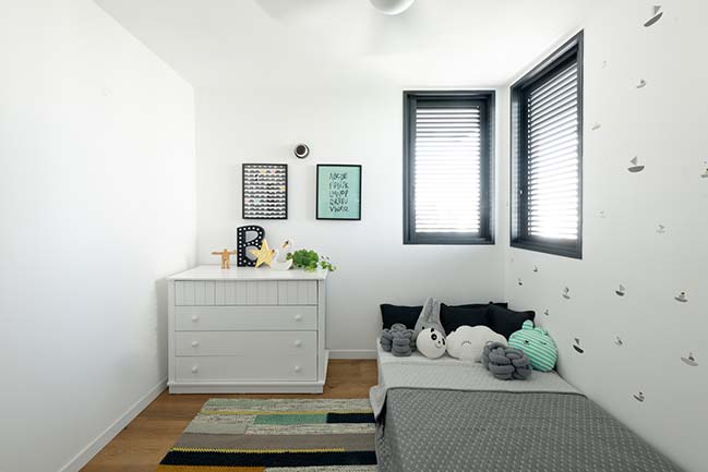
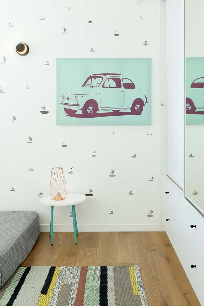
The son's room is down the corridor and next to the parents' unit:
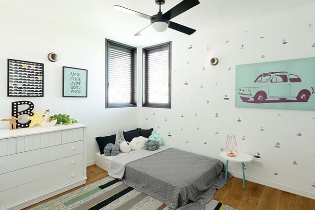
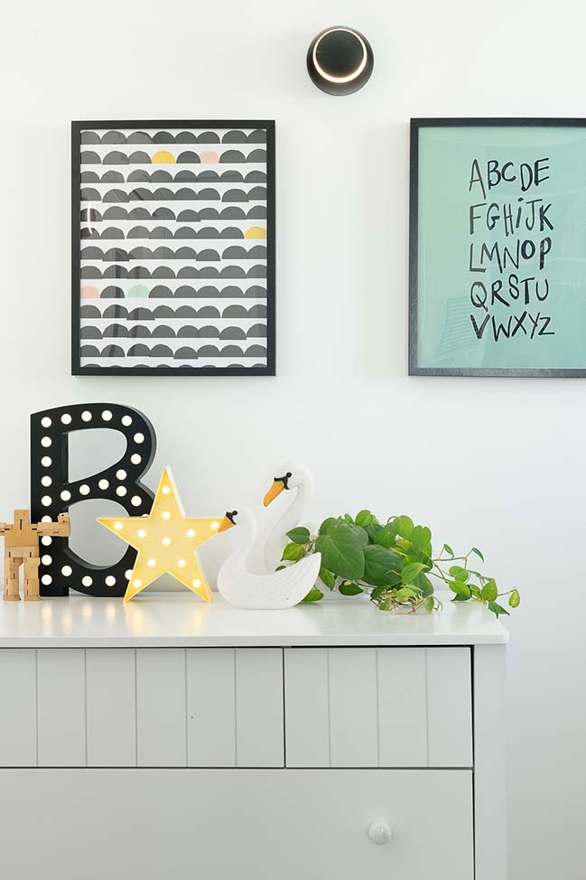
In a large closet in a niche with mirrored doors, a bed and a dresser. The color palette in the child's room is turquoise, gray and yellow, and appears in the carpet, wall stickers and decoration. At the end of the hall is the parents' unit - where we used oak root veneer, shades of gray, white and gold touches.
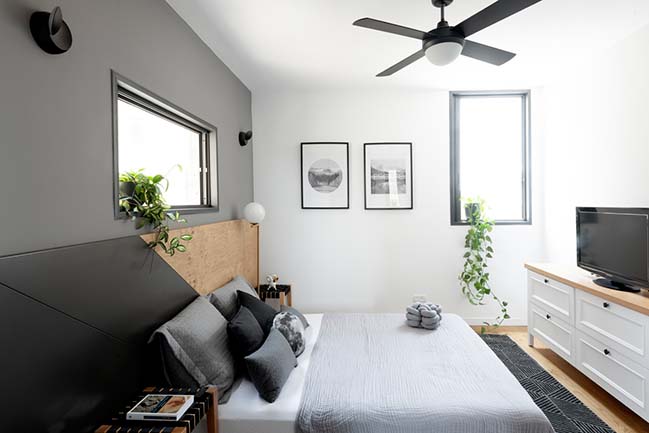
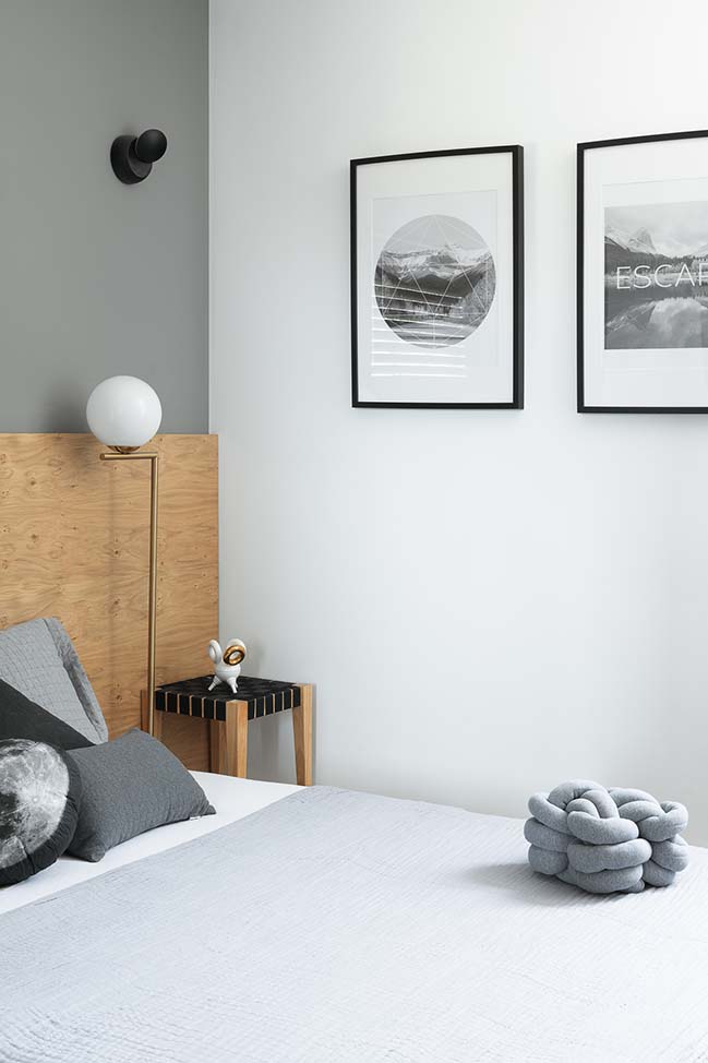
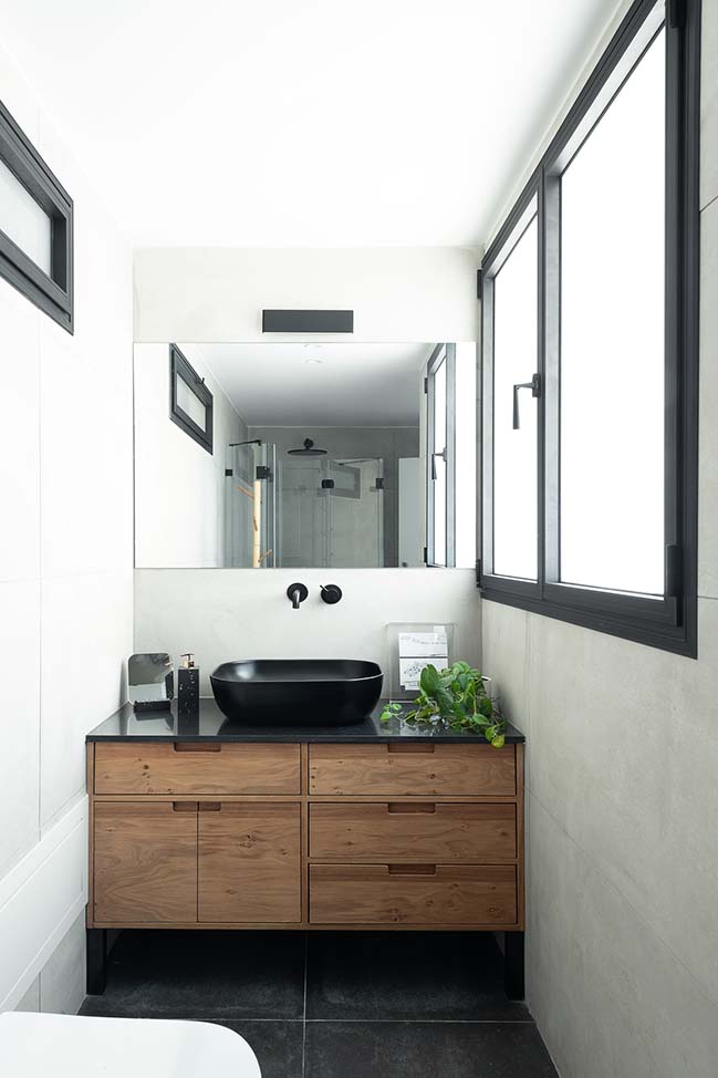
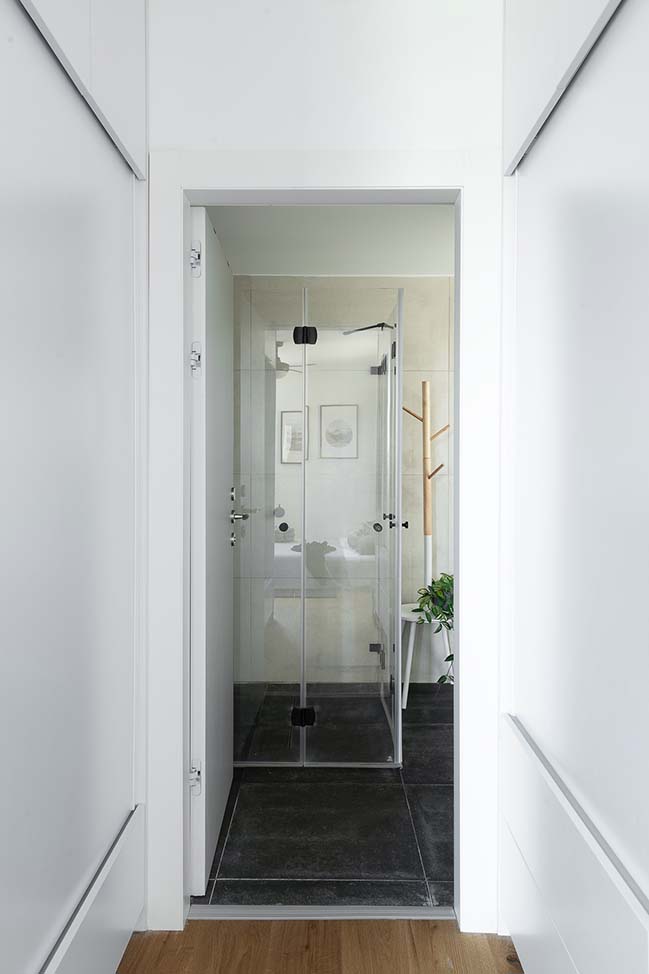
In order to create modularity in the location of the bed in the room we designed an extra wide bed with a geometrical example: the back of the bed also serves as a unique wall cover, and also allows them to enlarge or move the bed across the wall without being limited to its specific location. To maximize room space, the closet room is also the corridor leading to the master bedroom bathroom. The bathroom is paved with graphite tiles and its walls are decorated in light mocha tiles.

[ VIEW MORE STUDIO PERRI'S PROJECTS ]




Modern urban apartment in Tel Aviv by Studio Perri
11 / 20 / 2018 A young couple moved from central tel aviv to a bigger and quieter apartment in north tel aviv and invited Studio PERRI to plan and design their new home
You might also like:


![Modern apartment design by PLASTE[R]LINA](http://88designbox.com/upload/_thumbs/Images/2015/11/19/modern-apartment-furniture-08.jpg)


