04 / 19
2019
Michael K. Chen Architecture (MKCA) has completed both the gut renovation and interior design of a 2,800-square-foot prewar apartment on Park Avenue for a young New York family.
Architect: Michael K. Chen Architecture (MKCA)
Location: New York, USA
Year: 2017
Design Team: Natasha Harper, project lead; Michael Chen, Braden Caldwell, Justin Snider, Robinson Strong, Julian Anderson
General Contractor: Think Construction
Styling: Cristina Sonneman
Photography: Brooke Holm
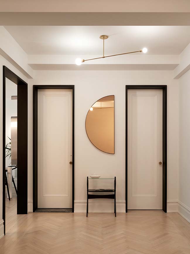
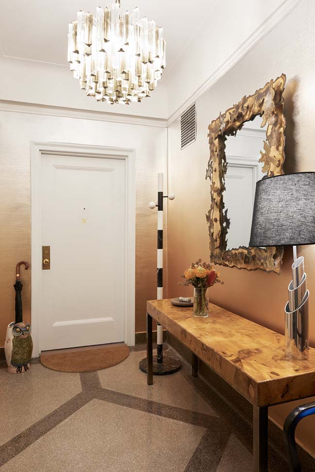
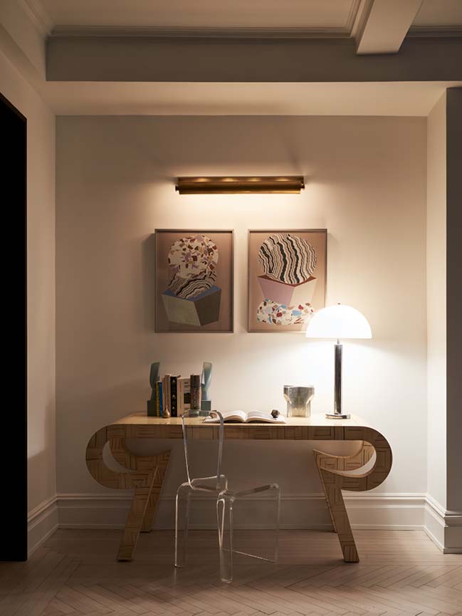
From the architect: The renovation concentrated on maximizing the already wellproportioned formal spaces, including a generous entrance gallery, formal living room and dining room; while converting the dark and crowded storage and service areas into functional contemporary living elements. Because the historic layout was quite segmented, MKCA set out to create enlarged openings to increase circulation between spaces. MKCA’s selection of furniture, finishes, and unique art and design objects played a large part in maximizing natural light, visual interconnectivity, and playfulness throughout.
“Drawing from our experience designing micro apartments, we start every project, large or small, looking for a very flexible spatial organization, where spaces can slip into and overlap with one another. Not only is that how most of our clients actually live, but it’s a way to make sure that every space in a project is utilized”, says Michael K. Chen, founder and principal of MKCA.
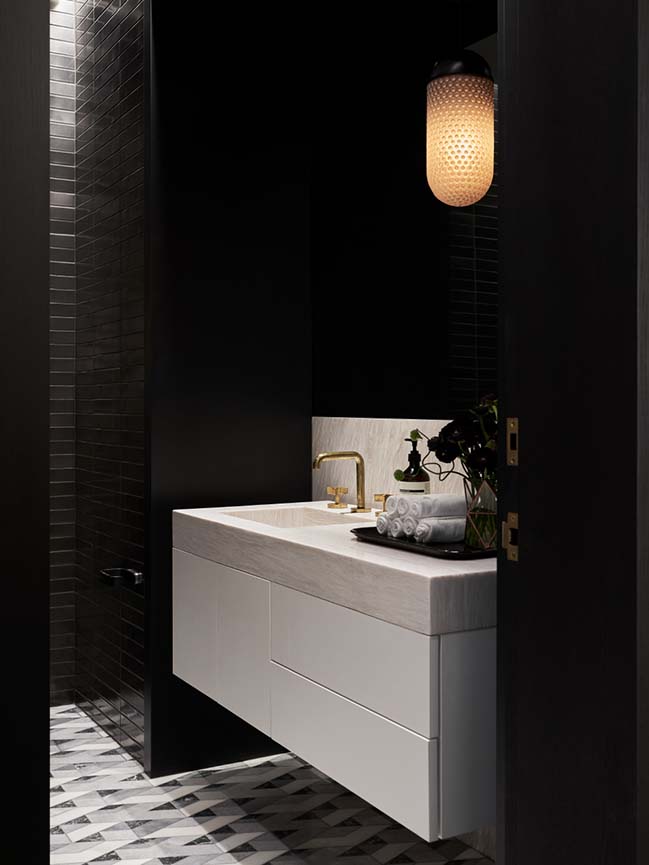
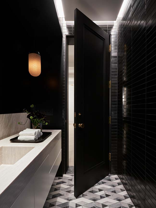
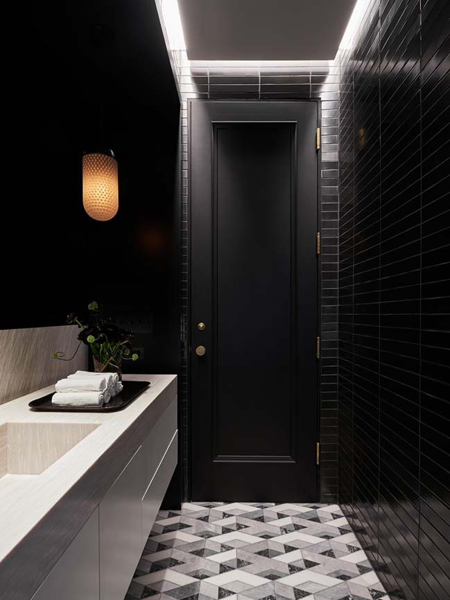
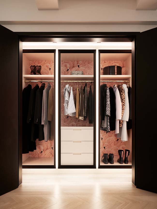
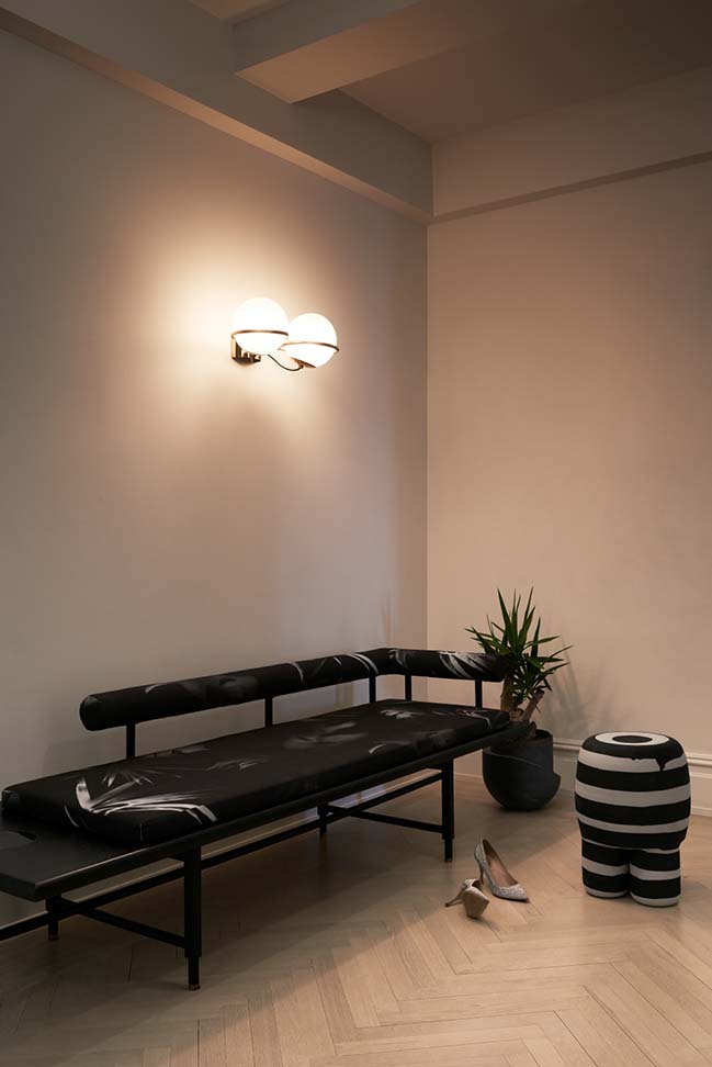
Off of the gallery, MKCA created a powder room and cloak room duet. The sleek and moody new powder room inhabits a former closet, and is lined from floor to ceiling in handmade metallic black tiles from Heath Ceramics and features a floating custom console of barely pink Rosa Aurora stone, lacquer, and smoke mirror, conjuring images of nightclub naughtiness. In contrast, the generous new cloak room across the gallery boasts powdery pink lacquer built-ins, integrated LED lighting, and puffy flamingo wallpaper, projecting a sunny and playful disposition. The cloak room absorbs baby strollers, shoes, and coats for the family and their guests in crisply detailed millwork compartments.
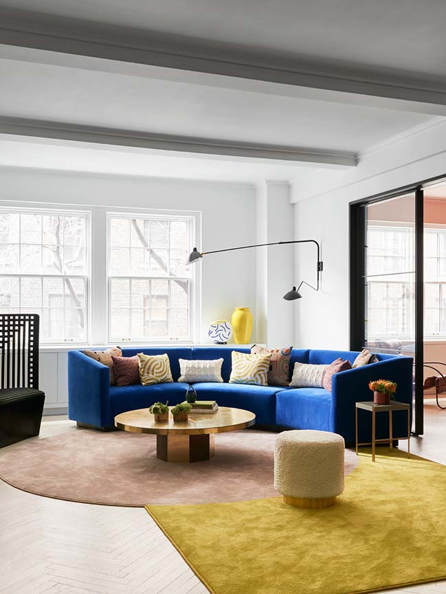
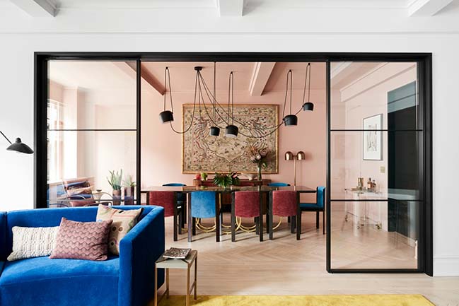
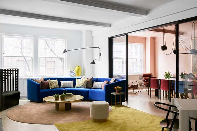
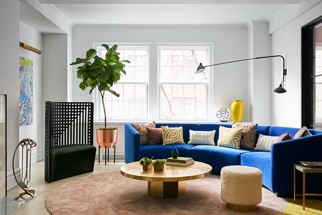
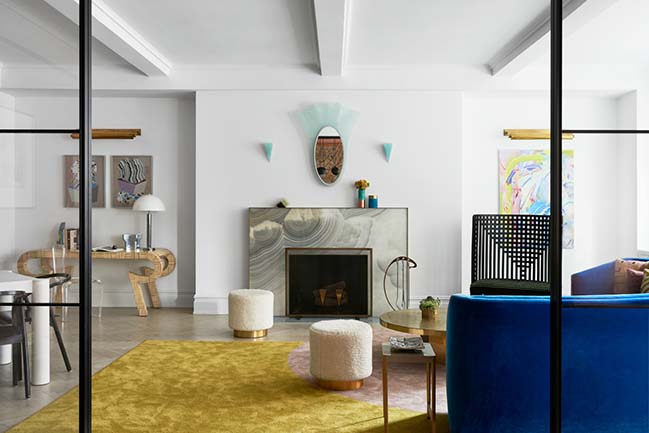
In the living and dining rooms, a tiny door opening was substantially enlarged and infilled with a black metal and glass sliding partition creating a generous portal between the two spaces. Facing the doors, a grey onyx and bronze fireplace mantel is flanked by turquoise glass sconces with a vintage Fontana Arte mirror above. A massive circular custom sofa designed by MKCA is upholstered in a bright blue synthetic textile from Maharam. “The round form was so useful,” says Chen. “We intended the sofa to be the centerpiece of the room, and be large enough for the whole family to plop down, and to transition between intimate conversation and full-blown party mode, which is does really well.”

A sculptural chair by Charles Rennie Mackintosh and poufs upholstered in shaggy mohair surround a vintage brass table. A bone console, sculptural stainless steel shelving unit by François Monnet, and linen wrapped game table complete the room. A painting by artist Ilona Savdie, and drawings by Karin Haas hang adjacent to the fireplace. A carpet by MKCA is made from joining two shapes of broadloom synthetic silk together.
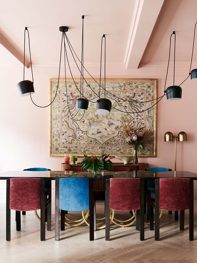
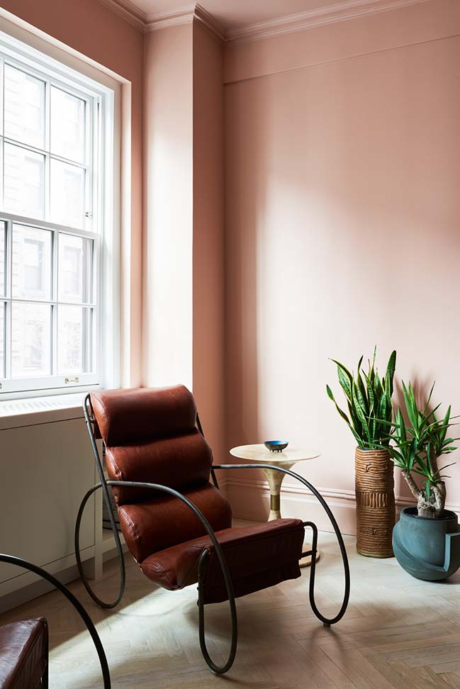
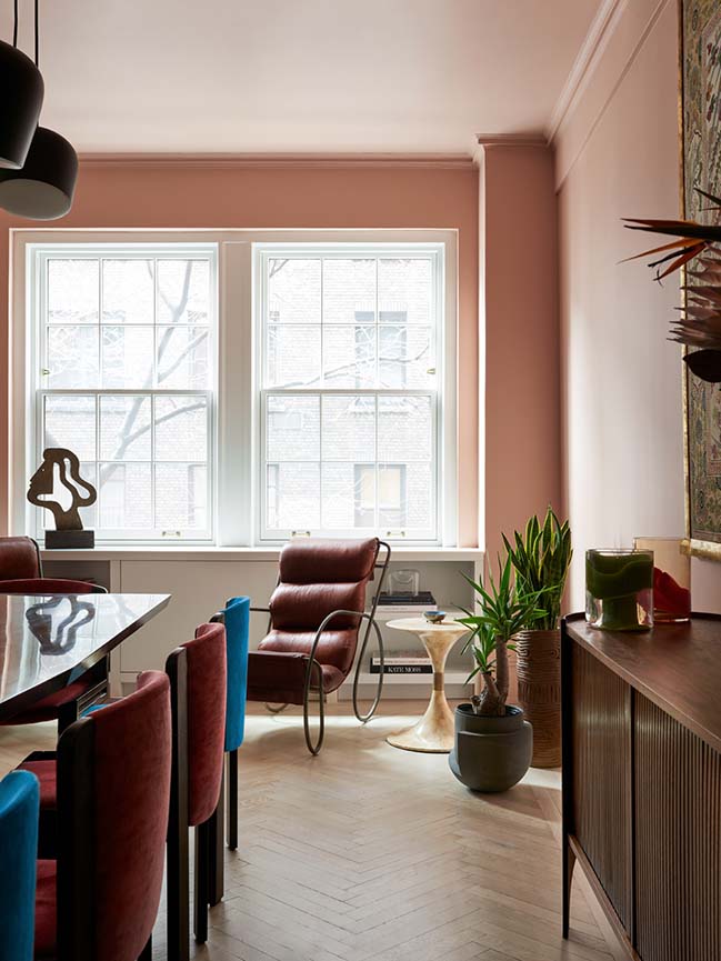
The dining room is shrouded in a desaturated pink paint and anchored by an eleven-foot custom table in high gloss lacquer, steel, and gold leaf from Los Angeles designers Alex Drew and No One, show stopping yet visually very light. The table is surrounded by vintage Joe Colombo dining chairs in their original well-worn fabric, and a pair of voluptuous leather and steel lounge chairs are used by the family to have coffee in the morning and to read after dinner.
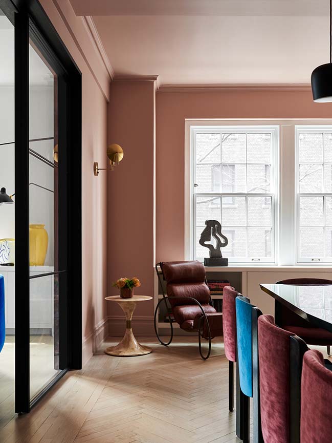
A massive vintage chinoiserie panel, chosen by the client at Housing Works, hangs above the vintage Henry Glass sideboard from Converso, beautifully integrating all of the colors of the room. “The very best kinds of client collaborations are when we are asked to push the clients a little past their comfort zone, and when they do the same to us”, Chen says of the juxtaposition.
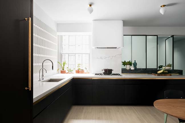
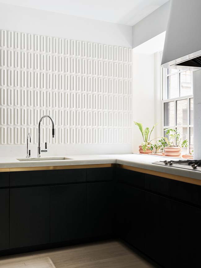
To create a light-filled kitchen where there was only one window facing a courtyard, Chen relied on high-contrast materials. The lacquer and ebonized oak pantry links the dining room and kitchen, which is lined in glossy three-dimensional tile from Ann Sacks, and pale iridescent wall covering from Flat Vernacular. “We wanted to catch as much light as we could with the glossy molded tiles,” says Chen, “There is always a play of light and shadow along the wall because of the three dimensional texture”.
The rear wall of the kitchen was removed and replaced with a sliding acid etched glass partition, which picks up the ambient light from windows in the service entrance beyond and glows all day long, replaced at night by an even glow from the overhead fixtures that bathe the partition in light.
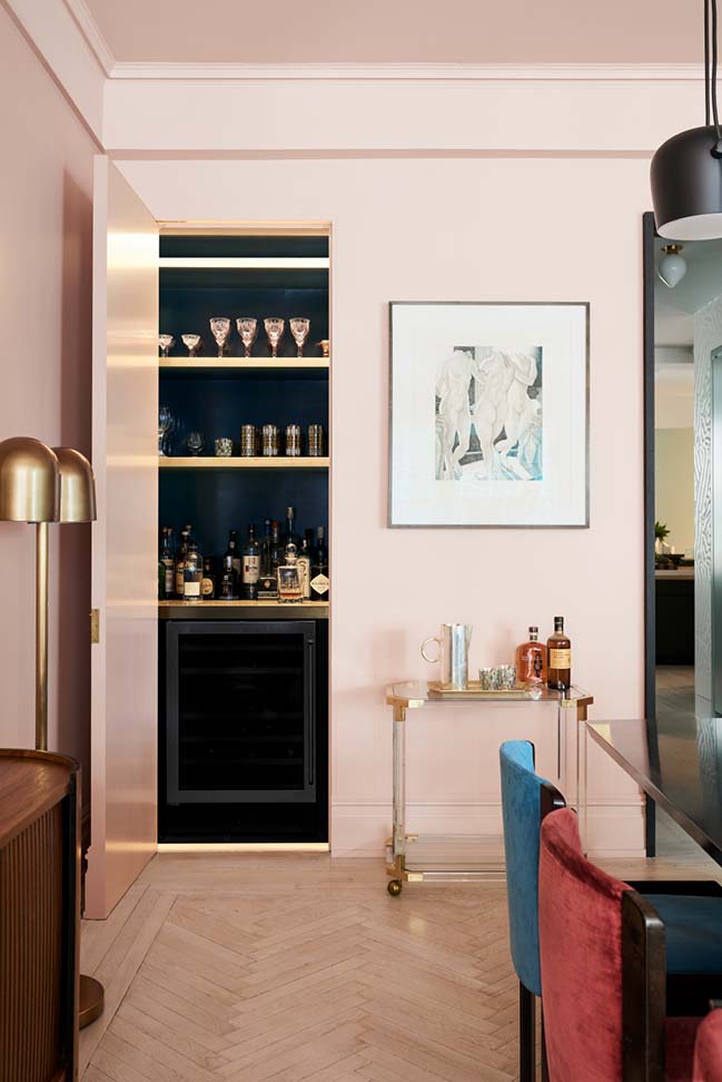
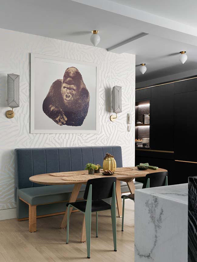
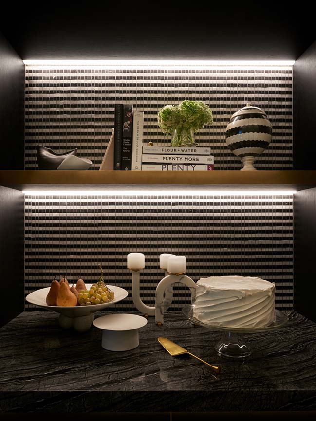
Overhead upper cabinets were banished in favor of multiple voluminous full height cabinets in the pantry where the majority of service-ware and dry goods are stored. Plentiful drawers below the white marble countertops provide ample storage for everything else. Under the glass partition, a thick counter of striped Kenya Black marble adds to the material contrast, and doubles as a bar top and work surface when the glass partition is slid away. An Enzo Mari gorilla print overlooks the dining table, flanked by fabric sconces by Erich Ginder. Overhead an array of fixtures by Michael Anastassiades, from The Future Perfect provides ample task lighting.
“When we are working in space without abundant natural light, we do everything we can to create a feeling of illumination without having to resort to visible fixtures. Every surface is considered for its properties relative to light. We tend toward contrast in both color and sheen to keep the spaces feeling visually lively, and we make ample use of LED strips that provide focused illumination where it counts.”

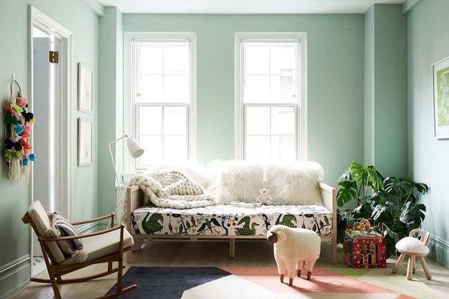
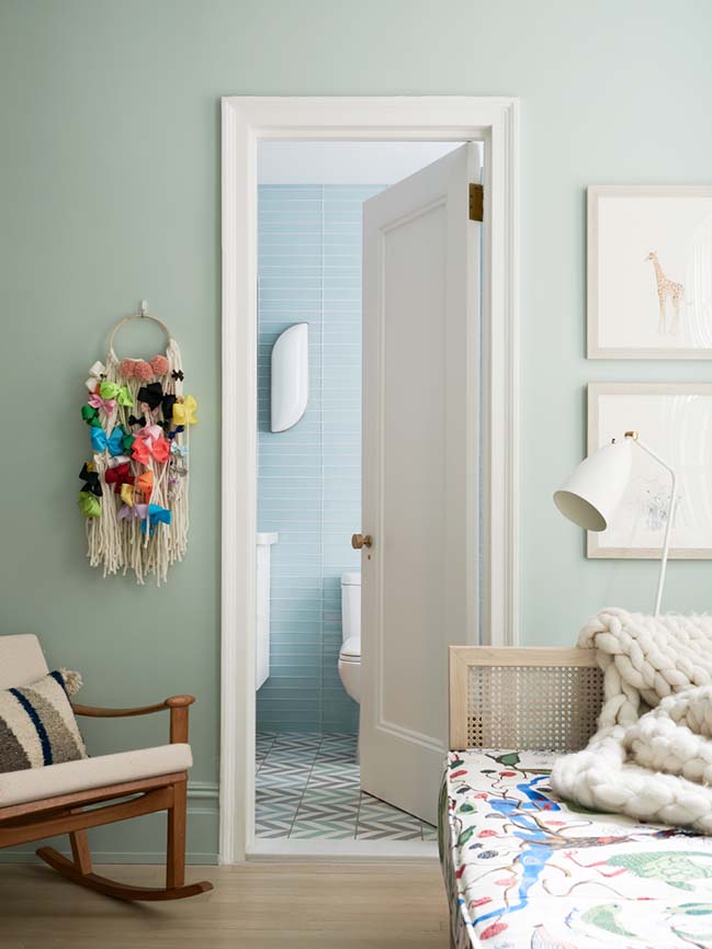
An inky blue-green back hall leads to three bedrooms. In the couple’s daughter’s room, the tropical motifs from the front of the apartment mingle with Scandinavian sensibilities. Sheepskin pillows dominate a CB2 daybed with a custom cushion, upholstered in a Josef Frank botanical print. A vintage teak rocker by Finn Juhl, tall shelving from Hem, and a coterie of animal-cum-footstool pieces from Kinder Modern surround the daughter’s play and drawing table.
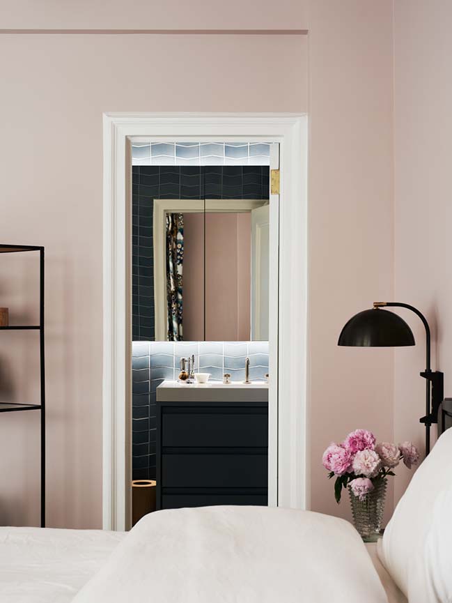
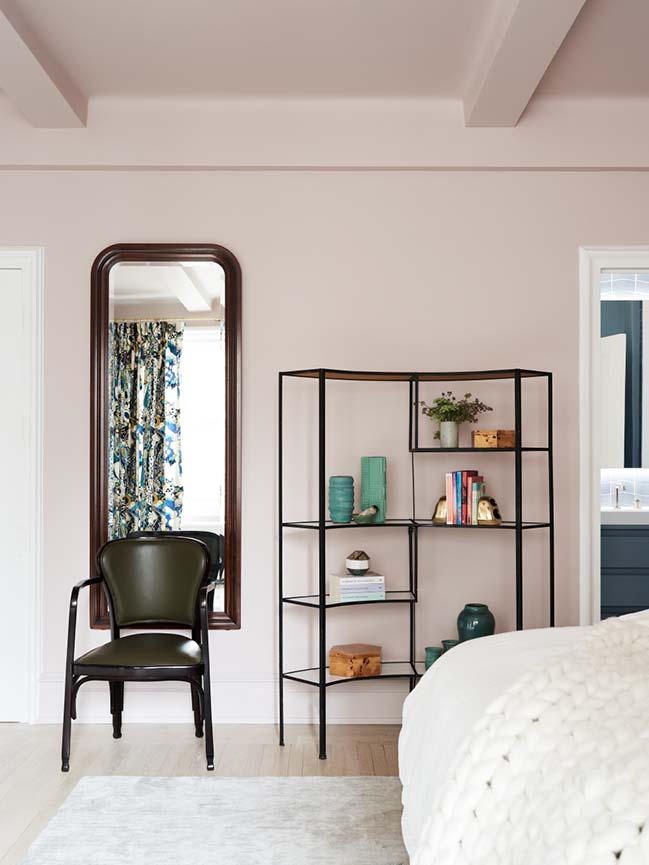
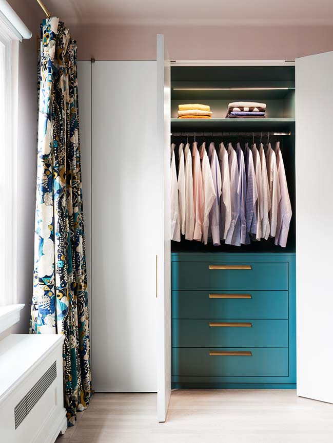
The master bedroom and bath were touched lightly, with the addition of custom millwork his and hers closets, and new finishes and fixtures in the master bath. A vintage shelving unit by Frederick Weinberg sourced from eBay holds vintage ceramics and books that the couple collect, and the couple’s bed is flanked by vintage nightstands by Luigi Caccia Dominioni for Azucena, sourced from Compasso Gallery; and custom sconces by Allied Maker.
YOU MAY ALSO LIKE: New Children's Library at Concourse House by MKCA

YOU MAY ALSO LIKE: Apartment in New York by Reutov Dmitry
YOU MAY ALSO LIKE: Small apartment with moving wall by MKCA
YOU MAY ALSO LIKE: The Barclay Apartment in New York by Handwerk Art and Design
Park Avenue Prewar Apartment by Michael K. Chen Architecture
04 / 19 / 2019 Michael K. Chen Architecture (MKCA) has completed both the gut renovation and interior design of a 2,800-square-foot prewar apartment on Park Avenue for a young New York family
You might also like:
Recommended post: Lian Palace by ACPV Architects | Redefining Taichung's Skyline



![Modern apartment design by PLASTE[R]LINA](http://88designbox.com/upload/_thumbs/Images/2015/11/19/modern-apartment-furniture-08.jpg)


