10 / 17
2024
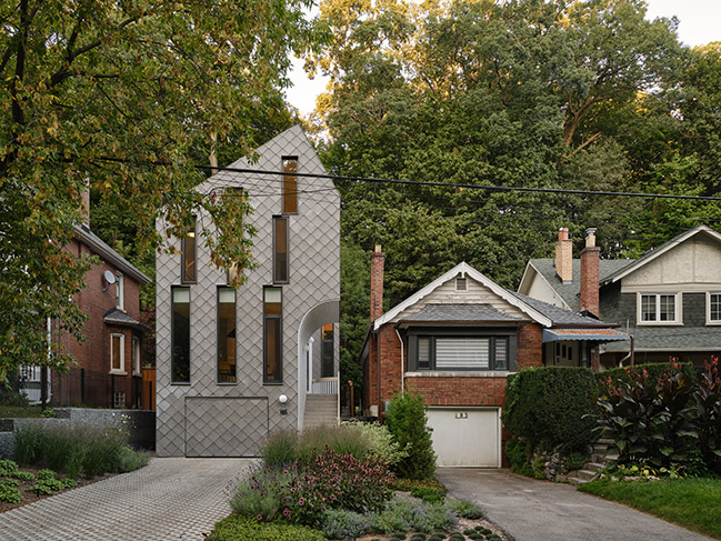
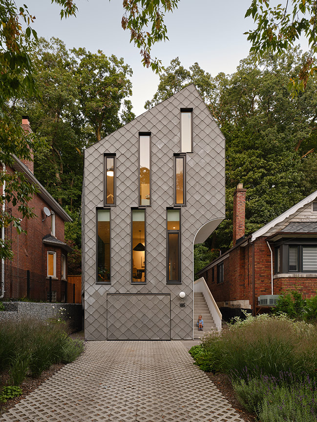
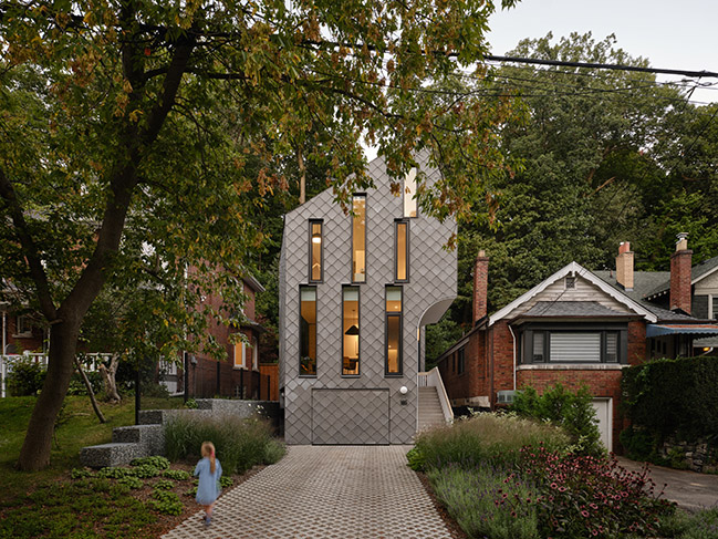
On a sloping site in Toronto’s east end, this single-family, four-bedroom home is tucked into a gully with steep slopes up the backyard and on the opposite side of the street. Canadian studio Reigo & Bauer designed this ground-up build using geometric manoeuvres to make the most of the narrow site and create an eye-catching structure...
> Updating Toronto's Existing Housing Stock by Reigo & Bauer
> House Caroline by Reign Architects
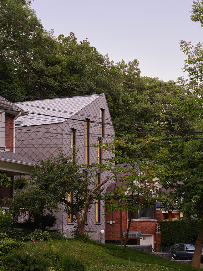
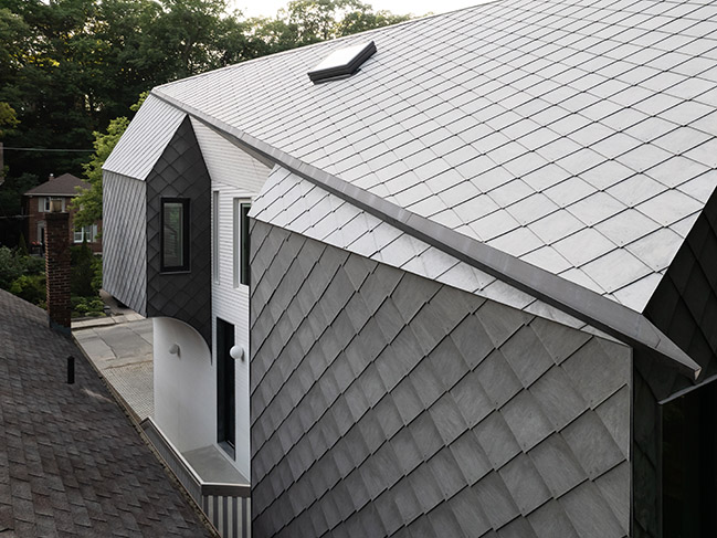
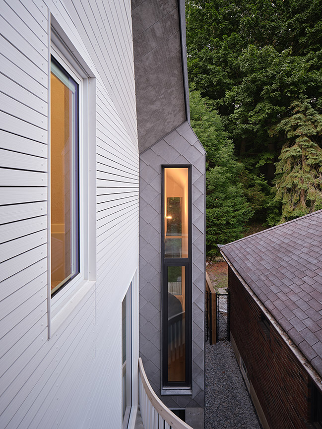
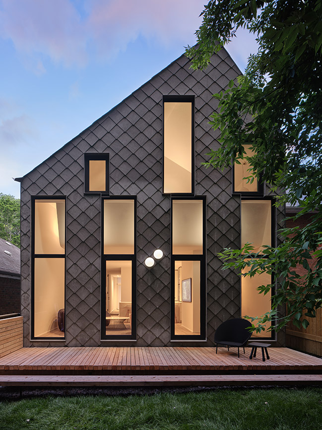
From the architect: The building’s tall, vertically emphasized form speaks to the old trees that tower over the houses as they climb up the hills either side. Its exterior is clad almost entirely in grey diamond-shaped tiles, which follow from the walls over the garage door and the roof so that the building reads as a coherent volume. A portion of the envelope is carved away on the south side, allowing space for steps to the front door, and additional windows in the sides of bays that are formed by this partial setback. These face one another, rather than overlooking the neighbouring property, and bring significantly more light into the centre of the house while adhering to zoning restrictions.
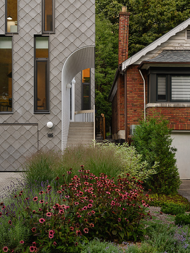
A portion of the south elevation is set back from the main facade and highlighted by white concrete boards, which extend to the roofline and also curve over the entry steps below, sheltering the access route from the front of the house. Playing with simple geometries to achieve unexpected results—a common ace in Reigo & Bauer’s hand—also occurs on the roof, which comprises triangular facets that connect the offset pitch peaks diagonally from the front of the house to the back.
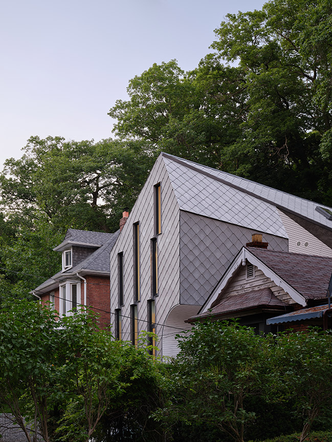
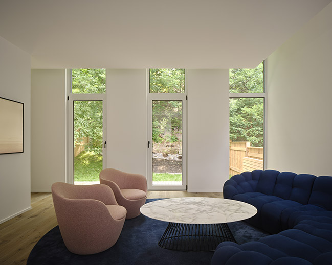
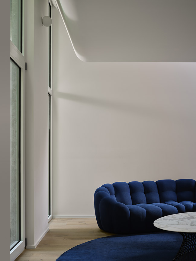
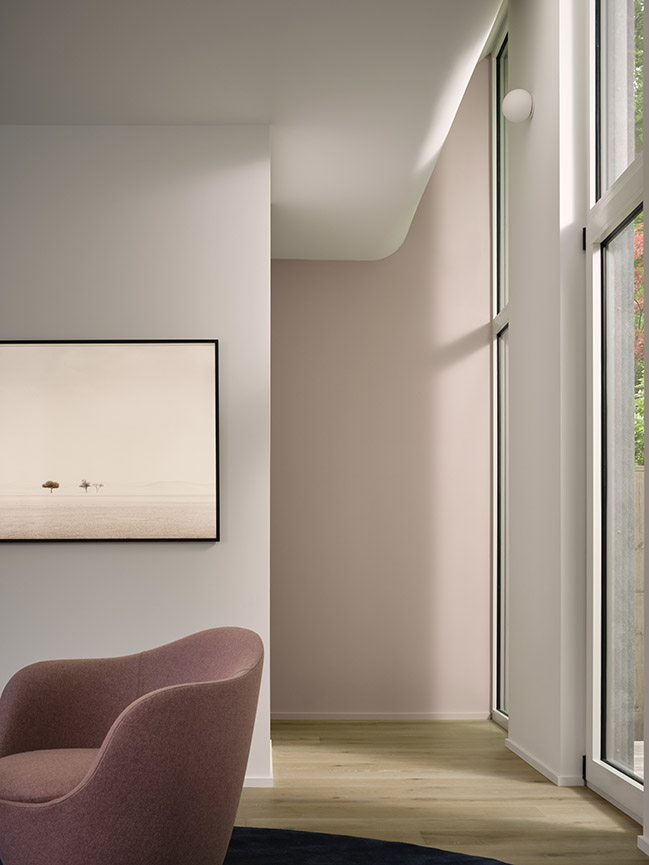
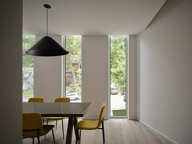
Narrow, staggered windows on both of the shorter front and back facades allow in plenty of light, while maintaining an element of privacy for the residents. In the street-facing dining room, these windows are pulled above the ceiling plane for further vertical accentuation. Meanwhile, at the rear, the living room ceiling curves and angles up to accommodate the elongated windows, drawing the eye up to the wooded hill behind the house. These clever gestures make the rooms feel much taller, without taking any space from the floor above.
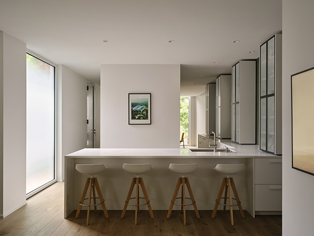
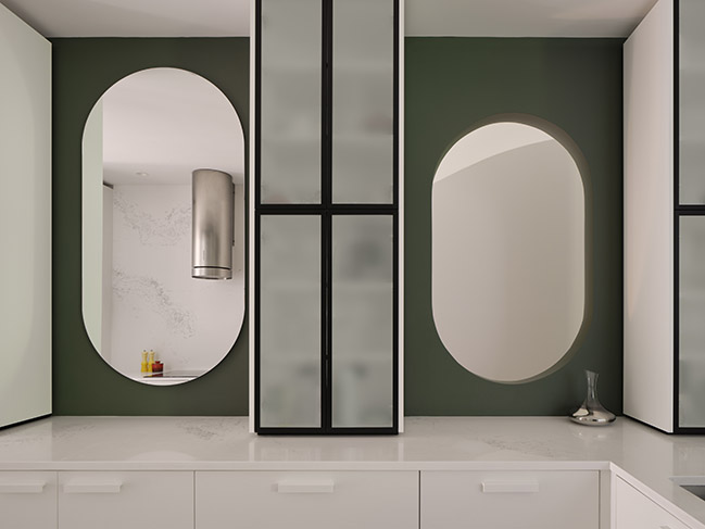
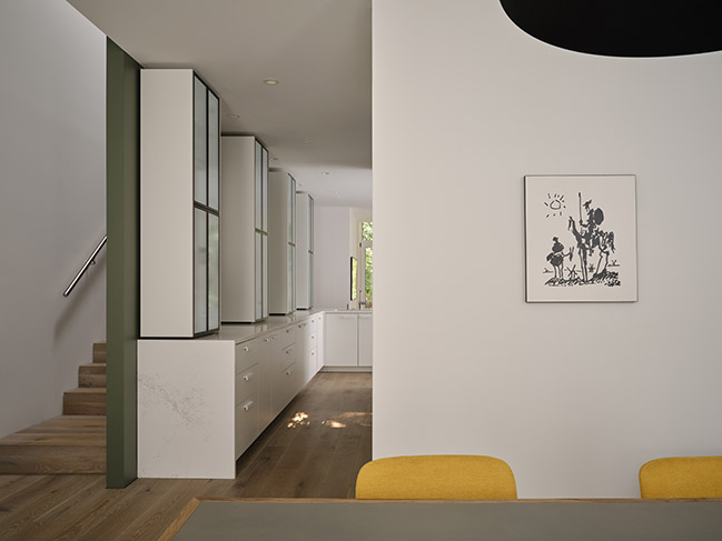
At entry level, a central block contains a powder room, a pantry, and storage facing two sides. This helps to partition and organize the spaces around it, which flow together without the need for doors. The kitchen occupies the area in between the dining and living rooms, and features minimal white cabinetry and surfaces for a clean, understated appearance.
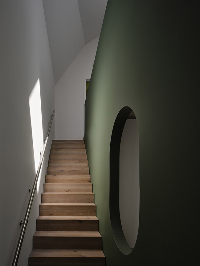
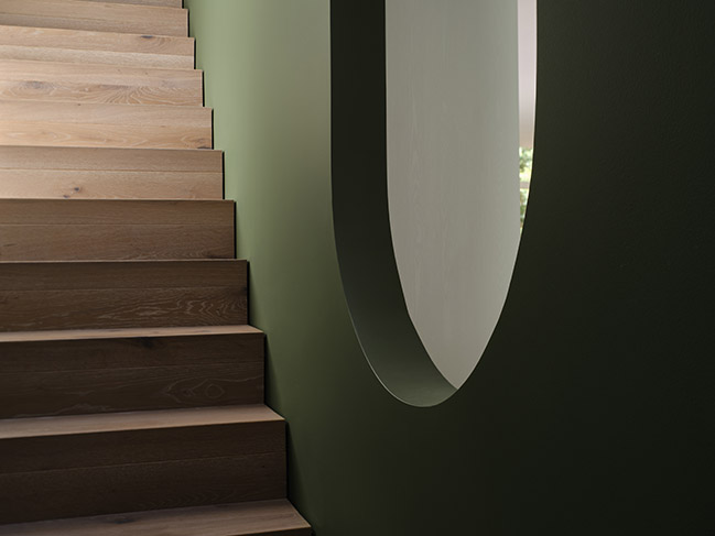
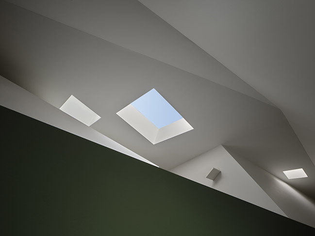
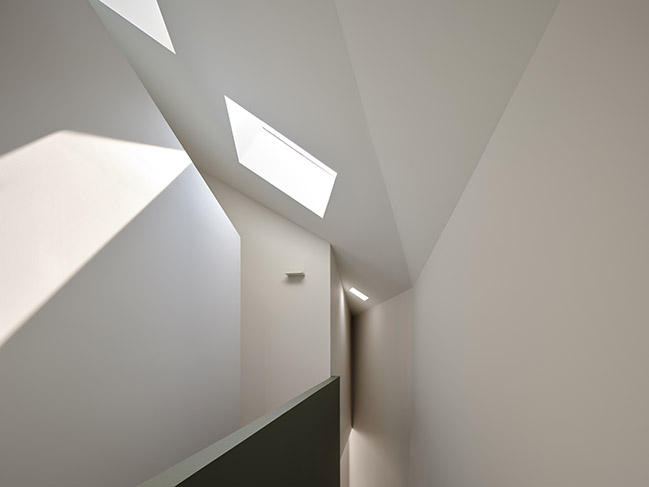
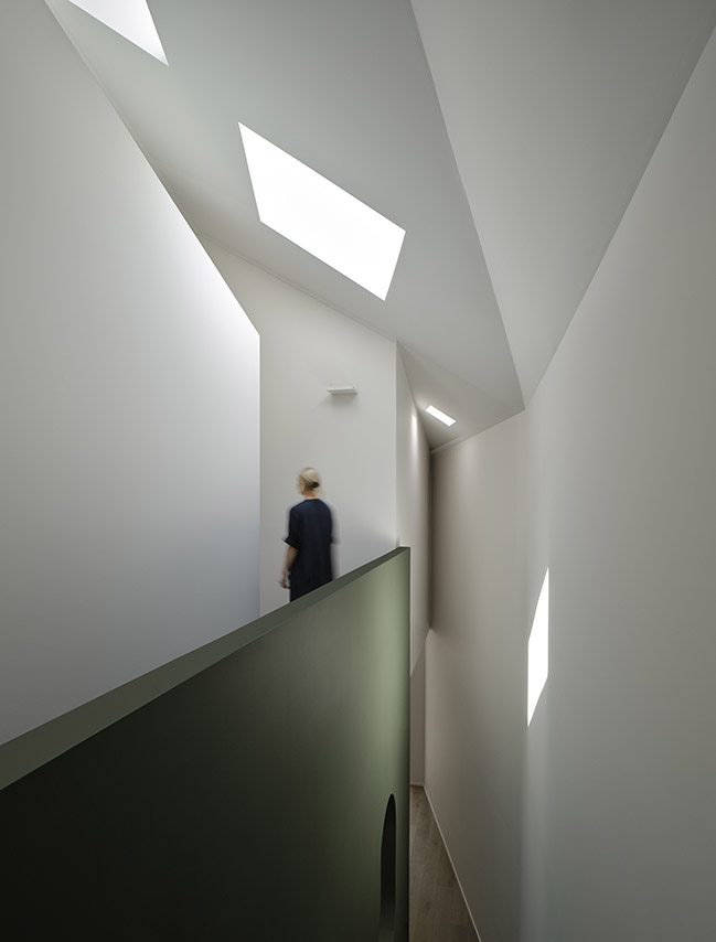
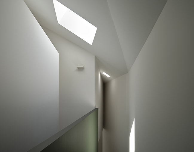
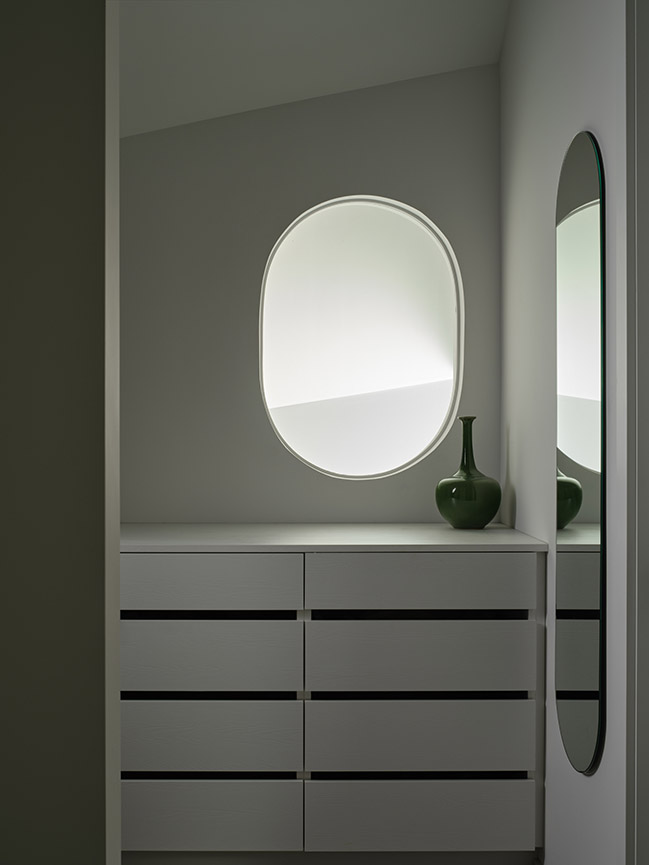
A muted green wall divides the kitchen from the staircases, but a pair of pill-shaped cutouts between cabinets offer sightlines and daylight to both the upper and lower flights. A similarly shaped mirror in the middle reflects back a view of the kitchen, creating a fun visual trick. The green wall extends up to become a solid bannister for the sky-lit, upper-floor corridor, which runs between two bedrooms at the front, and the primary suite at the back. An additional bedroom is located in the basement, behind the garage.
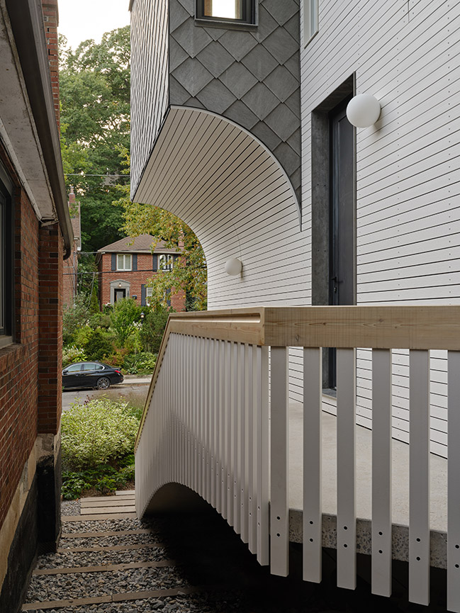
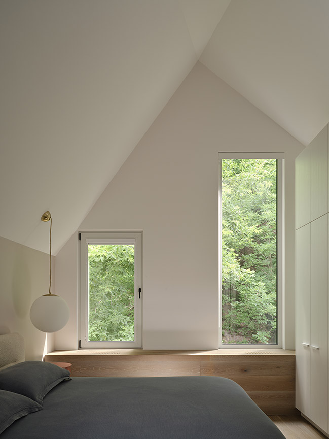
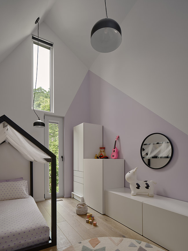
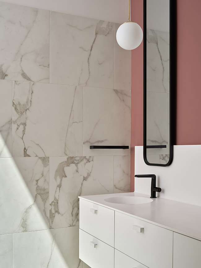
Other colourful vertical surfaces are found in the living room, where one wall is painted pale dusty pink, and the primary suite’s bath that features a slightly darker shade closer to terracotta. Most of the remaining walls are white, and the floors throughout are light-toned oak, leaving the clients a neutral backdrop to add their touches through bold rugs and furniture pieces. Subtle details including the repetition of spherical light fixtures both inside and out help to tie the whole project together.
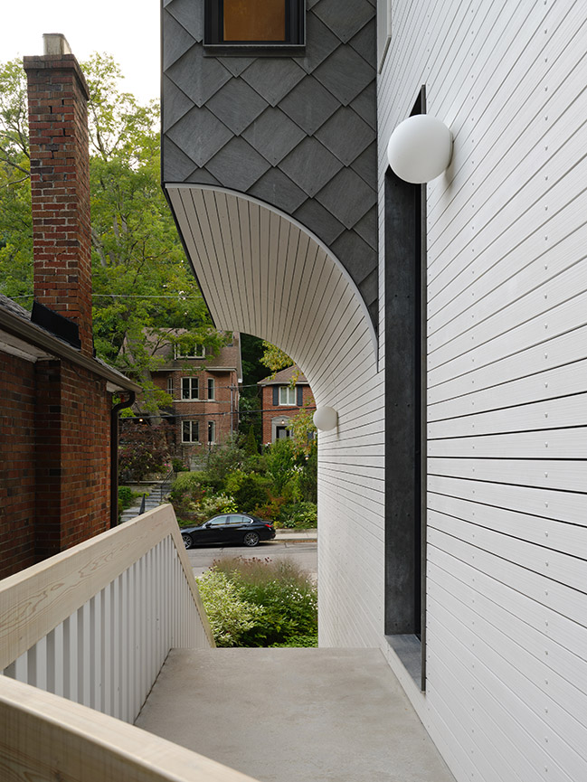
When granted full control over a home’s architecture, as in this case, Reigo & Bauer demonstrates an astute awareness of three-dimensional space, and an ability to manipulate it within tight restraints to fully optimize the conditions offered. The result is an exterior that’s unlike anything else on the street, yet still seems appropriate for its setting, and interiors that feel at once dynamic and balanced.
Project Name: Neville Park
Architecture & Interiors: Reigo & Bauer
Location: Toronto Ontario
Area: 2000 sf (185 m2)
Year: 2023
Design Team: Merike Bauer, Stephen Bauer, Victoria Dragoni
Structural Engineer: Blackwell
Photography: Doublespace Photography
Reigo & Bauer Utilizes Geometric Maneuvers to Create an Eye-Catching Narrow House
10 / 17 / 2024 Canadian studio Reigo & Bauer designed this ground-up build using geometric manoeuvres to make the most of the narrow site and create an eye-catching structure...
You might also like:
Recommended post: Sena House by Archimontage Design Fields Sophisticated
