11 / 07
2024
In the suburbs of New Orleans, a remarkable architecture renovation project has resulted in a stunning transformation of a mid-century home...
> Bienville House by Nathan Fell Architecture
> Studio Becker Xu Designs The Dogtrot House for a Seamless Indoor-Outdoor Way of Life
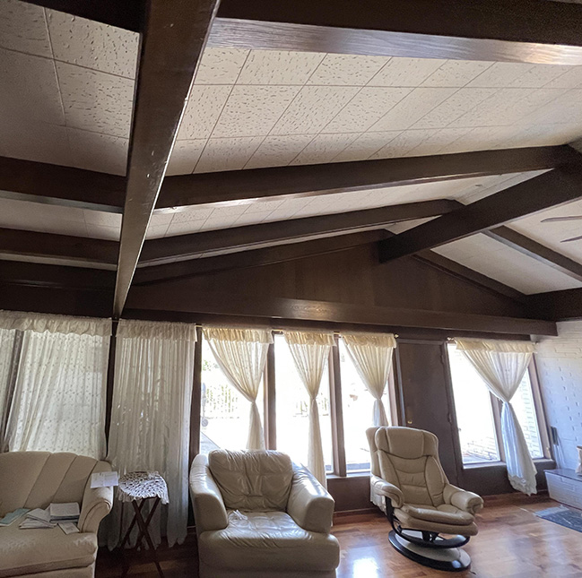
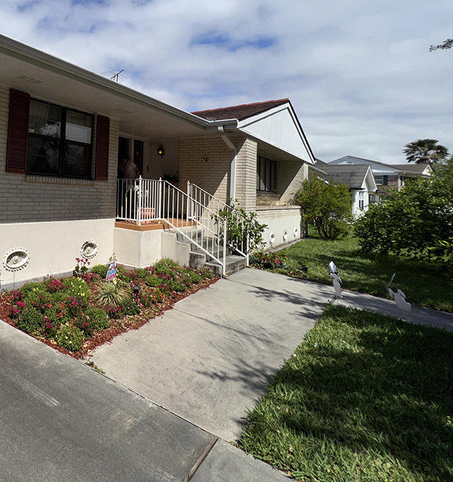
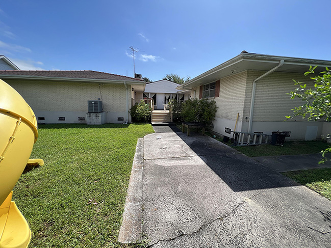
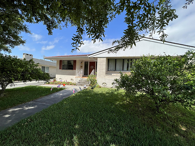
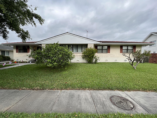
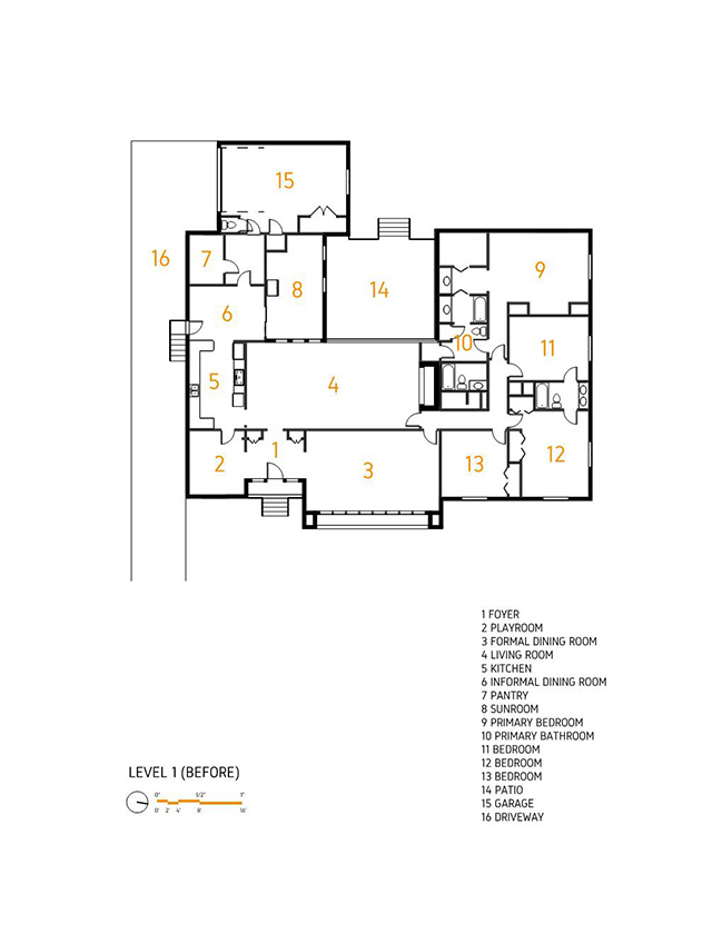
From the architect: The home located in the suburbs of New Orleans had a low ceiling that provided its exterior (and interior) with an aesthetic (and proportion) that was familiar to other mid-century homes built in this region but lacked many of the components that often distinguish these homes as remarkable works of Architecture such as an open floor plan, vaulted spaces (strategically juxtaposed to the low ceilings), and unexpected elements of surprise. Instead, the home favored functionality and formality in keeping with the regional client expectations of that time. Many distinct enclosed rooms with expected functions such as study, playroom, small and large formal dining room, sunroom, etc. strongly established a predetermined circulation path.
The owners aspired for a different, more expansive home but were firmly settled in place for good reason. After numerous and challenging life experiences, they hadn’t the inclination or belief until recently to claim their current house a home in the sense that it seemed permanent. While they had lived in the house for many years, it had taken some time to feel settled, so a renovation was favored over a new build. After sharing many life stories with Nathan Fell (NFA), the theme of how the owner's past transience culminated in their desire for stability became clear.
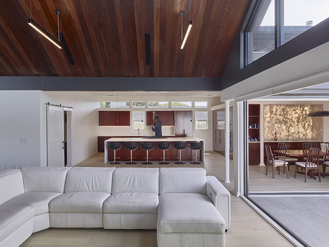
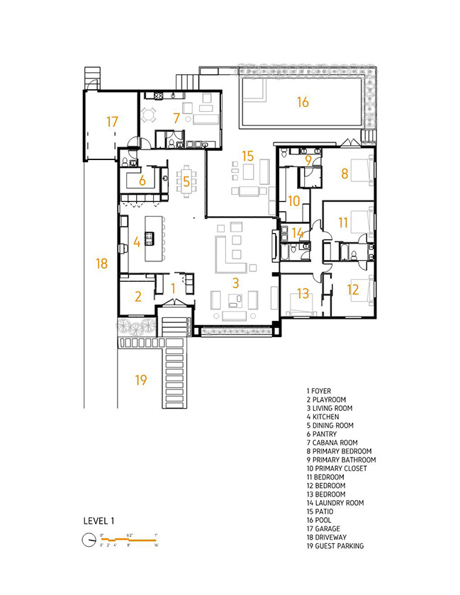
The floor plan was deceptively large but lacked openness, expansiveness, and visibility to multiple spaces the owners wanted for their large, multi-generational family. The idea of raising the roof came early on from them (the owners) who felt their existing house was too enclosed and cluttered. They wanted as much of the roof raised as possible, which means the existing roof would need to be completely removed and reframed. NFA suggested focusing (the portion of the roof to be raised) on the communal living areas rather than the bedrooms to get the most impact, and to leave most of the existing masonry exterior wall in their existing location.
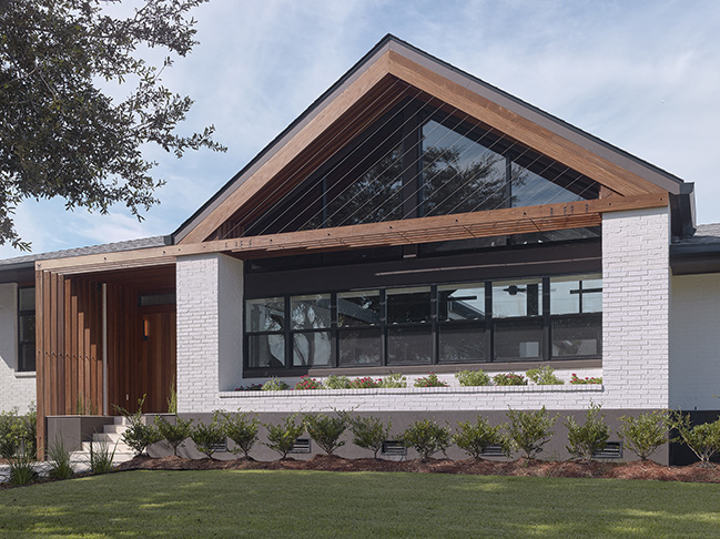
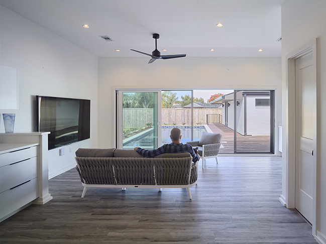
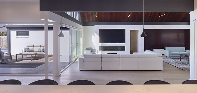
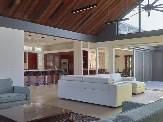
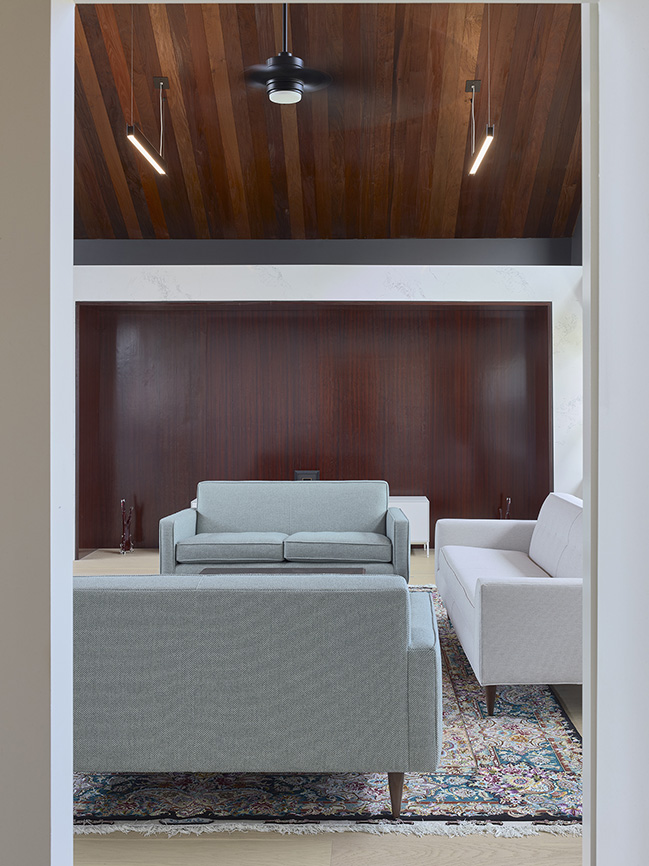
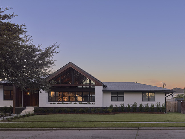
As for the interior floor plan modifications, the existing vaulted space in the rear-facing living room was increased in height and expanded to the front room, previously occupied by a large formal dining room. This resulted in a much larger multipurpose living area that opened from front to back with large triangular glazing at each end to maximize the visibility and scale.
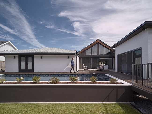
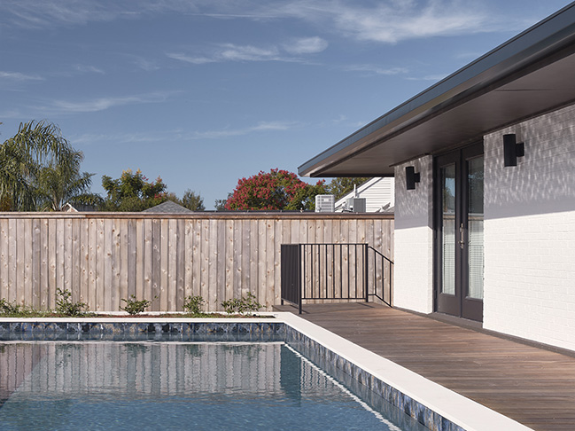
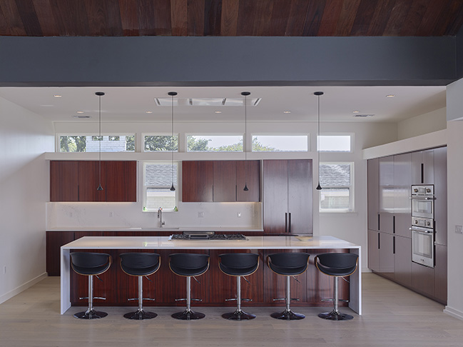
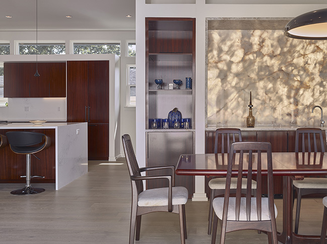
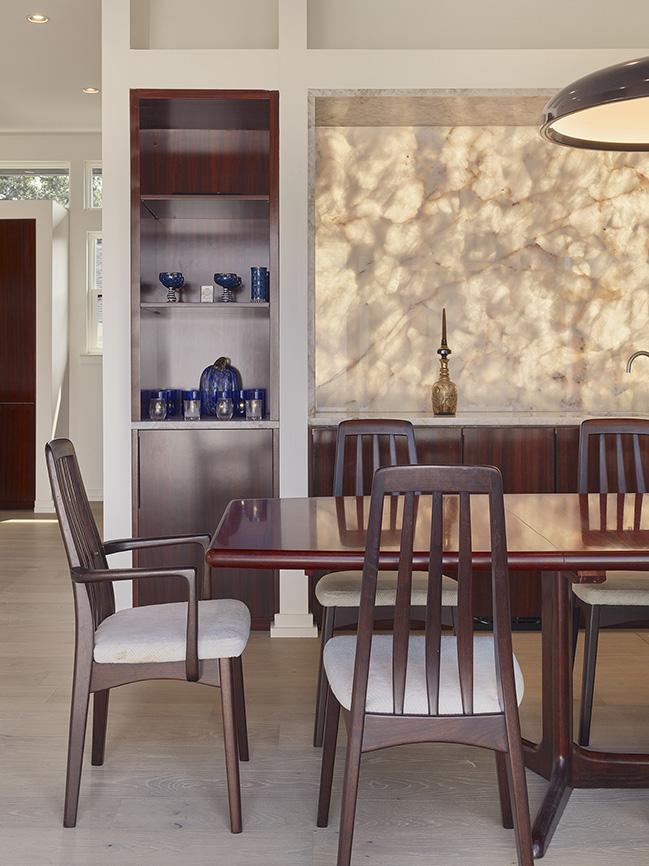
To increase the connection to the outside panorama even further a 2-sided multi-sliding glass wall added openness to the rear yard where a raised pool was constructed at the same level as the (3’ high) main floor. The existing rear deck was conceived as the internal courtyard from which multiple viewpoints of the main living spaces could all be taken in. The existing enclosed kitchen, informal dining, and sunroom were (also) all removed to create a more expansive and open kitchen and dining space that further connected to the courtyard and living areas.
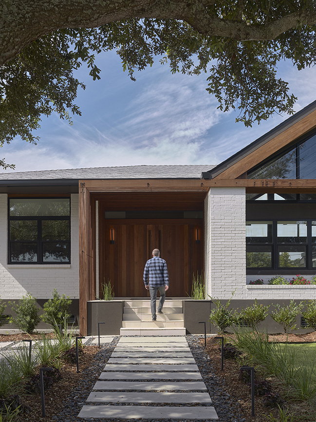
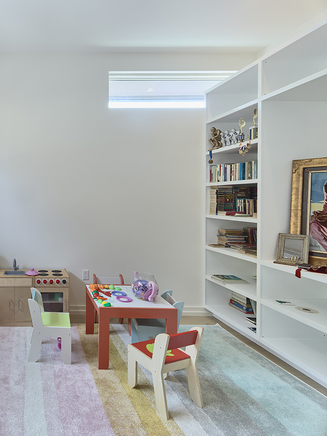
The resulting floor plan allows for a much more generous open space that could be adapted to various uses and furniture arrangements. Private and separate living spaces were also conceived as part of the plan. An existing small playroom was modified off the front entry and a new separate cabana room was added in the previous garage.
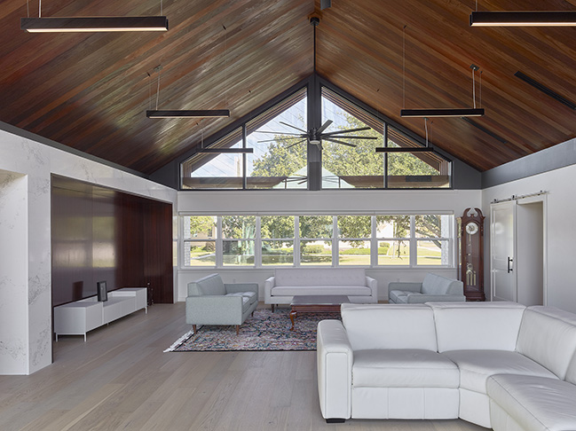
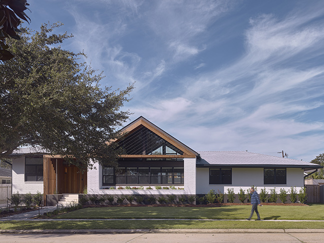
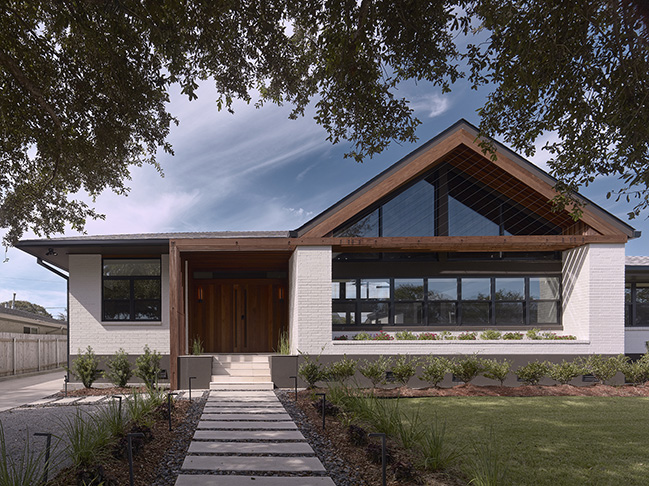
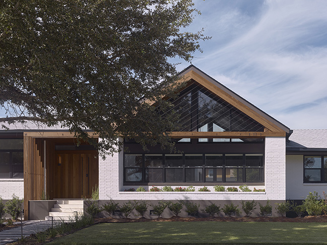
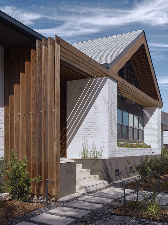
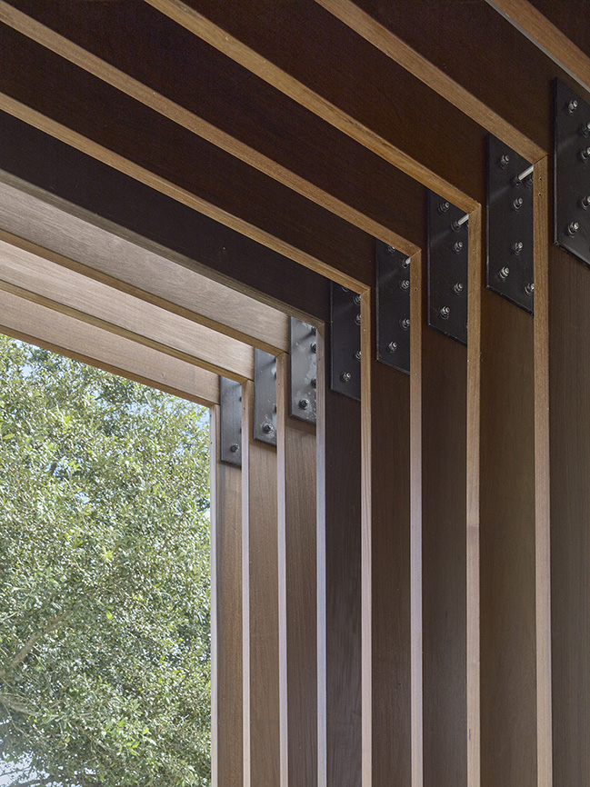
On the exterior, an Ipe wood trellis structure was added to the front to accentuate the front gable and entry. The trellis wraps horizontally at the front gable via a lower frame extending over the main doorway to the left to connote a more formal and grand sense of entry through new Ipe wood-clad double doors (that enlarged the existing front opening).
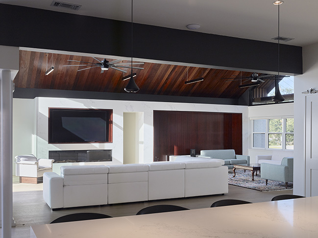
The idea was to use this wooden trellis as a layer of artifice that identifies the internal uses and scale of spaces while reinforcing the more horizontal proportion of the front elevation. It was important to the design to accentuate the existing brick façade element (including an existing planter reinforcing this horizontality rather than letting the increased height of the gable form seem like a superimposed element not blended to the whole.
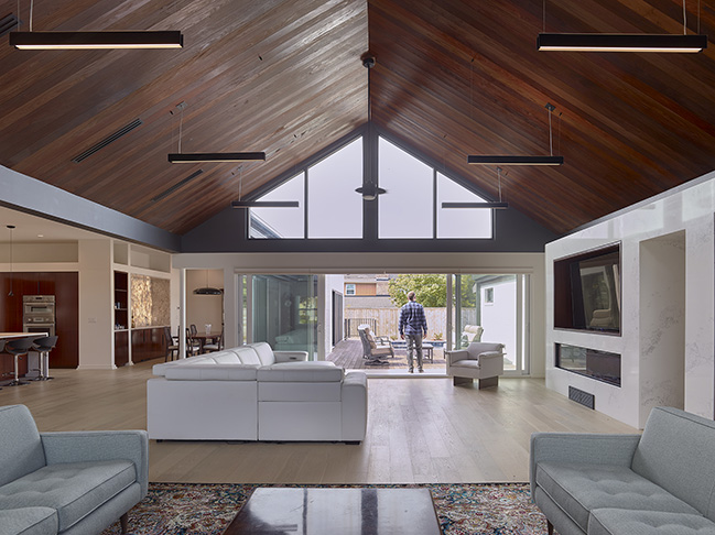
The owners loved their existing home and neighbors, so while there were a lot of ideas about the interior they wanted to be dramatically different, the renovation largely preserves a lot of the key elements from the general location of living spaces to exterior brick that made them feel connected to their home in the first place. It was an expansive and (at times) complicated project to detail and conceptualize, however, the result to feel both dramatically different and yet familiar at the same time was realized by the owners.
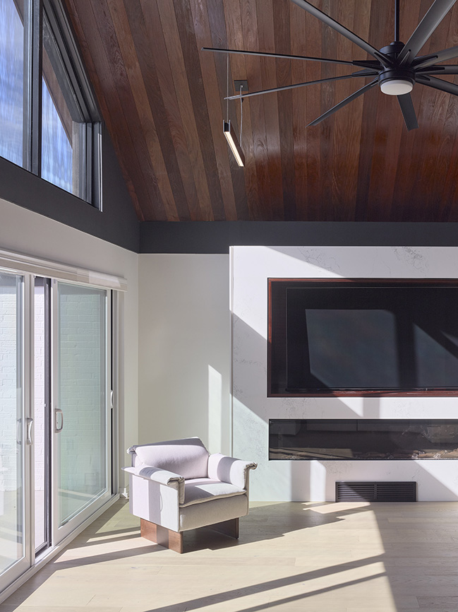
Architect: Nathan Fell Architecture
Location: New Orleans, USA
Year: 2024
Project size: 4,000 ft2
Site size: 11,300 ft2
Structural Engineer: Cali & LaPlace Engineers, LLC
Contractor: C & G Construction
Photography: Jeremy Jachym, Nathan Fell Architecture
Vaulted House by Nathan Fell Architecture
11 / 07 / 2024 In the suburbs of New Orleans, a remarkable architecture renovation project has resulted in a stunning transformation of a mid-century home...
You might also like:
Recommended post: Attic Apartment in a tenement house from 1911 by Loft Kolasiński
