11 / 11
2018
Whether it is day or night, the experience brought by space is full of endless possibilities, and we see it as the perceptual power that we always pursue. AD ARCHITECTURE has been insisting on the concept of abandoning designs that are over complicated, and, in order to pursue this kind of perception, we designed our own office as a habitat for soul.
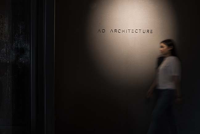
Architect: AD ARCHITECTURE
Location: Shantou, Guangdong, China
Year: 2018
Area: 850 m2
Chief Designer: Xie Peihe
Construction Company: AD Engineering
Photography: Ouyang Yun
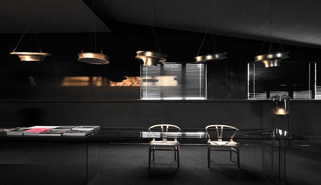
From the architect: The office of AD ARCHITECTURE is located in a creative park renovated from an old factory in Shantou. These old houses have witnessed the rise and fall of the city, and with the rapid development and expansion of the city, they are gradually being forgotten or waiting to be rebuilt. Knowing this, we seem to feel their weakness and loneliness, which remind us of the past vitality and unique temperament when we first saw the space.
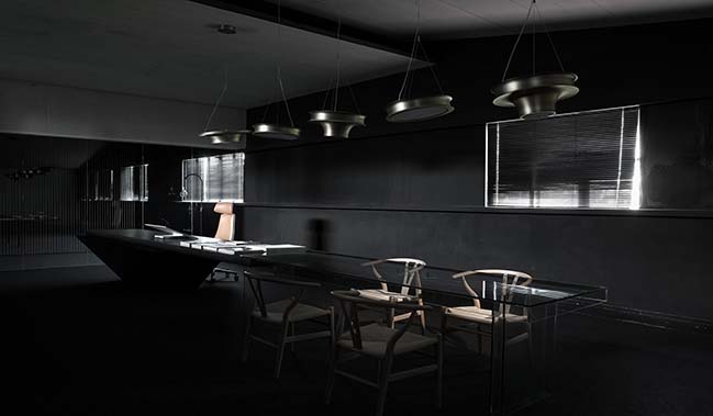
Does it mean the history it told us just ended here? When all the emotions came up, we started to think about it, and we decided to transform it into a space that can represent itself. We perceived the inspiration given by space and listened to it instead of changing it too much. In this design, what we need to do well is to respect the original ideology of space and inject new vitality inside.
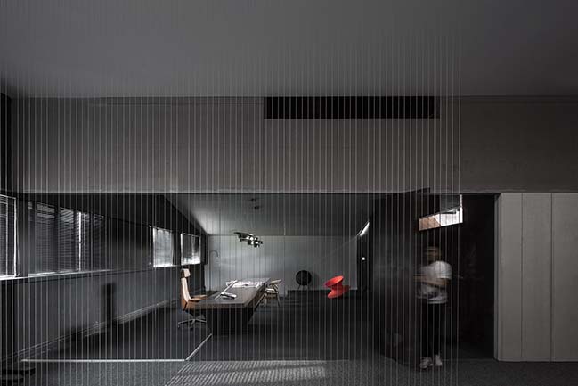
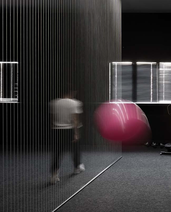
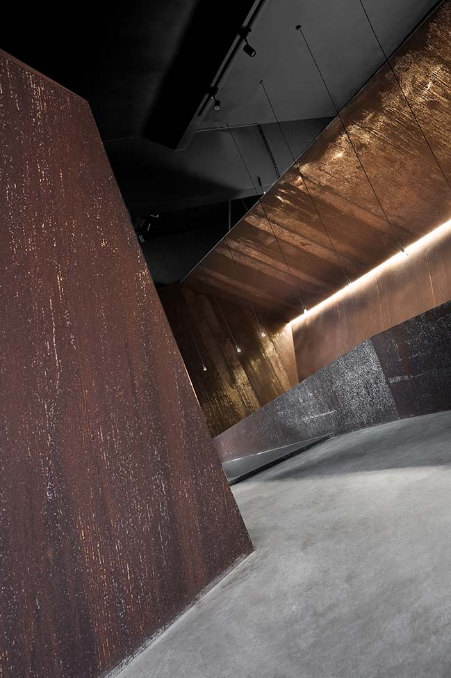
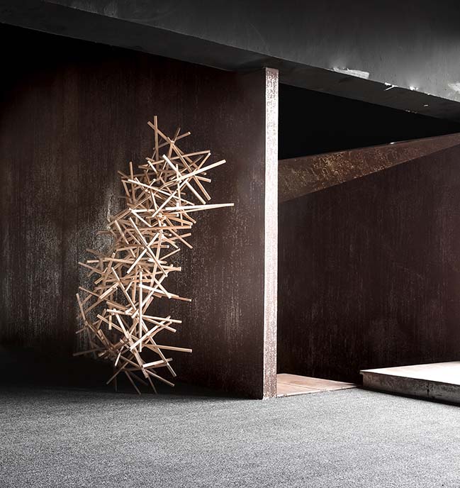
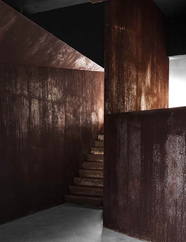
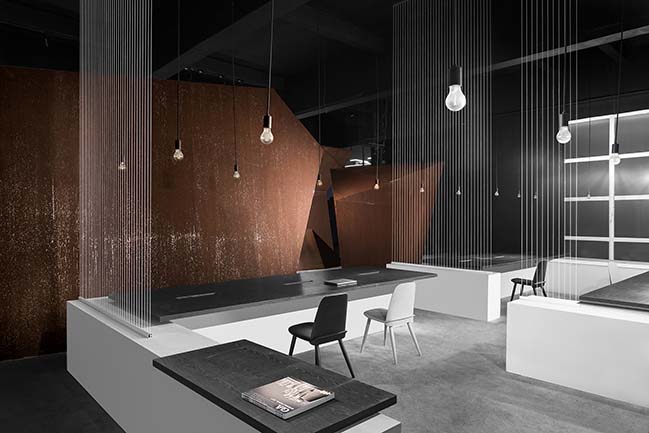
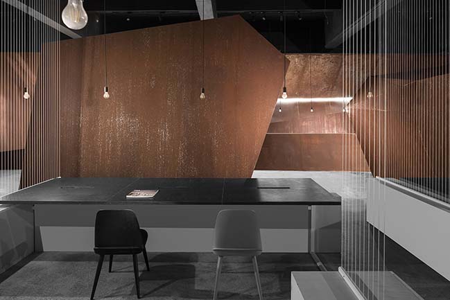
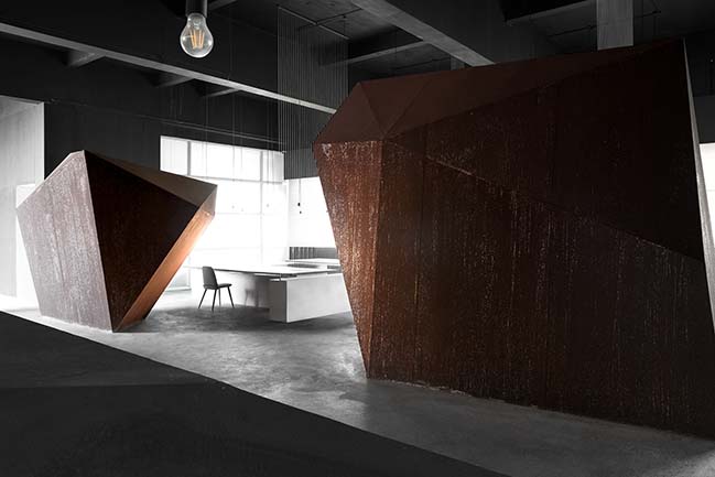
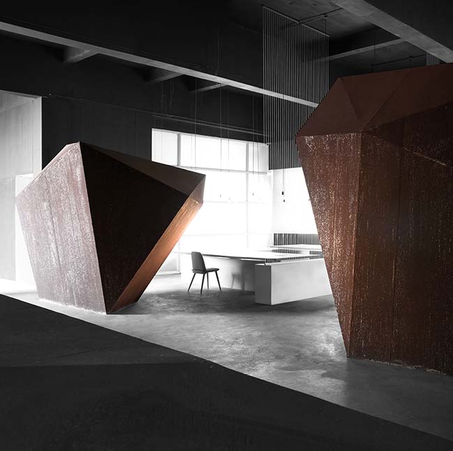
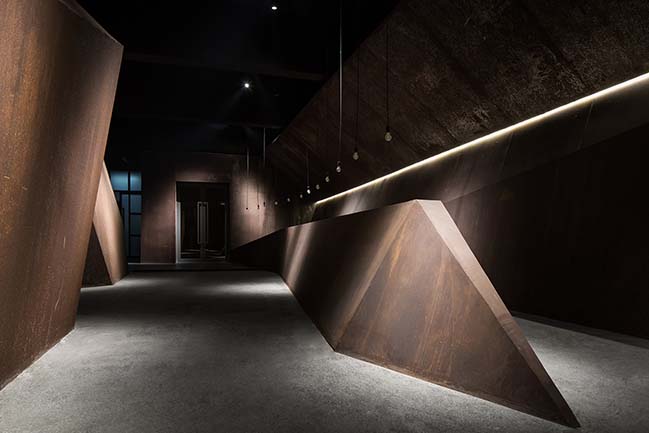
Perception | Power of the Original Space - In order to pursue the sense of scale brought by large space, we abandoned excessive partitions and adornments, and naturally extended the fusion of original space and new force through the composition of materials. The black paint finishes, cement floors and dark gray steel plates strengthened the consciousness of the original space's atmosphere.
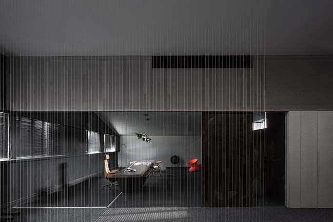
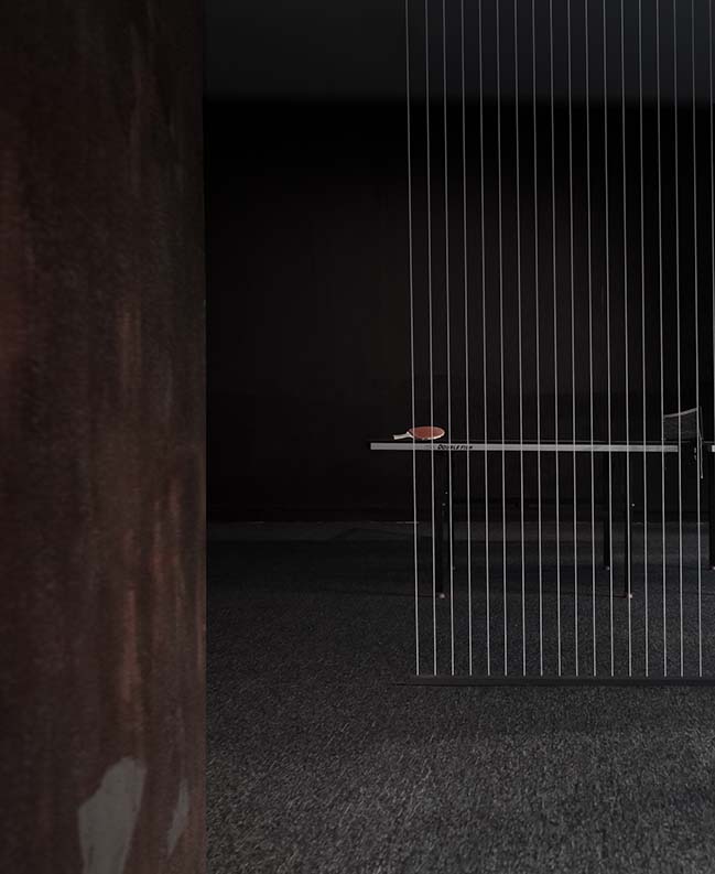
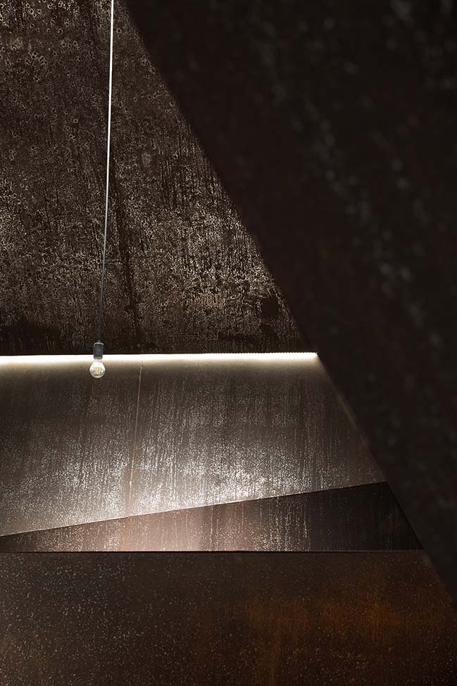
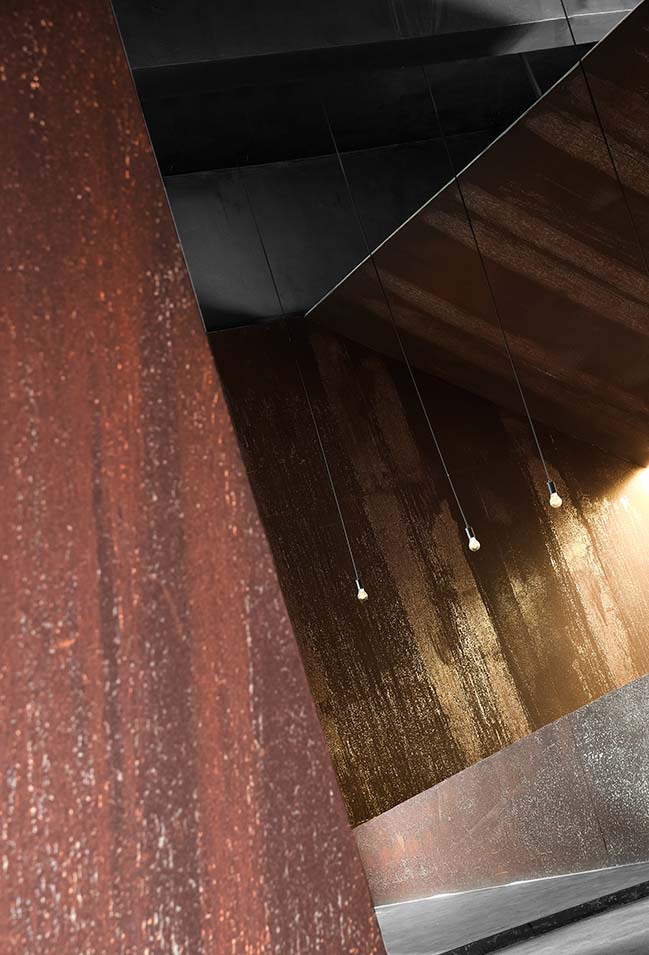
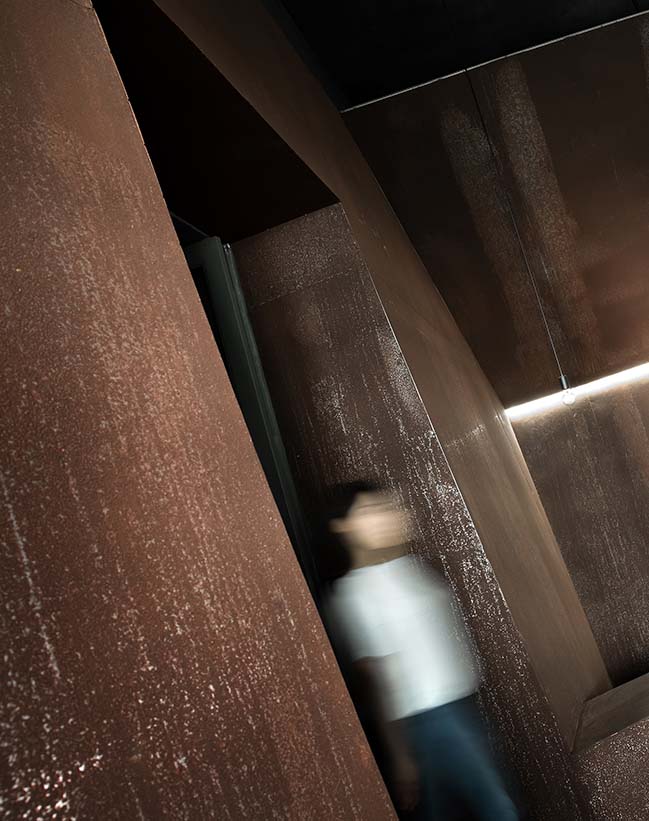
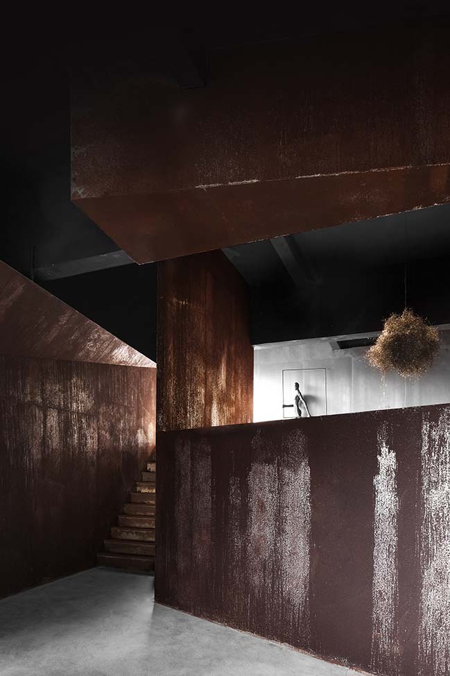
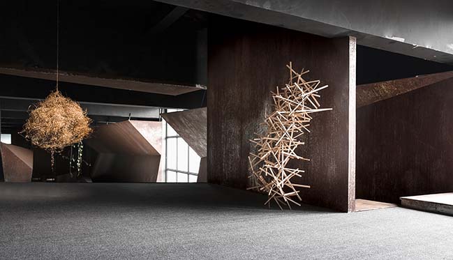
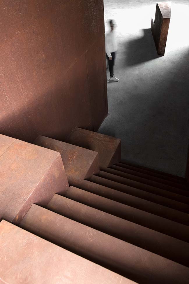
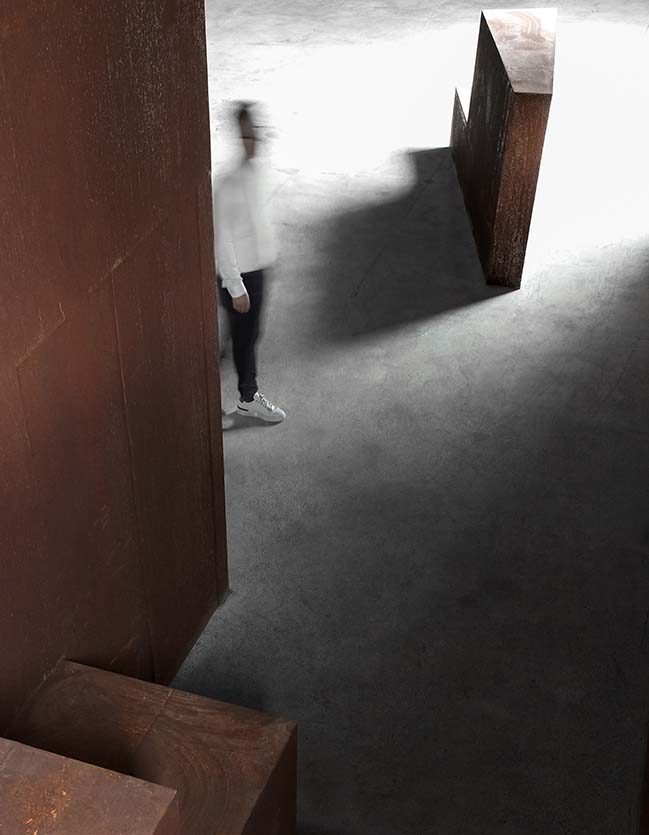
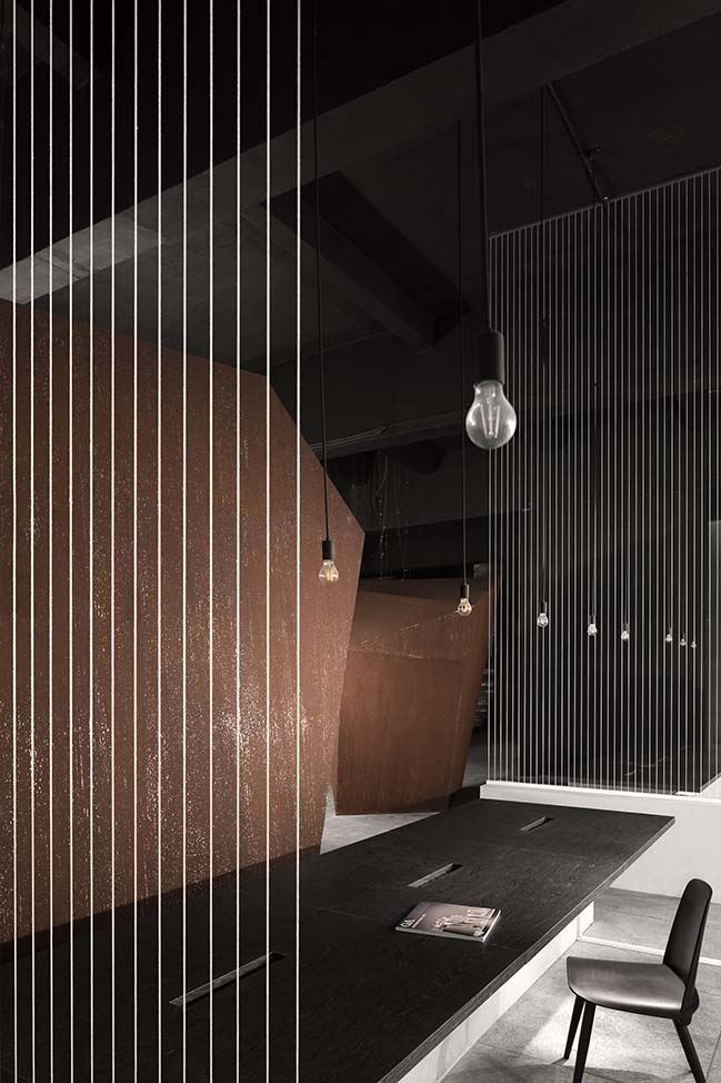
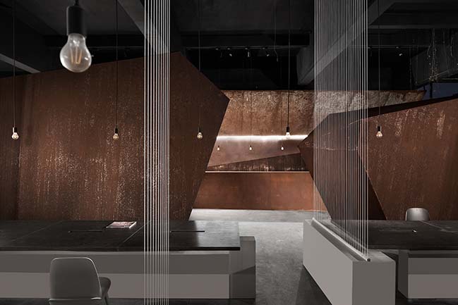
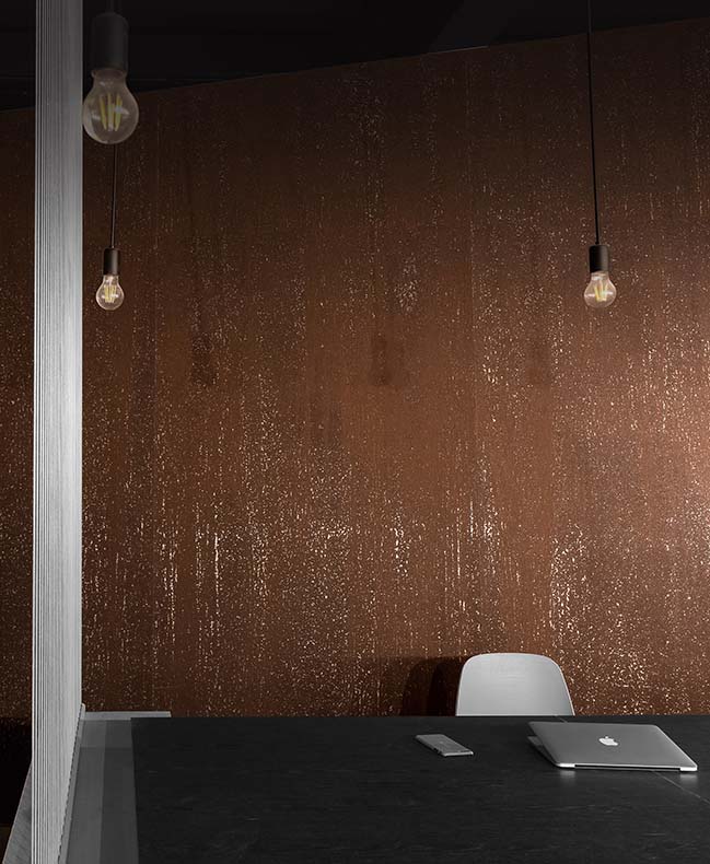
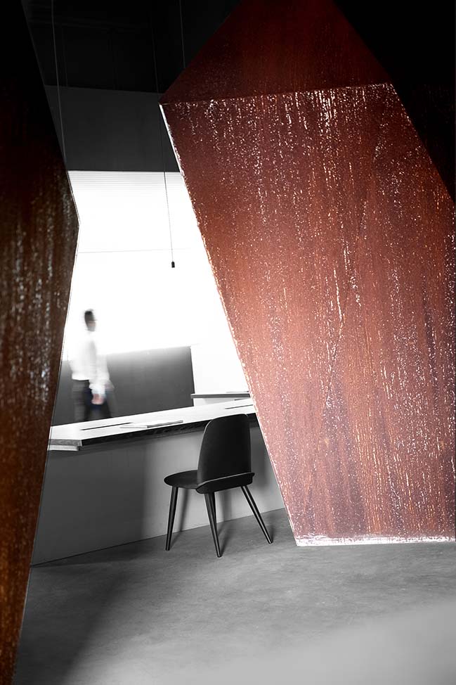
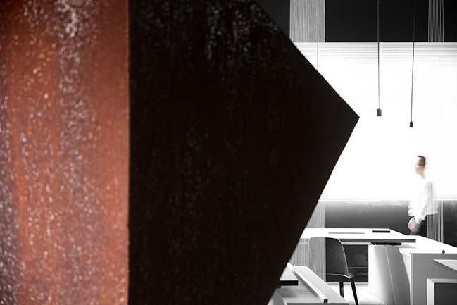
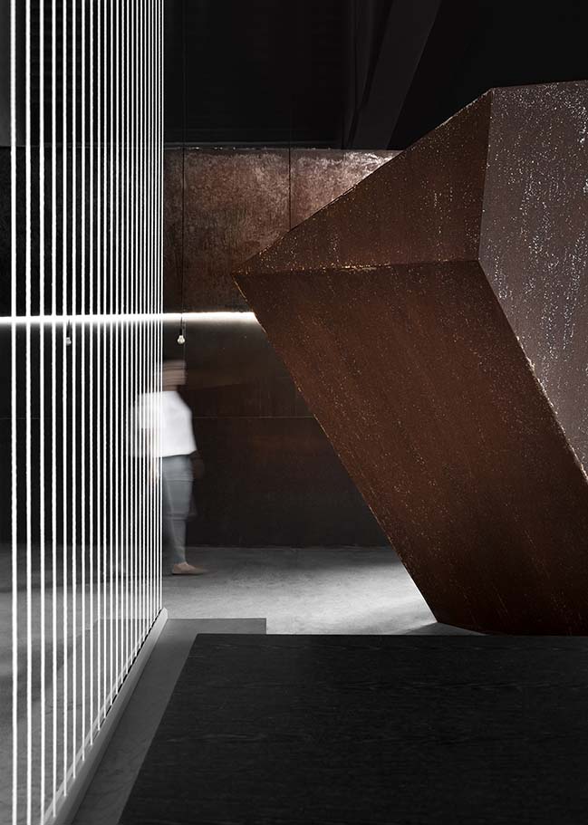
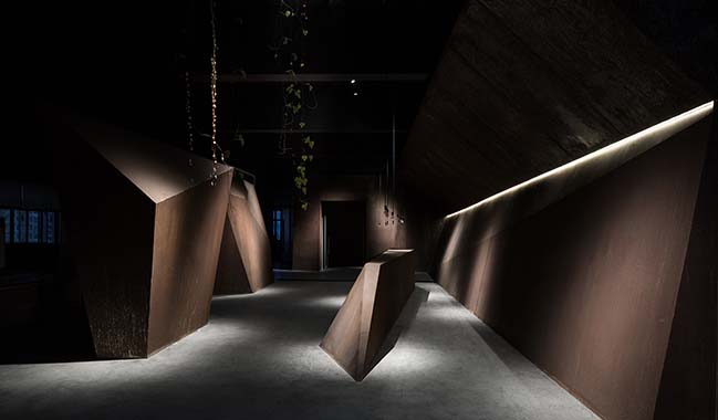
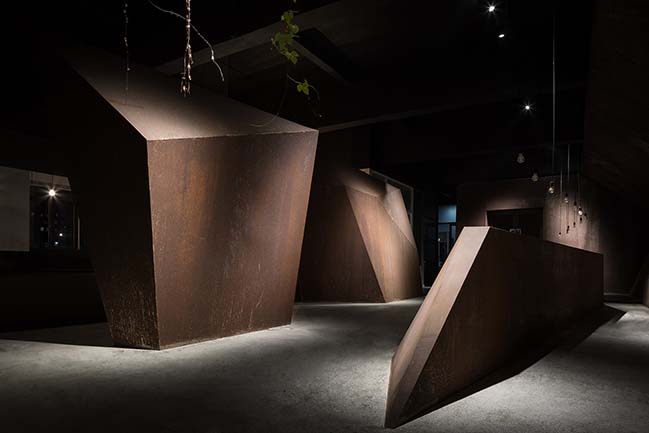
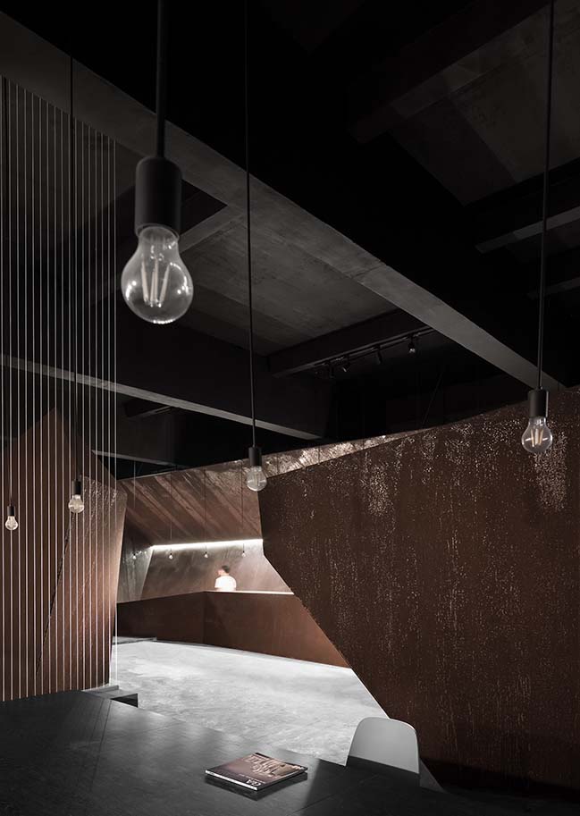
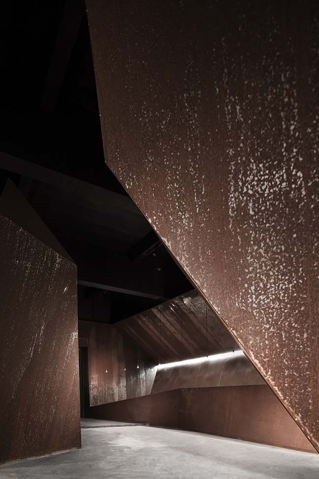
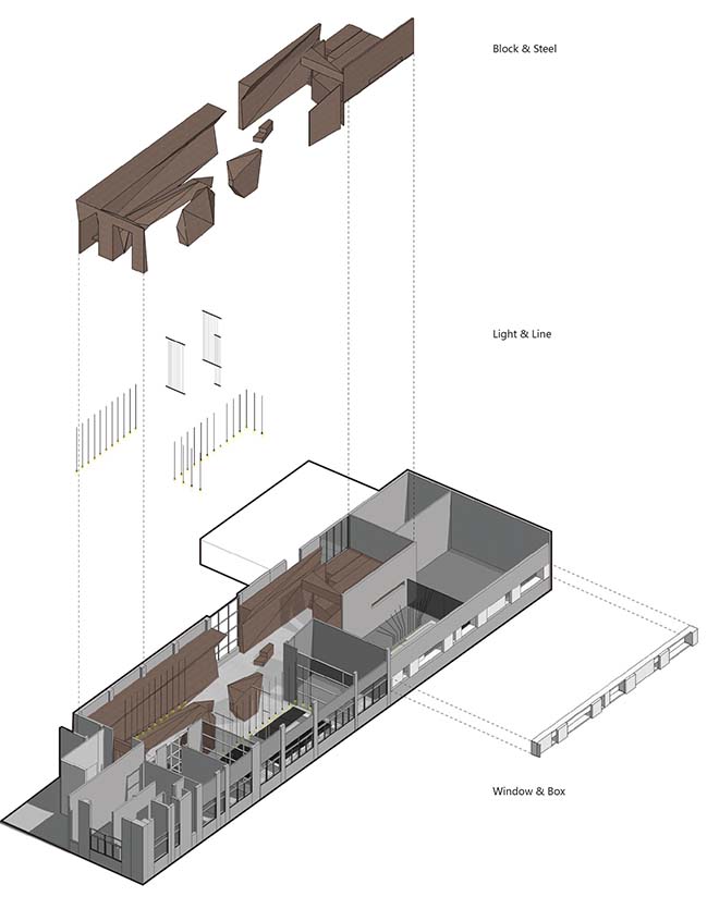
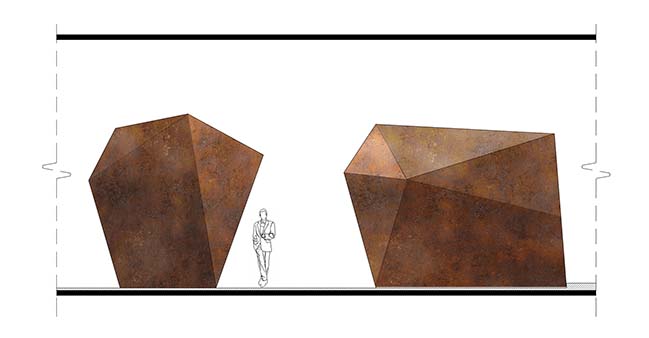
Without adopting unnecessary process and decoration, the additional built part is applied with industrialized steel and iron materials which corrode naturally as time passes by. It seems that they are showing the essence of strength and beauty. The integrity and uniqueness of each piece of material are respected, and the structure is as simple and direct as possible. All of them are telling the concealing power of the space, which intensifies its original temperament.
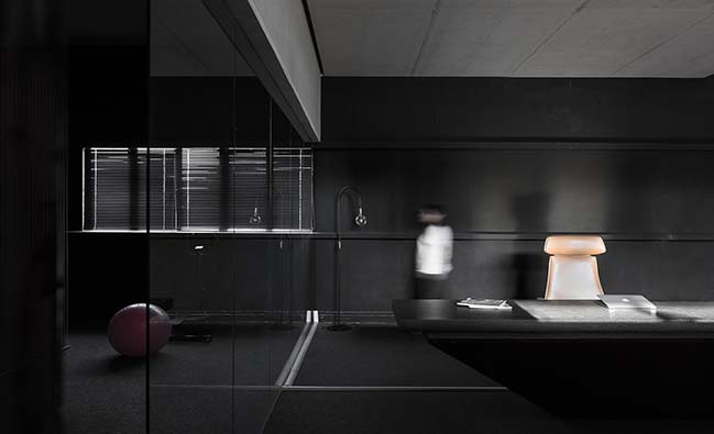
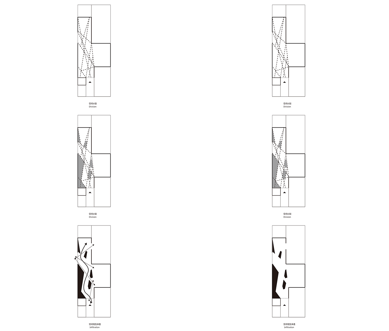
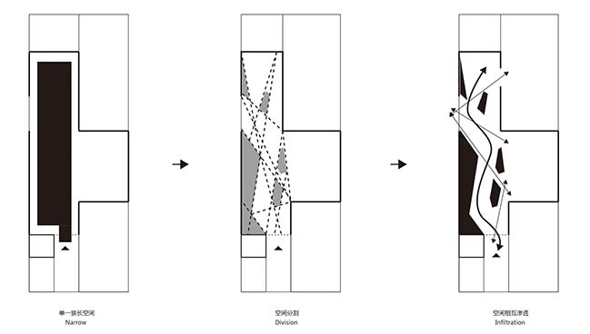
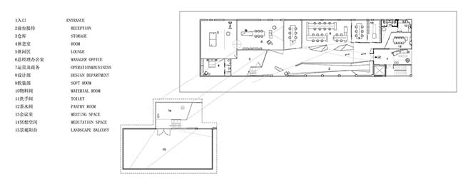
Functions | Enhance the Sense of Form - Apart from preserving the original structure and satisfying the functional needs in the office, we also added some bold spaces where people can think quietly. Taking the public working area as the core, we created two functional areas to inject new vitality. The small attic formed by space division enhances the sense of form, and the originally tall space becomes very interesting through the intersection of different volumes.

All volumes are seemingly connected without interfering each other, and each space is provided with necessary functions. The whole area is open and comfortable, and the focus is on the regained formal sense. We hope this sense of form can enable designers to open their minds and take every step with courage, and this is the spatial experience we want to bring to every visitor.
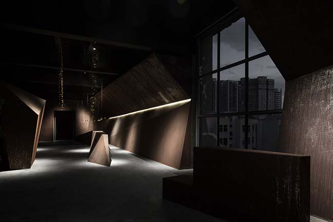
Nature | The Extension of Vitality - The sun is power. We retained the original structure and used a patio and some large windows to express the relationship between people and nature. The sunlight penetrates from the translucent patio and projects on the rusting models, which brings vitality to the interior. The concise large windows unintentionally allow the interior to talk with the exterior, and people would feel pleasant in the space.
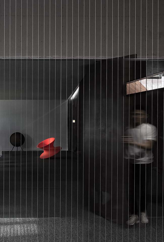
Through the refracted light and shadow, we can feel the power of nature. Designers are pursuing their dreams and insisting on design here, and this space frees their imaginations. They can enjoy a quiet moment in this place which no longer just shows its form. Based on the patio's lighting design, we aimed to create a nearly perfect space. Through the conversation between the patio and the outside, the spatial feeling is enriched and more experiences are provided.
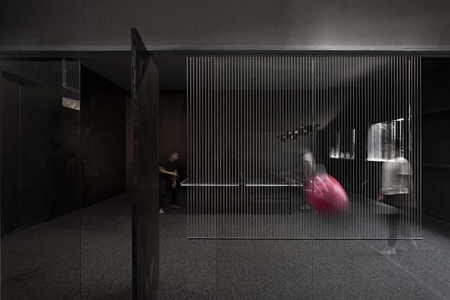
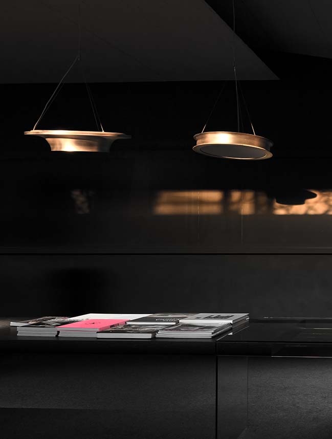
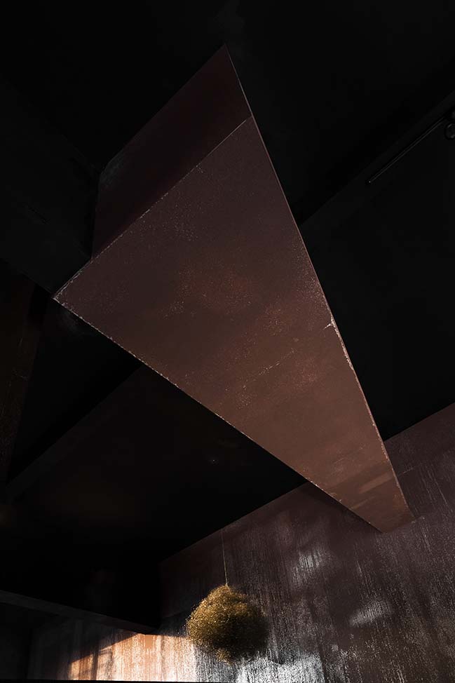
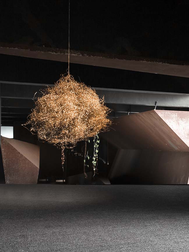
Lighting | Less is More - Lighting is also a major part of this design. We adhered to the principle of "less is more", and tried to create light without revealing the lamps. Lighting strips were mostly used in the front desk and office area. The light and shadow in the empty ceiling area refract on the model planes again, which not only avoids deliberately decoration, but also creates a simple atmosphere and good lighting layout. This is exactly what we are following and will follow in design.
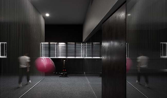
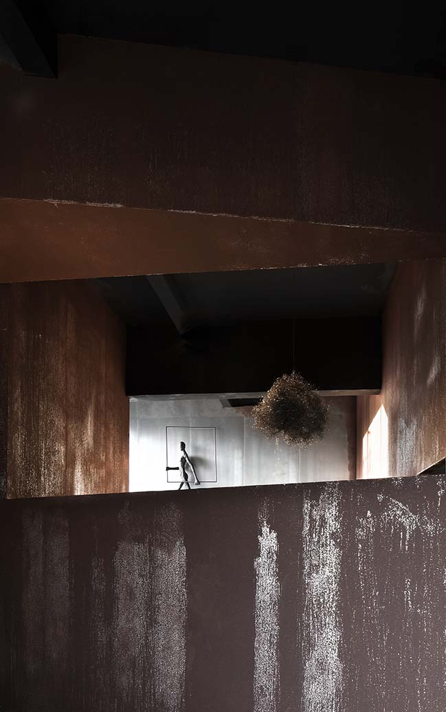
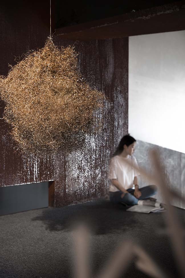
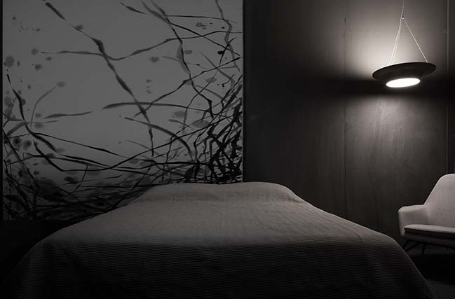
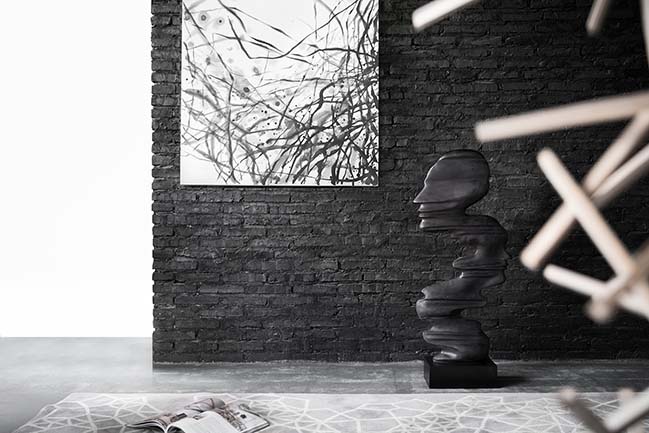
Soft Decoration | Artistic Temperament - Soft decoration is a symbol of design in space, and a connection between design culture and life. We selected simple materials as a respond to the space, so that the decorations are connected, and the individual character of the space is reflected. The small attic is a focal point in the space, where people generate lots of inner ideas every day.
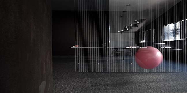
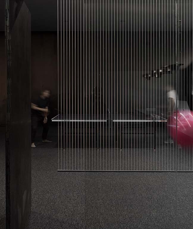
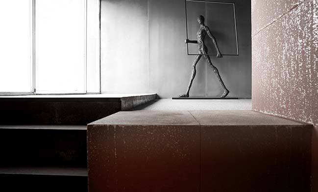
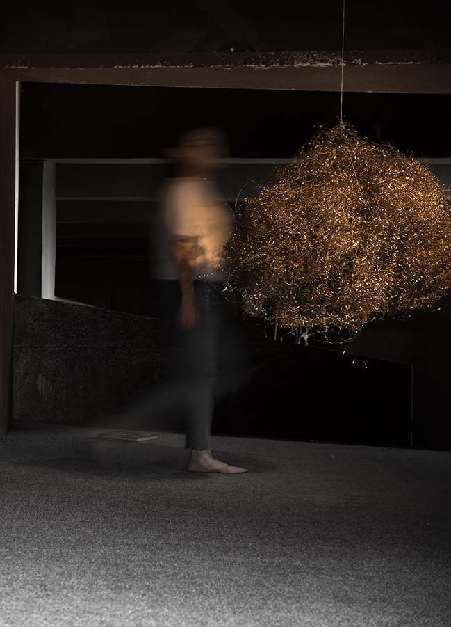
At one side of the attic, a large person statue is looking at the door, as if implying the visitors that more things are waiting to be explored in this office. Walking closely, you can see the ball which is made of iron wires is expressing art directly. The wires are interwoven with each other, just like designers' infinite thoughts. What we strove to do is to combine the artistic language to create a perceptual and powerful working space.
> YOU MAY ALSO LIKE: An elegant residence purifying your mind by AD ARCHITECTURE
> YOU MAY ALSO LIKE: XZONE Office in Shantou by AD ARCHITECTURE
> YOU MAY ALSO LIKE: CUN Design presents their new office in Beijing
> YOU MAY ALSO LIKE: CROYO Headquarter Office by Shenzhen Super Normal Design Co., Ltd.
> YOU MAY ALSO LIKE: JIAXING TKSTYLE OFFICE by JACKY.W DESIGN





AD ARCHITECTURE designed their new office in Shantou
11 / 11 / 2018 AD ARCHITECTURE has been insisting on the concept of abandoning designs that are over complicated and they designed their own office as a habitat for soul
You might also like:
Recommended post: Seascape by Atlas Architects
