12 / 07
2018
The project is called AX3, just like every project Studio ETN does it has its own branded name. We were asked to design a 90m2 apartment, that was originally designed in a way that didn’t accommodate the clients’ needs.
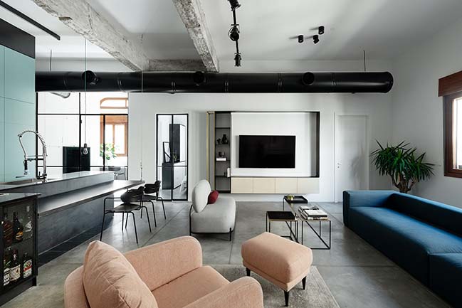
Architect: Studio ETN
Location: Tel Aviv, Israel
Year: 2018
Photography: Gideon Levin
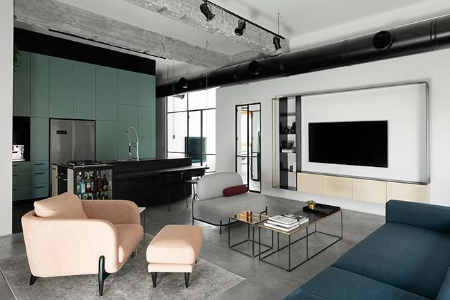
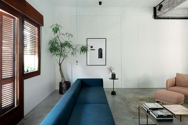
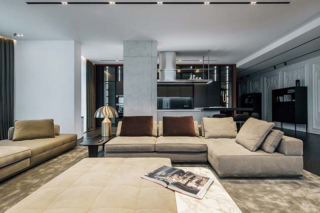
From the architect: The renovation was total and massive. Following the traditional Jaffa design, the space came with high ceilings and wooden blinds which were already full of local character. We wanted to create a mesmerizing dissonance between the interior and exterior of the space. The apartment is a very large open materialistic space that is accompanied by vigorous Jaffa character. The central program of the project began from the tenants’ desire to turn the apartment into an inviting well-lit space that will have a very “homey” feeling.
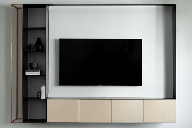
The idea behind the plan was to find a balance between natural light and artificial light using different lighting scenarios after sunset. Balancing up to date materials with traditional ones in order to form a harmonious, timeless combination between them. Finding a balance between the ceiling and floor. Creating the balance was essentially the concept.
The idea behind the project:
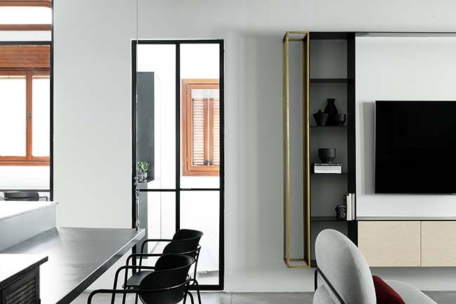
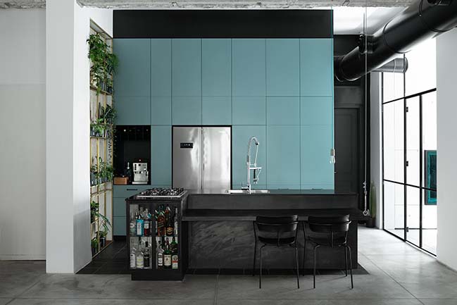
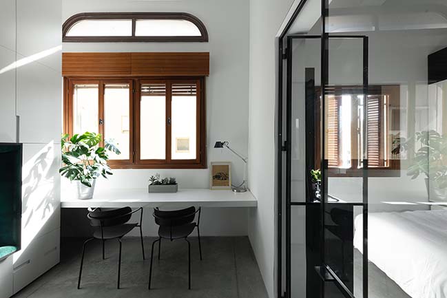
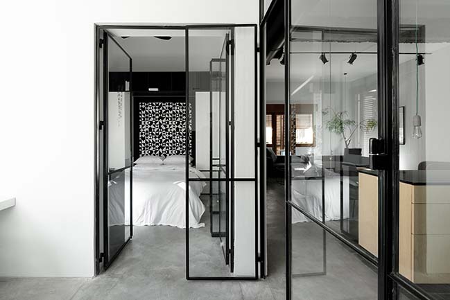
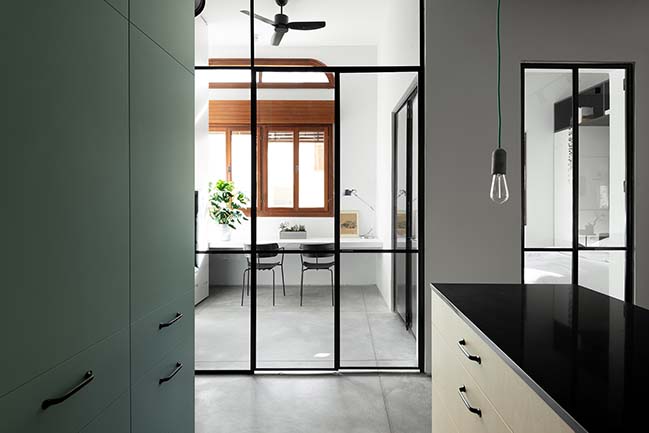
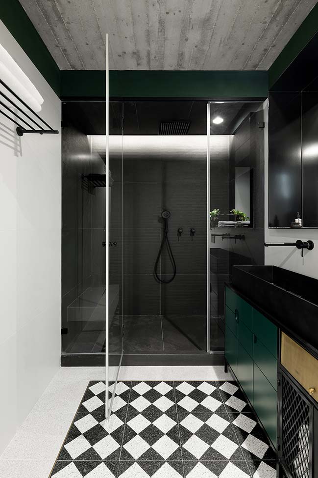
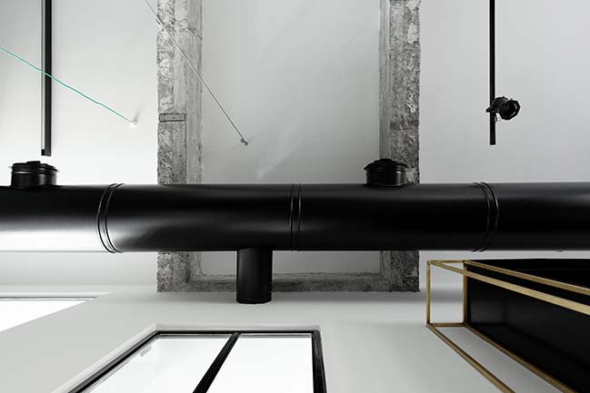
We’ll share project details in a few sentences: we demolished the existing walls between the main space and the bedrooms. Instead, we created dividers using glass and thin Belgium profiles in order to flood the space with natural light. We demolished all of the wet areas of the apartment including the technical gallery, which we later reinstated in order to open up a large kitchen that will compliment the tenants’ needs. We examined the idea of a technical gallery for the household systems such as a water heater, AC, and electrical systems. The gallery space is also used for storage which is reached by a ladder through the bathroom ceiling (!)
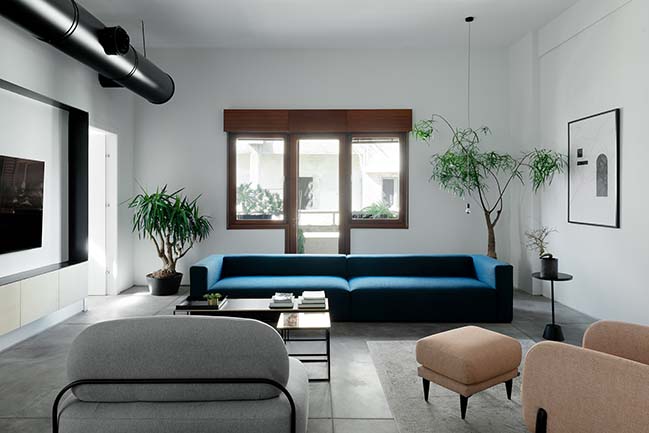
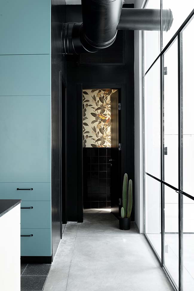
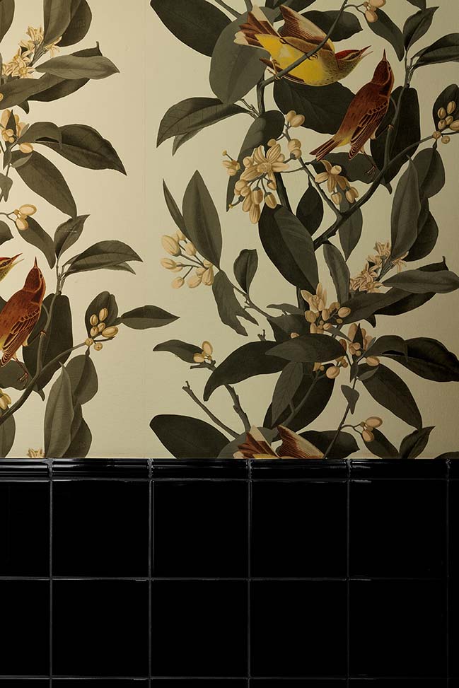
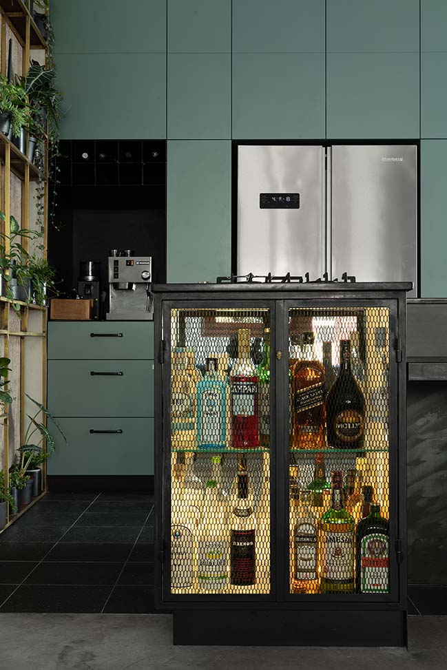
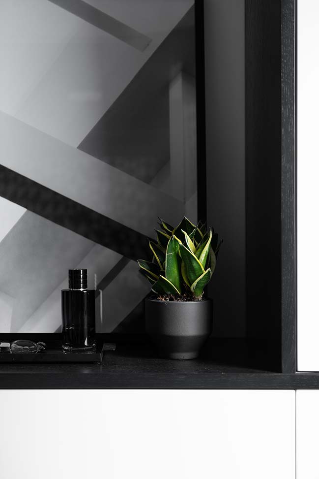
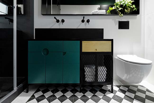
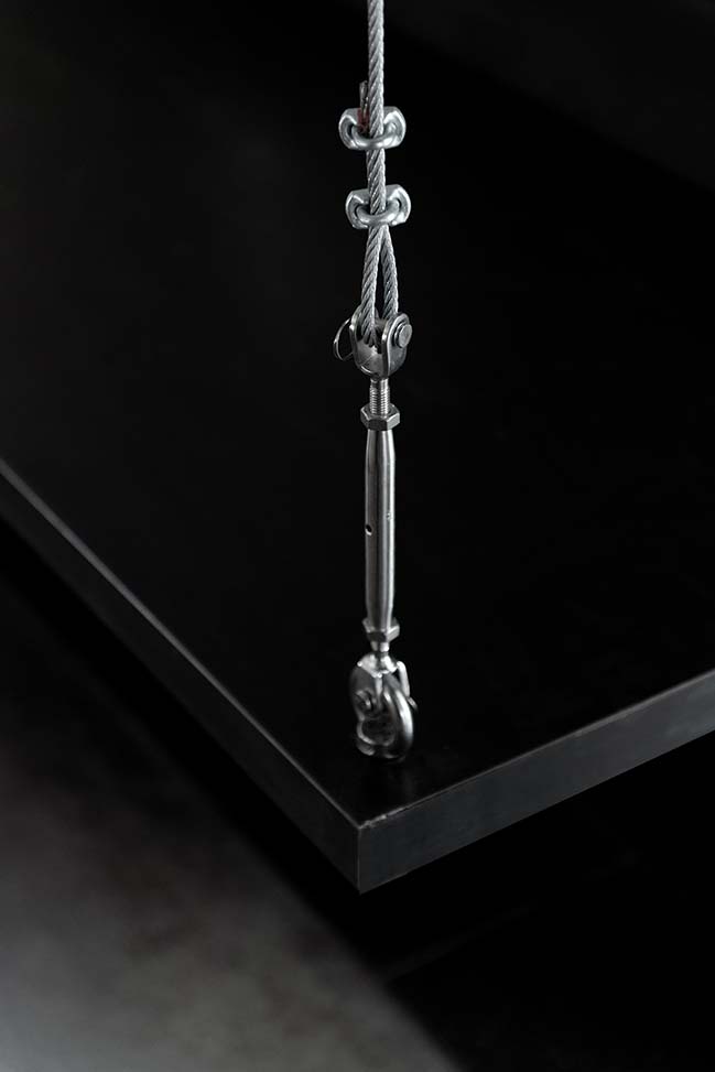
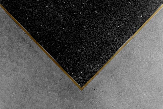
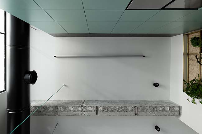
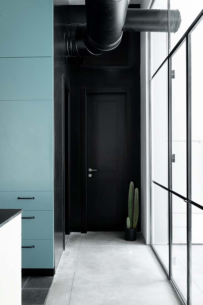
The chosen material palette is very national, down to earth, very Israeli. The materials take into consideration the loft’s Jaffan uniqueness and what it had to offer even before we intervened. We added more local materials such as iron and terrazzo which was applied in a modern context in order to add elements from the leisure and fashion worlds. We complimented these materials by pairing them with a neutral touch of color that wasn’t too bold. Artwork was also added to match the pace and character of the space.
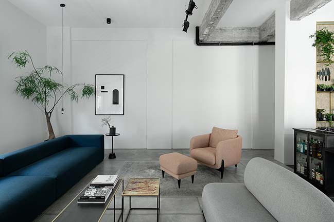
Essentially, one large open space was created which has a bedroom and a workspace closet space that is open to the main area using the glass dividers. This openness makes the living space half public and part of a shared kitchen open to a generous living space. The living space has a balcony overlooking an abandoned building. And, although is it abandoned is comes with a bright and promising future.
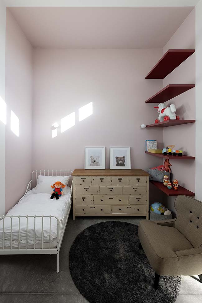
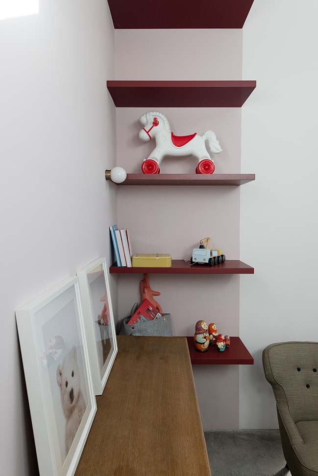
We decided that the daughter’s room would be separated from the rest of the space, and that apart from the rest of the rooms, would not be open to the main space. We wanted her to have a space that fits her age by choosing the right materials and shades for her, but also by giving her more privacy.
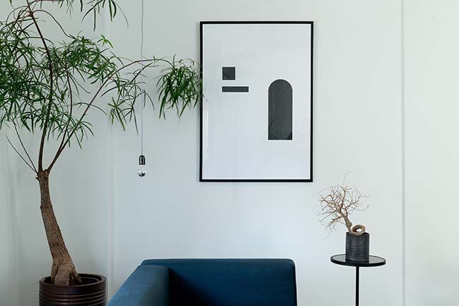
The lighting concept was chosen very thoughtfully and was designed specifically for this apartment. The concept was built around a number of scenarios- daytime, evening, and night that could change throughout the hours of the day by choosing the different light circuits.
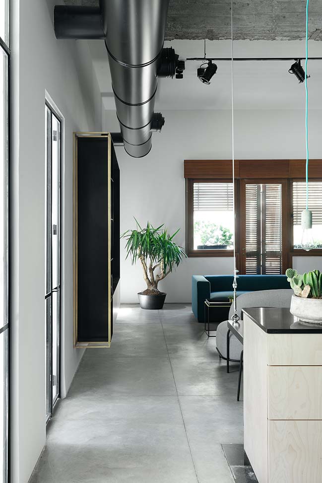
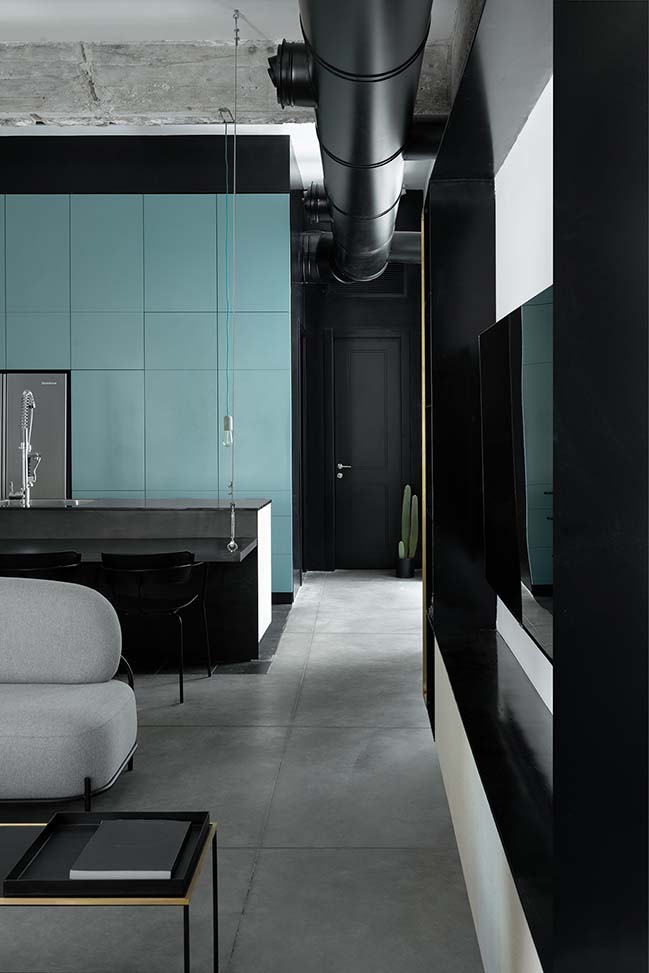
Although the apartment is very open, the use of different materials for the floor and the axis defines each area in more ways than one. This can be seen on the layout and when walking in the apartment. The idea was to create room for simultaneous day to day activities to take place without interrupting one another, by having very wide passageways.
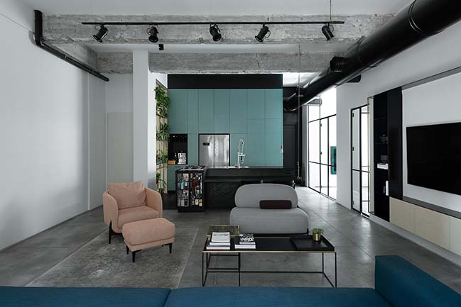
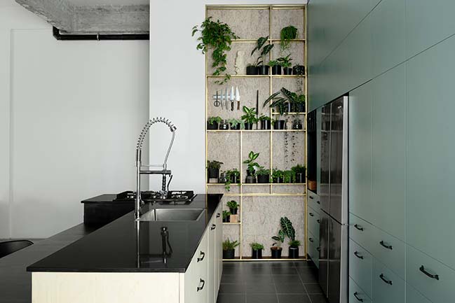
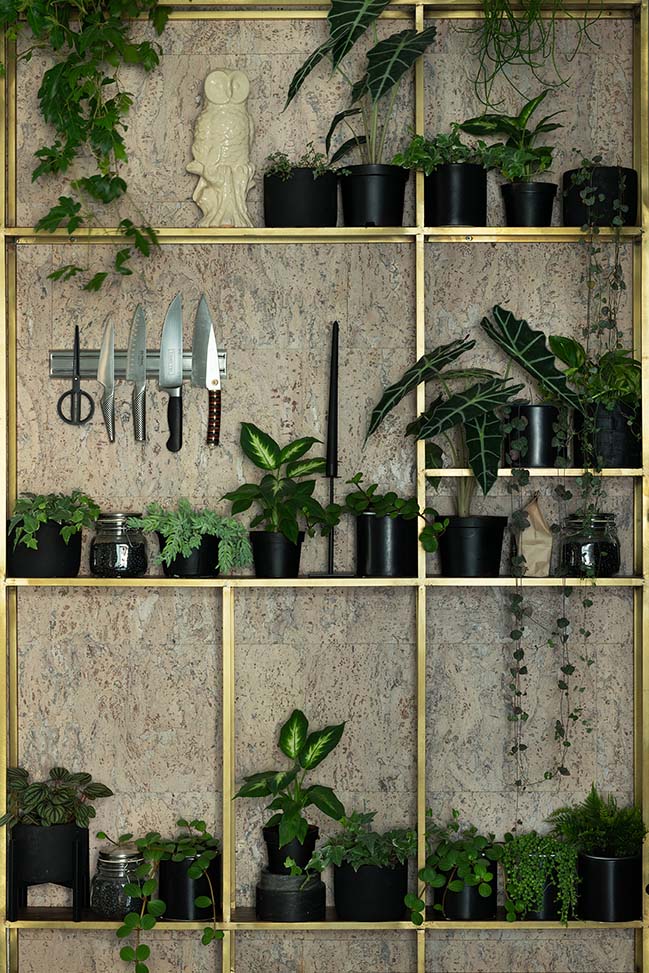
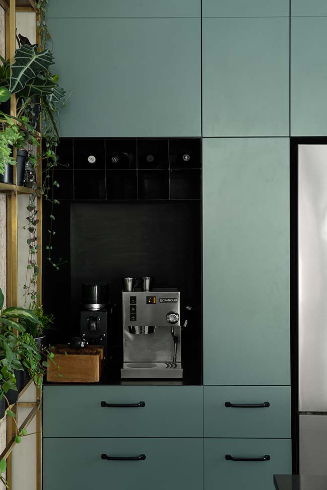
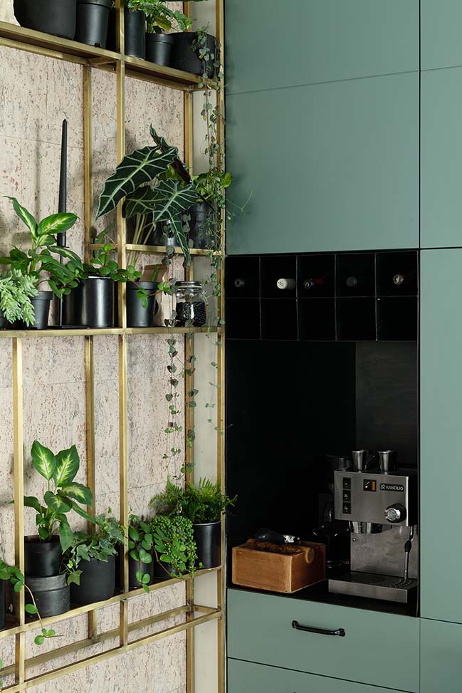
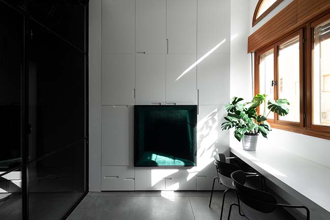
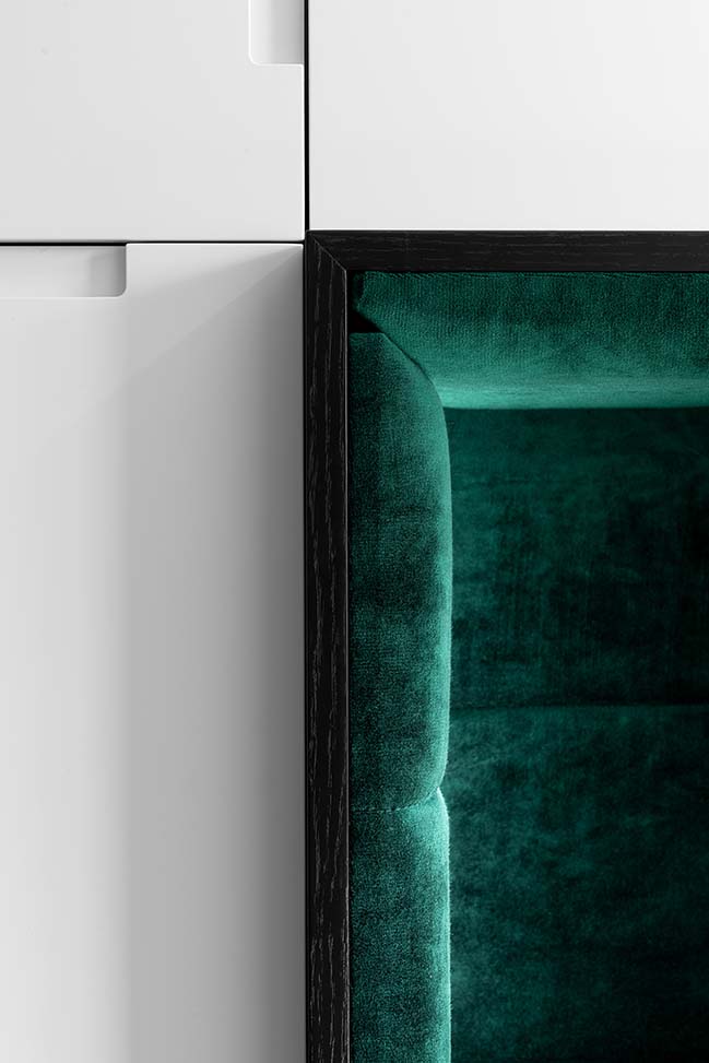
This project is very close to the studio’s heart, being that there are small magical gems hidden throughout it giving it the touch of humor that strings it together to other projects designed by us. Skulls, walls that were designed to become storage, plant furniture (botanic walls), a reading nook in the office space coated with green velvet that is carved out of the massive closet space. We really tried getting inside her head for the nook space and giving our modern interpretation of the ever so romantic concept of a “tree house”.
> YOU MAY ALSO LIKE: 70sqm apartment in Tel Aviv by Studio Perri

> YOU MAY ALSO LIKE: Penthouse in Tel Aviv by Aviram-Kushmirski
> YOU MAY ALSO LIKE: Tel Aviv Beach Apartment by MGA | Meirav Galan Architect

AX3 - 90m2 apartment in Tel Aviv by Studio ETN
12 / 07 / 2018 The project is called AX3, just like every project Studio ETN does it has its own branded name. We were asked to design a 90m2 apartment...
You might also like:
Recommended post: Banana House by Faber Group


![Modern apartment design by PLASTE[R]LINA](http://88designbox.com/upload/_thumbs/Images/2015/11/19/modern-apartment-furniture-08.jpg)


