06 / 16
2019
Yes! And this is what the architects did when they were given the opportunity to design & create this house for a family of 5 in Pune.
Architect: Alok Kothari Architects
Location: Bibvewadi, Pune, Mahrashtra, India
Year: 2019
Project area: 2,600 sq.ft
Site area: 3,600 sq.ft
Principal Architect: Alok Kothari
Team: Devendra Deshpande, Akshay Karanjkar
Photography: Hemant Patil
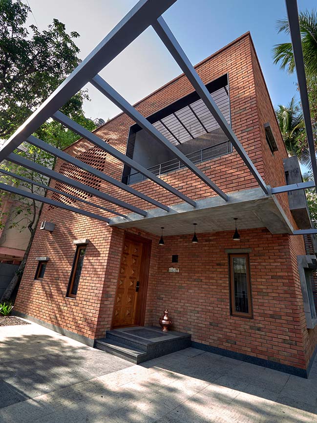
From the architect: Nestled in a quiet residential neighborhood, this 3,600 sq. ft. site hosted a 25-year-old single storey house. Unfortunately, we decided to bring down this structure as it was in a dilapidated state, its interiors were gloomy & also, it wasn’t a vaastushastra (traditional Hindu science of architecture) compliant house – which was the client’s main requirement. Our design had to provide solution to these issues & hence we started asking ourselves a few questions. First & foremost one was – What factors made the internal spaces of the existing structure gloomy & how to pull in enough natural light?
Study of the site surroundings & the existing structure provided a few answers. Main reasons for the existing house being dull & dark were the Parking + 3 storey bungalow on the east side of the site that was cutting off the morning sun, dense vegetation along the site periphery (though it is the main USP of the site) & small opening sizes which didn’t allow enough light to penetrate into the house.
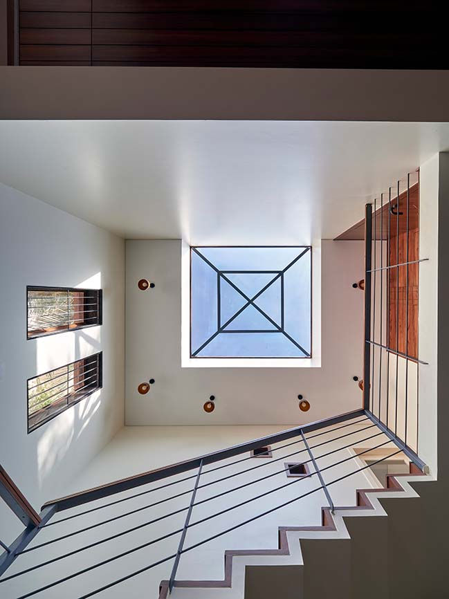
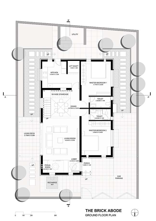
In order to cater to this issue, we decided to anchor all the spaces in the new design to a central ‘sky light’ which would not only draw in light during the entire day but also act as a ‘brahmasthan’ (an important aspect related to vaastushastra) of the house. Also, having large windows to all the rooms was the logical way forward. Interestingly, the need to light up the spaces naturally & presence of dense vegetation meant that we could do away with the fenestrations for the openings. Now that the tools of drawing in natural light were in place, the next question to be answered was – How would the spatial arrangement be?
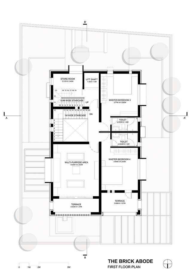
Of course, it had to be vaastushastra compliant but there had to be a larger planning principle that would act as a foundation to the design. Working around the norms of vaastushastra, we designed a ground + 2 storey structure around 2 functional zones – one for the private spaces & the other for the public spaces – along the north-south axis.
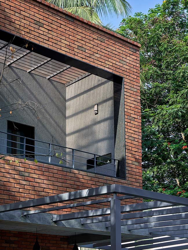
The client’s demand of having all daily necessity spaces – living, dining, kitchen, pooja room (area dedicated to worship to God), 2 bedrooms & toilets - on the ground floor was also catered to. The living area & the kitchen were placed on either side of the central ‘sky light’, below which the magnet of the entire house was placed – the dining area. The positioning of an L-type, folded plate, ferrocrete staircase around the dining added a play to this central core.
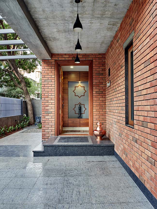
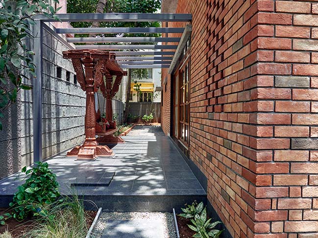
The living extends onto the outdoor seating area which hosts a traditional Indian swing that the client already had. The kitchen is connected to the utility space at the rear side (south side) of the house. Continuing the same grid, the first floor is composed of 2 bedrooms, toilets & a multi-purpose room. For ease of movement & connection, the kitchen (ground floor), the long term store (first floor) & the pantry (terrace floor) were deliberately placed next to the elevator on the rear side (south side) of the house, whose location was in turn guided by the vaastushastra norms.
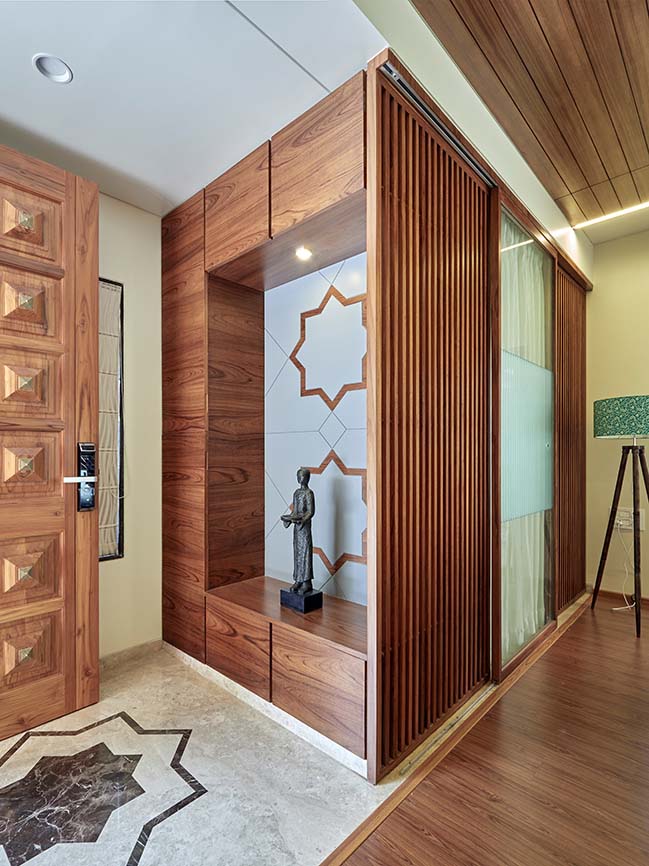
Carving out a block from the ground floor grid, provision was made for 2 car parks next to the entry porch. Once the client was convinced with the spatial arrangement of the functions, we were immediately asked as to how the plan would materialize into a 3-dimensional form?
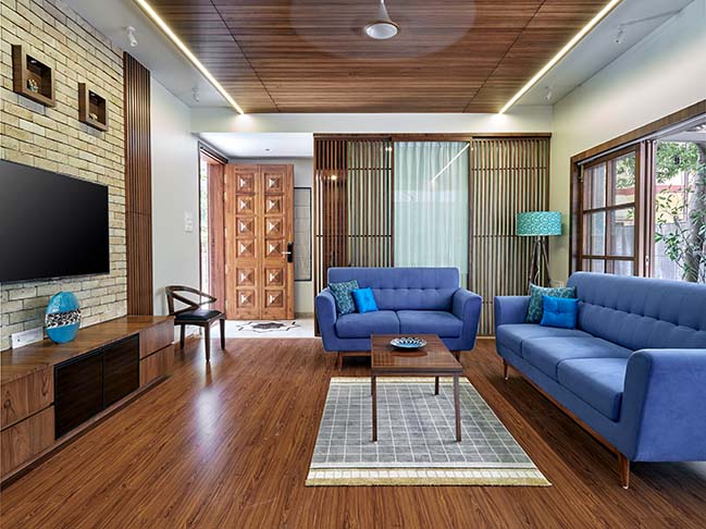
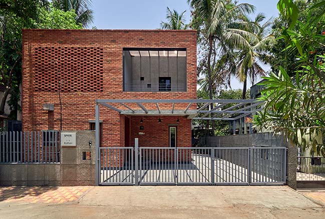
The client’s one-line brief about the built form was – “make something that is simple but still makes a statement”. We took this up as a challenge & started exploring different ways of architectural expression. Our research took us to the vernacular residential typology of Pune – the wada – which were always as simple & elegant and were mostly constructed in exposed brick or basalt stone or both. We decided to use brick as it is a reasonable material from environment as well as the cost perspective. Moreover, the warmth & the aesthetics provided by brick as a material is unmatched.
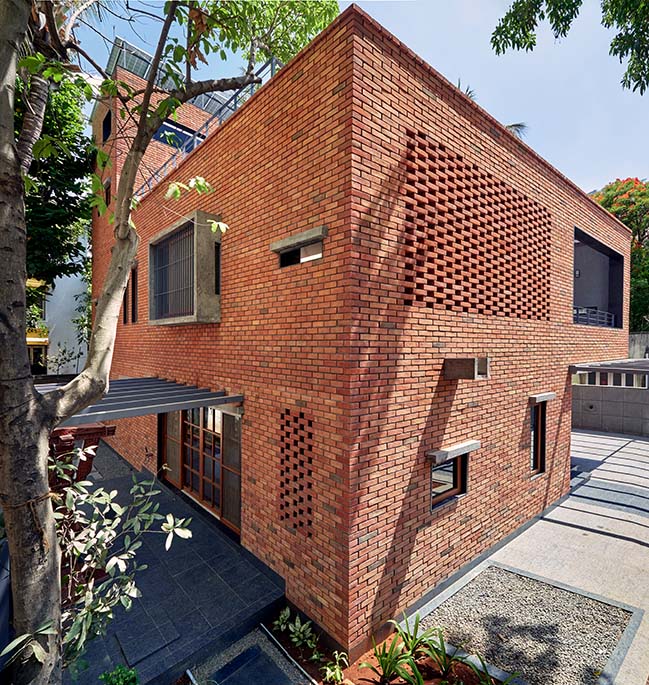
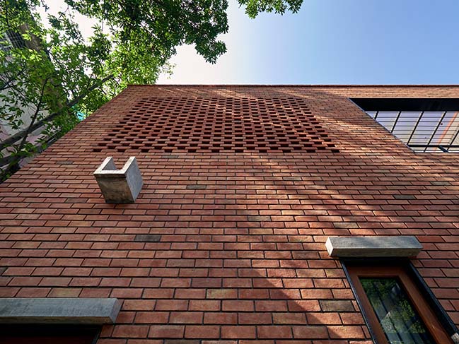
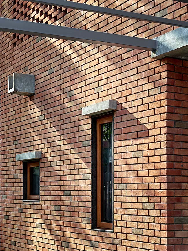
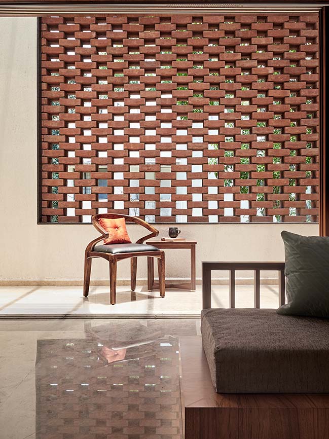
As mentioned before, massing of the structure has been kept very subtle & a lot of focus is on highlighting the materiality of brick. To complement the red colour of the bricks, exposed concrete box windows & weather shades have been introduced. In order to break the monotony of the brick façade & also to provide privacy, ‘jaali’ (perforated wall in brick) work has been used on the north side (front) elevation – at the first-floor balcony – and on the east side – at the pooja room. The bulky volumes of over-head water tank & the elevator cap have been strategically placed at the rear side of the house to maintain the scale of the structure.
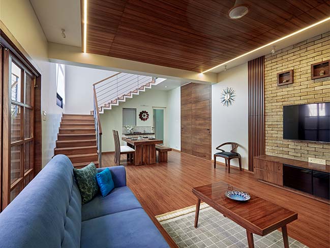
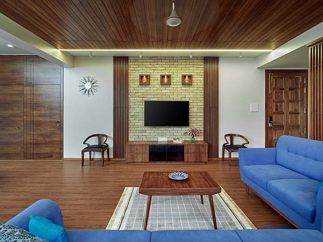
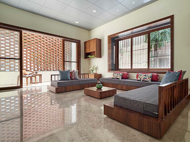
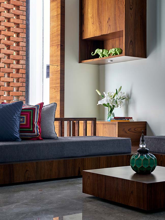
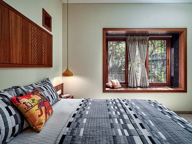
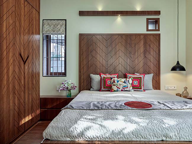
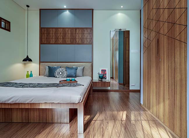
While the material palette (brick & concrete) for the exteriors of the building is carefully chosen to give it a simple, natural & a playful look; the interiors also follow a similar approach. The material palette comprising of teakwood finish & light colours helps in providing a simple, natural & an elegant look.
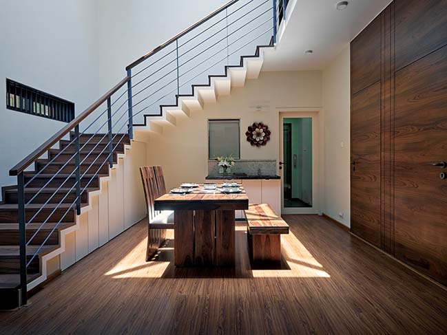
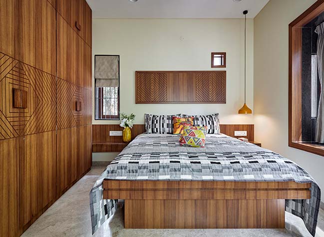
The main USP of the interior space & furniture design is the use of ‘patterns’ in defining different spaces. The seed of this once again lies in our study of the vernacular architecture where the use of such patterns is evident in floorings, wall carvings, ceilings, etc. The science of vaastushastra believes that the use of such shapes & patterns boosts the energy flow & generates positive vibrations. These positive vibrations are what make a house ‘a home’ – an abode.
YOU MAY ALSO LIKE: IHA Residence by Wallmakers
YOU MAY ALSO LIKE: Chhavi: Desert House by Abraham John Architects
YOU MAY ALSO LIKE: Garden Room by The White Room
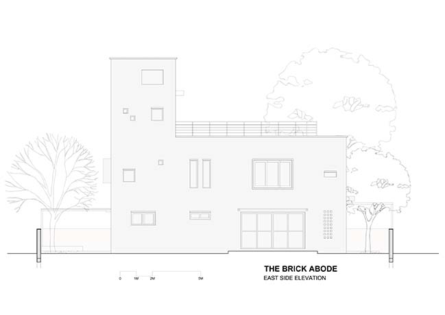
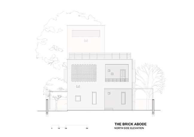
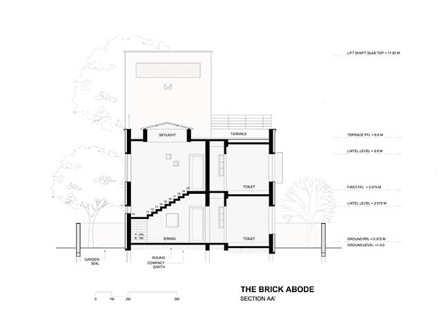
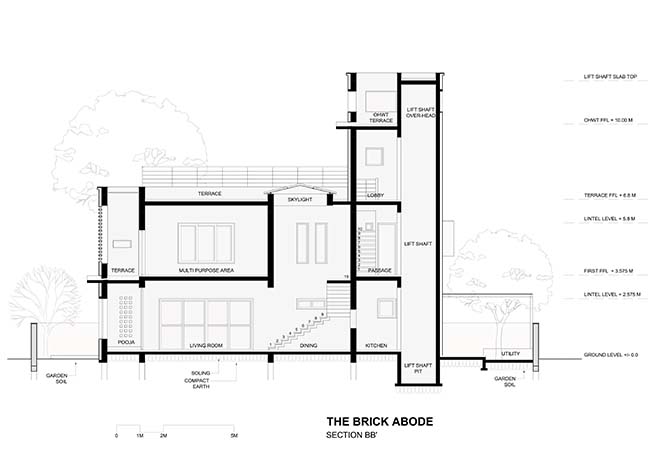
The Brick Abode by Alok Kothari Architects
06 / 16 / 2019 Yes! And this is what the architects did when they were given the opportunity to design & create this house for a family of 5 in Pune
You might also like:
