04 / 06
2022
Taking into full consideration of functions and environmental protection, the designer did not reorganize structure of the apartment, but divided the functional layout of the space by means of deconstructionism while proceeding from the perspective of creativity and art...

> The Penthouse of the OPUS ONE, Hangzhou, China by T.K. Chu Design
> Luxury in the sky by U31 Inc
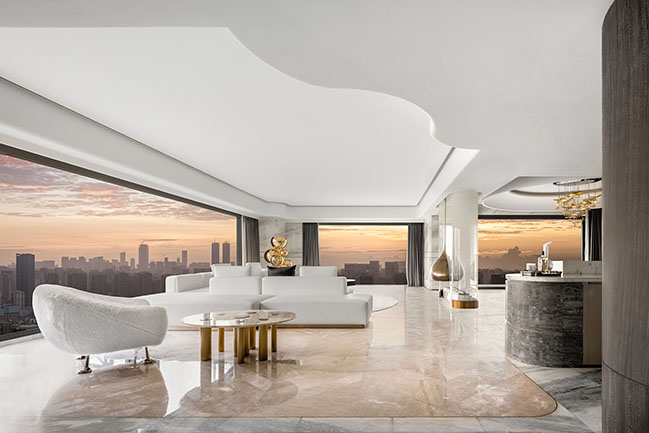
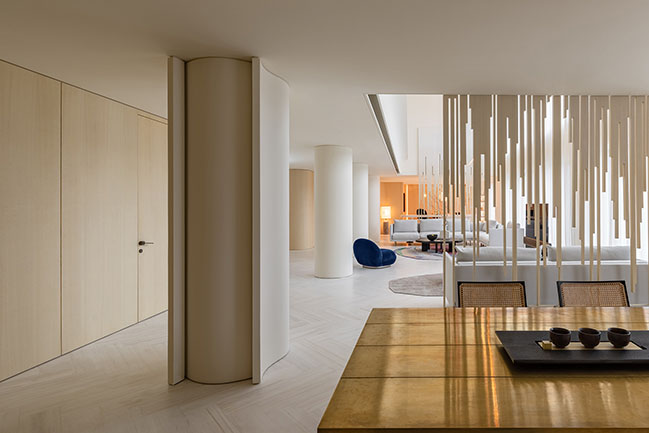
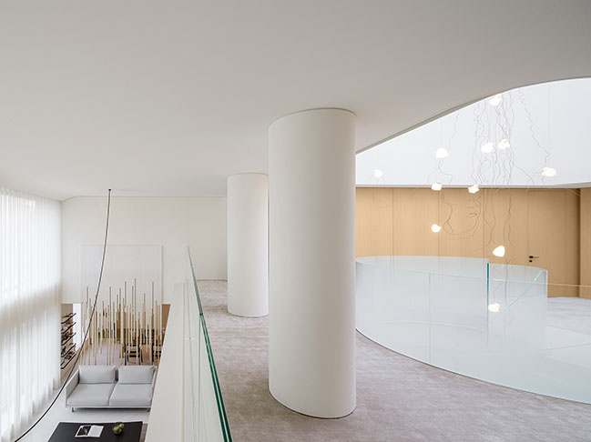
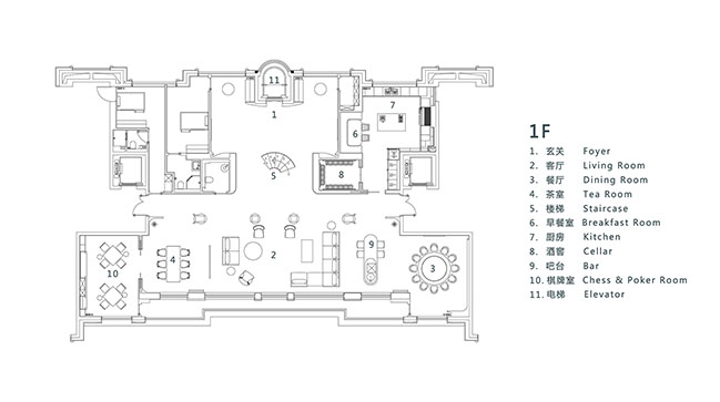
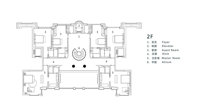
From the architect: For a female property owner who honors freedom and sharing and pursues art and fashion, private resort residence needs to be elegant and serene, generating richness and a sense of belonging. Being sensitive to the property owner's inner appeal and expectation, the designer also faces difficulty in restructuring. The project is an area of 650 square meters, which is a large floor flat formed through knocking two apartments. The fundamental space layout is fragmented, scattered, awkward, and too rigid and tedious. The space is divided symmetrically by four pillars, leading to lack of flow in the interior.
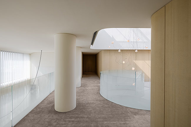
Taking into full consideration of functions and environmental protection, the designer did not reorganize structure of the apartment, but divided the functional layout of the space by means of deconstructionism while proceeding from the perspective of creativity and art. Through asymmetric, three-dimensional and curving forms of layout and through rebuilding of structure, light and shadow, and artworks, the space is extended and reshaped, allowing it to become a private space that combines multiple functions of a private resort, such as reception of guests and gathering, exchanges and entertainment.
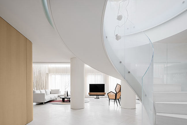
1. Entrance lobby
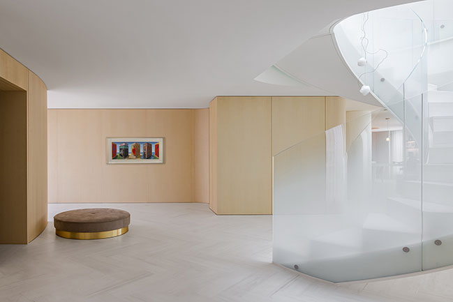
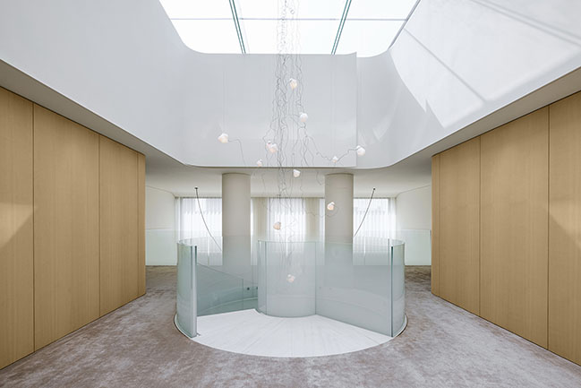
The broad and bright entrance lobby is like an art gallery basking in natural light. The original artwork on the wooden wall is the million-yuan-worth 3D artwork by the surrealism artist Patrick Hughes, displaying charm and fun of both graphic arts and three-dimensional sculpture. The lively wood paint sculpture by artist Jacky Tsai combines traditional Oriental implication and Western pop color.
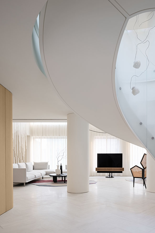
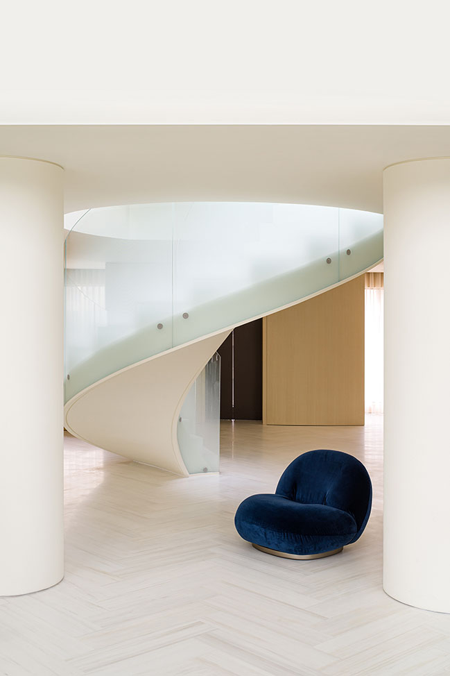
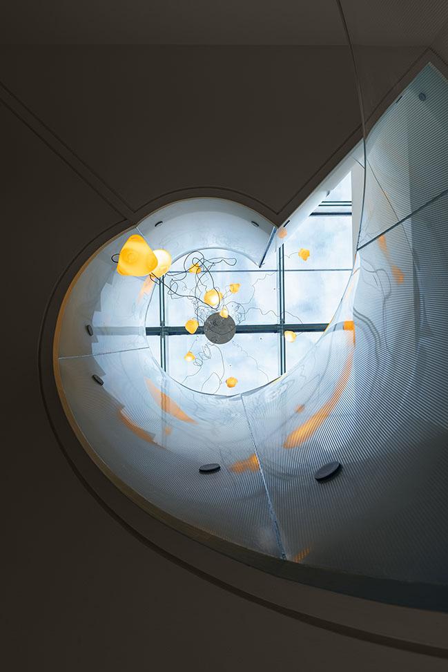
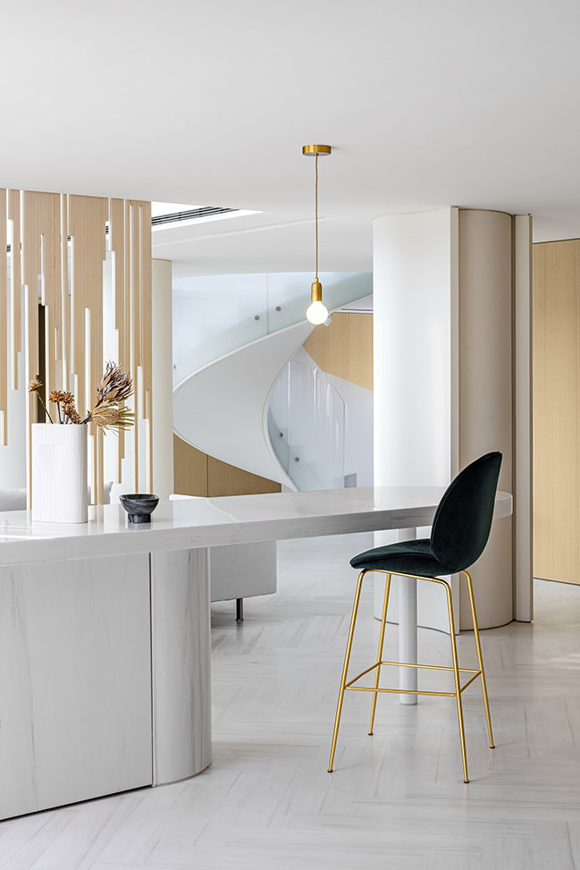
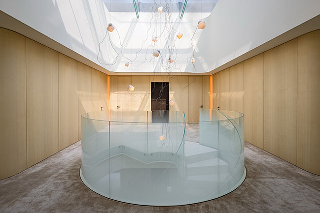
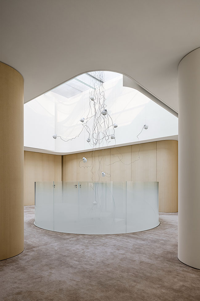
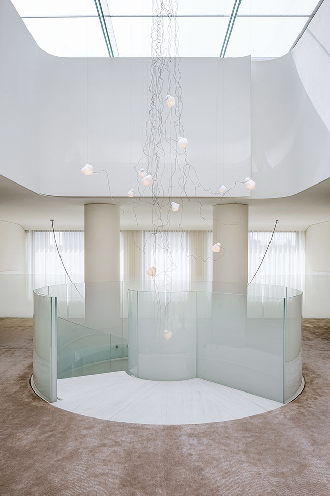
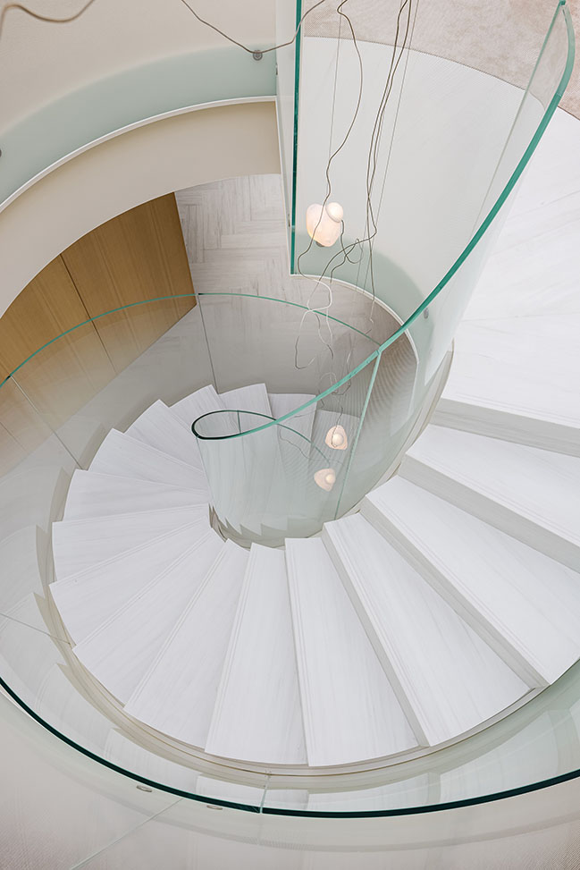
The spiral staircase in the entrance lobby contains both sense of sculpture and visual impact: the gorgeous and smooth line and the light dripped through the impluvium being smudged and diffused through the wired glass have injected great vitality into the originally low and dark entrance lobby. The 6-meter-high Bocci glass artwork is like vine extending from the impluvium to the entrance lobby, full of vigor and sense of layers.
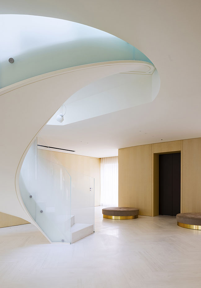
2. Living room
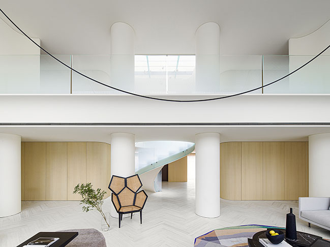
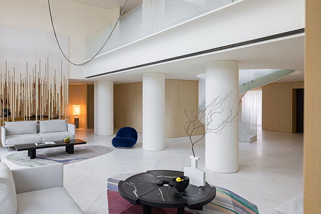
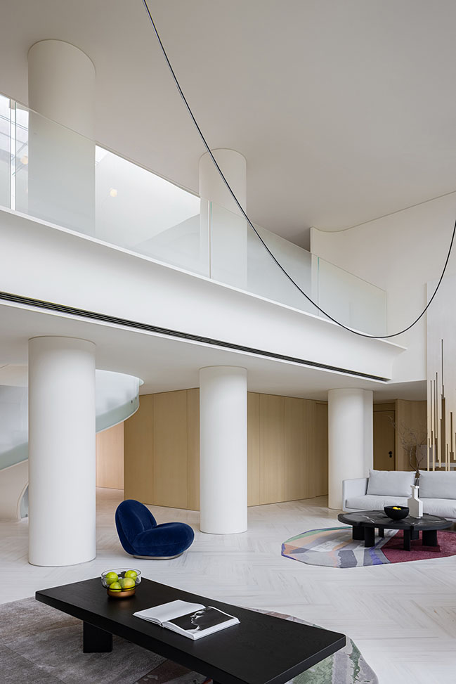
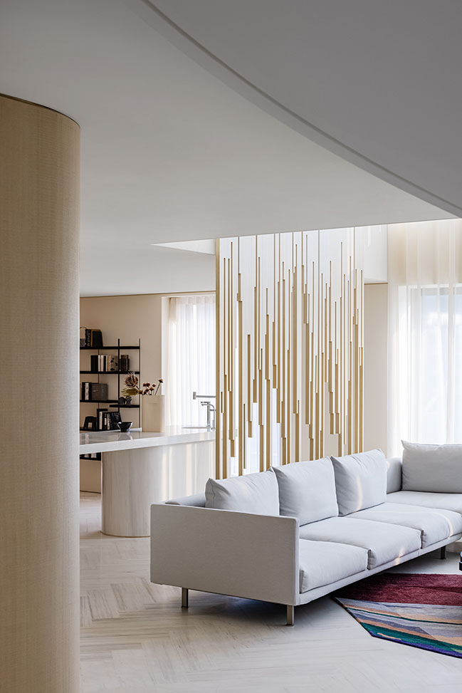
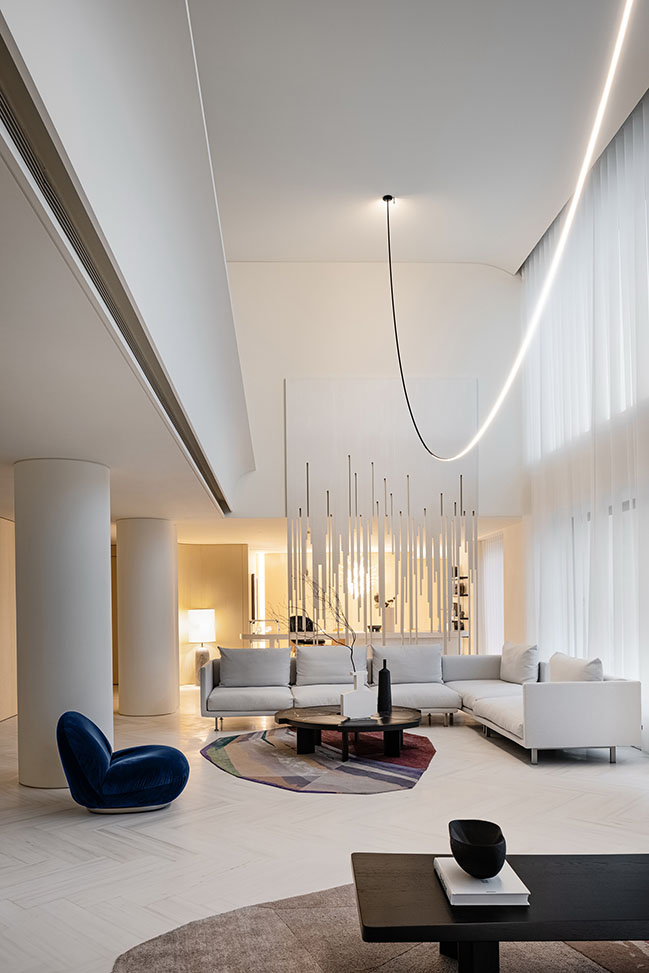
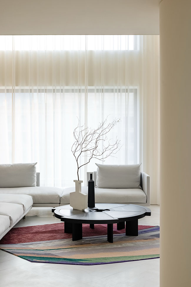
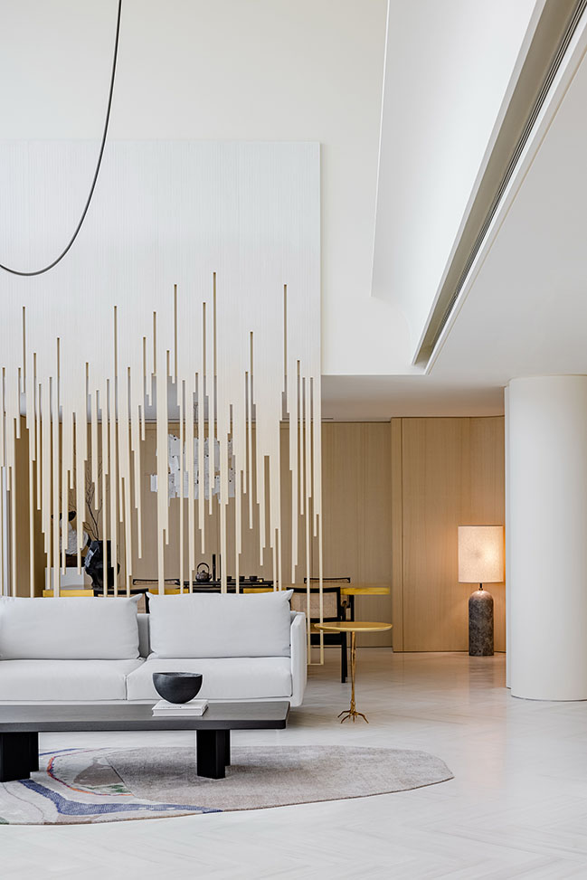
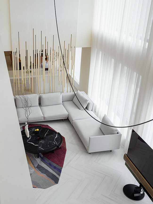
The radius of the linear chandelier in the two-story-high living room is 3 meters long. The two sides below the chandelier lie a variety of elegant furniture: beige Moroso main sofa, Cassina oak coffee table, handmade animal-foot-shaped bronze Traccia side table designed by artist Dalí, Gubi blue velvet armchair of retro fashion in the mid 20th century, Boffi wooden armchair and colorful cc-tapis wool carpet.
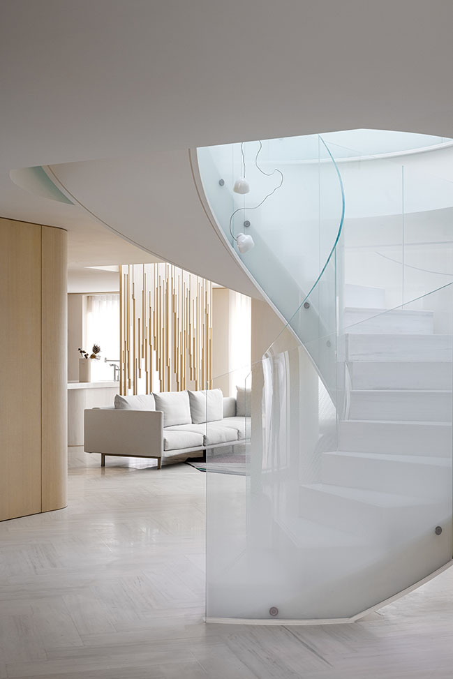
The linear design behind the sofa serves as the artistic screen, connecting the two-story space, the entrance lobby, the living room and the dining room. The design also serves as supplement to an open and sharing space with layers.
3. Dining room
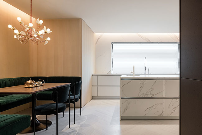
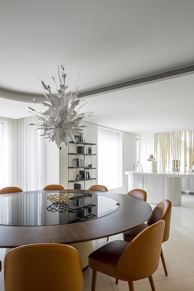
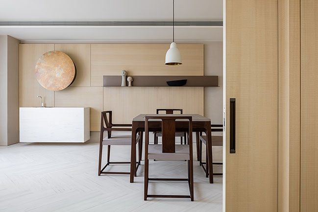
As the transitional space between the living room and the dining room, the bar-shaped marble table and the dark green stool chairs exude relaxing atmosphere with exquisiteness and modernity.
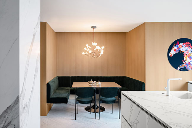
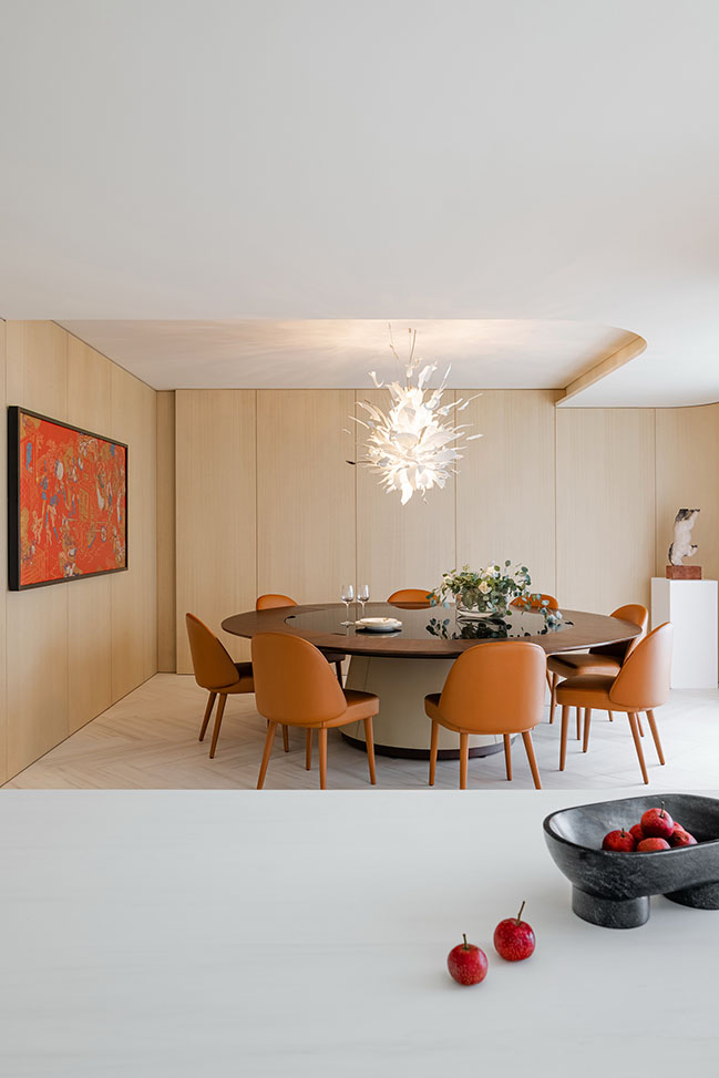
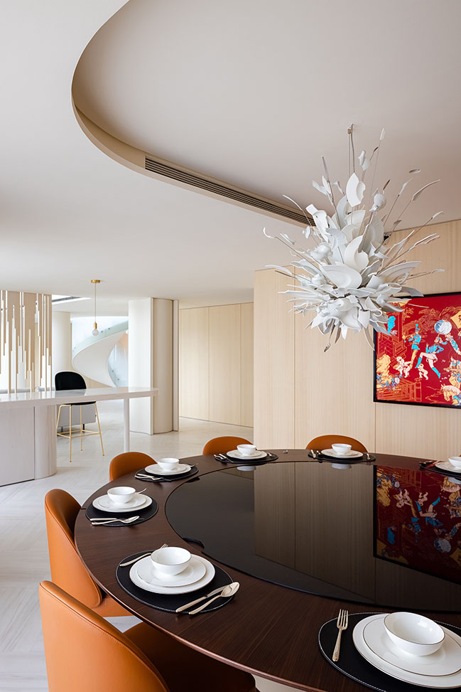
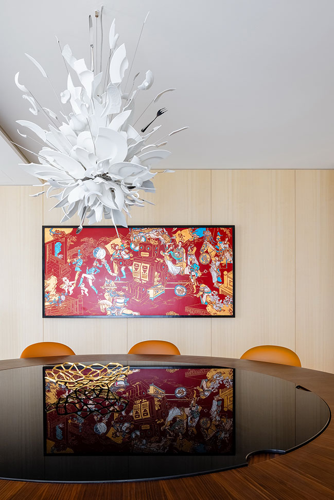
The chandelier above the dining table is designed by lighting artist Ingo Maurer. The free and swanky white tableware combine in an explosive manner, vertically pointing to the center of the table.
In order to balance space relations and set off a hospitable dining atmosphere, the designer also chose wood paint carved painting with bright colors as decoration.
4. Tearoom
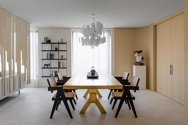
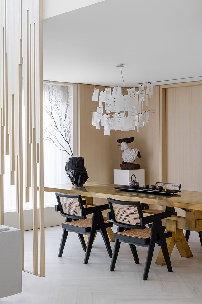
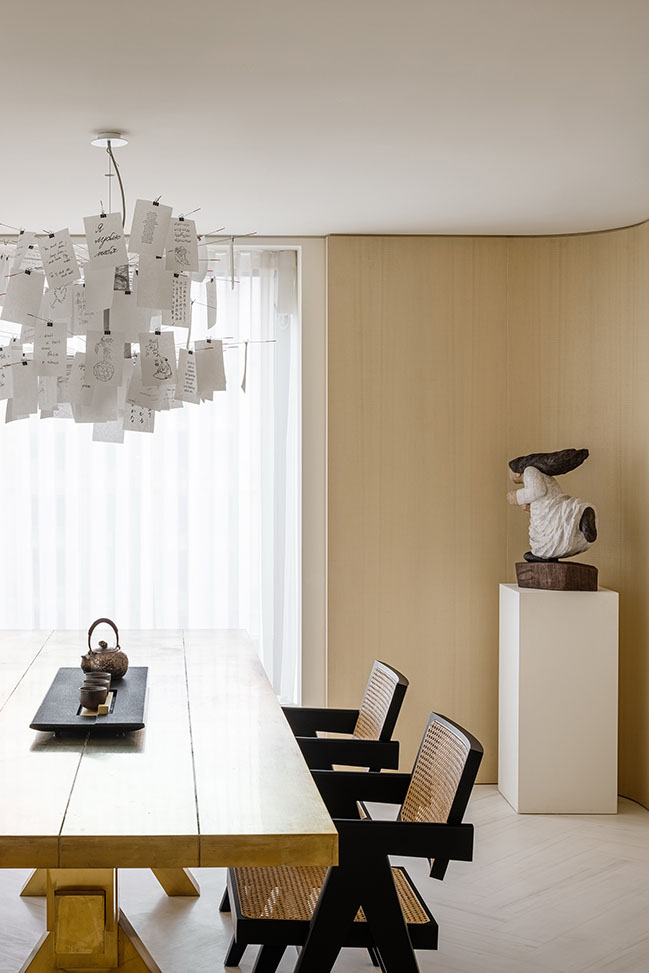
The oak chairs in the tearoom perfectly complement with the rattan armchair in the living room. The creative post-it chandelier is designed by Ingo Maurer and the long brass table is designed by rock-style genius Tom Dixon.
Behind the wooden wall hides a chess and poker room.
5. Gentle Structure
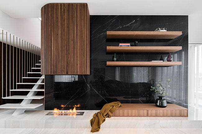
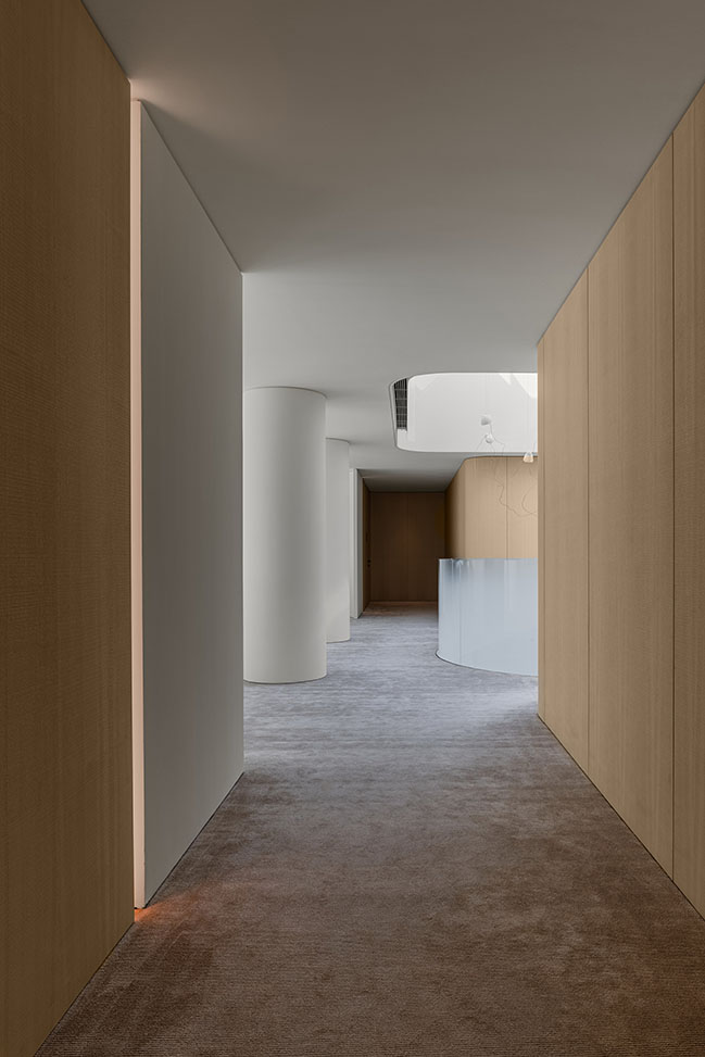
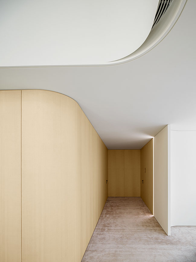
From the beginning of the "gentle hurricane", the spiral stair case, the "fragmented" wooden veneer unrolls, redefining the temperament of the space.

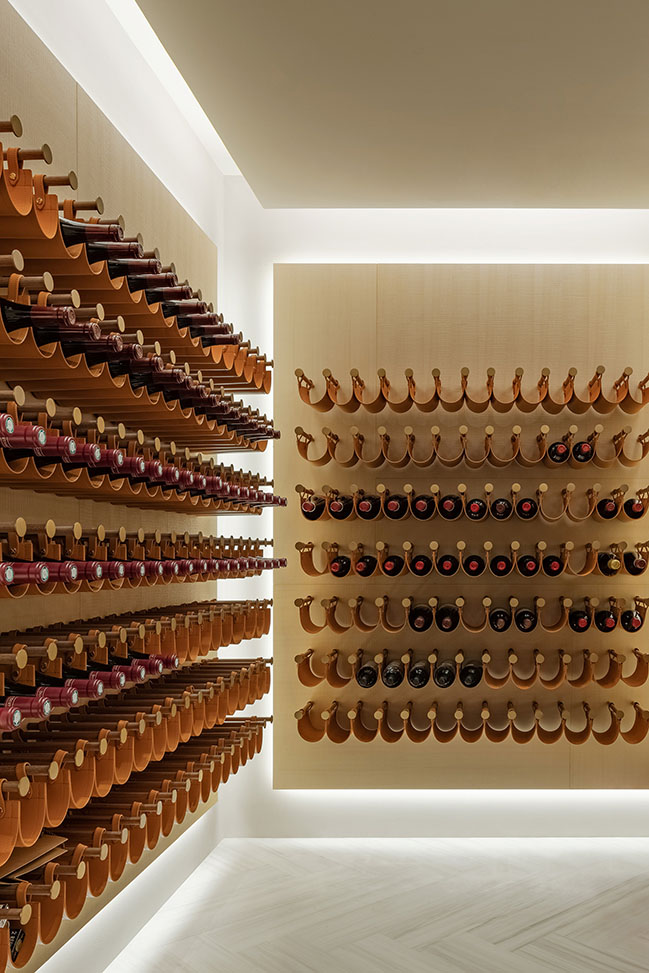
The arc-shaped wall plays down the stiffness of the original layout; while breaking the whole into parts, the multiple overlapping, splitting and dividing approach also breathes life into the space; for instance, the background wall of the bedrooms, beneath the impluvium, and behind the wooden veneer of the wine cellar shelf boards, light strips hidden behind the layout all reinforce the sense of "deconstruction".

6. Bedrooms
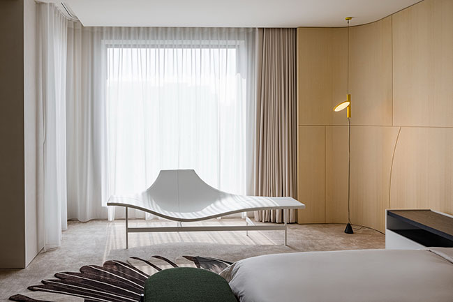
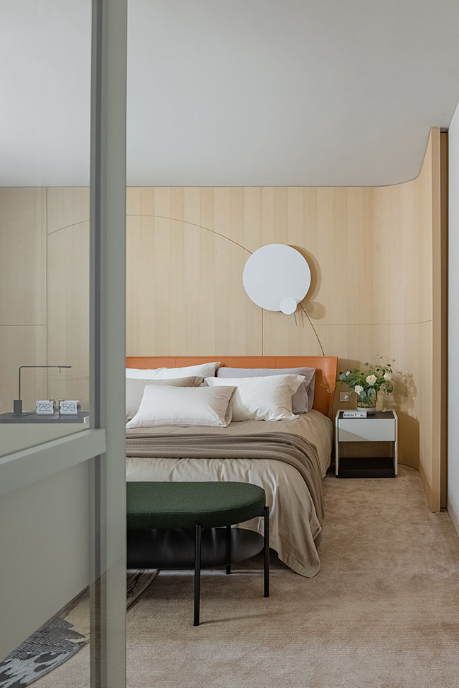
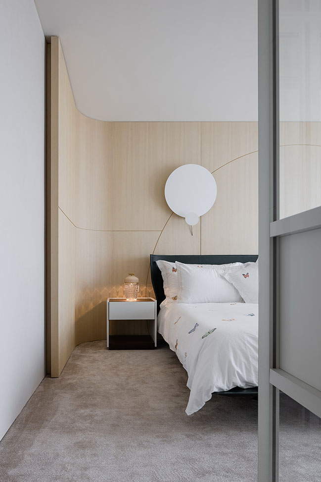
The comfortable bed of primary bedroom is B&B Italia, exemplary contemporary design. The bedside background wall is formed by generally light-colored wooden veneer with the surface being divided into several units differing in size and shape, constituting the meaning of "falling moon and rising sun" together with the round-shaped wall light.
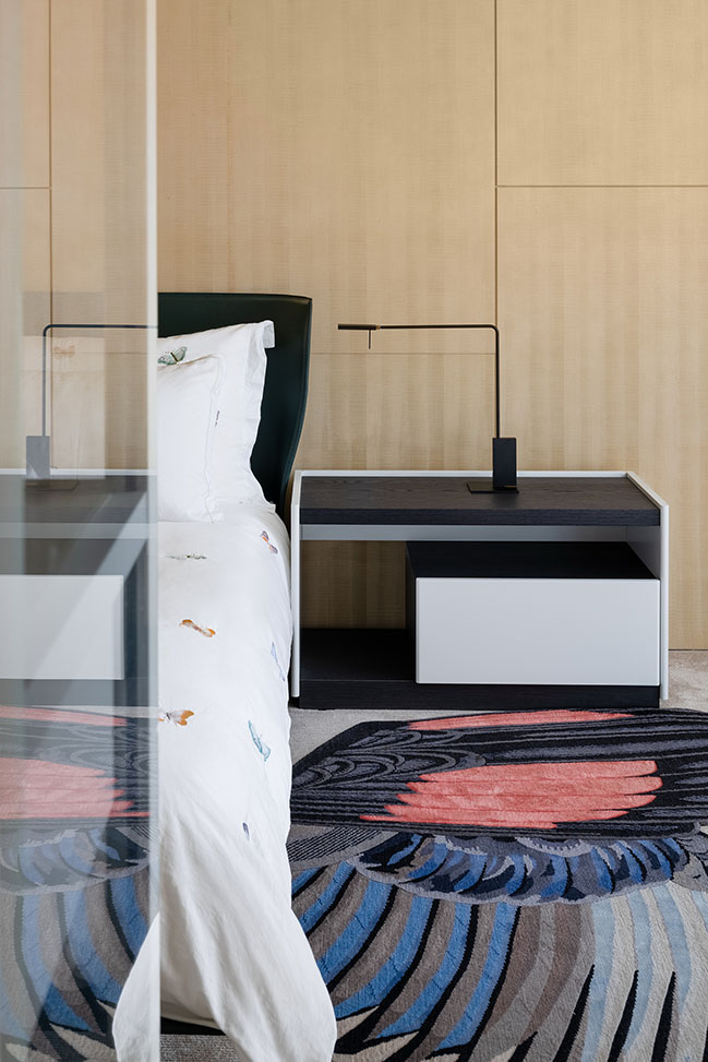
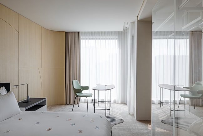
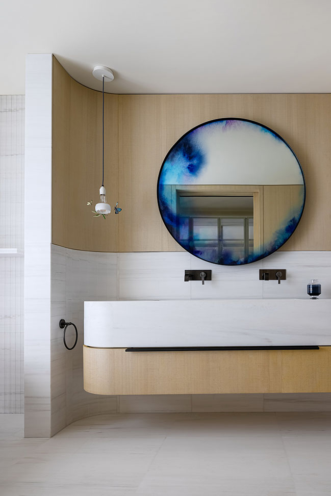
The four suites of secondary bedroom all adopt gentle and elegant warm white color, simple but artistic furniture, romantic and bold carpet.
Design Firms: YuQiang & Partners, EK Design
Location: Zhejiang Province, China
Year: 2021
Project area: 650 sqm
Photography: Zhu Di @ SHADØO PLAY


Zhejiang Private Penthouse by YuQiang & Partners, EK Design
04 / 06 / 2022 Taking into full consideration of functions and environmental protection, the designer did not reorganize structure of the apartment, but divided the functional layout of the space by means of deconstructionism while proceeding from the perspective of creativity and art
You might also like:
Recommended post: Landscape Viewpoint House by AP arquitectos
